The redesign looked polished in Figma, then fell apart the moment it reached production. The homepage used one button style, the product pages used another, the campaign landing page felt like it belonged to a different company, and every small change triggered another round of Slack messages between marketing, design, and development. That is the point where the problem becomes clear. It is a guidelines problem.
Site design guidelines turn scattered decisions into a repeatable system. They give marketing teams, SMBs, and creative partners one shared reference for how the site should look, behave, and support business goals, so every page does not have to be renegotiated from scratch. That matters because users form an opinion about a website quickly, and the first few seconds often decide whether they keep reading, click, or leave. When the stakes are that immediate, guidelines stop being a nice-to-have and become a revenue tool.
Strong guidelines also reduce the hidden cost of constant revision. Without a clear standard, teams spend time debating spacing, typography, component behavior, and content hierarchy instead of improving the offer or tightening the user journey. With a shared system in place, marketing can move faster, developers can build with fewer assumptions, and the brand stays consistent across ads, landing pages, blog layouts, product pages, and sales collateral.
Introduction Beyond Pretty Pictures to Predictable Results
A lot of teams start with a visual refresh and end up with inconsistency everywhere else. The header on one page feels elegant, the footer on another feels cramped, and a campaign page built by a different person starts looking like a separate brand entirely. Then the revision cycle begins, and every new asset turns into a debate about spacing, typography, or whether a button should be blue or charcoal.
That kind of chaos usually isn't caused by bad talent. It's caused by the absence of a shared system that tells people what “good” looks like before they start designing. Once that system exists, marketing can move faster without improvising on every asset, and developers can build with fewer assumptions.
Practical rule: if two people can interpret a design decision differently, the guideline isn't finished yet.
The useful shift is simple, but it changes everything. Instead of treating design as a series of one-off creative decisions, treat it like an operational asset that protects consistency across ads, landing pages, blog layouts, product pages, and sales collateral. That's especially important for SMBs, where one off-brand page can weaken trust just as much as a broken form or a slow page.
The stronger the system, the less time teams spend explaining choices that should already be documented. That creates room for actual strategic work, like refining the offer, improving the user journey, and aligning the page to the campaign goal. It also keeps brand expression from drifting every time a freelancer, agency, or internal stakeholder touches the site.
What Are Site Design Guidelines and Why You Need Them
Think of site design guidelines as the architect's blueprint for your digital storefront. A storefront can still function without one, but you'll end up with inconsistent fixtures, awkward circulation, and a space that feels assembled instead of designed. The same is true online, where a centralized guideline document gives every page the same structural logic, visual language, and implementation rules.
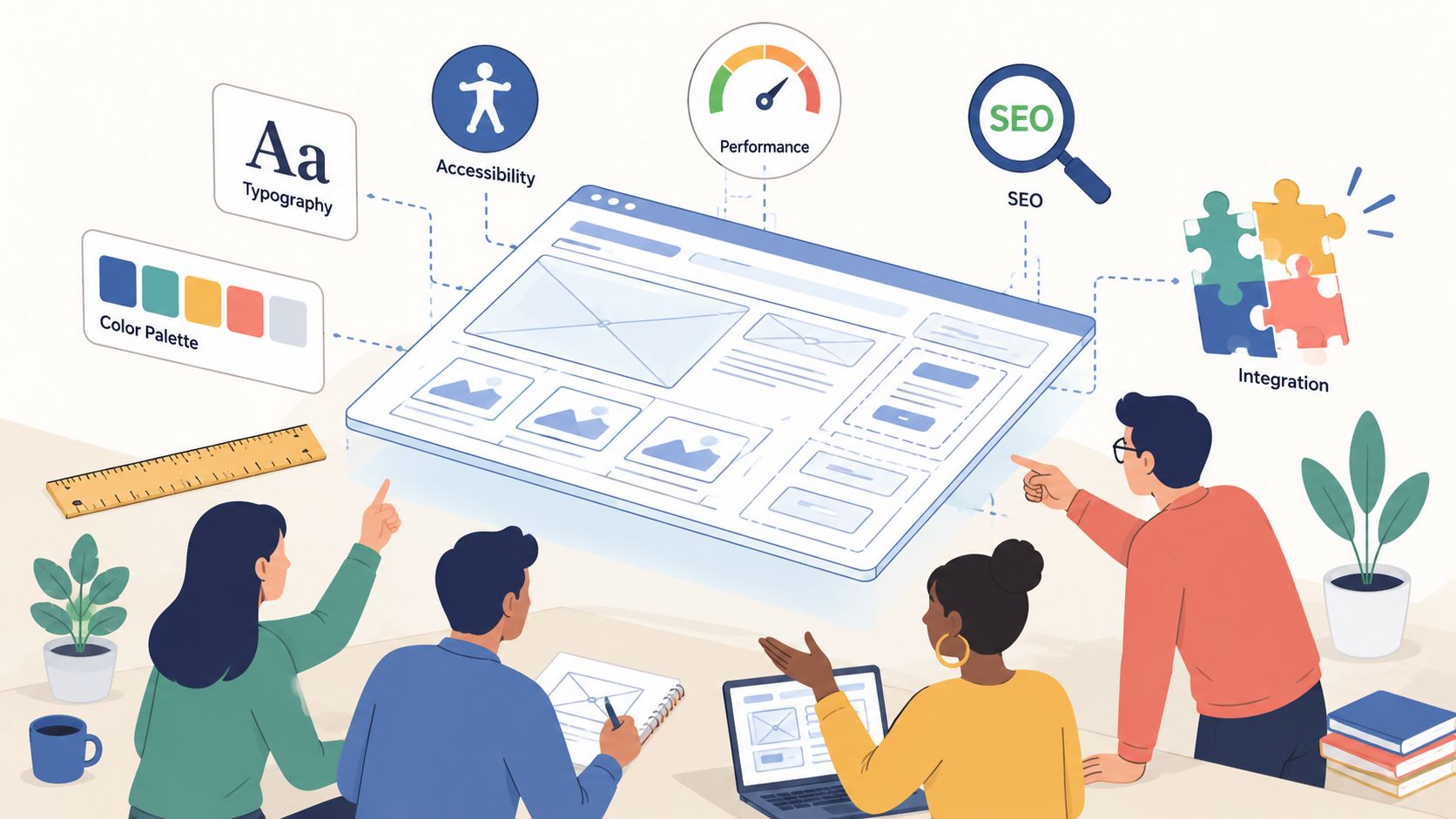
In practical terms, the document should define the decisions people make over and over again. That includes color usage, typography, button behavior, imagery style, spacing, navigation patterns, accessibility expectations, and the standard components used across the site. When those choices live in one place, the team isn't guessing, and each new page gets built faster with fewer revisions.

A good guideline also reduces the gap between design intent and technical execution. NN/g says design specs exist to align designers and developers on user needs, feasibility, and technical requirements, and recommends involving developers early rather than after the design is “finished” (NN/g). That point matters for SMBs because rework is expensive in both time and morale, especially when marketing is waiting on a launch date.
What the document should actually do
A useful guideline document does three jobs at once:
- Keeps the brand recognizable: The same visual language appears across landing pages, forms, emails, and core site pages.
- Cuts production friction: Designers and developers can move without pausing for constant clarification.
- Improves user confidence: Visitors see a site that feels deliberate, not stitched together.
A guideline is only useful when it removes decisions, not when it adds another layer of debate.
The most effective teams treat this document as a shared operating system. Marketing uses it to brief campaigns. Design uses it to create assets. Development uses it to implement patterns. Sales and leadership use it to protect the brand when new pages or offers get added quickly. If you want one reference point for brand expression, a system like ReachLabs.ai's visual brand identity approach can help frame the kind of consistency a marketing team needs to document.
The Foundations User Experience and Accessibility
The first thing users notice is not your color palette, it's whether the page makes sense. Navigation needs to be obvious, the hierarchy needs to be readable at a glance, and the page should tell people where to look next without making them think too hard. That's why the most practical guidelines focus on structure and interaction patterns before they get into decorative polish.
A literature review in the U.S. Web Design System materials found that the most frequently discussed elements in user engagement studies were navigation (62.86%), graphical representation (60%), organization (42.86%), content utility (37.14%), purpose (31.43%), simplicity (31.43%), and readability (31.43%) (U.S. Web Design System). Those figures reinforce a simple truth, people engage more when the site is clear, structured, and easy to move through.

Accessibility belongs in that same foundation, not as a separate compliance file hidden in a folder no one opens. If a button is hard to read, if a form can't be used from the keyboard, or if images don't have meaningful alt text, then the experience is narrower than it should be. That's not just a legal or ethical issue, it's a practical one, because every barrier removes potential customers from the funnel.
Define the rules that prevent confusion
The most helpful UX guidelines are specific enough to stop argument before it starts. For example, define what the primary navigation can contain, how many levels deep it should go, how breadcrumb trails work, what the active state looks like, and how forms should confirm success or flag errors. If the team doesn't document these choices, people will keep reinventing them.
Accessibility rules should be just as explicit. Spell out contrast expectations, keyboard operability, descriptive link text, and alt text standards in the same document the team already uses for layout and components. That's the point of a design system mindset, the site becomes easier to use because the rules are consistent, not because someone manually fixes every page.
The U.S. government's design guidance also emphasizes reviewing existing guidance, analyzing search and social data, publishing metrics, involving the team in user research, and continuing to test with real users. That research-driven habit is what keeps UX from becoming opinion theater. In practice, it means your guidelines should reflect actual user behavior, not just internal taste.
Defining Your Visual and Brand Identity
Visual identity is where many teams overcomplicate things. They create too many color tokens, too many type styles, and too many “special” versions of the same component, then wonder why the site feels inconsistent. Strong guidelines do the opposite, they narrow the choices so the brand shows up clearly every time.
Start with the basics: a fixed color palette, approved fonts, and a rule for how each type style is used. If your headings, body copy, and link colors are loosely defined, the site will drift the moment a new page template appears. Operationally useful guidelines have to be concrete, and technical guides emphasize documenting the site map, standard UI elements like typography, link colors, heading and body text rules, and accessibility requirements in one approved document to reduce ambiguity and implementation errors (Webhelp Agency).
The same principle applies to imagery and iconography. If every blog header uses a different treatment, or every product page uses a different style of illustration, users feel the inconsistency even if they can't name it. Brands don't just build recognition through logos, they build it through repetition of the same visual decisions in every customer touchpoint.
What to document in the visual system
A strong visual section usually includes:
- Color palette: Primary, secondary, accent, and neutral colors, plus when each one can be used.
- Typography rules: Fonts for headings and body copy, weights, sizes, line height, and when not to use decorative styles.
- Logo usage: Clear space, minimum size, and examples of misuse.
- Imagery style: Photography tone, cropping rules, illustration style, and icon consistency.
- Component styling: Button shapes, border radius, card treatment, and hover states.
Each of those items protects brand consistency in a different way. Color sets the emotional tone, typography shapes readability, and imagery tells the audience whether the brand feels premium, practical, playful, or technical. When the rules are clear, the design team can move faster without second-guessing every asset.
Useful standard: if the brand team can't approve a page by looking at the same rules document the build team uses, the system still needs work.
A practical guideline should also show what not to do. For example, don't let every campaign page introduce a new button color just because the creative brief changed. Don't let typography expand beyond the defined scale. Don't let logo placement become a negotiation on every page. Consistency is what makes the site feel intentional, and intentionality is what makes the brand feel trustworthy.
Optimizing for Performance and SEO
A site can look polished and still lose the lead if it loads slowly or gets buried in search results. Performance and SEO belong in design guidelines from the start because they shape what people experience before they read a single line. That means the design team has to treat page speed, crawlability, and content structure as part of the brand, not as cleanup work for later.
Visual choices carry technical trade-offs. Large hero images, autoplay motion, weak mobile behavior, and unclear hierarchy can all make a page harder to use and harder to find. If the page feels impressive but keeps visitors waiting or guessing, it is undercutting the very conversion path it was meant to support.

SEO belongs in the same conversation because discoverability and usability overlap. A page structure that uses clear headings, descriptive image treatment, and scan-friendly content blocks usually helps both users and search engines. Search-friendly design is often clearer design, and clearer design usually supports conversions better.
Build technical rules into the design guide
The guideline should spell out what good looks like before the site is built:
- Image treatment: File formats, compression expectations, and when an image is decorative versus informative.
- Responsive behavior: How layouts stack on smaller screens, how navigation collapses, and how content should reflow.
- Content hierarchy: Which elements appear first, what deserves a heading, and how section breaks should work.
- SEO basics: Page titles, descriptive headings, internal linking patterns, and alt text expectations.
- Performance guardrails: What kinds of visuals or effects are off-limits when they slow the experience.
A technical SEO checklist can sit beside the design guide so the team does not split aesthetics from visibility. For a practical example of how teams connect design and optimization work, ReachLabs.ai's new site SEO checklist is the kind of working reference that belongs in the same folder as the design system.
A common mistake is treating performance as something to fix after launch. By the time a slow page is live, the team is already spending budget to recover from a decision that should have been prevented. Good guidelines stop that problem at the source.
Your Actionable Site Design Guidelines Checklist
A useful checklist should be short enough to use and specific enough to enforce. That balance matters because marketing teams don't need another theoretical framework, they need a working document that tells people what to define before a page goes into production. If the checklist can't guide a real launch, it's too abstract.

1. Define the user and the job to be done
Start with the audience, then map the main journeys. What are people trying to accomplish when they land on the site, and what should they see first? If the answer isn't clear, the design will drift toward decoration instead of conversion.
2. Lock the visual system
Choose the approved colors, fonts, logo placement rules, and image style. From these selections, the brand either maintains coherence or begins to fragment into a hundred little exceptions. A page can still be creative inside a system, but the system has to exist first.
3. Standardize navigation and page structure
Define the main menu, footer links, content hierarchy, and common modules. If each page invents its own structure, users spend more time orienting themselves than acting. Clear structure helps the site feel easier even before the content changes.
4. Make mobile behavior explicit
Don't assume the desktop design will translate cleanly. Document how navigation collapses, how cards stack, how forms behave, and what happens to long headlines on smaller screens. If the mobile version is an afterthought, the site will usually feel that way too.
5. Set performance rules
Spell out what gets optimized, what gets compressed, and what kinds of assets are too heavy for standard use. Fast loading isn't only a technical win, it protects the marketing investment behind every page. A slow page weakens the impact of every campaign that sends traffic to it.
6. Bake accessibility into every template
Document contrast, keyboard behavior, alt text, form labels, and focus states in the same place the rest of the component rules live. Accessibility should not depend on individual memory or goodwill. It should be part of the default build process.
7. Create a feedback loop
Add a rule for testing, review, and revision after launch. That can include stakeholder review, user testing, or a simple audit of the pages most important to revenue. Good guidelines get sharper when real users interact with them.
Best practice: put the checklist where the team already works, not in a forgotten PDF.
A page brief can also borrow content planning from ReachLabs.ai's content-for-website-design workflow, especially if your team needs a structured way to connect page goals, proof, and layout modules. That kind of workflow keeps the guideline from becoming purely visual.
Conclusion From Document to Living Design System
A strong guideline document isn't a trophy file. It should live in the same place the team already checks for assets, component rules, and approvals, whether that's Notion, Figma, or another shared workspace. If people can't find it quickly, they won't use it when they're under deadline pressure.
Ownership matters too. Someone needs to act as the guardian of the system, not to control every creative decision, but to protect consistency and update the rules when the brand, platform, or business model changes. Without that accountability, the document starts reflecting old decisions instead of current reality.
The most effective teams treat the guide like a living system. They review it, refine it, and keep it aligned with what users need and what the business is trying to achieve. That's how guidelines stay useful after the launch celebration ends.
When that happens, design stops being a bottleneck and becomes a shared language. Marketing can launch faster, developers can build with fewer ambiguities, and every new page strengthens the brand instead of fragmenting it. That's the return on site design guidelines, predictable execution that supports conversion, trust, and scale.
A CTA for ReachLabs.ai.