You’re probably in one of two situations right now.
Either the design comp is nearly done and someone has finally asked, “Who’s writing the copy?” Or the content doc exists, but it’s a loose pile of notes that doesn’t line up with the pages, modules, and calls to action the designer already built.
That workflow creates expensive rework. It also creates websites that look polished in a review deck but feel disjointed when real visitors use them. Good content for website design isn’t decorative text you pour into finished layouts. It’s part of the structure, part of the user journey, and part of the conversion logic.
Teams get into trouble when they separate writing, SEO, UX, and design into isolated tasks. The homepage headline gets written without knowing what the navigation promises. Service page sections get added because they “look balanced” in the layout. Forms, buttons, and proof points get treated like tiny details, even though they often decide whether a visitor keeps moving or leaves.
A better approach is simpler. Plan content and design together. Build page goals before page mockups. Decide what each section needs to say before anyone starts fussing over spacing, animation, or image treatments.
Why Great Website Content Starts Before You Write a Word
The most common website mistake is easy to spot. A team approves attractive design directions first, then tries to force content into the approved blocks afterward. That’s how you get vague headlines, oversized paragraphs, missing proof, and pages that feel like they were assembled by different people with different priorities.
Design absolutely matters. 94% of users form their first impression of a business based solely on website design, and that judgment happens in just 0.05 seconds. With 75% of a website’s credibility coming from its design elements, which is why content has to be built into the visual strategy from the start, not bolted on later, according to these website design statistics.

Why post-design copy almost always underperforms
When copy is treated as filler, three things usually happen:
- The page goal gets blurred because sections exist to satisfy the layout, not the buyer journey.
- The message gets flattened because every block demands the same amount of copy whether it needs it or not.
- The revision cycle balloons because writers, designers, and stakeholders are solving structure problems too late.
That’s why the right sequence isn’t “design first, words later.” It’s parallel planning. The content strategist defines the user questions, proof needs, and CTA logic while the designer translates those priorities into hierarchy, spacing, and interaction patterns.
Practical rule: If a designer is making layout decisions before the team agrees on page purpose, content hierarchy, and CTA priority, the project is already drifting.
Content shapes the interface
A homepage hero isn’t just a place for a clever headline. It’s where visitors decide whether they’re in the right place. A services section isn’t just three cards in a row. It’s a decision point. A testimonial block isn’t decoration. It’s risk reduction.
This is why solid effective website project planning matters long before visual polish enters the conversation. Good planning forces the team to answer the hard questions early. Who is this page for? What do they need to understand first? What objection needs proof? What action should feel easiest?
Treat content for website design as part architecture, part messaging system, and part UX. Once you do that, wireframes stop being empty boxes and start becoming decision tools.
Blueprint Your Content with Audience Research and Audits
Before anyone writes a homepage headline or drafts a service page, you need two assets: a usable audience model and a brutally honest audit of the current site. Without those, teams write from internal assumptions. That’s when websites drift into feature-heavy language, generic claims, and navigation built around the org chart instead of customer intent.
Baymard Institute research shows that overwhelming users with feature-centric content can increase bounce rates by up to 60%. A persona-driven strategy, which focuses on user problems and goals, is the proven methodology to reverse this by building trust and guiding decisions, as summarized in this article on startup web design mistakes that kill conversions.
Build personas that are useful in meetings
Most personas fail because they’re too soft to guide decisions. “Marketing Mary” with a stock photo and a list of hobbies won’t help anyone decide what belongs above the fold.
A working persona should include four things:
Demographic context
Only include details that affect buying context, language, or constraints.Goals and challenges
What are they trying to get done, and what’s making that difficult right now?Preferred communication style
Do they want direct language, education-first messaging, or proof-heavy copy?Decision criteria
What must they believe before they contact sales, book a call, or request a quote?
That persona should then influence page hierarchy. Problem-led headline first. Benefits before feature detail. Proof placed near friction points. Clear next steps instead of vague “learn more” everywhere.
If you need a practical starting point, ReachLabs has a guide on how to identify target audience that can help teams move from broad assumptions to usable audience definitions.
Audit the existing site like a strategist, not a librarian
A content audit isn’t a page inventory for its own sake. The point is to decide what earns a place on the new site.
Use a spreadsheet or Airtable and review each page through these lenses:
- Purpose
What job is this page supposed to do? - Audience fit
Does it speak to a real buyer need or internal preference? - Performance signal
Is the page attracting the right intent, supporting conversion, or stalling the journey? - Content quality
Is the message clear, specific, current, and credible? - Actionability
Keep, merge, rewrite, move, or delete.
What usually gets cut
In most audits, the same weak spots show up:
- Feature dumps that explain the company’s capabilities without translating them into buyer outcomes
- Duplicate pages built for edge cases no one visits
- Thin trust content where bold claims exist but proof is missing
- Bloated introductions that spend too long warming up before saying anything useful
- Legacy SEO pages written for keywords first and humans second
A useful audit doesn’t ask, “Can we reuse this?” It asks, “Would we publish this today if we had to earn the click again?”
What you’re trying to leave with
By the end of this stage, you should have:
- a short list of priority audiences
- a map of their questions and objections
- a page inventory with keep, cut, and rewrite decisions
- a list of missing pages or modules
- a message hierarchy the designer can use
That’s the blueprint. Not a moodboard. Not a stack of disconnected copy docs. A decision-ready foundation.
Mapping Your Content to Sitemaps and Wireframes
Once the audience and audit work is done, the project gets concrete. At this point, content for website design stops being abstract strategy and starts shaping the site’s structure.
A good sitemap isn’t just a navigation tree. It’s a model of how buyers move from question to clarity to action. A good wireframe isn’t a grayscale placeholder. It’s a page-level argument about what deserves attention first, what proof must appear next, and where the user should go after that.
Start with the process view below.

Build the sitemap around user tasks
Teams often overcomplicate sitemaps because they’re thinking in departments, not journeys. Visitors don’t care how your company is organized. They care whether they can quickly find what you do, whether you can help, and what to do next.
A practical sitemap review should ask:
- What pages are mandatory for discovery, trust, and conversion?
- What pages support decision-making but don’t belong in primary navigation?
- What can be consolidated so users don’t have to compare near-identical pages?
- Where do proof assets live such as case examples, testimonials, credentials, or FAQs?
If a page doesn’t have a clear role in the journey, it usually doesn’t need to exist.
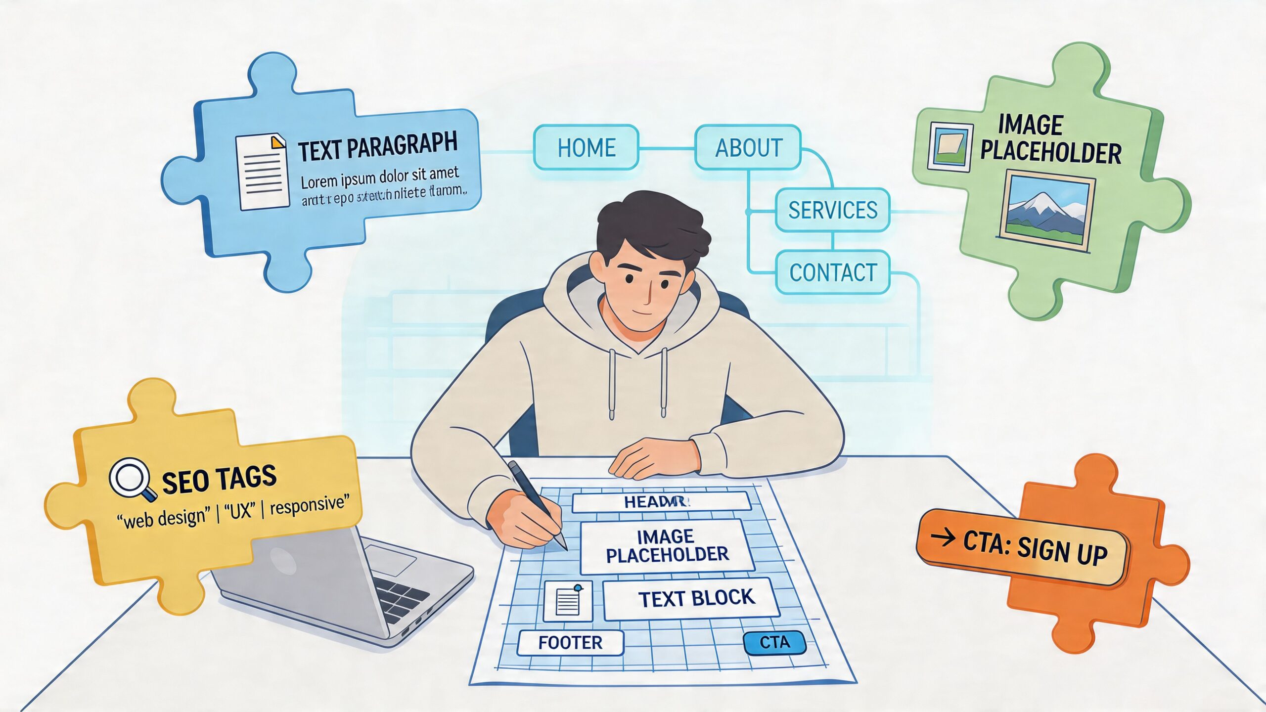
Turn each wireframe into a content brief
This is the step many teams skip. They approve wireframes with labels like “text block,” “image,” or “CTA section,” then leave the writer to guess what each block is trying to accomplish.
Don’t do that. For each page, annotate the wireframe with content requirements.
For example, a service page wireframe should specify:
| Section | What belongs there | Why it exists |
|---|---|---|
| Hero | audience-specific headline, supporting subhead, primary CTA | confirms relevance fast |
| Problem block | key pain points and stakes | shows understanding |
| Solution block | service explanation and outcomes | frames the offer clearly |
| Proof block | testimonial, example, trust markers | reduces doubt |
| FAQ or objection section | buying questions and practical concerns | removes friction |
| Final CTA | direct next step with low ambiguity | converts intent |
This sounds basic, but it changes the project. Designers stop guessing how much text the page needs. Writers stop forcing copy into mismatched modules. Stakeholders review against purpose instead of aesthetics alone.
Wireframes should answer one question on every page section: what does the user need to understand or do here?
Use real content lengths early
Placeholder lorem ipsum hides structural problems. Draft-level copy reveals them.
If the hero needs a concise value proposition and the draft takes three sentences to say it, you’ve learned something useful. If the proof section feels empty, the issue isn’t design. It’s that the team hasn’t gathered enough evidence yet. If the CTA area feels repetitive, maybe the page doesn’t need two competing offers.
Collaboration is key. In Figma, FigJam, Whimsical, or even Google Slides, content and design teams should review wireframes together with draft headlines, likely paragraph lengths, button copy, and asset notes already in place.
A short training resource can help align teams on the workflow side too:
A simple page mapping workflow
Use this sequence on every important page:
Name the page goal
Not “inform users.” Be specific. Book consults. Qualify leads. Drive demo requests.List the visitor questions
What will they need answered before they act?Define the proof requirements
Testimonials, examples, logos, process, pricing guidance, or FAQs.Assign module types
Hero, comparison grid, benefit list, process steps, form, testimonial slider.Draft within the wireframe
Even rough copy is better than empty labels.
That’s how content starts informing UX instead of merely occupying it.
Writing Words That Convert and Visuals That Engage
Once structure is locked, writing gets easier because you’re no longer staring at a blank page. You’re solving specific jobs inside specific modules. The hero needs to establish relevance. The benefits section needs to make the offer feel useful. The CTA needs to reduce hesitation.
The biggest writing mistake at this stage is trying to sound polished before getting specific. Clear copy outperforms clever copy on most business pages because visitors are trying to orient themselves fast.
According to Nielsen Norman Group research, 79% of users scan content rather than reading word-for-word. This makes scannable formatting, using subheadings, short paragraphs, and highlighted keywords, a critical requirement for engagement and conversion, as explained in this article on costly web design mistakes for business success.

Write for scanners first
Most website pages improve when the writer trims introductions and sharpens section openings. If someone only reads your headline, subhead, bullets, and buttons, they should still understand the offer.
That means using:
- Direct subheadings instead of vague transitions
- Short paragraphs that hold one idea at a time
- Bullets for decision points instead of burying them in prose
- Highlighted phrases only where they help orientation
A strong page often feels slightly plain in a Google Doc and much stronger once paired with hierarchy, spacing, and visuals in design.
Microcopy is part of conversion, not cleanup
Teams usually spend hours on the hero and minutes on the form, error states, CTA labels, and confirmation messages. That’s backwards.
Button text, form labels, helper text, scheduling instructions, pricing disclaimers, and navigation labels all shape whether the experience feels easy or annoying. “Submit” is weaker than a button that describes the next step. “Message” as a nav label is fuzzier than “Contact” or “Book a call,” depending on intent.
A few practical checks help:
- Buttons should describe the action users are taking
- Forms should explain what happens next
- Error states should help people recover
- Repeating CTAs should stay consistent unless the action changes
If your team needs a deeper copy framework, this guide on how to write web content for a website is a useful companion during drafting.
Good UX writing removes tiny moments of doubt before they become exits.
Match visuals to the message
Visuals shouldn’t be chosen after the copy is done, and they shouldn’t be selected only because they fill space. The image, illustration, chart, or video has a job to do.
Choose visuals based on function:
- Trust building with real team photos, product views, or process screenshots
- Clarification with diagrams, annotated screenshots, or explainer graphics
- Proof with examples that show the work, not generic mood imagery
- Momentum with visual cues that support the next action
When stock photography appears on high-stakes pages, it usually weakens the message unless it’s used sparingly and fits the context. Real visuals tend to carry more credibility because they make the offer feel tangible.
Draft in layers, not in one pass
A practical writing process looks like this:
- Rough message draft by page section
- Tightening for clarity and scannability
- CTA and microcopy pass
- SEO pass for natural keyword placement
- Voice consistency pass
That order matters. If you start with keyword placement or line-level polish too early, you’ll waste time refining sections that may still need structural changes.
From Draft to Live CMS Entry and Content QA
A website can have strong strategy, clean copy, and approved designs, then still launch with broken links, inconsistent headings, clumsy mobile spacing, and missing alt text. That last mile matters more than people admit.
This is also where rushed teams leak trust. Websites are often “riddled with paragraph after paragraph of boring information” because strategists neglect the “forgotten” 10-20% of content, such as microcopy and secondary pages. A thorough QA process that audits these elements is a key differentiator that impacts perceived professionalism and trust, as noted in this article on website content areas that are often neglected or forgotten.
Enter content into the CMS with structure intact
Whether you’re using WordPress, Webflow, Shopify, HubSpot CMS, Squarespace, or another platform, the same principle applies. Don’t paste content in as if the CMS is a glorified text box.
Check these basics during entry:
- Heading hierarchy should follow a real outline, not visual preference alone
- Body copy formatting should preserve scan-friendly spacing
- Alt text should describe the image’s purpose where relevant
- Internal links should support navigation and related intent
- Buttons and form labels should match the approved copy exactly
This phase is where style drift happens. A writer may draft one CTA, a designer may label the button another way, and a developer may simplify it again in the build. Someone has to own final content consistency.
QA the page as a user would
Don’t review only in desktop preview. Click through the page like a first-time visitor with a goal.
Use a QA checklist that includes:
Page intent check
Can you tell what this page wants you to do within a few seconds?Link verification
Do all buttons, nav links, footer links, and inline links go where they should?Mobile review
Do line breaks, spacing, buttons, embedded media, and forms hold up on smaller screens?Microcopy review
Are field labels, disclaimers, confirmations, and helper text consistent in tone and clarity?SEO and accessibility basics
Are title tags, meta descriptions, alt text, and heading structure properly entered?
Catch the forgotten pages
The pages that get skipped are often the ones users see at sensitive moments. Think contact pages, thank-you pages, privacy pages, error states, and footers. They don’t need theatrical copy. They need competence.
A practical launch review benefits from an operations-style checklist, especially for search and implementation details. This new site SEO checklist is a useful reference before anything goes live.
Launch-day quality doesn’t come from one final proofread. It comes from checking the small pages and small words with the same discipline you gave the homepage.
Measuring Content Performance and Planning for Iteration
A launch is a starting point. Once the site is live, the main question is whether people understand it, use it, and convert through it the way the team intended.
One of the most expensive habits in web projects is assuming content is done because it has been published. A common mistake is treating website content as a “set it and forget it” feature. This directly conflicts with Google’s algorithms, which continuously evaluate content relevance, meaning that ongoing optimization is not a cost center but a revenue-generating activity, as discussed in this article on website design website features to avoid.
What to measure after launch
You don’t need a bloated dashboard. You need a short list of page-level signals that help you diagnose friction.
Here’s a simple tracking table you can adapt.
| Metric | What It Measures | Tool to Use | Good Benchmark |
|---|---|---|---|
| Engagement rate | Whether visitors are interacting meaningfully with a page | GA4 | Compare against your site average and page type |
| Time on page | Whether the content holds attention long enough to be useful | GA4 | Look for relative improvement on priority pages |
| Bounce rate | Whether users leave without taking another step | GA4 or other analytics platform | Lower is generally better, but evaluate by intent |
| Scroll depth | How far users get through the page | Hotjar, Microsoft Clarity, or similar | Enough depth to reach key proof and CTA sections |
| Conversion rate per page | Whether the page drives the intended action | GA4, CRM, form tracking | Track trend over time by page goal |
The point isn’t to chase vanity movement. The point is to connect user behavior to content decisions.
How to respond when a page underperforms
When a page struggles, avoid a full rewrite as the first move. Diagnose the likely issue.
Common patterns include:
Strong traffic, weak conversion
The page may attract the right visitors but fail to create confidence or direction.Good engagement, weak CTA clicks
The message may be useful, but the action is unclear or poorly placed.Low scroll depth
The intro may be bloated, the hierarchy weak, or the page asking for too much effort too early.Fast exits from key pages
The content may be mismatched to search intent or too focused on the company instead of the buyer.
Iterate with a hypothesis, not a hunch
Each revision should have a reason. Change the headline because it’s too generic. Reorder proof because users aren’t reaching it. Simplify the CTA because the current ask is too abrupt.
If you run e-commerce journeys or product-heavy funnels, a strong practical reference is this e-commerce conversion rate optimization playbook, especially for thinking through test ideas beyond cosmetic changes.
Don’t ask, “How can we freshen this page up?” Ask, “What specific friction are users showing us, and what change should reduce it?”
Iteration is where websites become sharper. Not because the team keeps “adding content,” but because they remove confusion.
Frequently Asked Questions About Website Content
How much content should a new website have?
Less than many might expect. More than most templates suggest.
A good site has enough content to answer buying questions, support trust, and guide the next step. It doesn’t need to explain everything the business has ever done. If a page exists only because someone on the team felt nervous deleting it, that’s not a good reason to publish it.
A lean site with clear page roles usually performs better than a sprawling site full of thin sections.
Should content or design come first?
Neither should operate alone. Content strategy should start first or run in parallel with UX and wireframing.
In practice, that means page goals, audience priorities, section hierarchy, and CTA logic should be decided before high-fidelity design is approved. Visual design can then reinforce the message instead of competing with it.
Should I write the copy myself or hire help?
That depends on three things: your clarity, your time, and the stakes.
If you know your audience well and can speak plainly about the offer, you may be able to draft strong source material yourself. But many internal teams struggle because they’re too close to the business. They know too much. That often produces jargon, feature overload, and weak differentiation.
A useful hybrid model is to have the internal team provide raw inputs, customer language, objections, and proof, then let a strategist or web copywriter shape it into page-ready content.
What tools help during a website content project?
The tool stack matters less than the workflow, but a practical setup often includes:
- Figma or FigJam for wireframes and content mapping
- Google Docs or Notion for drafting and stakeholder review
- Airtable or Sheets for content audits and page inventories
- Hotjar or Microsoft Clarity for post-launch behavior review
- GA4 and your CRM for conversion tracking
If you need a partner that can handle both the messaging and implementation side, ReachLabs.ai offers content creation and content management as part of website design work. That’s one option among many, but the larger point is to avoid splitting strategy, writing, and build execution so far apart that nobody owns the final user experience.
How long should website copy be?
Long enough to do the job. Short enough to stay usable.
A homepage hero usually needs compression. A service page may need more explanation, proof, and objection handling. A contact page should be simple. Don’t force every page into the same length target. Judge it by clarity, not by word count.
How do I know if a page needs more proof?
Look for hesitation points. If a page asks for a high-commitment action, such as booking a call, requesting a quote, or starting a trial, it usually needs visible reassurance nearby.
That proof might be testimonials, process clarity, team credibility, examples of work, FAQs, or simple language that explains what happens next. If a page makes a strong claim and offers no evidence, it probably needs more proof.
What’s the most overlooked part of content for website design?
Microcopy and secondary pages.
Teams spend their energy on hero sections and top-level messaging, then rush through form labels, CTA wording, confirmation messages, footer links, and small support pages. Those pieces often shape the user’s final impression because they show whether the business feels careful or sloppy.
How often should website content be updated?
There isn’t one universal schedule. Update frequency should follow business change, search relevance, and performance signals.
Service pages need attention when the offer changes. Team pages need updates when people change. High-value landing pages need review when conversion weakens. Articles and evergreen pages need refreshes when they drift out of date or no longer match intent.
The right mindset is maintenance-first. If a page contributes to pipeline, it deserves periodic review.
What does a finished website content package usually include?
At minimum, it should include:
- page-by-page copy drafts
- headline and CTA recommendations
- metadata guidance
- image and asset notes
- internal link suggestions
- CMS-ready formatting guidance
- QA notes for implementation
If those pieces are missing, the handoff from strategy to production usually gets messy fast.
How do I keep stakeholders from derailing the message?
Give them the right review framework.
Don’t ask, “Do you like this copy?” Ask narrower questions. Does this headline speak to the right audience? Does this proof answer the objection we identified? Is the CTA aligned with page intent? Stakeholders are much more useful when they review against goals instead of personal taste.
If your team is redesigning a site and doesn’t want content to become an afterthought, ReachLabs.ai can help map messaging to page structure, draft conversion-focused web copy, and support the content workflow from strategy through launch.

