
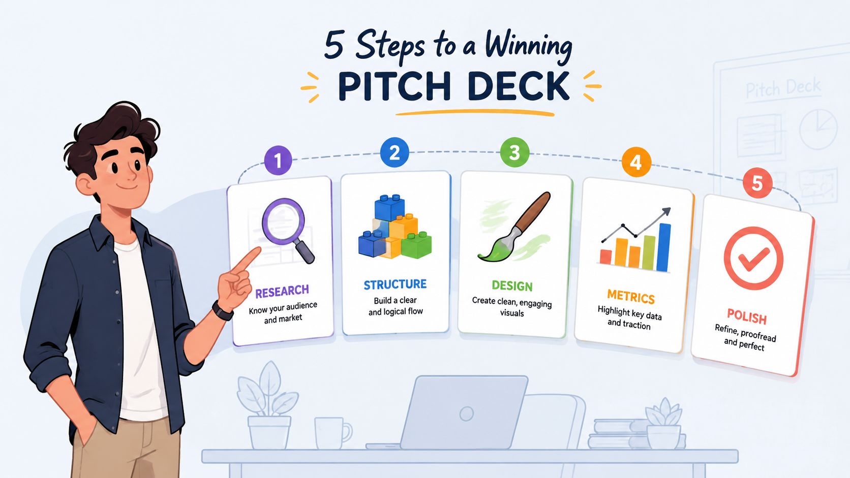
Investor review time can be as short as 2 minutes 24 seconds, down from 3 minutes 44 seconds in 2021, according to independent pitch deck analysis. That changes the job completely. Pitch deck creation isn't mainly a design exercise or a slide-filling exercise. It's the disciplined work of making an investor understand the problem, trust the evidence, and see the path to execution before attention disappears.
A strong deck therefore has to survive asynchronous reading, small screens, interruptions, and skeptical scrutiny. It needs a clear opening, a compact narrative, readable visuals, and claims that hold up when someone asks, “How do you know?” The founders who raise with decks aren't necessarily the ones with the most polished templates. They're the ones who make the right information impossible to miss.
Why Modern Pitch Decks Must Be Built for Speed
A pitch deck now competes with interruptions, small screens, and crowded investor inboxes. In one review of 3,000 decks, the average complete-review time was 3.2 minutes, with only 23 seconds spent on the first page. The same dataset recorded a 32% completion rate for 10-slide decks, compared with a 22% average across all decks, according to pitch deck statistics from Whitepage.

That behavior changes how founders should build. Clarity beats completeness when a reader is scanning between meetings or reviewing on a phone. Put the central insight where it can be found immediately. Tiny labels, dense paragraphs, and visuals that require verbal explanation create friction before credibility has formed.
A separate analysis of pitch deck behavior found that 31% of readers leave within the first 10 seconds, while 82% of investors who reach slide 4 finish the entire deck. The opening sequence carries the burden of earning that fourth slide. It should establish relevance, comprehension, and enough evidence to justify continued attention.
The Essential Slide Sequence for Investor-Ready Decks
A useful sequence is not a rigid template. Each slide should answer a specific investor question and reduce uncertainty in a deliberate order. A lean deck can follow this progression, with the exact count adjusted for the business and stage.

Start with the investment logic
1. Opening claim. State the company, customer, and meaningful outcome in one sentence. “We help independent clinics reduce appointment leakage” gives an investor something concrete to assess. “The future of healthcare operations” does not.
2. Problem. Show the operational failure through a specific customer situation. Explain what people do today, why that approach breaks, and why the cost is becoming unacceptable.
3. Solution. Show the product at the moment it resolves the problem. A workflow, screenshot, or before-and-after process usually communicates more effectively than a feature inventory.
4. Why now. Identify the change that makes the opportunity timely. It might be a regulation, distribution shift, technical change, or newly visible customer behavior. “The market is growing” is not a timing argument.
These first four slides must earn continued attention. The earlier analysis reported that 82% of investors who reach slide 4 finish the entire deck. Use the opening sequence to establish relevance, comprehension, and evidence before asking the reader to absorb detail.
Move from promise to proof
5. Market opportunity. Present a defensible model built from customers, pricing logic, and reachable segments. Separate the total category from the portion the company can realistically serve.
6. Traction. Show evidence that matches the business model. Depending on the company, that may include revenue, retention, repeat usage, signed contracts, qualified pipeline, or a clear adoption pattern. Label the period and define every metric.
7. Business model. Explain who pays, what they pay for, and how the economics work. If pricing is still evolving, show what the company has learned instead of creating false precision.
8. Go-to-market. Identify the acquisition channel, sales motion, buyer, and constraint. A list of possible channels is not a strategy. Investors need to understand how the company reaches customers repeatedly.
Close with execution and commitment
9. Competition and advantage. Include the status quo, direct alternatives, and internal workarounds. Tie the advantage to something that can strengthen over time, such as proprietary access, distribution, workflow integration, or accumulated data. A claim of having no competitors weakens credibility.
10. Team and ask. Connect each founder's experience to the specific risk the company must overcome. State the amount sought, intended use, milestones, and timing. The team slide needs evidence, not a collection of impressive titles.
A TechCrunch review of pitch deck weaknesses found that 56% lacked a clear use-of-funds story, 60% lacked a clear target customer, 38% lacked a clear go-to-market strategy, and 86% failed to include an operating plan. These omissions make it difficult to judge whether capital will translate into execution.
When cutting slides, remove repeated explanation before removing proof. A second product overview, decorative vision slide, or long feature appendix can usually go. Keep clear traction definitions, an operating plan, and a funding-use slide. Those details give investors a basis for evaluating execution after the initial promise.
Crafting a Story That Holds Investor Attention
A compelling deck makes the next slide feel necessary. It doesn't present unrelated facts in a familiar order. The problem creates the need for the solution, the solution creates a credible market opportunity, and the evidence shows why this team can capture it.

Consider a hypothetical company selling workflow software to regional logistics operators. A weak opening might say that the company is an “AI-powered platform transforming logistics.” That sentence describes ambition, not a business. It doesn't identify the buyer, the failure, or the reason to change.
A stronger narrative starts with a concrete scene: dispatch managers re-enter delivery exceptions across separate systems, supervisors discover delays late, and customers receive inconsistent updates. The solution then shows one connected workflow, while traction demonstrates that operators are willing to adopt it. The market slide becomes an extension of the observed pain, not a disconnected claim about a giant industry.
Replace adjectives with evidence
The phrase “platform” often hides an unfinished explanation. Name the workflow, user, and result instead. “A platform for better team collaboration” becomes more credible when rewritten as “software that gives field supervisors one queue for unresolved delivery exceptions.”
Market sizing needs the same discipline. An inflated TAM can signal weak judgment even when the category is large. Build from the customers you can identify, the segment you can reach, and the commercial model you can explain. If the calculation depends on assumptions, show those assumptions instead of presenting a large figure as a fact.
Traction should answer the investor's next question. If you show users, explain whether they return. If you show revenue, clarify whether it is recurring, contracted, or one-time. If you show pipeline, distinguish interest from committed demand. The metric matters less than its definition and relevance to the model.
Founders can also use a narrative framework such as this brand storytelling framework to clarify the tension between the customer's current state and the future your product enables. The deck still needs business evidence, but a coherent story helps the reader understand why each piece of evidence belongs.
Make the funding ask operational
A funding request shouldn't be a closing flourish. It should explain what capital changes. Tie the ask to specific operating priorities, such as hiring for a constrained function, completing a product milestone, expanding a proven channel, or meeting a defined implementation need.
Then show what success looks like after those investments. Investors don't need a theatrical promise. They need to see that the founders know which decisions come first, which risks remain, and how the money will be converted into measurable progress.
The following video can help founders think about narrative flow before they turn the story into slides.
A credible story doesn't eliminate uncertainty. It demonstrates that the team understands uncertainty better than anyone else in the room.
Designing for Mobile-First and Asynchronous Review

Investors often form an initial view in under three minutes, frequently from a phone or tablet rather than a conference-room screen. A deck designed for live presentation can therefore fail as a PDF attachment: small type, crowded charts, and missing context make the reader work before trust has been established. Recent 2026 pitch deck design coverage describes mobile and tablet review as common and notes a trend toward shorter decks of 12 to 15 slides.
Design for scanning, not zooming
Give each slide one dominant idea. The headline should state the conclusion, while the visual and labels supply proof. Test the file at the size an investor sees in a mobile preview, not only on a large monitor.
Practical choices include:
- Readable typography: Choose a generous font size and inspect the slide on an actual phone.
- High contrast: Use color to show meaning. Light gray text on white becomes difficult to read quickly.
- Single-column hierarchy: Put the conclusion first, followed by the evidence. Dense multi-column layouts often lose their order when reduced.
- Simple charts: Label the insight directly on the chart so the reader does not have to decode a legend.
- Lightweight files: Compress images and remove unnecessary effects so the deck opens quickly in email or a browser.
Interactive and live data visuals appear frequently in 2026 design discussions, but they should support the file rather than control access to it. A linked dashboard can help during diligence. The core deck still needs to work as a static PDF. If a chart depends on a login, animation, or live connection, place a static takeaway beside it.
Make asynchronous navigation easy
Use descriptive slide titles that let an investor skim thumbnail views and follow the argument. Keep appendix slides for likely questions, including cohort definitions, pricing detail, competitive comparisons, product architecture, security information, and financial assumptions.
An appendix works best when grouped by question, with consistent labels that let readers move from the main narrative to supporting evidence without losing context. Visual content creation support can help turn dense evidence into charts and diagrams, while the founder remains responsible for the interpretation.
Export a stable PDF, test every link, inspect the file on mobile, and send one version to everyone reviewing it. Good design removes avoidable friction. Clear judgment still determines whether the deck earns a diligence file.
Common Mistakes That Kill Fundraising Chances
Polished slides have become easier to produce, especially with AI-assisted design tools. That makes visual quality less distinctive. Investors now notice whether the founder has made sound choices about evidence, prioritization, and language.
The first problem is vanity metrics. A large registration count may sound impressive, but it doesn't necessarily show active use, willingness to pay, retention, or a repeatable acquisition path. Replace it with the metric closest to the company's economic engine, then define the measurement period and audience.
The second is inflated market sizing. Multiplying a broad industry category by a speculative share produces a large number, not a credible plan. Show the segment you can reach, the buyer you can name, and the assumptions that connect customer volume to revenue.
The third is generic product language. “All-in-one platform,” “integrated ecosystem,” and “AI-powered solution” are labels that many companies can use. They don't tell an investor what happens inside the product or why a customer chooses it over the status quo.
Audit the claims investors challenge
Open the deck and highlight every assertion that asks the reader to believe something. For each one, ask:
- What is the evidence: Is the claim supported by a customer behavior, contract, experiment, product record, or documented assumption?
- What does it mean: Have you defined terms such as active user, qualified pipeline, conversion, or retention?
- What would disprove it: Can the team explain the limitation, exception, or sample boundary?
- Why does it matter: Does the fact change the investment decision, or is it included because it looks flattering?
Founders should also examine product risk. A broader review of common MVP pitfalls for Web3 offers a useful reminder that ambitious product claims can obscure basic questions about user need, scope, and execution. The same principle applies beyond Web3. A smaller product with clear adoption is often easier to trust than a sweeping roadmap with no proof.
Design earns a second look. Judgment earns diligence.
Don't hide weak fundamentals behind gradients, mockups, or elaborate animations. Use visual polish to improve comprehension, then let authentic founder reasoning carry the argument.
Final Polish and Pre-Send Checklist
Treat the final review as an adversarial test. A polished deck still fails if a skeptical investor cannot understand the company without a live explanation. The opening must survive a brief mobile glance: the customer, problem, product, and proof should be identifiable from the first slides. If any answer is unclear, rewrite the headlines before changing the layout.
Verify the evidence
Run a claim audit before exporting:
- Define every metric: State what it measures, who it covers, and the relevant period.
- Recheck the math: Recalculate market sizing, pricing logic, growth claims, and financial assumptions against the underlying model.
- Connect the ask: Tie each use of funds to a milestone, operating priority, or known constraint.
- Expose the risks: Identify assumptions that could alter the plan and explain how you will test them.
- Prepare the backup: Organize methodology, customer evidence, product architecture, and financial schedules in an appendix or data room.
Review the deck with people who are not emotionally attached to the company. A fellow founder can test clarity, a domain specialist can challenge assumptions, and a finance-minded reviewer can find inconsistencies. Practice presenting it live, then send it without explanation. The first test exposes delivery problems. The second shows whether the document can stand on its own during asynchronous review.
Keep the supporting material disciplined. The same clarity required to how to write a book proposal applies here: establish a clear premise, define the audience, show evidence of execution, and explain why the opportunity deserves attention now. A pitch deck must compress those points into a commercially specific case.
Before sending, inspect the PDF on both a phone and tablet. Confirm that charts remain legible, test every hyperlink, and remove comments or draft pages. Use a filename containing the company name, deck purpose, and version date. Maintain a simple version log so the deck, financial model, and data room stay consistent.
The investor package should make the next action obvious. Put contact details and the ask where they are easy to find, and make sure the appendix can answer predictable questions. For guidance on the conversation that follows the deck, see how to pitch to investors.
ReachLabs.ai supports founders with investor pitch deck strategy, writing, and design. Its team helps turn complex business information into a clear, investor-ready narrative. Review the ReachLabs.ai team and services for practical support building a mobile-readable deck that can withstand diligence.