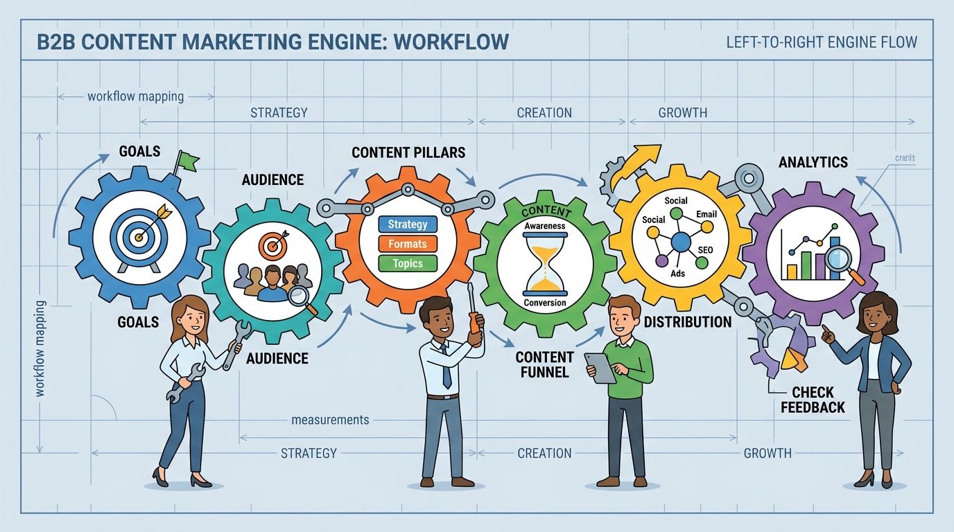
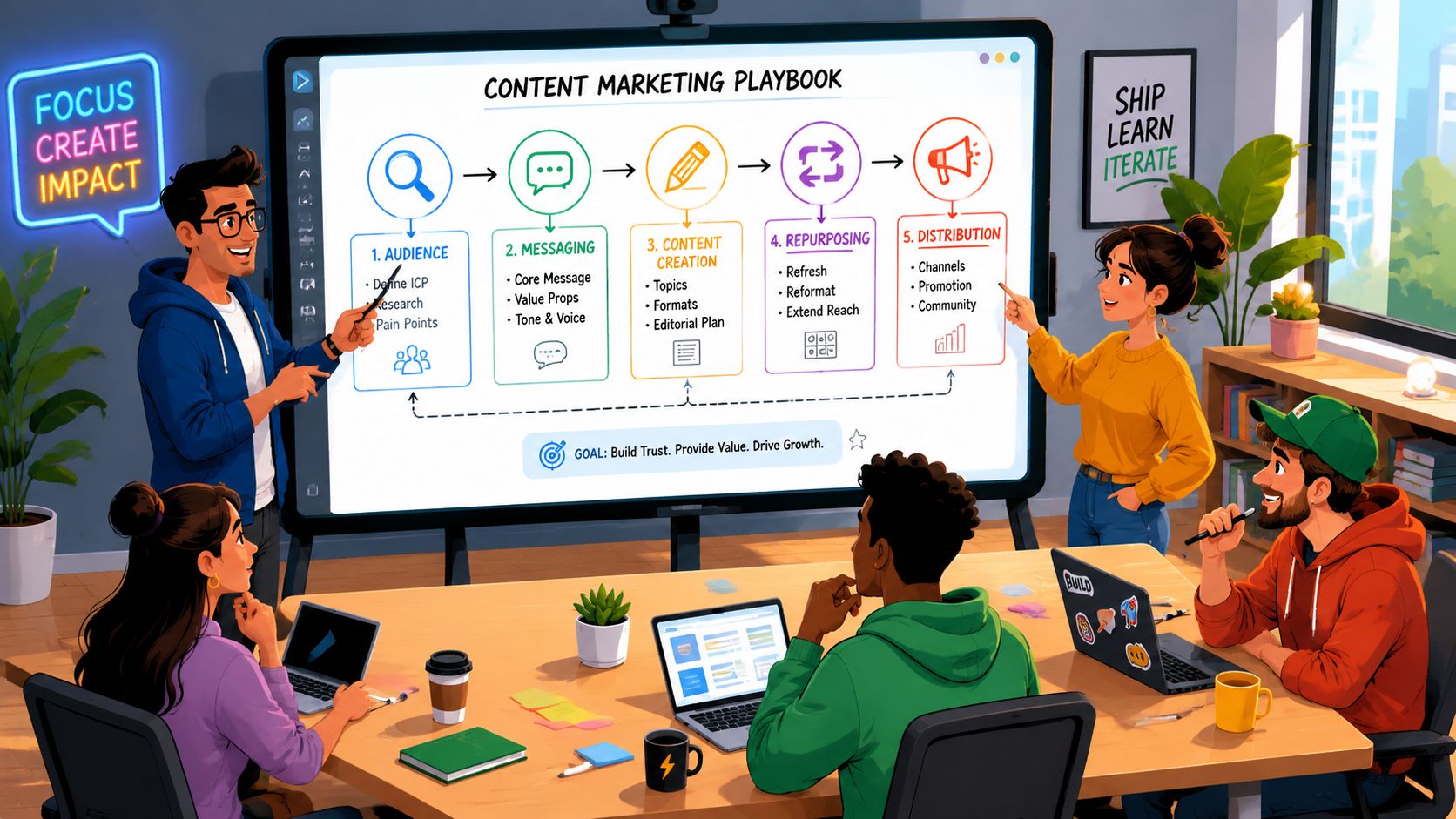
Visual content creation has shifted from a creative request into an operating model for growth.
For a marketing manager, that changes the job. The goal is no longer to commission a video, approve a few social graphics, and move on. The goal is to build a visual content engine that turns one strong idea into many assets, adapts those assets to each channel, and connects performance back to pipeline and revenue.
A lot of teams still work asset by asset. The process usually looks familiar. A campaign idea gets approved, design is pulled in late, production starts without a clear plan for reuse, and the team spends launch week resizing files and rewriting the same message for every platform. The result is busy work, inconsistent output, and weak insight into what drove results.
High-performing teams run a different system. They start with the audience angle, not the format. They plan a shoot or design project like a retailer plans inventory, with every core asset feeding a set of derivatives across paid, organic, sales, and lifecycle channels. They build templates, workflows, and review steps that reduce rework. Then they measure which messages, formats, and placements create business impact so the next round starts smarter.
That is the primary subject of this guide.
It goes beyond how to make a single video or graphic. It explains how to create a visual production system that is efficient, scalable, and tied to revenue, so your team can produce more useful content with less waste.
Why Visual Content Dominates Digital Marketing
Visual content earns its place because it helps people grasp value faster.
A marketing manager feels this in every channel. Prospects scroll past ads in seconds, skim landing pages, and decide whether an email or post deserves attention before they read the full message. In that environment, visuals do an early job that copy alone often cannot do. They set context, signal relevance, and reduce the effort required to understand what you are offering.
A strong visual works like storefront packaging. The product can be excellent, but buyers still need quick answers. What is this? Is it for me? Can I trust it? How would it fit into my day or my team? Good visuals answer those questions early enough to keep the evaluation alive.
What visuals do that text alone often cannot
Visuals compress meaning.
A product screenshot can show usability faster than a paragraph of explanation. A short demo can remove uncertainty before a sales call. A chart can make a pattern visible at a glance. For busy audiences, that speed matters because digital attention is not just scarce. It is constantly interrupted.
This matters across the full funnel, not just at the awareness stage. Visuals help ads win the first click, landing pages clarify the offer, case study graphics make proof easier to absorb, and sales enablement assets help stakeholders retell your story internally. If your team is deciding between formats, this breakdown of social media content types and where they fit is a useful reference point.
The business effect is straightforward. Better clarity usually means more qualified attention, fewer drop-offs caused by confusion, and stronger performance from the same message.
Practical rule: If a message needs to be understood in under five seconds, design the visual explanation first, then write the supporting copy.
Why this matters for scale
The primary advantage is not that visuals look polished. The advantage is that they make one idea travel well across many surfaces.
A campaign theme can become a hero graphic, paid ad variations, a product explainer, email banners, sales slides, and short social edits. That cross-format reuse is where teams gain efficiency. Instead of rebuilding the message from scratch for every channel, they adapt a clear visual core. Production gets faster, brand consistency improves, and performance data becomes easier to compare because the underlying message stays stable.
This is also why template systems matter. Resources like EvergreenFeed's template sources can speed up repeatable execution, especially for social and campaign variations, without forcing the team to start from a blank canvas each time.
Strong visual marketing does more than make content look better. It makes the message easier to notice, easier to understand, and easier to distribute at scale in a way that supports revenue.
Understanding the Spectrum of Visuals
A new marketing manager usually asks one of two questions. "What should we make?" or "What format works best?" The answer depends on what job the visual needs to do.
Think of visual content creation as a toolkit. You wouldn't use a screwdriver for every repair. In the same way, you shouldn't use the same visual format for every message.

Static images
Static imagery includes photography, illustrations, branded graphics, social tiles, product shots, and quote cards. These are often the fastest assets to produce and the easiest to scale across channels.
They work best when the goal is immediate recognition or a clean single-message delivery. A product photo can anchor an ecommerce page. A campaign graphic can carry a promotion. A branded illustration can make a technical blog post feel easier to enter.
If your team needs fast-turn social posts, campaign headers, or ad variants, static images are often the workhorse. If you need ready-made building blocks for that process, EvergreenFeed's template sources are a practical example of how teams can speed up layout decisions without starting from a blank artboard every time.
Video content
Video handles complexity, demonstration, and emotion better than almost any other format. It can show how a product works, capture a founder's voice, or compress a before-and-after transformation into a few seconds.
Short-form video is usually better for grabbing attention. Longer video is better when the audience already has intent and needs depth. A social reel and a product explainer can both be "video," but they solve very different problems.
For a broader view of how formats map to channels, this guide to social media types of content is useful because it shows how the same brand message can take different shapes depending on platform behavior.
Data visualizations
Data visualizations include charts, infographics, scorecards, dashboards, and comparison graphics. They shine when the message is dense or when you need credibility.
A good data visual doesn't decorate information. It reduces cognitive load. Instead of asking a reader to interpret a spreadsheet or a long paragraph, you present the pattern directly. That makes data easier to trust and easier to share inside an organization.
Motion graphics and interactive visuals
Motion graphics sit between static design and full video. Think animated text, logo stings, explainer sequences, moving charts, and GIF-style assets. They're useful when static feels too flat but live-action production would be too heavy.
Interactive visuals are different again. Quizzes, calculators, maps, sliders, and virtual experiences ask the user to participate. They work well when the audience needs personalization or discovery.
Static images capture attention. Video builds understanding. Data visuals earn trust. Motion and interactivity create momentum.
The strongest teams don't pick one category and stay there. They combine formats so each one does the job it's built for.
Developing Your Visual Content Strategy
"Just be authentic" is common advice. It sounds good, but it doesn't help a team decide what to produce on Monday morning.
The harder truth is that most brands don't struggle because they lack sincerity. They struggle because they don't have a repeatable way to find an angle that feels distinct and useful. A 2025 study found that 90% of creators struggle with differentiation, only 15% use a structured roadmap review to identify distinctive angles, and that gap contributes to a 50% failure rate in content that misses high-value audiences, according to Valchanova's guide on standing out with unique content.
Start with angle discovery, not format
Angle discovery means deciding what perspective you own before choosing whether the output becomes a carousel, video, infographic, or landing page visual.
A weak angle sounds like this: "We help companies grow."
A stronger angle sounds like this: "We help lean teams build campaign systems that remove manual content bottlenecks."
The second one gives your creative team something to work with. It suggests visuals, use cases, audience pain, and proof points.
A simple framework for finding your angle
Use a structured review instead of a brainstorm free-for-all.
Review your history
Look at what your brand already knows from customer calls, proposals, support tickets, demos, and campaign retrospectives. The strongest angle is often hiding in familiar language your team already uses.Study competitors for sameness
Don't just collect inspiration. Look for repetition. If every competitor says "pioneering," "results-driven," and "customer-centric," you've found the empty phrases to avoid.Map audience tension
Ask what your audience wants, what frustrates them, and what they fear wasting. Good angles live at the intersection of aspiration and friction.Turn one point into multiple narratives
A product feature can become several different stories. It can be personal, situational, demonstrative, contrarian, or educational.
Here's what that looks like in practice:
| Standard message | Better angle options |
|---|---|
| Fast reporting | "What your team can stop doing once reporting is automated" |
| Better design | "How clearer design reduces decision friction in a sales funnel" |
| Flexible service | "How to launch without hiring a full in-house creative bench" |
Score ideas before you produce them
Teams waste time when every idea sounds equally promising. Give each angle a simple internal score using qualitative criteria:
- Audience relevance means the idea speaks to a real pain your buyers already feel.
- Distinctiveness means a competitor couldn't publish the same post with their logo swapped in.
- Visual potential means the concept can be shown, not just described.
- Commercial fit means the topic can naturally connect to your offer.
If an angle isn't clear enough to sketch on a whiteboard, it probably isn't clear enough to produce.
A strong strategy results in cost savings. Once your team knows the angle, visual content creation becomes sharper. The script gets tighter. The design choices make sense. The audience sees something that feels made for them, not just posted at them.
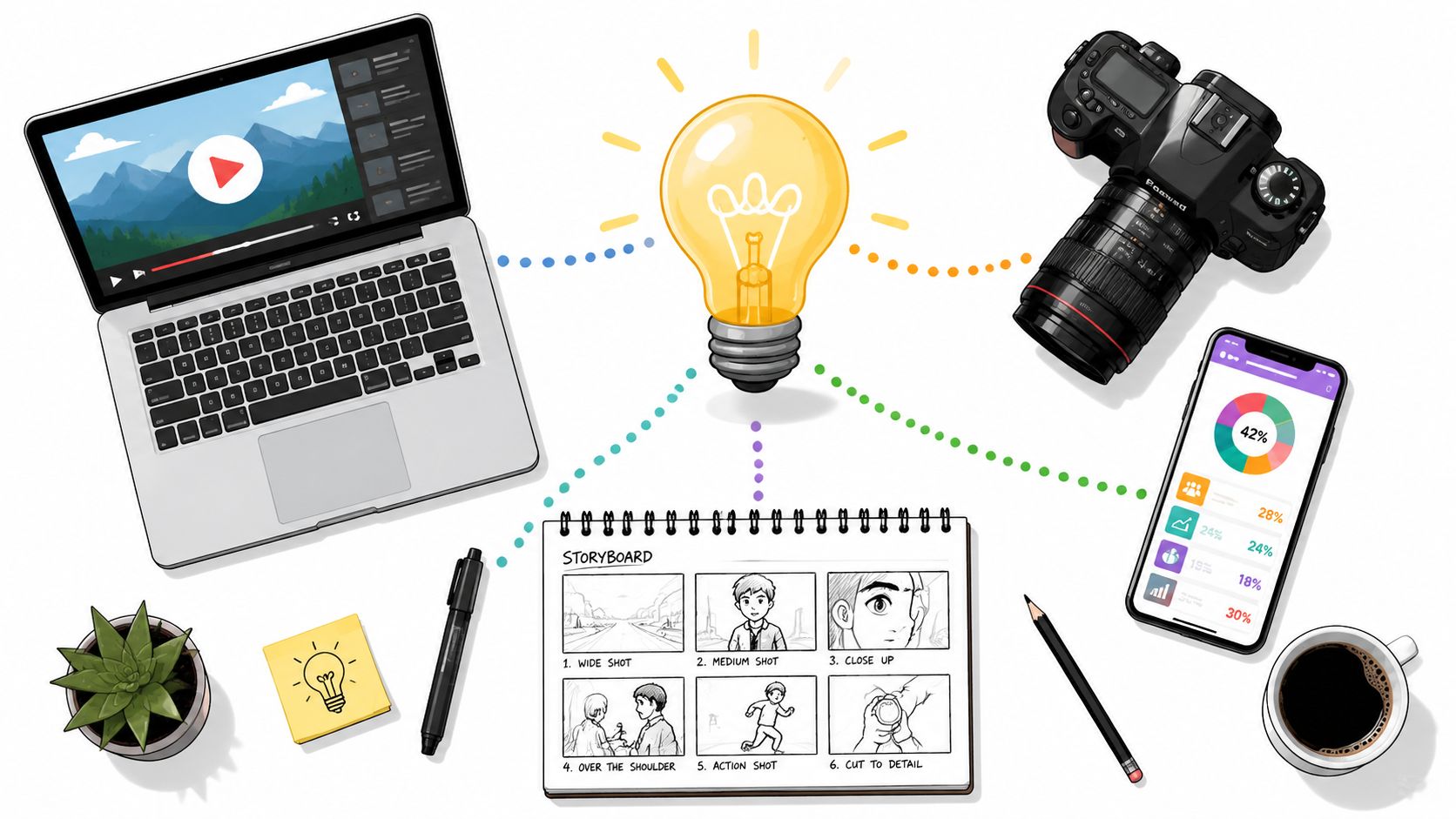
The Visual Content Production Workflow
Most content problems don't begin in editing. They begin before the shoot. A weak production workflow forces the team to improvise under pressure, and improvisation is expensive.
A clean workflow has three parts. Pre-production, production, and post-production. If one is rushed, the others become slower and messier.

Pre-production
At this stage, strategy turns into a plan. You define the goal, angle, audience, platform mix, message hierarchy, and deliverables. Then you write scripts, draft shot lists, build storyboards, and lock practical details such as location, wardrobe, props, and approvals.
A lot of teams want to rush past this because it doesn't feel creative. That's a mistake. Pre-production is where you prevent wasted footage and contradictory feedback.
One operational issue matters more now than it did a few years ago. Cross-format efficiency. Recent data shows that 78% of marketers demand cross-format efficiency, but small businesses that fail to implement it face a 40% increase in production costs per asset, according to the Content Marketing Institute's visual content budget guidance.
That means you should plan the shoot for multiple outputs before anyone starts recording.
Production
Production is the capture phase. Cameras roll, microphones record, designers build layout systems, and the team gathers every asset needed for downstream editing.
The most useful production habit for modern teams is dual-framing. Instead of treating horizontal and vertical content as separate projects, frame the set and subject so both can work from a single session. Leave enough headroom and side space. Avoid placing key text or products too close to edges. Keep backgrounds clean enough to crop without breaking composition.
A simple setup often works well:
- Camera placement should prioritize the master shot first, then preserve safe crop space.
- Lighting should flatter the subject evenly so reframing doesn't create awkward shadows.
- Lens choice should avoid distortion that gets worse when assets are cropped into vertical formats.
- Performance direction should capture concise lines for short-form edits and fuller explanations for long-form versions.
For teams exploring automation inside that workflow, this piece on generative AI for content creation is useful background on where AI can assist with versioning, ideation, and asset adaptation without replacing human direction.
A short walkthrough helps clarify how teams manage the handoff between planning and capture.
Post-production
Post-production is where the raw material becomes usable marketing. Editors cut footage, designers build motion layers, sound gets cleaned, captions are added, graphics are inserted, and exports are prepared for each destination.
This stage breaks down when the upstream process was fuzzy. If there wasn't a clear naming system, assets get lost. If there wasn't a defined approval flow, feedback conflicts multiply. If the team didn't pre-plan formats, editors spend time rescuing bad crops and rebuilding scenes.
A strong operating model usually includes:
- Version control so everyone knows which edit is current.
- Approval gates that separate strategic feedback from taste-based preferences.
- Channel exports with naming tied to platform and objective.
- Operations ownership so someone manages deadlines, dependencies, and asset flow.
If you're building a more disciplined internal system, creative operations management is the part of the process that keeps visual content creation from collapsing under its own volume.
Structuring Your Visual Creation Team
A content engine needs people who know their role. Not necessarily a large team, but a clear one.
At minimum, visual content creation usually involves strategy, messaging, design, production, editing, and distribution. In a small company, one person may wear three hats. In a larger organization, each hat belongs to a specialist. The problem isn't overlap. The problem is ambiguity.
Core roles that keep work moving
Some roles shape thinking. Others shape execution.
- Strategist decides the objective, audience, angle, and campaign fit.
- Copywriter or scriptwriter turns positioning into language people can understand and repeat.
- Designer builds the visual system, layouts, and branded consistency.
- Videographer or producer handles capture, set logic, and production quality.
- Editor or motion designer turns raw material into finished assets that fit each platform.
- Channel manager publishes, adapts captions, and watches performance.
When these responsibilities are blurry, the team starts making avoidable mistakes. Designers end up guessing the message. Editors try to solve strategic problems late. Channel managers receive assets that don't fit the platform.
Three common team models
The right structure depends on how often you produce, how complex your campaigns are, and how much management capacity you have.
| Model | Strengths | Tradeoffs |
|---|---|---|
| In-house team | Deep brand familiarity, fast feedback loops, easier collaboration | Higher fixed overhead, harder to scale niche skills quickly |
| Freelance network | Flexible, specialized talent, useful for project spikes | More coordination work, inconsistent availability, varied processes |
| Agency partner | Integrated capabilities, broader skill coverage, easier scale across formats | Requires strong briefing and alignment to protect brand nuance |
How to choose without overcomplicating it
If you publish frequently and need close collaboration with sales, product, and leadership, in-house often makes sense. If your needs swing up and down, a freelance bench can be efficient. If you need strategy plus execution across multiple disciplines, an agency model may reduce operational drag.
The deciding factor usually isn't talent quality. It's management load. Ask yourself who will brief, review, schedule, organize files, protect deadlines, and keep the brand coherent over time. That's where many visual programs succeed or fail.
The cheapest production model on paper often becomes the most expensive one to manage.
Distribution and Platform Optimization
A finished asset isn't the end of visual content creation. It's raw material for distribution. Frequently, much good work underperforms at this stage. Teams publish the same creative everywhere, then blame the platform when results flatten.
Platforms don't just prefer different sizes. They reward different behaviors. The same audience may want a polished explainer on LinkedIn, a fast hook on TikTok, and a cleaner decision aid on a website landing page.
Format should follow platform behavior
A thumbnail designed for YouTube has one job. It must earn the click before the video starts. An Instagram post has a different job. It needs to stop the scroll while still looking native to the feed. A LinkedIn visual often needs more clarity and less visual noise because the viewer is in a professional browsing mode.
That means adaptation isn't optional. Cropping alone won't solve it. The opening frame, text density, pacing, caption style, and call to action often need to change too.
Here is a practical guide your team can use when adapting assets:
| Platform | Primary Visual Format | Key Optimization Tip |
|---|---|---|
| Vertical short-form video, carousels, static posts | Make the first frame legible without audio | |
| TikTok | Vertical short-form video | Lead with movement or tension immediately |
| YouTube | Horizontal video and strong thumbnails | Treat packaging as part of the content |
| Clean graphics, short video, document-style visuals | Prioritize clarity and business relevance | |
| Website | Product visuals, explainer video, diagrams, screenshots | Match the visual to the conversion step |
| Compact graphics, GIF-style motion, product shots | Keep visuals supportive, not bloated |
Real-time content changes the production requirement
Some campaigns now depend on live information, not static reporting. Benchmark data from 2025 to 2026 shows that integrating real-time data pipelines with visualization tools reduces latency in KPI tracking by 58% and can lead to up to 27% higher conversion rates in live retail and event marketing. That matters when your team is adjusting creative during launches, activations, or fast-moving paid campaigns.
In plain language, if the campaign changes quickly, your visuals must be built to change quickly too.
A static weekly report won't help much during a live product drop or an event campaign. Teams in those environments increasingly use real-time ingestion systems such as Apache Kafka or AWS Kinesis, process streams with Spark, and feed dashboards into tools like Looker Studio, Flourish, or Infogram. The point isn't technical theater. The point is immediate visibility. When the dashboard updates fast, teams can swap creatives, shift spend, or emphasize a different message while the campaign is still active.
Distribution is part content strategy, part operations strategy
This is why distribution can't be delegated at the very end. The visual asset has to be designed with destination in mind. If a campaign needs rapid iteration, the production file should support fast text swaps and modular edits. If a platform favors timeliness, the review process has to move accordingly.
For teams trying to sharpen this side of execution, optimizing content performance is a useful companion read because it focuses on refining the distribution layer rather than just improving the creative itself.
Measuring Performance and Proving ROI
Marketing leaders don't fund visuals because they look impressive in a deck. They fund visuals because they expect business impact. If your reporting stops at likes, views, and shares, you're only proving that something was noticed.
That isn't enough.

Vanity metrics and business metrics are not the same
Engagement metrics still matter. They tell you whether the creative earned attention. But attention is an intermediate outcome, not the final one.
A stronger reporting structure ties each visual asset to a business purpose:
- Awareness assets should be judged by qualified reach, click behavior, and downstream audience growth.
- Consideration assets should connect to time on page, return visits, demo interest, or lead quality.
- Conversion assets should connect to form fills, purchases, pipeline influence, or sales movement.
A product video on a landing page, for example, shouldn't only be judged by play count. It should be evaluated against what happened next. Did visitors stay longer? Did they move deeper into the funnel? Did the sales team report fewer repetitive questions after the video launched?
Make attribution readable for non-specialists
Many teams lose leadership confidence at this point. The analysis may be valid, but the reporting feels opaque. Executives don't want a black box. They want a clear explanation of what changed and why.
One promising approach is SHAP-based visualization. The integration of SHAP values into machine learning visualizations improves audience trust and decision-making speed by 34% by explaining why a specific audience segment was targeted or why a KPI shifted. In practice, that means a dashboard can show not just that conversions changed, but which factors most likely contributed to the shift.
For a marketing manager, this matters because it turns analytics from mystery into narrative. Instead of saying, "Performance improved after optimization," you can show a visual explanation of which variables moved and how they influenced the outcome.
Clear reporting earns budget. Murky reporting invites budget cuts.
Build a measurement stack your team can actually maintain
You don't need a giant analytics department to measure visual content creation well. You do need consistency.
A practical measurement habit looks like this:
Assign a purpose before launch
Every asset should have one primary job.Define the business signal
Decide what success will look like in behavior, not just reaction.Tag and organize assets clearly
If naming is messy, analysis will be messy.Review at the campaign level and the asset level
A weak visual can drag down a strong campaign, and a strong visual can save one.Translate findings into the next brief
Measurement should improve creation, not just justify it after the fact.
If your team wants a stronger framework for that reporting discipline, this overview of content performance metrics is relevant because it focuses on connecting outputs to outcomes rather than stopping at surface-level engagement.
Examples and Actionable Checklists
Theory matters, but operations become real when you can picture how the work looks in practice. Here are three common examples of visual content creation done well, followed by a checklist you can use with your team.

Example one, the B2B explainer system
A software company has a complex offer. The homepage copy is solid, but prospects still arrive at sales calls with the same basic questions. The team responds by creating a visual system, not just a single asset.
They produce a short homepage explainer, a clean feature comparison graphic, and a simple workflow diagram for the sales team to reuse in outbound messages. The key move isn't the polish. It's alignment. Each visual answers a different stage of buyer confusion.
Example two, the local brand with one efficient shoot
A small business doesn't have budget for separate shoots for YouTube, Instagram, and paid ads. Instead, the team plans one session with cross-format efficiency in mind. They capture a stable hero shot, several vertical-first takes, product closeups, and still frames for static use.
From one shoot, they leave with social clips, website banners, testimonial snippets, and ad creative options. That's what an engine looks like. One production day, multiple business uses.
Example three, the analytics-first campaign
A performance team launches a live promotion that requires fast decisions. They pair campaign assets with a dashboard that shows movement clearly enough for both marketers and leadership to interpret. The visual reporting layer becomes part of the campaign itself.
That changes team behavior. Instead of waiting for a recap days later, they adjust creative and messaging while the campaign is active.
Strong visual content doesn't just communicate the offer. It improves how the organization makes decisions around the offer.
A practical checklist for your next visual content cycle
Use this before your next campaign goes into production.
- Define the objective: Know whether the asset is meant to attract attention, explain, convert, or support sales.
- Choose the angle: Don't settle for generic positioning. Write the perspective in one sentence.
- Match the format to the job: Use static, video, data visualization, motion, or interactive elements based on audience need.
- Plan for multiple outputs: Design the shoot and files so one project can support several channels.
- Write before you shoot: Scripts, hooks, captions, overlays, and CTAs should not be afterthoughts.
- Protect production basics: Audio, framing, lighting, and brand consistency matter more than fancy gear.
- Edit for platform context: Adapt pacing, layout, and opening frames for each destination.
- Set measurement before launch: Decide what business signal will prove success.
- Review learnings quickly: Feed performance insights into the next brief while the campaign is still fresh.
- Organize your assets: File naming, version control, and approval flow save more time than people expect.
Visual content creation works best when it stops being treated as occasional creative output and starts being managed like an operating system. That's when teams produce faster, learn faster, and improve results with less waste.
ReachLabs.ai can support that kind of system if you need outside execution or strategic help. As a full-service marketing agency, ReachLabs.ai provides creative services such as design, video production, and broader campaign support, which can fit teams that want a partner for visual content creation alongside their internal marketing function.
