
Before you can start boosting your website's conversion rates, you need to know exactly where you stand right now. This means digging into your current performance metrics to establish a clear baseline. Without this starting point, you’re just guessing. A solid baseline is what turns random tweaks into a strategic, data-driven optimization plan.
Setting Your Conversion Rate Baseline
It's easy to get hung up on what a "good" conversion rate is, but honestly, there's no magic number that fits every business. The first step is having a deep understanding conversion rates in the context of your specific situation.
What's considered stellar for a high-volume e-commerce store is completely different from a B2B SaaS company trying to generate qualified leads. So, before you start comparing your site to others, the real work begins with your own data. This process gives you a meaningful benchmark that's actually relevant to your audience, your industry, and your goals.
Why Industry Averages Are Just a Guide
Looking at industry benchmarks can be helpful for a bit of perspective, but think of them as a compass, not a detailed map. For example, in 2025, the average global e-commerce conversion rate might float somewhere between 2% and 4%. That's a pretty wide range.
Dive deeper, and you'll see massive variations. Personal care brands can hit conversion rates as high as 6.8%, while home decor sites often see closer to 1.4%. Even the device someone uses makes a huge difference—desktop users tend to convert around 4.8%, which is way higher than mobile's 2.9%, even though most of your traffic probably comes from phones. These numbers show why your own context is what truly matters.
Below is a table that highlights how much e-commerce conversion rates can vary. Use it to get a general idea of where you stand, but remember your own baseline is the number to beat.
E-commerce Conversion Rate Benchmarks By Industry
| Industry | Average Conversion Rate |
|---|---|
| Arts & Crafts | 4.2% |
| Food & Beverage | 4.1% |
| Health & Beauty | 3.8% |
| Fashion & Apparel | 2.7% |
| Home & Garden | 1.9% |
| Electronics | 1.7% |
These benchmarks are a useful starting point, but they don’t tell the whole story. Your brand, price point, and traffic sources all play a massive role.
Defining Your Key Conversion Goals
Your "conversion rate" is rarely a single number. Most websites have several important actions they want users to take, and each one needs to be tracked.
It helps to break them down into two main types:
- Macro-Conversions: These are your main business objectives—the finish line. Think of a completed purchase, a signed contract, or a new paid subscription.
- Micro-Conversions: These are the smaller, valuable steps a user takes along the way. Things like signing up for your newsletter, adding an item to their cart, or watching a demo video all count.
Tracking both gives you a much richer understanding of user behavior. For instance, if you have a ton of "add to carts" (micro-conversions) but very few completed sales (macro-conversions), you know the problem isn't with your product pages. It’s likely a friction point in your checkout process. You can learn more about how to set this up by learning how to monitor conversion metrics.
The goal isn't just to measure a single number; it's to understand the entire user journey. By identifying where users drop off, you can pinpoint the exact friction points that need optimization.
Taking the time to establish this detailed baseline is the most important thing you can do for a successful CRO strategy. It moves your efforts from guesswork to a calculated process designed for real, measurable growth.
Mastering a High-Converting User Experience
Alright, you've got your analytics set up. Now for the real work: turning your website into a place people actually want to use. A clunky, confusing, or slow website is the fastest way to send potential customers straight to your competition.
Mastering user experience (UX) isn't just about making things look pretty. It's about paving a smooth, frictionless path from the moment someone lands on your site to the second they click "buy now." Every single element on your page either helps or hurts that journey.
The Non-Negotiable Need for Speed
Let's be blunt: nothing kills conversions faster than a slow website. We live in an "I want it now" world, and even a two-second delay can feel like an eternity to a visitor. A slow site isn't just an annoyance; it actively costs you money.
The data on this is staggering. An analysis from BloggingWizard.com shows that a site loading in just one second can have conversion rates up to five times higher than a site that takes ten seconds. Think about that. Just by speeding things up, you could be leaving a massive amount of revenue on the table.
Here's a powerful stat to remember: A one-second improvement in mobile load times can boost mobile conversions by up to 27%. Speed isn't just a "nice-to-have"—it's one of the highest-impact changes you can possibly make.
Fixing your site's performance isn't just a developer's chore; it's a core business strategy. Simple things like compressing images, using browser caching, and trimming down unnecessary code are essential if you're serious about your bottom line.
Crafting an Intuitive Navigation Flow
If I can't find what I'm looking for on your site in a few seconds, I'm gone. And so are your customers. Your navigation is the roadmap for your website, and if it's confusing, you're leading people to a dead end.
Put yourself in a first-time visitor's shoes. Is it immediately obvious where to find your products? Your pricing? A way to get in touch? Your main menu should be dead simple and use language anyone can understand.
A few battle-tested tips for better navigation:
- Keep It Simple: Stick to five to seven main menu items, max. Anything more creates "decision paralysis," and a confused user is a user who leaves.
- Use Obvious Labels: This isn't the place for clever branding. "Products" will always outperform "Our Creations." Clarity is king.
- Add a Search Bar: If you have a lot of content or products, a prominent search bar is a lifesaver. Make it easy to find and make sure it actually works well.
A well-designed navigation system builds trust and makes it easy for visitors to take the next step.
Adopting a True Mobile-First Design
More than half of all web traffic now comes from mobile devices. This isn't a trend; it's the standard. That's why "mobile-first" design isn't just a buzzword—it's a necessity. This means you design for the smallest screen first and then adapt the experience for larger screens, not the other way around.
A true mobile-first approach is all about understanding the user's context. They're likely on the go, using their thumbs to navigate, and have zero patience for tiny text or complicated forms.
Focus on these mobile essentials:
- Make It Thumb-Friendly: Place your most important buttons and links where a thumb can easily reach them. This small detail makes a huge difference in how the site feels to use.
- Simplify Your Forms: Nobody wants to fill out a 10-field form on a smartphone. Cut it down to the absolute essentials.
- Ensure Text is Readable: Your fonts have to be large enough to read comfortably without pinching and zooming. If users have to work to read your content, you've already lost them.
When you nail the mobile experience, you're not just catering to the majority of your audience—you're building a solid foundation that works beautifully on every device.
Leveraging Visual Hierarchy and Clear Cues
Visual hierarchy is a fancy term for a simple concept: guiding your user's eye. By strategically using size, color, and placement, you can create a visual path that leads people straight to your most important call-to-action (CTA).
Your "Add to Cart" or "Request a Demo" button should be the most obvious thing on the page. Use a bold, contrasting color that pops. Make it big enough to be easily tapped. And give it some breathing room—surrounding your CTA with whitespace makes it stand out even more.
You also need to give people clear signals. An underlined blue text still screams "click me!" to most users. A shopping cart icon is universally understood. Don't try to reinvent the wheel. These familiar patterns reduce the mental effort required from your users, making the entire experience feel effortless. Get these UX fundamentals right, and you'll have a site that doesn't just look good, but actually does its job: turning visitors into customers.
Writing Copy and Offers That Actually Persuade
Once your site’s user experience is buttoned up, it’s time to zero in on your message. Your words and the offers you present are what truly drive persuasion. Think of it as turning a well-built website into a powerful sales tool by starting a conversation that clicks with your visitors' real needs.
Great copy does more than just describe what you sell; it convinces. It’s the magic that turns a visitor’s casual thought of "that's interesting" into an urgent feeling of "I need this right now." This is where you swap out feature lists for tangible benefits and turn passive browsers into paying customers.
Hook Them with an Unforgettable Headline
Let's be blunt: your headline is the most important piece of copy on the entire page. You get one shot—a few seconds at best—to grab someone's attention in an ocean of digital noise. If your headline falls flat, all the brilliant copy that follows might as well be invisible.
Your headline needs to make a clear promise. It tells the reader exactly what problem you're about to solve for them. The best ones are specific, crystal clear, and all about the user's desired outcome.
Here’s a simple comparison to illustrate the point:
- Weak Headline: "Our Newest Accounting Software"
- Strong Headline: "Stop Wasting Hours on Invoices. Get Paid 2x Faster."
See the difference? The first one is all about you. The second one makes a powerful promise to the customer, hitting on a specific pain point (wasted time) and offering a benefit that’s impossible to ignore (getting paid faster).
Sell the Outcome, Not Just the Features
One of the biggest copywriting traps I see people fall into is getting lost in the weeds of their product's features. Here's a secret: your customers don't actually care about the drill bit; they care about the perfectly hung picture frame. They aren’t buying "AI-powered algorithms"; they’re buying the ability to "effortlessly find more qualified leads in less time."
To really boost your website conversions, you have to translate every single feature into a tangible, real-world benefit.
People don’t buy products; they buy better versions of themselves. Your copy should paint a vivid picture of that transformation. It’s about showing them how their life or business improves after they click "buy."
For every feature you list, get in the habit of asking, "So what?"
| Feature | The "So What?" (The Real Benefit) |
|---|---|
| 24/7 Customer Support | Get expert help the moment you need it, day or night, so you never feel stuck. |
| Lightweight Carbon Fiber Frame | Easily carry your bike up a flight of stairs after a long ride, no sweat. |
| Automated Weekly Reports | Save hours of tedious data entry and walk into your next meeting with clear, impressive insights. |
This simple shift connects what your product does with what your customer wants. That’s where the magic happens.
Master the Art of the Irresistible Call to Action
Your Call to Action (CTA) is the moment of truth. It's the point where you ask the user to do something. A vague, uninspired CTA can bring a perfectly good user journey to a dead stop.
Let's get rid of the conversion killers: "Submit," "Click Here," and "Learn More." They’re boring, unhelpful, and create a sense of uncertainty. Instead, your CTA should be a clear, action-oriented command that reminds the user of the value they're about to get.
Here are a few quick upgrades:
- Instead of "Subscribe," try "Get My Weekly Growth Tips."
- Instead of "Download," use "Grab Your Free Ebook Now."
- Instead of "Buy," how about "Start My 30-Day Free Trial."
A neat little trick is to have the button copy complete the sentence "I want to…" This aligns the action directly with the user's own motivation. The world of persuasive writing is deep, and exploring copywriting for business is a proven way to level up these crucial skills.
Build Trust with Powerful Social Proof
It’s human nature: we trust what other people say about you far more than what you say about yourself. That’s the core principle of social proof. Weaving authentic testimonials, case studies, and reviews into your site is one of the fastest ways to melt away skepticism and build rock-solid credibility.
But effective social proof is more than just slapping a few five-star ratings on a page. It's about showcasing specific, relatable stories that tackle potential customer objections before they even have them. A testimonial that says, "I was worried the setup would be complicated, but I was up and running in less than 10 minutes," is infinitely more powerful than a generic "Great product!"
Here are a few ways to put social proof to work:
- Quote Testimonials: Place short, punchy quotes from happy customers right next to your CTAs.
- Case Studies: Tell detailed before-and-after stories that prove you get real-world results.
- Trust Badges: Display logos of well-known clients, industry awards, or security seals to build instant confidence.
By blending compelling copy with undeniable proof, you create a persuasive story that smoothly guides visitors from their first curious glance all the way to conversion.
Crafting Landing Pages That Actually Convert
Think of your website's homepage as a department store—lots of options, different aisles, something for everyone. A landing page, on the other hand, is a specialty boutique. It has one specific purpose, and it does it exceptionally well. It’s a laser-focused environment, stripped of the usual distractions like a main navigation menu, all designed to guide a visitor toward one single action.
If you’re serious about increasing website conversions, you have to get your landing pages right. They’re the real workhorses of your marketing campaigns, directly tied to every ad, email, or social media post you run. Someone who clicks an ad for "ergonomic office chairs" expects to see just that. Sending them to your generic furniture homepage is a recipe for a quick exit. They need to land on a page that immediately reassures them, "You're in the right place. Let's find your perfect ergonomic chair."
One Page, One Goal. Period.
This is the golden rule of landing pages. Every single element—the headline, the body copy, the images, the call-to-action—must work together to support that one objective. The second you add competing links or multiple offers, you muddy the waters and introduce decision fatigue. That hesitation is a notorious conversion killer.
This singular focus generally splits landing pages into two main types:
- Click-Through Pages: These are the warm-up act. They're designed to build desire and give a visitor just enough information to get them to click the main CTA, which then takes them to the next step, like a product or checkout page.
- Lead Generation Pages: Here, the entire goal is to capture a visitor's information. The form is the star of the show, offering something valuable—an ebook, a webinar seat, a free consultation—in exchange for their contact details.
This visual from Wikipedia perfectly illustrates a typical landing page structure.
See how there's no main menu? No distracting links in the footer? That's by design. By removing all the potential exits, you keep the visitor's attention locked on the one action you want them to take.
The Critical Role of Message Matching
One of the quickest ways to kill a landing page's effectiveness is to have a disconnect between your ad and the page itself. We call this a message mismatch, and it’s an instant trust-breaker. If your ad screams "50% Off Spring Sale," your landing page headline had better say the exact same thing. The visuals, the tone, and the offer must feel like a natural, seamless continuation of the ad they just clicked.
Maintaining this consistency is crucial. It tells visitors they’ve made a good click and reinforces the value proposition that caught their eye in the first place. It sounds simple, but flawlessly executing this is a hallmark of a high-converting landing page.
A landing page is a promise. Your ad makes that promise, and your page must deliver on it—instantly and clearly. Any friction or confusion in that handoff will send your bounce rate through the roof.
Designing for a Specific Outcome
The type of landing page you build has to be a direct reflection of your campaign's goal. Data consistently shows that the design and objective of a campaign have a massive impact on its performance.
For example, campaigns with click-through pages (where the goal is to get a user to the next page) see a median conversion rate of 11.3%. That absolutely crushes form-based campaigns, which average a much lower 4.1%. Interestingly, the catering and restaurant industry leads the pack with an impressive 18.2% average conversion rate, largely by using simple click-through pages for online bookings. You can dig into more of these industry benchmarks over at blendcommerce.com.
A restaurant, for instance, will get far better results with a simple "Reserve a Table" button than by asking visitors to fill out a complicated form. Their goal is immediate action. On the flip side, a B2B software company offering an in-depth industry report needs a lead generation page to capture valuable prospect data. The key is to always align your page's mechanics with the conversion you actually want, making the user's journey as direct and effortless as possible.
Creating Your Data-Driven Optimization System
Relying on gut feelings to improve your website is like navigating a ship without a compass. If you want to really increase website conversions in a way that lasts, you have to stop guessing and start measuring. Building a data-driven optimization system is all about creating a structured, repeatable process that uses real user behavior to inform every single change you make.
This shift from random tweaks to a methodical workflow is what separates the businesses that see a few small wins from those that achieve consistent, long-term growth. It's about letting your audience tell you what they want through their actions, not just what you think they want.
The Power of A/B Testing Done Right
At the heart of any solid optimization system is A/B testing, which you might also hear called split testing. The concept is refreshingly simple: you create two versions of a webpage—an "A" version (your control) and a "B" version with one specific change. You then show each version to different segments of your audience to see which one performs better.
The real magic of A/B testing is how it takes ego and assumptions out of the equation. Instead of sitting in a meeting debating whether a green or a red button is better, you can just test it and let the data declare a winner. This process lets you make small, informed improvements that stack up into some pretty significant conversion lifts over time.
But a successful A/B test is about more than just changing a button color. It always starts with a strong, testable hypothesis.
A good hypothesis isn't a random guess; it's an educated statement that follows a simple structure: "By changing [Independent Variable], I predict it will cause [Desired Outcome] because of [Rationale]."
For example, a weak idea is just "Let's test a new headline." A much stronger hypothesis sounds like this: "By changing our headline to focus on the 'time-saving' benefit, we predict a 15% increase in demo sign-ups because our user feedback suggests this is a major pain point." This structure forces you to think critically about why you're even running the test.
Prioritizing What to Test for Maximum Impact
With an endless list of things you could test—headlines, images, form fields, entire page layouts—how do you decide where to start? The key is to prioritize the tests that have the best chance of actually moving the needle.
A simple framework can help you focus your efforts. For each test idea, just score it on three key factors: the potential impact it could have, your confidence in its success, and how easy it is to implement.
Here’s a simple table to help you map this out.
A/B Testing Idea Prioritization Framework
| Test Idea (e.g., Change CTA Button Color) | Potential Impact (1-5) | Confidence in Success (1-5) | Ease of Implementation (1-5) | Priority Score (Impact * Confidence * Ease) |
|---|---|---|---|---|
| Example 1: Change headline to focus on a new benefit | 5 | 4 | 5 | 100 |
| Example 2: Redesign the entire homepage layout | 5 | 3 | 1 | 15 |
| Example 3: Change the color of the footer links | 1 | 2 | 5 | 10 |
By multiplying the scores, you get a clear priority number. Start with the tests that have the highest scores—the high-impact, high-confidence, and easy-to-implement ideas. This is how you build momentum and get some quick wins on the board.
This infographic outlines a great blueprint for a landing page, hitting on the core elements that almost always drive conversions.
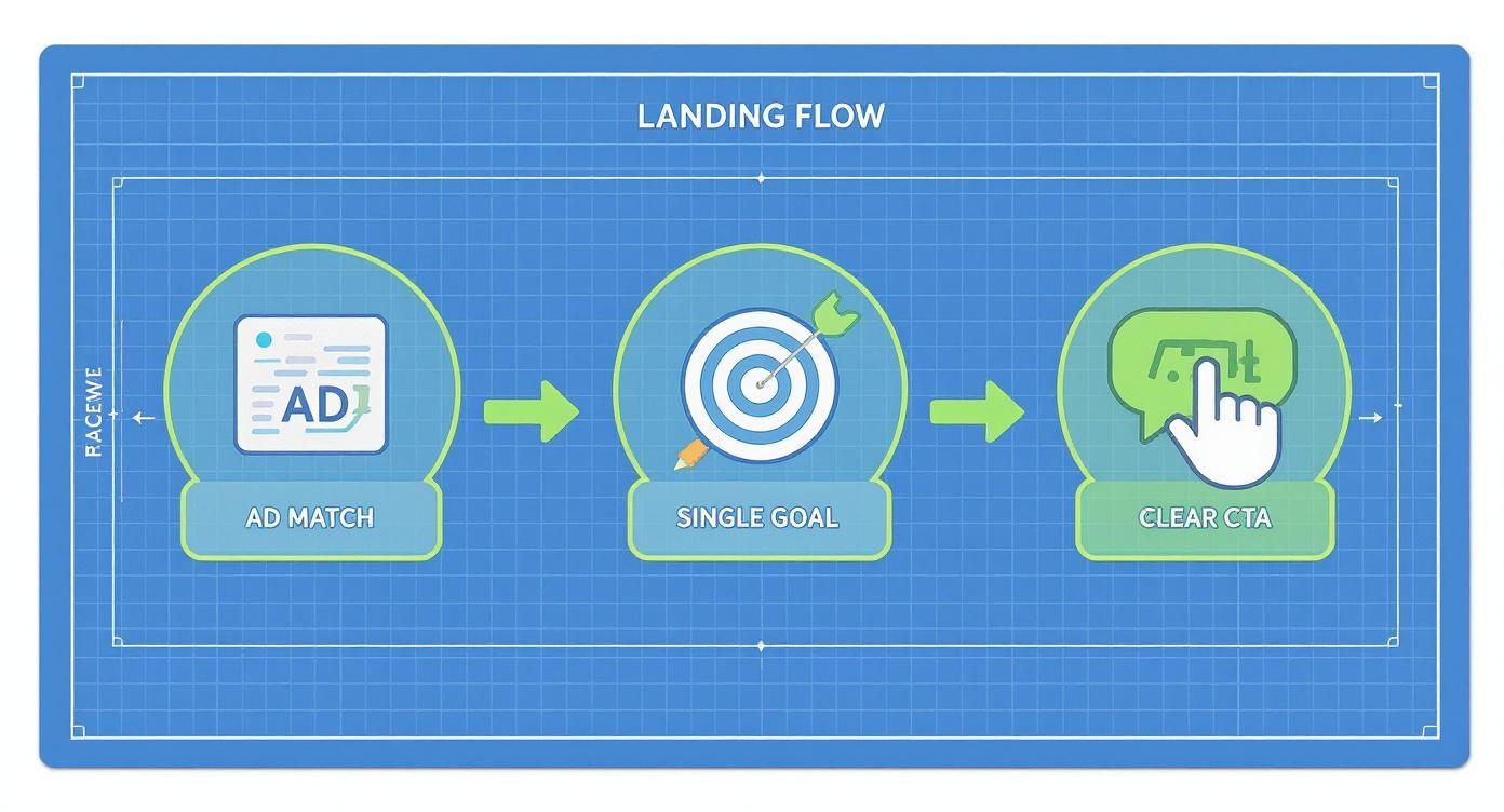
The flow it shows, from matching the ad's message to focusing on a single goal and a clear CTA, is a foundational strategy for any test you run.
Moving Beyond Numbers with User Behavior Analysis
A/B testing is great for telling you what is happening on your site, but it doesn't always tell you why. That’s where qualitative data tools come in. They add the human context behind the numbers, revealing the friction points and frustrations that analytics alone will never show you.
Two of the most powerful tools for this are:
-
Heatmaps: These are visual maps of where users click, move their mouse, and scroll. A heatmap can instantly show you if people are clicking on things that aren't actually links (a classic sign of confusion) or if they aren't scrolling far enough down the page to see your main call-to-action.
-
Session Recordings: These are anonymous recordings of real user sessions. Honestly, watching how actual visitors navigate—or struggle to navigate—your pages is an incredibly insightful, and often humbling, experience. You can see exactly where they get stuck, hesitate, or even rage-click in frustration.
Imagine you're running an A/B test on a new checkout page design. Your analytics show that the new version is performing worse, but you have no idea why. By watching a few session recordings from a tool like Hotjar or FullStory, you might discover that users are repeatedly failing to find the "apply discount code" field, causing them to abandon their carts. That's a golden insight you'd never get from a simple conversion rate metric.
When you combine the quantitative data from A/B tests with the qualitative insights from behavior analysis, you create a powerful feedback loop. You use heatmaps and recordings to find problems, form a hypothesis, run a test to validate a solution, and then analyze the results to figure out your next move. This is how you turn conversion optimization into a predictable, data-backed process for growth.
Common Questions About Website Conversions
If you're diving into the world of conversion optimization, you've probably got questions. It's a field filled with nuance, and a few key questions come up time and time again. Let's clear up some of the most common ones I hear from clients and colleagues.
What Is a Good Website Conversion Rate?
This is the big one, and the honest answer is always: it depends.
You'll hear people toss around a general benchmark of 2-4% for e-commerce, but that number is pretty useless without context. A high-end B2B service might convert at less than 1% and be incredibly profitable, while a personal care brand could see rates closer to 7%. The industry, price point, and traffic source all dramatically change what's considered "good."
Instead of chasing a vague industry average, focus on beating your own numbers. Your real goal is to establish a baseline and then consistently improve upon it, month over month. That's what sustainable growth looks like.
A "good" conversion rate isn't a static number—it's one that's always getting better. Focus on beating your own historical performance, not some generic industry benchmark.
How Long Should I Run an A/B Test?
This is a classic question. The answer isn't about time; it's about data. You need to run a test long enough to reach statistical significance, which is just a fancy way of saying you're confident the results are real and not just a random fluke.
As a solid rule of thumb, aim for at least 100-200 conversions per variation.
- If you have tons of traffic, you might get there in a few days.
- For a smaller site, it could easily take a few weeks or more.
No matter what, always let a test run for at least one full week. This helps smooth out any differences in user behavior between weekdays and weekends. And whatever you do, don't stop the test early just because one version is "winning." That's a classic mistake that often leads to false positives.
What One Change Has the Biggest Impact on Conversions?
Everyone is looking for that silver bullet, that one simple tweak that will double their conversions overnight. While it rarely works like that, some changes definitely punch above their weight. The biggest wins almost always come from clarifying your core message and improving the user's journey.
Specifically, I've found that honing your value proposition and call-to-action (CTA) delivers the most bang for your buck. You have to nail these three things right away:
- What do you offer? (Your headline needs to be crystal clear.)
- Why should I care? (Your sub-headline or body copy must explain the benefit.)
- What do I do next? (Your CTA button has to be obvious and compelling.)
Beyond messaging, the single most powerful technical fix is almost always page load speed. A slow website frustrates everyone and kills conversions before your message even has a chance to land. Making your site faster is a tide that lifts all boats.
For a deeper dive into more strategies that can move the needle, check out this guide on how to improve website conversion rates.
At ReachLabs.ai, we build data-driven marketing strategies designed to turn your website visitors into dedicated customers. If you're tired of guessing and want to see real, measurable growth, find out what we can do for you at https://www.reachlabs.ai.
