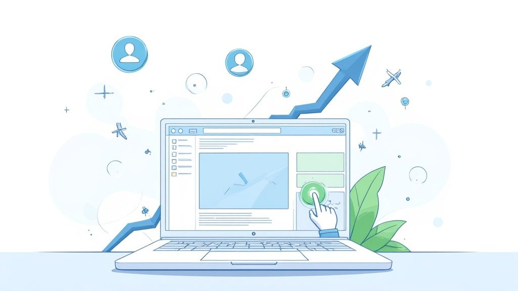
A high-converting landing page isn't just another page on your website. It's a purpose-built, standalone page designed to do one thing and one thing only: convince a visitor to take a specific action. It’s not your homepage, which is full of distractions. Instead, think of it as a focused, streamlined environment built to turn clicks into customers.
The Anatomy of a High-Converting Landing Page
Before you ever write a line of copy or pick a color palette, you have to understand the anatomy of a page that actually converts. A successful landing page isn't just a jumble of good ideas; it’s a strategic assembly of carefully chosen components, where each piece has a specific job to do.
I like to think of a great landing page as an expert salesperson. It knows exactly what the customer needs, anticipates their questions, and guides them smoothly toward a single, beneficial decision.
The secret sauce is singular focus. Your homepage might offer a dozen different paths—About Us, Blog, Services, etc. A high-converting landing page relentlessly strips those away. It removes all exits except for the one you want the visitor to take. That means no main navigation menu, no footer links to your social media, and zero competing offers. Every single element should reinforce that one primary goal.
The Five Core Elements You Can't Skip
I’ve found that every effective landing page, regardless of the industry, is built on five foundational pillars. When these elements work in harmony, they create a persuasive experience that feels helpful, not pushy. Nail these, and you're well on your way to building pages that consistently deliver.
These non-negotiables are:
- A Compelling Headline: This is your first impression. It must grab attention and instantly confirm the visitor is in the right place by matching the promise of the ad or link they just clicked.
- Persuasive Copy: This is where you expand on the headline's promise. The copy needs to clearly explain the value, speak directly to the visitor's pain points, and position your offer as the perfect solution.
- Engaging Visuals: A powerful image or video can communicate value much faster than text alone. It should be relevant, stir some emotion, and help visitors picture themselves enjoying the outcome.
- Trust-Building Social Proof: People are wired to follow the crowd. Things like testimonials, customer reviews, company logos, or case studies break down skepticism and build credibility, making visitors feel they're making a safe choice.
- An Unmistakable Call-to-Action (CTA): This is your closing argument. It needs to be a visually distinct button with clear, action-oriented text that tells the visitor exactly what to do next.
To make this crystal clear, here’s a quick-reference table summarizing how these pieces fit together.
Key Components of a High-Conversion Landing Page
| Element | Primary Goal | Best Practice Example |
|---|---|---|
| Headline | Grab attention & confirm relevance | "Get Your Free Marketing Plan in 48 Hours" |
| Copy | Explain value & solve a problem | Bullets outlining benefits, not just features |
| Visuals | Create an emotional connection | A video testimonial from a happy customer |
| Social Proof | Build credibility & reduce anxiety | "Trusted by over 10,000 businesses" with logos |
| Call-to-Action (CTA) | Drive the final conversion | A bright, clickable button that says "Start My Free Trial" |
Getting these elements right is the foundation for everything else you'll do to optimize your page for conversions.
Why Does This Blueprint Actually Work?
Sticking to this focused blueprint isn't just theory; it has a massive impact on results. Recent benchmarks show that dedicated landing pages have a huge advantage, boasting a 160% higher conversion rate than other lead capture forms like pop-ups. While a decent landing page converts around 23–26% of visitors, pop-ups barely scrape by at 3%. You can dig into more landing page performance statistics if you're curious.
The real magic of a high-converting landing page is in its simplicity and clarity. By eliminating distractions and presenting a single, obvious path forward, you make it incredibly easy for your visitors to say "yes."
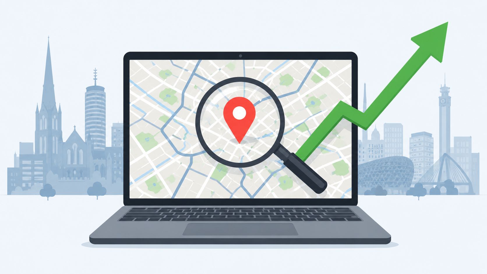
This structure is also incredibly versatile. You can adapt the blueprint for almost any goal or audience, from generating leads for a global SaaS product to attracting local customers. For example, the very same principles are essential when creating effective local SEO landing pages designed to capture geographically specific search traffic.
Ultimately, understanding this framework moves you from guesswork to a repeatable system. It gives you a reliable foundation you can build on, test, and refine to create pages that don't just look good—they deliver real, tangible business results.
Writing Copy That Actually Converts
You can have the most beautiful landing page design in the world, but if the words don't connect, you've got nothing. Great design gets people to look; great copy gets people to act. It's the engine of your page.
Effective copy isn’t about being clever or witty. It's about being incredibly clear and empathetic. From the moment someone lands on your page, your words need to answer their single most important question: "What's in it for me?" Every single sentence should build on the value of your offer and guide them closer to that final click.
Crafting a Headline That Hooks
Your headline is your first—and sometimes only—shot at grabbing a visitor's attention. You have about three seconds to convince them they’re in the right place. Don't waste it talking about yourself.
A powerful headline is always about the benefit, not the feature. Instead of "Our CRM Has AI-Powered Analytics," you'd say something like, "Stop Guessing and Start Growing with Smarter Sales Insights." One is a technical spec; the other is a desired outcome. That’s the difference.
A headline has one job: to stop the right person from leaving your page. It must be a perfect match for the ad or link they just clicked, confirming their intent and promising a solution to their problem.
Clarity trumps creativity every time. If they have to re-read your headline to figure out what you do, they’re already gone.
Weaving a Persuasive Narrative
Once your headline gets a nod of agreement, the rest of your copy has to deliver on that promise. This is where you tell a story that resonates with your visitor's real-world problems and what they hope to achieve. Drop the corporate jargon and use the same words your customers use to describe their frustrations.
A simple but incredibly effective way to structure your story is the classic Problem-Agitate-Solve framework:
- State the Problem: Start by clearly describing the pain point. Show them you get it.
- Agitate the Pain: Gently twist the knife. What are the consequences of not solving this problem?
- Introduce Your Solution: Present your product or service as the clear, obvious path to relief.
This approach feels less like a sales pitch and more like you’re genuinely trying to help. If you want to really master this, digging into the fundamentals of copywriting for businesses can make a massive difference in how your message lands.
Using Bullets to Showcase Benefits
Nobody reads a landing page from top to bottom like a book. They scan. And nothing kills conversions faster than a giant wall of text. Bullet points are your secret weapon for making your key selling points pop.
But there’s a right way and a wrong way to write them. Don't just list features; translate every feature into a tangible benefit.
- Feature-focused: "128-bit SSL encryption"
- Benefit-focused: "Shop with confidence knowing your personal data is always secure."
See the difference? The benefit answers the visitor's internal "so what?" and makes the value instantly clear. I always recommend putting your most impactful benefit first to keep the momentum going.
Writing a Call-to-Action That Inspires Action
Your Call-to-Action (CTA) is the moment of truth. The words on that button need to be crystal clear and action-oriented. Generic, lazy words like "Submit" or "Learn More" create uncertainty and friction.
Instead, use specific, value-driven language that tells people exactly what they're getting.
| Vague CTA | Compelling CTA |
|---|---|
| Submit | Get My Free Guide |
| Download | Start My 14-Day Free Trial |
| Continue | See Pricing and Plans |
A great trick is to have the button copy complete the sentence "I want to…" For example, "I want to… Get My Free Guide." This little psychological shift puts the user in control. A high converting landing page feels like a conversation, and your CTA is the perfect, logical end to that chat.
Designing for Trust and Action
Your landing page design is the digital equivalent of a first handshake. You have just a few seconds to make a good impression and earn a visitor's trust. Great design is more than just a professional gloss; it's a strategic tool that guides your visitor’s eyes, calms their anxieties, and makes clicking that button feel like the most obvious thing in the world. It’s the silent partner to your persuasive copy.
The moment someone lands on your page, their brain is doing a rapid-fire scan for credibility cues. A cluttered layout, pixelated images, or a confusing path forward are immediate red flags. Your mission is to create a visual experience that feels secure, laser-focused, and built around one single goal.
Establishing a Strong Visual Hierarchy
Think of visual hierarchy as the art of telling your visitors where to look, without saying a word. A high-converting landing page doesn’t leave things up to chance; it uses size, color, contrast, and spacing to pull the eye straight to what matters most.
Your headline needs to be the biggest, boldest thing on the page. Period. Your call-to-action (CTA) button should have a contrasting color that almost begs to be clicked. Everything else—the supporting copy, the images, the secondary details—should be visually subordinate. This creates a clear, predictable path for the eye to follow, leading visitors from your big promise right to the conversion goal.
It’s just like a natural conversation. You open with a powerful statement (the headline), offer up the details (the body copy), and finish with a clear request (the CTA). A solid visual hierarchy keeps that conversation flowing smoothly.
Leveraging High-Quality Imagery and Video
Words tell, but visuals show. A single, powerful image or a short, engaging video can convey the value of your offer far more effectively—and emotionally—than a dense block of text. And please, steer clear of those generic stock photos. You know the ones. They can actually hurt your credibility.
Instead, invest in high-quality, authentic visuals that feel true to your brand and connect with your audience.
- Product Shots: Show your product being used in a real-world setting. Help visitors see it in their own lives.
- Hero Shots: Feature a person who looks like your ideal customer—happy, successful, and clearly benefiting from your offer.
- Video Demos: A quick video (think under 60 seconds) is perfect for explaining a complex product, building a personal connection, and showing your offer in action.
The aim here is to forge an emotional link. When visitors can actually see the positive outcome they’re after, they’re much more likely to believe in it.
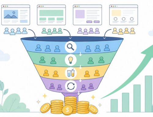
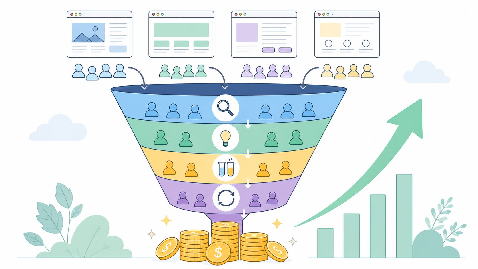
This infographic breaks down how crucial design elements like visual hierarchy and trust signals directly fuel your key metrics.
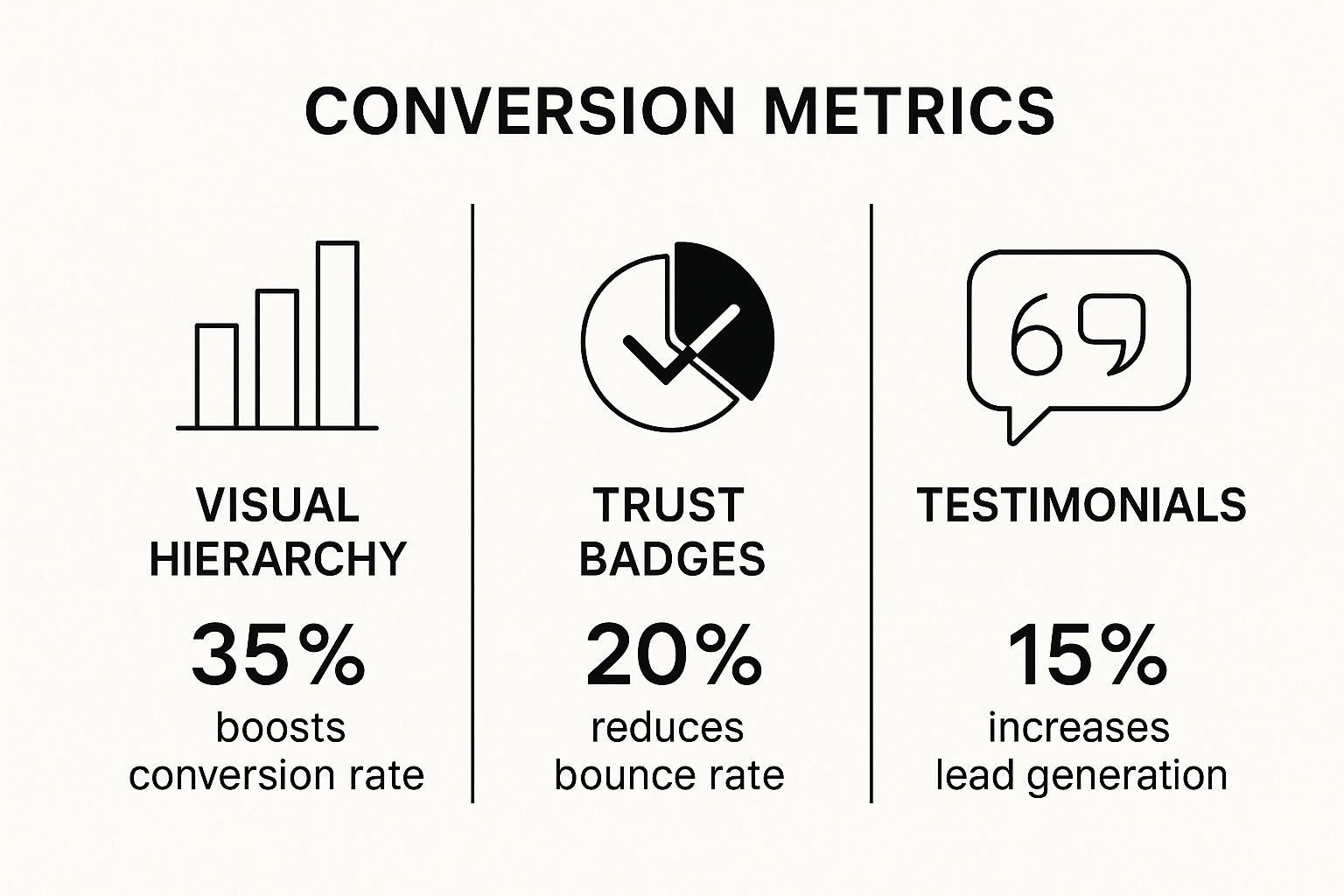
The numbers don't lie. A well-designed page isn't just about looking good; it's a powerful engine for conversions and engagement.
Integrating Trust Signals Seamlessly
Trust signals are the visual proof that your offer is legit and that it's safe to move forward. Without them, even the most brilliant copy will struggle. You have to proactively dismantle skepticism before it even has a chance to form. These signals shouldn't feel like they were tacked on at the last minute; they need to be woven right into your design.
A visitor should never have to consciously search for reasons to trust you. Credibility should be communicated instantly through a combination of professional design and explicit trust signals.
Some of the most effective trust signals include:
- Customer Testimonials: Short, punchy quotes from real customers. Adding a name and a photo makes them infinitely more powerful.
- Partner or Client Logos: If you've worked with well-known companies, showing their logos "borrows" their established credibility.
- Security Badges: Handling payments or sensitive data? SSL certificates or badges from names like Norton or McAfee are non-negotiable.
- Guarantees: A simple "30-Day Money-Back Guarantee" or a "Cancel Anytime" policy can dramatically lower the perceived risk.
When you pepper these elements throughout your design, you're showing visitors that other people have trusted you and had a great experience. That makes it so much easier for them to do the same. This is a fundamental piece of the puzzle, and to see how your entire site stacks up, a comprehensive website audit checklist can help you spot other opportunities for improvement.
Optimizing Your Page with A/B Testing
Let’s be clear: a high-converting landing page is never really “done.” The moment you publish it, you’ve just created your baseline. The real magic, the thing that separates a good page from a great one, is a commitment to constant, data-backed improvement.
This is where A/B testing, or split testing, becomes your best friend.
The concept is simple. You create two versions of your page—an original (A) and a variation (B)—and you show each to a segment of your audience. The goal is to see which one performs better. But this isn't about throwing random ideas at the wall to see what sticks. It's a methodical process that takes the guesswork out of optimization and lets your audience’s actions tell you what works.
Forming a Clear Hypothesis
Before you even think about changing a button color or rewriting a headline, you need a solid hypothesis. This is more than just a vague hunch; it's a clear, testable statement about what you're changing, what you expect to happen, and why.
I always tell my team to use this framework: "By changing [X], I predict [Y] will happen because [Z]."
Here’s what that looks like in the real world:
"By changing the CTA button text from the generic 'Submit' to the benefit-driven 'Get My Free Marketing Plan,' I predict our sign-up conversion rate will increase because the new copy clarifies the immediate value a user gets."
See the difference? This structure forces you to justify your test. It connects a specific change to a measurable outcome and a psychological reason. Without that foundation, you’re just making changes in the dark.
Prioritizing What to Test First
You could probably come up with a hundred things to test on any given landing page. But your time is valuable, so you need to be strategic. The key is to prioritize tests based on their potential impact versus the effort they require. Start with the big swings.
Some of the highest-impact elements I’ve seen move the needle are:
- The Headline: This is your first impression. A minor tweak here can lead to a major lift in conversions. It's often the easiest and most impactful place to start.
- The Call-to-Action (CTA): Everything from the button copy ("Buy Now" vs. "Get Started Today") to its color and placement can dramatically alter performance.
- The Hero Shot: Are you using a static image? Try a short video instead. Does a picture of your product work better than a picture of a happy customer? Test it.
- The Offer Itself: Sometimes the problem isn't the page, it's what you're offering. Testing a "Free Trial" against a "Live Demo" can reveal a lot about your audience's commitment level.
- Social Proof: Don't just have testimonials—test how you present them. Do video testimonials outperform quotes with headshots? Does a "wall of logos" work better than a detailed case study?
To help you get started, I've put together a simple table that breaks down common tests by their potential impact and the effort needed to get them running.
A/B Testing Impact vs Effort
This table compares common landing page elements, giving you a sense of where you can get the biggest wins for the least amount of work.
| Element to Test | Potential Impact | Implementation Effort |
|---|---|---|
| Headline | High | Low |
| CTA Button Text | High | Low |
| Hero Image | High | Medium |
| Form Length | Medium | Medium |
| Page Layout | High | High |
As you can see, you don't need to start with a complete page redesign. Focusing on low-effort, high-impact elements like your headline and CTA can deliver significant results quickly, building momentum for more complex tests down the line.
Interpreting the Results Correctly
After your test has collected enough data to be statistically significant—and please, wait for significance!—it’s time to dig into the results. Don't just glance at the conversion rate and declare a winner.
You have to ask deeper questions. Did the winning version also impact other metrics, like bounce rate or time on page? Did it attract a different quality of lead? Understanding the "why" behind the numbers is what turns a one-off win into a powerful insight you can apply across all your marketing. For a fantastic breakdown of the entire process, I often point people to this guide on A/B Testing For Landing Pages.
A/B testing isn't a one-and-done task; it's a cycle. Every test, win or lose, teaches you something valuable about your customer. Embrace it, and you’ll be well on your way to building a truly optimized conversion engine. And while you're at it, check out our other conversion optimization tips for more ways to improve your results.
Scaling Your Leads with Multiple Landing Pages

Once you've dialed in a single high-converting landing page, it’s really tempting to just point all your traffic there and call it a day. It’s a proven winner, right? While that’s a decent starting point, you’re leaving a ton of leads on the table. The real secret to explosive lead growth isn't just having one good page; it’s about serving the perfect page to every single person who clicks.
This is exactly where a multi-page strategy comes in, and it's what separates a marketing effort that just "works" from one that truly scales.
Think about it—not all traffic is the same. Someone clicking from a professional ad on LinkedIn is in a completely different headspace than a longtime subscriber clicking from your email newsletter. Forcing them both onto the exact same page is a compromise that ends up speaking to no one.
Matching the Message to the Visitor
By building out unique landing pages for your different campaigns, traffic sources, and audience segments, you can deliver a message that feels incredibly personal and relevant. This idea is called message matching, and it’s all about creating a smooth, consistent journey from the ad they clicked all the way to the conversion.
When a visitor lands on your page, they should instantly see the same words, offers, and visuals that got them to click in the first place. That immediate recognition builds trust and kills the impulse to bounce.
Let’s say you’re a SaaS company with a great project management tool. A single, generic landing page will probably net you some sign-ups. But a more targeted approach will blow it out of the water.
Imagine a few different people you're trying to reach:
- Google PPC Ad for "small business project tools": The landing page headline here needs to be direct. "The Easiest Project Tool for Small Business Owners." All the copy should be about simplicity, affordability, and getting started fast.
- Email to existing free users: This page should greet them with something like, "Unlock the Advanced Features You're Missing." You don't need to sell them on the basics; you need to show them exactly what upgrading gets them.
- Facebook ad targeting marketing managers: The hero image on this page might be a marketing campaign calendar. The copy would speak their language, focusing on things like team collaboration and tracking campaign deadlines.
Each page sells the same product, but it does so by speaking directly to the visitor's unique situation and what they care about most. It feels less like a billboard and more like a conversation.
The Exponential Power of More Pages
This isn't just a nice theory; the numbers back it up in a big way. Research consistently shows a direct line between the number of landing pages a business has and the leads it brings in. For instance, businesses with 31 to 40 landing pages generate seven times more leads than companies with only one to five pages. If you're curious, you can dig into more of these eye-opening landing page growth statistics yourself.
This kind of growth happens because more pages let you cast a much wider net. You can hit more niche keywords, speak to specific pain points, and create tailored experiences for every part of the buyer's journey. Every new page you build is another chance to make a visitor feel like you created that offer just for them.
Your Top Landing Page Questions, Answered
Even the most seasoned marketers run into questions when they're deep in the weeds of building a new landing page. Let's tackle some of the most common sticking points I see people grapple with.
Think of this as a quick-reference guide to sanity-check your decisions and solve those nagging problems that can derail a launch.
What Is a Good Conversion Rate for a Landing Page?
This is probably the most common question I get, and the honest-to-goodness answer is always, "It depends." People love to throw around 10% as a gold standard, but that number is almost meaningless without context.
A landing page for a free e-book is playing a completely different game than one selling a $2,000 course. One is a low-friction "yes," the other is a major buying decision. Their conversion rates will, and should, look drastically different.
So, instead of getting hung up on a universal magic number, shift your focus to two far more practical metrics:
- Your Industry's Reality: Do some digging. What's a typical conversion rate for your specific niche and offer type? A 3% conversion rate for high-ticket B2B software leads might be phenomenal, while that same 3% for a free email signup would be a total flop.
- Your Own Progress: This is the one that really matters. The best benchmark you have is your last version. A "good" conversion rate is one that's better than last month's. Your real goal is relentless, iterative improvement.
The most successful landing pages aren't measured against some vague industry average. They're measured against themselves. The real win is consistent growth, one A/B test at a time.
How Long Should a Landing Page Be?
There’s no secret formula for word count. The right length for your page is dictated entirely by how much your ask costs—in time, money, or trust.
The guiding principle is this: your page needs to be exactly as long as it takes to answer every major question and overcome every significant objection your visitor has. No more, no less.
A simple way I like to think about it is matching page length to the size of the commitment:
- Go Short For: Low-commitment asks. Think free newsletter sign-ups, checklist downloads, or low-cost impulse buys. The decision is easy, so get straight to the point and don't over-explain it.
- Go Long For: High-commitment asks. We're talking about expensive products, booking a demo for a complex service, or signing up for a subscription. Here, you need the space to build a case, show social proof, handle objections, and fully detail the value.
Don't ever be afraid of the scroll. A visitor will happily scroll through a long page if the story is compelling and answers their questions. A short page that leaves them uncertain will always lose to a longer one that gives them the confidence to click "buy."
Should I Remove the Navigation Menu?
Yes. One hundred percent, yes. A landing page has one job and one job only. Your main website navigation is a beautiful, helpful tool for exploration, but on a landing page, it's a series of tempting escape hatches.
Every link that doesn't point to your primary call-to-action is a potential "leak" in your conversion funnel. It introduces decision fatigue and pulls your visitor’s attention in a dozen different directions.
By removing the navigation, you create a focused, purpose-built environment. You’re essentially telling your visitor, "This is the only thing that matters right now." It's one of the simplest and most effective changes you can make to boost conversions.
What's the Difference Between a Landing Page and a Homepage?
This is a fundamental distinction that, once you get it, changes how you think about marketing campaigns.
Your homepage is the lobby of your company. It’s designed to welcome everyone, from potential customers to job seekers to investors. It has to serve many masters, offering different paths for people to explore your brand.
A landing page is a private meeting room with a single agenda. It’s built for a very specific audience from a specific traffic source (like a Google Ad or an email campaign) with one clear goal. It strips away all the general-purpose noise of a homepage to focus a visitor’s attention on a single, desired action. This is why you never send campaign traffic to your homepage—you send it to a dedicated landing page built to convert.
At ReachLabs.ai, our focus is on building marketing strategies that do more than just attract eyeballs—they create customers. If you're ready to build landing pages that are engineered for results, not just looks, let's connect. Find out how we can help grow your business at https://www.reachlabs.ai.
