
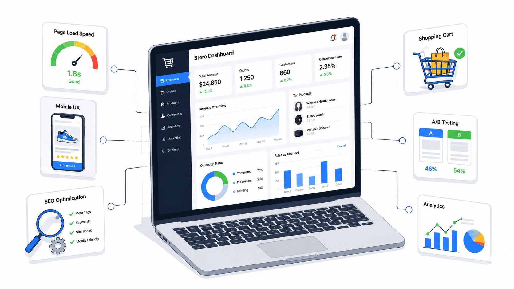
Traffic is coming in. Orders aren't keeping pace. Your team keeps hearing the same explanations: paid traffic got expensive, search is volatile, customers are distracted, conversion is “probably seasonal.”
Sometimes that's true. Often, the bigger problem sits on the site itself.
A typical SMB store runs into the same cluster of issues at once. Product pages are heavy. Mobile layouts look acceptable in a design review but feel awkward on a real phone. Filters lag. The cart updates late. Checkout asks for too much. Nobody can say which pages hurt revenue most because reporting stops at sessions and purchases. The result is familiar: decent interest, weak throughput.
That's where optimizing an ecommerce website stops being a design project and becomes an operating discipline. You don't need a giant replatform to get traction. You need a sequence. Fix the bottlenecks that block revenue first, leave lower-impact polish for later, and measure every meaningful change.
I've seen SMB teams waste months debating homepage redesigns while category pages, product templates, and cart interactions erode sales. The stores that recover fastest usually do something simpler. They identify the page types tied closest to revenue, tighten performance, remove mobile friction, sharpen product-page persuasion, and test checkout changes in controlled rounds.
This playbook is built for that reality. It favors actions that are practical under budget pressure. It also assumes your team has limited engineering time, which means every request needs a reason, an order, and a way to prove impact.
Introduction to Optimizing Ecommerce Website
A small ecommerce team usually feels the problem before they can diagnose it. Paid campaigns send qualified visitors to the site. Email drives repeat traffic. Organic rankings hold steady enough. Yet carts stall, mobile bounce feels high, and the sales team keeps asking why traffic growth isn't turning into more completed orders.
Take a common scenario. A retailer runs on Shopify with a handful of apps layered onto a theme that looked fine when it launched. Over time, image libraries expanded, scripts piled up, product pages became inconsistent, and the checkout experience picked up friction one field at a time. Nothing is “broken” in a dramatic sense. The store asks shoppers to work harder than they should.
That's why optimizing ecommerce website performance has to start with prioritization, not perfection. SMB teams rarely have the budget to rebuild everything at once. They need to know what to fix first, what can wait, and what's likely to move revenue rather than just make reports look cleaner.
Practical rule: Start where intent and money meet. Product templates, cart behavior, checkout flow, and mobile rendering usually deserve attention before broad visual refreshes.
The useful way to approach this is sequentially. First, remove technical drag so pages load and respond properly. Then make mobile buying easier, because that's where the most fragile sessions often happen. After that, improve product-page relevance so shoppers get a clear answer to “why buy this here, now.” Then tighten checkout and run disciplined experiments instead of opinion-driven redesigns. Finally, set up monitoring so improvements don't fade the next time someone installs a new app, script, or widget.
A good optimization program isn't flashy. It's operational. The payoff comes from making the store easier to discover, easier to trust, and easier to buy from.
Improving Site Performance and Technical SEO
If the site is slow, every channel becomes less efficient. Paid traffic costs more to monetize. Organic traffic lands on pages that underperform. Email clicks hit friction before the shopper even evaluates the product. This is why technical work belongs near the top of the revenue queue.
Consumers are impatient. Backlinko's ecommerce website optimization analysis notes that 47% of consumers expect a page to load in under 2 seconds, 40% abandon a site that takes longer than 3 seconds, and improving page speed by 0.1 seconds can increase conversion rates by up to 8%.
Audit the templates that matter most
Don't start with a full-site checklist. Start with templates tied to money:
- Top product pages
- Highest-traffic category pages
- Cart
- Homepage only if it drives a large share of assisted conversions
Run those pages through Lighthouse, WebPageTest, and Chrome DevTools using mobile throttling. The point isn't to collect every score. The point is to isolate delays on high-impact templates and connect them to behavior you can improve.

Google's practical thresholds give you a working standard. Aim for Largest Contentful Paint under 2.5 seconds, Interaction to Next Paint at 200ms or less, and Cumulative Layout Shift below 0.1, as outlined in the same Backlinko guidance on ecommerce speed and Core Web Vitals. Those numbers matter because they map to visible shopper experience. LCP tells you whether the page feels loaded. INP shows whether taps and clicks feel responsive. CLS exposes layout movement that causes misclicks and erodes trust.
Fix what usually breaks first
A lot of SMB stores lose time on edge-case performance work while ignoring obvious offenders. In practice, these are the first fixes worth making:
- Compress heavy images: Use Tinify or convert large assets to WebP where your stack supports it. Hero banners and gallery images are frequent LCP offenders.
- Trim script bloat: Use Terser or your build process to minify code and remove dead JavaScript. Marketing tags and app scripts often create render-blocking delays.
- Use a CDN: Cloudflare can reduce delivery latency and help static assets load more consistently across regions.
- Upgrade hosting or app architecture: If your server response is slow, front-end cleanup won't solve the underlying drag.
- Review backend bottlenecks: Check TTFB, API latency, cache behavior, and database-heavy functions. Slow inventory checks, pricing calls, and recommendation widgets often hurt pages in ways designers don't catch.
Slow sites rarely have one villain. Most of the time, revenue leaks come from a stack of “small” delays that hit the same visit.
Don't separate technical SEO from speed work
Teams often treat SEO and performance as separate tracks. That's a mistake. Faster rendering helps users and makes pages easier for search systems to process. But speed alone won't rescue weak technical foundations.
Review these items while you're already inside the templates:
| Check | Why it matters | What to look for |
|---|---|---|
| Crawlability | Search engines need clean access | Broken internal links, accidental noindex tags, redirect chains |
| Metadata | Helps search visibility and click quality | Unique titles, useful meta descriptions, no duplication across product variants |
| Structured data | Supports richer understanding of pages | Product, review, and FAQ schema implemented correctly |
| Internal linking | Helps discovery and authority flow | Category-to-product paths, related product links, buying-guide links |
| Canonical setup | Reduces duplicate indexation issues | Variant pages and filtered URLs handled consistently |
If your team is also working authority building alongside on-site improvements, this guide to link building for ecommerce sites is a useful companion because technical cleanup and stronger category-page authority tend to work better together than in isolation.
Prioritize by revenue impact
Not every performance issue deserves immediate engineering time. Use this triage:
- Fix first: Problems on revenue-driving product, category, cart, and checkout templates
- Fix second: Indexation and structured data gaps on commercially important pages
- Fix later: Cosmetic score improvements that don't affect user-perceived speed or search visibility
That's the practical standard for optimizing ecommerce website performance. Don't chase perfect scores. Chase faster buying paths.
Enhancing Mobile UX for Conversions
A common assertion is that a site is mobile-friendly if it technically resizes. That bar is too low. Mobile shoppers don't judge your store by whether the layout collapses correctly. They judge it by whether they can understand the offer, trust the product, and move toward checkout without friction.
Shopify's ecommerce website optimization guidance states that mobile devices account for 60% of all ecommerce traffic globally, and 53% of mobile site visits are abandoned if pages take longer than 3 seconds to load. That's enough to treat mobile UX as a revenue center, not a formatting task.
Put buying signals above the fold
On mobile, hesitation happens fast. Shoppers shouldn't need to scroll past oversized lifestyle imagery to find the information that supports a purchase decision.
Lead with the essentials:
- Price visibility: Don't bury final pricing beneath image carousels or expandable accordions.
- Stock clarity: Show availability early, especially for sizes, colors, or limited inventory items.
- Primary CTA placement: Keep “Add to Cart” or “Buy Now” obvious and reachable with one hand.
- Variant selection feedback: If a size or color is required, make the state change unmistakable.

Large, high-contrast buttons work better than subtle outline treatments on small screens. So do sticky purchase bars, provided they don't cover important product information or conflict with chat widgets.
Design for thumbs, not screenshots
A mobile mockup can look polished and still fail in real use. The issue usually isn't aesthetics. It's interaction friction.
Here's what to check on actual devices:
| Mobile element | Common mistake | Better approach |
|---|---|---|
| Navigation | Deep menus with tiny tap targets | Shorter menu depth and larger touch areas |
| Filters | Full-screen filter flows that are hard to exit | Collapsible filters with clear apply and reset actions |
| Product gallery | Oversized swiping area above all content | Balanced image height with immediate access to key product info |
| Forms | Too many fields and poor keyboard matching | Fewer inputs, autofill support, and mobile-friendly field types |
One practical habit helps more than teams expect: walk the full path yourself on a mid-range phone over mobile data, from landing page to purchase attempt. You'll catch awkward spacing, delayed popups, sticky bars that overlap content, and broken field focus behavior that analytics alone won't explain.
If a shopper has to zoom, hunt, or second-guess a tap, the mobile design isn't finished.
Tighten mobile search snippets and entry pages
Mobile optimization starts before the click too. Search listings compete for tiny amounts of screen space. Keep title tags under 55 characters and meta descriptions between 135 and 155 characters, following the practical guidance included in Shopify's mobile ecommerce optimization recommendations. That won't fix weak pages, but it does help sharpen the promise before the visit starts.
Once the shopper lands, make the first screen do real work. That means:
- Clear product naming: Avoid clever but vague titles
- Short benefit language: Explain the product's immediate value quickly
- Transparent pricing: Don't create surprise fees or delayed cost visibility
- Readable descriptions: Use short blocks and scannable bullets rather than dense copy
What usually isn't worth the effort first
Some mobile changes are high effort and low payoff for SMB teams early on:
- Custom animations that increase complexity
- Overdesigned transitions between product states
- Decorative widgets that consume space above the fold
- Novel navigation patterns shoppers must learn
For optimizing ecommerce website mobile UX, the best wins are usually plain: faster image delivery, clearer hierarchy, stronger CTA visibility, fewer steps, and fewer reasons to hesitate. Mobile users don't reward creativity that slows them down.
Boosting Product Page Relevance and Persuasion
A lot of product pages fail for a simple reason. They describe the item without helping the shopper decide. Features are listed. Specs are present. A few keywords are inserted. But the page never answers the buyer's real question: why this product, for my use case, from this store?
Semrush's ecommerce website optimization analysis notes that 68% of high-intent searchers abandon sites when product pages fail to answer their specific “why buy this” question, while 22% of stores optimize descriptions for intent-based queries. That gap is where a lot of hidden revenue sits.
Match the page to the search intent
The strongest product pages don't just rank for terms. They align with the reason behind the search.
A shopper looking for “best vegan running shoes” needs different reassurance than someone searching “how to break in hiking boots.” One wants comparative confidence and fast validation. The other wants practical guidance and comfort proof. If both land on the same generic description, one or both will bounce.
A useful working model is the 4P structure:
Problem
Name the pain point or use case the buyer is trying to solve.Promise
State the outcome clearly. Not hype. Just the practical benefit.Proof
Show evidence through reviews, materials, use details, FAQs, or compatibility information.Proposal
Ask for the action with a CTA that fits the buying stage.
Rewrite weak product copy with decision support
Most underperforming product pages share the same copy issues:
- They open with brand language instead of buyer language.
- They list features before clarifying use.
- They bury objections such as sizing, shipping expectations, or care instructions.
- They separate SEO from persuasion, so the page ranks better than it converts.
Here's a stronger layout for product-page copy:
| Page block | Job |
|---|---|
| Headline and subhead | Clarify what it is and who it's for |
| Benefit bullets | Translate features into outcomes |
| Short narrative section | Address the core use case or problem |
| Trust layer | Reviews, guarantees, shipping clarity, materials |
| FAQ block | Resolve common hesitation before checkout |
If your team needs help tightening product language across templates, this guide to copywriting for websites is useful for sharpening clarity, hierarchy, and conversion-focused messaging.
Good product copy reduces decision effort. Great product copy also reduces doubt.
Use proof where it affects action
Social proof works best when it sits close to the moment of choice. A review tab hidden near the footer doesn't help much. A visible rating summary, fit notes, or usage feedback near the CTA can.
Practical proof elements include:
- Review excerpts that answer concerns: comfort, durability, fit, setup, quality
- FAQ schema and product schema: useful for search visibility and clearer page structure
- Use-case bullets: who it's for, when it works best, when it may not be ideal
- Comparison framing: better for X, designed for Y, not intended for Z
That last point matters. Stores often try to make every product universal. In practice, specificity converts better because it feels more trustworthy.
Write for scanning first, depth second
Most shoppers won't read the page top to bottom. They scan, pause at proof points, and look for friction. That means formatting matters as much as sentence quality.
Use:
- short paragraphs
- benefit-led bullets
- descriptive subheads
- visible return, shipping, and sizing info
- CTAs that sound concrete, not generic
Product pages don't need more adjectives. They need clearer answers. When optimizing ecommerce website content, relevance and persuasion should sit on the same page, not in different departments.
Advancing Checkout Flow and CRO Experimentation
Checkout problems rarely announce themselves with one obvious bug. They usually show up as friction spread across several steps: weak cart clarity, slow shipping disclosure, unnecessary form demands, and last-minute uncertainty about trust or total cost.
One mobile-specific issue is especially costly. ConvertCart's ecommerce website optimization findings report that 58% of mobile users abandon carts when price, reviews, or stock status aren't visible within 2 seconds, causing 37% higher abandonment than desktop. If those signals arrive late, your funnel weakens before checkout even really begins.
Fix the five friction points first
Start with the common blockers that affect most SMB stores.

Guest checkout
If account creation appears mandatory too early, many shoppers stall. Let them buy first, then offer account creation after purchase.Form length
Remove anything you don't need to complete fulfillment or support the customer. Extra fields add hesitation and typo risk.Payment choice
Offer the payment methods your buyers expect. Don't make shoppers adapt to your preferences.Trust visibility
Security messaging, returns clarity, and support access should appear where uncertainty peaks, not only in the footer.Progress feedback
A clear step indicator helps shoppers understand how much is left and reduces drop-off from perceived complexity.
Run experiments like an operator, not a committee
Checkout optimization gets derailed when teams redesign based on taste. The better approach is controlled experimentation with narrow hypotheses.
Use a simple test brief:
| Element | Current friction | Hypothesis |
|---|---|---|
| Guest checkout | Too much commitment upfront | Making guest checkout primary will increase completion |
| Address form | Too many required fields | Reducing fields will lower abandonment |
| Shipping stage | Costs shown too late | Earlier shipping visibility will reduce exits |
| Payment step | Limited options or confusing layout | Clearer payment presentation will increase completion |
For teams building a tighter testing discipline, these A/B testing best practices from Figr are a useful reference because they keep the focus on cleaner hypotheses, cleaner variants, and more interpretable results.
A short walkthrough can help your team align on where friction typically appears in the funnel:
Use a weekly experiment rhythm
Most SMB teams don't need a giant CRO roadmap. They need consistency. One meaningful test per week is often enough if the hypotheses are tied to actual friction.
A workable rhythm looks like this:
- Week 1: Review recordings, funnel drop-offs, and support tickets. Pick one checkout issue.
- Week 2: Launch one A/B test with one primary KPI.
- Week 3: Read results, segment by device, and decide whether to ship, revise, or discard.
- Week 4: Document the outcome and queue the next test.
The fastest way to slow CRO is testing three ideas at once and learning nothing with confidence.
What tends to work versus what tends to distract
Usually worth testing
- clearer cart summaries
- earlier shipping transparency
- fewer form fields
- stronger mobile payment presentation
- more visible stock and review information near purchase actions
Usually lower priority
- dramatic visual overhaul of checkout
- clever microcopy that changes tone but not clarity
- adding more upsell modules before payment
- forcing app downloads or account creation
Checkout optimization isn't about adding persuasion tricks at the final step. It's about removing reasons to pause. That's the version of optimizing ecommerce website funnels that compounds over time.
Establishing Analytics and Monitoring Framework
Optimization falls apart when nobody can prove what changed, where it changed, or whether the result lasted. A store can feel better after updates and still underperform because the team measured the wrong thing. Sessions and revenue alone won't tell you which pages improved, which events broke, or which experiment moved the funnel.
The practical baseline is simple. Track user actions that connect site behavior to buying progress, then build a dashboard that makes drop-offs obvious.
Track events that map to commercial intent
Webalize's performance optimization guidance for ecommerce conversion recommends using lab tests with Lighthouse and mapping specific metrics to business KPIs. The same source notes that controlled A/B experiments show image optimization and lazy loading often yield 10–20% conversion lifts. The useful takeaway isn't only that performance work can pay off. It's that teams need event tracking granular enough to see where those gains appear.
Build your analytics around the actions that matter most.
| Event Name | Purpose | Dashboard Location |
|---|---|---|
| Product View | Confirms traffic is reaching commercial pages | Product performance dashboard |
| Add to Cart | Shows product-page persuasion and CTA effectiveness | Funnel dashboard |
| Begin Checkout | Measures transition from browsing to buying | Checkout dashboard |
| Payment Info Submitted | Identifies payment-step progression | Checkout diagnostics dashboard |
| Purchase | Final conversion signal | Executive revenue dashboard |
| Page Performance by Template | Connects speed to page type | Technical health dashboard |
| Error or Form Failure | Surfaces hidden friction in checkout | QA and support dashboard |
Keep event names consistent across platforms. If one team calls it “start_checkout” and another calls it “checkout_begin,” reporting gets messy fast. Pick a naming convention and document it.
Build one dashboard for operators and one for leadership
Most analytics setups fail because they try to serve everyone with one view. Don't do that.
Use two layers:
Operator dashboard
This should answer daily questions:
- Which page templates slowed down?
- Which device category lost conversion efficiency?
- Where did users drop between product view, cart, and checkout?
- Did a recent release correlate with lower completion?
Leadership dashboard
This should stay tighter:
- Revenue trend
- Purchase volume trend
- Add-to-cart to purchase progression
- Device split
- Top landing-page groups by commercial outcome
If your data is scattered across ecommerce, analytics, ad, and CRM systems, a service like marketing data integration can help centralize reporting so teams aren't reconciling numbers manually across tools.
Monitoring should shorten decision time. If your dashboard requires a meeting to interpret basic funnel health, it's too complicated.
Set alerts before you need them
Quarterly reporting won't protect an ecommerce store from sudden issues. You need alerts for meaningful changes in behavior.
Set notifications for:
- traffic dips on top revenue pages
- checkout completion declines
- unusual rises in error events
- template-level performance regressions
- sudden device-specific conversion changes
These alerts don't need to be elaborate. They need to be fast enough that someone can investigate before a bad deploy, app conflict, or script issue drags through a full week of sales.
Keep a lightweight optimization log
A simple change log prevents endless confusion later. Every site update tied to performance, UX, or checkout should record:
- date launched
- pages affected
- owner
- hypothesis
- KPI observed
- final outcome
That record matters more than teams think. Without it, people remember opinions, not evidence.
For optimizing ecommerce website performance over the long term, the monitoring framework is what keeps gains from slipping backward. The work doesn't end when a test wins. It ends when the win remains visible in reporting and holds after the next release cycle.
Conclusion and Prioritized Next Steps
Most SMB stores don't need more ideas. They need a sharper order of operations. The mistake I see most often is treating all optimization tasks as equal. They aren't. Some changes affect buying behavior almost immediately. Others are nice improvements that can wait until the core path is healthy.
The first priority is the money path. That means product templates, category pages that drive commercial traffic, mobile product UX, cart clarity, and checkout friction. If those areas are slow, vague, or awkward, broader marketing efficiency suffers. Better campaigns won't fix a weak buying experience.
What to do in the next 30 days
Start with the fastest, highest-impact fixes.
- Audit revenue-driving templates: Use Lighthouse, WebPageTest, and device testing to find slow or unstable pages.
- Reduce obvious weight: Compress images, remove script clutter, and check whether apps are loading where they're not needed.
- Improve mobile first-screen clarity: Make price, stock, and CTA visible without forcing a hunt.
- Tighten product-page messaging: Rewrite top product pages so they answer the buyer's use case and objections directly.
- Review checkout friction: Put guest checkout, field count, shipping visibility, and payment layout under immediate review.
What to do in 60 days
Once the obvious friction is addressed, shift to controlled optimization.
| Timeline | Focus | Expected outcome |
|---|---|---|
| 30 days | Speed and mobile clarity | Fewer blocked sessions and cleaner first impressions |
| 60 days | Product-page persuasion and checkout tests | Better add-to-cart and checkout progression |
| 90 days | Monitoring and governance | More stable conversion performance over time |
At this stage, your team should also:
- launch recurring A/B tests on the highest-friction steps
- implement cleaner event naming and dashboards
- document a release review process so new apps and scripts don't inadvertently reintroduce issues
What to do in 90 days
By this point, optimization should stop feeling like a one-off project. It should become part of how the team operates.
That means assigning clear ownership:
- marketing owns messaging, entry-page clarity, and test prioritization
- design owns hierarchy, mobile usability, and consistency
- engineering owns performance, template health, and release quality
- analytics owns measurement, dashboards, and alerting
This is also the stage where outside reading can help teams stay sharp without chasing random tactics. If you want broader perspective on practical digital strategy and creative execution, the Come Together Media articles are worth browsing for ideas that connect brand, content, and performance work.
A store improves faster when every optimization request has three parts: the friction it solves, the page it affects, and the KPI that proves it mattered.
The bigger point is simple. Optimizing ecommerce website performance isn't about polishing everything at once. It's about protecting revenue with discipline. Fix what blocks trust. Fix what slows decisions. Fix what makes checkout harder than it needs to be. Then measure, document, and repeat.
Do that consistently and the site stops fighting your marketing.
If you want a team to help prioritize and execute those fixes, ReachLabs.ai supports ecommerce brands with CRO, content, analytics, and performance-focused marketing work designed to turn site traffic into more qualified conversions.