Most agency sites still get judged like portfolios. That's the wrong test. The better question is simpler. Which sites move a skeptical buyer from curiosity to qualified inquiry?
That matters because an agency website now does far more than display work. In B2B, HubSpot reports that website, blog, and SEO efforts were the top ROI-driving channels in 2024, and WordStream notes projected digital marketing growth plus social media ad spend topping $220 billion by the end of 2024, which reinforces how central owned web experiences have become in client acquisition and evaluation for agencies (WordStream digital marketing statistics). If your site can't explain your offer, prove outcomes, and reduce friction, design polish won't save it.
That's the lens for this teardown. Not visual novelty for its own sake. Conversion architecture. The sequence of decisions that makes a visitor trust you, understand you, and contact you.
Across the strongest marketing agency websites, the recurring patterns are consistent: visible proof near the top of the page, clear contact paths, and case studies with measurable before-and-after outcomes instead of soft claims (analysis of strong agency website patterns). The seven sites below stand out for different reasons. Some win on pricing clarity. Some win on niche positioning. Some win by making complex service stacks feel easy to buy.
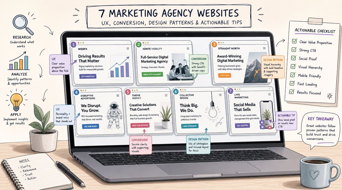
1. ReachLabs.ai

What happens when an agency site sells the operating model before it sells the services? ReachLabs.ai answers that well. The site frames the agency as one coordinated team across digital campaigns, influencer marketing, content, design, investor decks, personal branding, and managed LinkedIn outreach.
That matters because the conversion job here is not just "show what we do." It is helping a buyer see how several overlapping needs can be handled inside one engagement. For founders, executives, and brand-side teams juggling growth, visibility, and positioning at the same time, that structure reduces a common point of friction. They do not have to build the strategy themselves from a list of disconnected offers.
Why the conversion architecture works
The site's strongest move is the way it connects breadth to a clear commercial story. A prospect can quickly grasp that ReachLabs.ai is built for businesses that need acquisition, creative, and authority-building to work together. Many agency websites expand their service lists and lose the plot. This one keeps a unifying thread.
That gives the sales motion a practical advantage. Buyers with multi-part problems often prefer one accountable partner over several niche vendors, but only if the website makes orchestration feel credible. ReachLabs.ai gets close by presenting services as linked functions, not isolated departments.
It also speaks to multiple buyer types without collapsing into vague copy. SMB owners, creators, influencers, and operators can each find an entry point because the services map to recognizable business outcomes.
Practical rule: Full-service positioning only converts when the visitor can tell how the pieces fit together and why that structure improves execution.
Where it's strong and where it leaves questions
The site is strongest when viewed as a consultative funnel. It is designed to start a sales conversation, not settle every objection on the page. That works for custom engagements, especially if the target buyer expects strategy before scope.
There is a trade-off. A consultative site can feel more customized, but it also asks the visitor to commit before seeing hard proof. ReachLabs.ai does not lead with public pricing, detailed case studies, or a heavy layer of quantified outcomes. For some prospects, that is acceptable. For operator-minded buyers comparing several agencies side by side, it pushes more of the trust-building burden into the call.
A useful qualifier is the company's educational content. Its guide on how to choose a digital marketing agency helps prospects clarify fit before they inquire, which can improve lead quality even if it does not remove every objection.
- Strong fit: Buyers who need campaign execution, content, design, and executive positioning to work in one system.
- Less effective for: Prospects who want transparent pricing, public proof, and a lower-friction shortlist process before speaking with sales.
- Strategic takeaway: The site sells coordination well. It could convert more comparison-stage buyers with stronger evidence closer to the top of the funnel.
2. WebFX

WebFX converts with operational confidence. You can feel it in the way the site handles pricing, packaging, and reporting.
Many marketing agency websites try to look premium by hiding the mechanics. WebFX does the opposite. It reduces uncertainty. For a buyer comparing several agencies, that's a serious advantage.
The buying experience is the pitch
Published rate cards and packaged services do more than answer budget questions. They qualify the lead before the first call. If a prospect sees the structure and still engages, they're already more likely to be aligned on scope and expectations.
The other smart move is pairing services with in-house reporting software. That tells buyers they won't just get execution. They'll get a system for reading performance.
Clear pricing doesn't cheapen an agency. It filters out poor-fit leads and shortens trust-building.
That said, productized service design always creates a trade-off. It can make the agency easier to buy, but it can also make highly nuanced engagements feel more standardized than they really are.
Best fit and limitations
- Best for: Companies that want budgeting clarity and broad channel coverage from one vendor.
- Less ideal for: Brands with unusual sales cycles, highly regulated categories, or edge-case technical requirements that don't fit packaged tiers.
I'd also call out the positioning lesson here. WebFX proves that transparency is itself a conversion asset. If you're evaluating options, their structure is a useful counterpoint to more bespoke agencies. It also pairs well with broader buyer education like this ReachLabs.ai piece on how to choose a digital marketing agency, because that's the exact decision context visitors are in.
3. Ignite Visibility

Ignite Visibility is built for prospects who don't want vague optimism. They want a plan, forecast logic, and a path from channel activity to commercial outcomes.
That becomes obvious in how the site frames its services. SEO, paid media, social, email, CRO, creative, and PR aren't presented as isolated disciplines. They're organized like parts of a performance model.
Forecasting changes the sales conversation
The standout differentiator is the agency's certainty-based forecasting approach. Strategically, that matters because it gives buyers a way to discuss expectations before launch instead of debating them after results arrive.
For enterprise and multi-location brands, this is persuasive. Complex organizations often don't need more inspiration. They need predictability, scenario planning, and reporting that survives executive scrutiny. Ignite Visibility's site signals that kind of maturity well.
The best agency sites also know when to bring evidence into view. Public guidance on agency website performance repeatedly points back to measurable case studies with hard business outcomes, including examples like 44% more calls, 205% revenue growth, 100% ROAS, and 1,252% organic lead growth as the kind of quantified proof that sharpens credibility (published case study examples with measurable outcomes). Ignite's approach fits that expectation even when a visitor is still early in the decision process.
Where the site is strongest
- Complex buyer readiness: Good fit for enterprise teams and multi-location organizations.
- Cross-functional trust signals: The site speaks to technical, creative, and executive stakeholders.
- Structured engagement model: Better for buyers who want process discipline than for those seeking a loose, experimental shop.
The main drawback is familiar. Pricing isn't standardized on-site, so the buyer still has to enter a consultative sales flow. If that's your model, the site has to work harder to justify the call. Ignite largely does.
For agencies reviewing their own presentation, ReachLabs.ai's guide to marketing agency design is a useful reminder that visual treatment only works when the commercial logic underneath is clear.
4. Tinuiti

Tinuiti stands out because it doesn't try to be universally relevant. It leans hard into commerce, retail media, marketplaces, and cross-channel performance. That focus makes the site more convincing.
A lot of agency homepages say they're full-service. Tinuiti says, in effect, “we understand how commerce brands grow across retail ecosystems.” That's a stronger sales argument than broad capability language.
Niche authority beats generic scale
Many marketing agency websites often fail because they try to widen the top of funnel by speaking to everyone, then wonder why the message feels thin. Tinuiti narrows the frame. Amazon, Walmart, retail media, CRM, CTV, paid social. A buyer in that world can self-identify quickly.
That matches a broader pattern in agency positioning. Standout agency sites increasingly make niche expertise immediately clear through content architecture, case studies, testimonials, and client logos, but most advice still doesn't quantify which proof points matter most by buyer segment (agency website positioning and niche relevance discussion). Tinuiti benefits from not waiting for a visitor to infer specialization.
If your pipeline depends on one commercial environment, say it early. Specificity raises relevance faster than polished generalism.
The trade-off
Tinuiti's specialization is also the filter. For ecommerce and retail-heavy brands, that's a plus. For a pure B2B software company, the same positioning can feel like overkill or mismatch.
That's not a weakness in the site. It's disciplined segmentation. More agencies should be willing to repel the wrong lead if it helps the right one convert faster.
5. Power Digital Marketing

Power Digital Marketing presents itself like an agency built for executive scrutiny. The site's most persuasive layer isn't the service list. It's the data infrastructure story.
That matters because discerning buyers often aren't choosing between SEO, paid media, email, and creative as separate line items. They're choosing whether a partner can unify those channels into decisions.
The analytics-first framing is the conversion device
The nova platform positioning does important work. It gives the agency a mechanism for talking to CFOs, operators, and private-equity stakeholders, not just marketing leads. That expands the site's persuasive range.
The practical benefit is coordination. A visitor can see that strategy, execution, and reporting are intended to live in the same operating model. That lowers perceived management overhead before the buyer even speaks to sales.
Power Digital also does well on service-stack cohesion. Programmatic, CTV, SEO, lifecycle, CRO, PR, and web can easily read like a bloated menu. Here, the site ties them together through planning and insight language rather than letting each service fight for attention.
What works and what doesn't
- Works well: Executive-friendly positioning, cross-channel integration, and a clear “single partner” story.
- Works less well: Smaller teams may find the analytics emphasis heavier than they need, and pricing remains consultative.
This is a recurring pattern among high-end agencies. The site is optimized less for bargain hunting and more for confidence transfer. If you're the right buyer, that feels efficient. If you want immediate cost comparability, it creates friction.
6. NP Digital

NP Digital benefits from a rare structural advantage. Its thought leadership and agency offer reinforce each other.
That can go wrong if the educational footprint overshadows the service business. On NP Digital's site, it mostly works because the content authority feeds trust into the agency pitch rather than distracting from it.
Brand familiarity shortens the trust curve
For visitors who already know the Neil Patel ecosystem, the site doesn't need to spend as much time proving baseline competence. It can move faster into service breadth, global reach, and cross-channel execution.
That's a useful lesson for agencies building content programs. Content shouldn't just attract traffic. It should pre-sell the operating model. If your blog, guides, and tools build trust, your service pages don't have to carry the full burden alone.
The site is also strong at presenting integrated capabilities across SEO, paid media, content, analytics, creative, and marketplace advertising without making the offer feel fragmented. That's harder than it looks. Many agencies list all the channels they serve, but the visitor still can't tell how the pieces connect.
The main trade-off
NP Digital feels enterprise-ready, which is a positive for larger organizations and a barrier for very small teams. Buyers who want a lightweight relationship may interpret the scale and breadth as more process than they want.
That doesn't weaken the site. It clarifies who it's built to convert. Good agency websites don't just attract leads. They shape expectations before the first meeting.
7. Directive

Directive is the cleanest example on this list of a site built around one commercial thesis. Pipeline matters more than vanity metrics.
That message lands because the rest of the site supports it. The B2B and SaaS specialization, the Customer Generation framing, the RevOps inclusion, and the Stratos platform all point in the same direction.
This is what strategic positioning looks like
Directive's site doesn't waste time trying to persuade every category of buyer. It speaks directly to revenue-focused B2B teams that care about attribution, pipeline quality, and CRM-connected decision-making.
That focus is increasingly important because one of the biggest gaps in agency site design is the tension between creative spectacle and lead-generation clarity. Strong guidance now stresses the need to combine visual storytelling with clear CTAs, easy navigation, responsive design, speed, and friction reduction, rather than assuming more immersive design automatically improves conversions (analysis of agency website design trade-offs). Directive's site gets that balance right. The message does the heavy lifting.
A niche site doesn't need to look narrow. It needs to make the right buyer feel understood within seconds.
Best use case
- Excellent fit: B2B SaaS and technology companies that need marketing tied tightly to pipeline and revenue operations.
- Poorer fit: Pure DTC and broader brand-led engagements where the message may feel too performance-rigid.
Among the best marketing agency websites, Directive is one of the least ambiguous. That's why it converts the right audience well.
Top 7 Marketing Agency Websites Comparison
| Agency | Implementation Complexity 🔄 | Resource Requirements ⚡ | Expected Outcomes ⭐📊 | Ideal Use Cases 💡 | Key Advantages |
|---|---|---|---|---|---|
| ReachLabs.ai | Moderate 🔄 Consultative onboarding, custom program setup | Medium ⚡ Requires dedicated marketing budget and collaboration | ⭐ Focused on leads, brand visibility, authentic engagement | 💡 Marketing pros, SMBs, creators seeking end-to-end content + influencer growth | Specialist-led teams + data-driven ROI |
| WebFX | Low–Moderate 🔄 Packaged services with standardized onboarding | Low–Medium ⚡ Predictable budgets via published rate cards | ⭐📊 Consistent multi-channel performance with transparent reporting | 💡 Organizations needing predictable costs and single-vendor execution | Published pricing + in-house analytics/reporting |
| Ignite Visibility | High 🔄 Enterprise-grade onboarding with forecasting frameworks | High ⚡ Requires enterprise resources and cross-functional teams | ⭐📊 Forecasted ROI and measurable lift for complex programs | 💡 Enterprise or multi-location brands needing scenario planning | ‘Certainty' forecasting + enterprise program delivery |
| Tinuiti | Moderate–High 🔄 Marketplace and retail-media integrations can be complex | High ⚡ Suited to mid-market/enterprise retail budgets and ops | ⭐📊 Strong retail-media-driven sales and marketplace performance | 💡 Commerce-first brands selling on Amazon/Walmart and marketplaces | Deep Amazon/retail expertise + proprietary data/tech |
| Power Digital Marketing | High 🔄 Integrated multi-channel delivery with AI-driven analytics | High ⚡ Needs mature data infrastructure and retainers | ⭐📊 Executive-level unified insights driving optimization | 💡 DTC, B2B, or PE-backed brands wanting advanced analytics | nova AI platform + end-to-end growth execution |
| NP Digital (Neil Patel) | High 🔄 Enterprise processes and discovery-based scoping | High ⚡ Global scale resources and agency execution | ⭐📊 Full-funnel scalable performance across channels | 💡 Brands needing global reach and strong SEO + paid mix | SEO pedigree + integrated paid/creative capabilities |
| Directive | Moderate–High 🔄 Methodical pipeline-focused implementation with RevOps | High ⚡ Requires CRM access, sales alignment, and data readiness | ⭐📊 Attributable pipeline growth and improved attribution | 💡 B2B/SaaS companies prioritizing pipeline and revenue metrics | Customer Generation methodology + Stratos AI + RevOps integration |
Your Blueprint for a High-Performing Agency Website
What separates an agency site that gets admired from one that books qualified conversations?
It usually comes down to conversion architecture. The strongest marketing agency websites coordinate positioning, proof, page flow, and calls to action so a prospect can self-qualify without friction. That is the pattern running through all seven examples in this list.
The winners make a deliberate trade-off. They give up some broad appeal to gain clarity. Tinuiti narrows the story around commerce and retail media. Directive centers pipeline and revenue for B2B teams. ReachLabs.ai, as noted earlier, makes a broader service mix credible by presenting it as a specialist-led system instead of a catch-all agency pitch.
Proof placement matters just as much as message quality. Strong agency sites do not hide case studies in the navigation or treat logos as enough evidence. They place outcomes, client context, and next-step options close together, because that is how buyers evaluate risk. Good copy gets attention. Evidence gets the meeting.
Design still matters, but only when it improves decision-making. A polished homepage can create initial interest, yet it fails if visitors cannot tell who the agency serves, what problem it solves, and how to start a conversation. I see this mistake often. Teams spend heavily on visual identity, then leave the actual buying path vague.
That matters because an agency website often handles first-touch qualification before a salesperson ever gets involved. If the site cannot orient the right visitor fast, the funnel weakens early and every downstream channel becomes less efficient.
Audit your homepage with one standard. Can the right buyer understand the offer, trust the proof, and act on the next step without hunting for answers? If not, the problem is structural, not cosmetic.
For teams refining the content layer behind that journey, these best AI content creation tools can support production. The positioning, proof strategy, and offer design still need human judgment.
If you want an agency partner that combines strategic planning, creative execution, influencer programs, content production, and business-facing assets under one roof, ReachLabs.ai is worth a close look. Its specialist-led model fits brands that need coordinated execution across channels, not isolated campaign delivery.


