
Graphic design for branding blends art and psychology to shape how people perceive a company at a glance. A memorable logo, a harmonious palette, and purposeful typography become powerful signals, guiding expectations and fostering loyalty.
Shaping Brand Perception With Design
Every visual element in your brand’s toolkit acts like that first firm handshake—it sets the tone and sparks an emotional connection. In this guide, we’ll move through six chapters that build on one another:
- Mastering Fundamental Design Principles
- Building Cohesive Brand Assets
- Streamlining Creative Workflows
- Measuring Visual Performance
- Avoiding Common Pitfalls
- Answering Top Branding Questions
Think of this as your blueprint for consistent storytelling. By the end, you’ll know how to craft an identity that resonates at every touchpoint.
Why Visual Signals Matter
Studies show that 93% of information sent to the brain is visual. The global graphic design industry—branding services included—stood at $43.4 billion and is headed toward $11.3 billion in U.S. revenue by 2025. That’s a steady 4.4% CAGR from 2020 to 2027. Meanwhile, the number of design businesses worldwide has climbed to 415,468, an 11.4% rise since 2020, underlining growing demand for strong brand identities.
Learn more in the Graphic Design Statistics at Skillademia.
Visual communication establishes an emotional bridge between brands and audiences.
Key Takeaways:
- Design Is a Strategic Asset That Drives Recognition
- A Clear Roadmap Ensures Consistent Implementation
Now that you see why first impressions hinge on design, let’s begin this journey together starting today.
Understanding Key Design Concepts
Think of graphic design like a building’s framework. You need sturdy beams—in our case, balance, hierarchy, contrast, alignment, and space—to give every layout strength and clarity.
These rules guide the viewer’s eye, shaping how your brand story unfolds. A subtle packaging tweak can move a product from casual to high-end, while a high-contrast header holds attention at first glance.
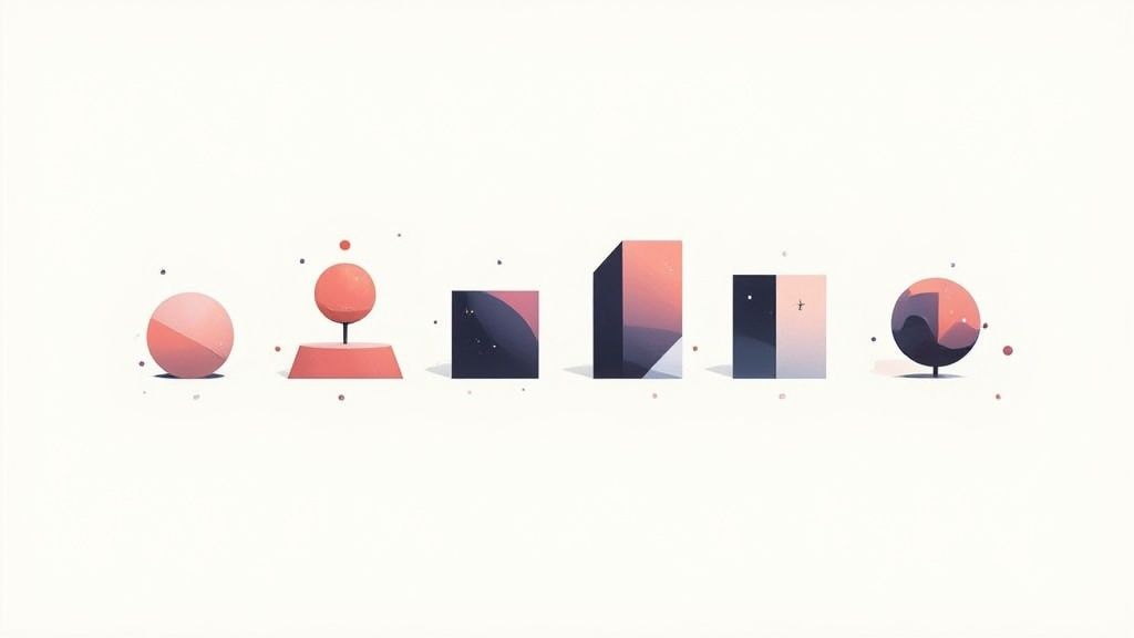
Fundamental Principles
Balance spreads visual weight so nothing feels off-kilter. Hierarchy pulls the eye toward your main message first.
Contrast and alignment define relationships between elements. Space then gives each detail room to breathe.
Treat these principles as your brand’s blueprint. They ensure every touchpoint stays true to your identity.
Design Examples
Imagine magnifying a button’s size and color to make “Shop Now” impossible to miss. Sketching quick thumbnails helps test packaging balance in minutes. On web pages, a tidy grid accelerates scanning speed. These tweaks can deliver a 80% boost in recognition across channels.
- Key Principles Explored: Balance, Hierarchy, Contrast, Alignment, Space
- Platforms Illustrated: Packaging, Headers, Ads
- Metrics Mentioned: 80% recognition lift
Practice Exercises
Sketch five thumbnail layouts to play with balance. Then map out a color-temperature chart to see how warm or cool tones alter mood. Compare your drafts and note how spacing shifts focus. This hands-on work cements concepts faster than any definition.
Check out our article on brand development for insights on visual identity frameworks.
Understanding typography is vital; the right typeface sets tone and legibility. Explore the best sources for fonts for metal signs to see how font choices matter.
Ensuring Consistency
A simple style guide is your north star, listing color codes, margin rules, and font hierarchies. Teams following it trim review cycles by 30% and keep messaging aligned.
- Define Clear Margin Rules
- Lock Primary Color Codes
- Enforce Typography Hierarchies
In one mini case study, a beverage startup adjusted header hierarchy and enjoyed a 15% lift in ad engagement. Small shifts in alignment or spacing, applied consistently, can transform perception. Master these basics and you’ll build a rock-solid visual identity that sticks.
What’s Next
Look at a skincare label that leaned into negative space as a luxury cue, and you’ll see site dwell time climb 20%. These clear visual markers make navigation feel intuitive and your brand impossible to forget.
Onward to Building Core Brand Assets where we apply these rules to logos, palettes, and typography.
See how logos, color systems, and typography form the essential building blocks of your brand.
Quick Tip
Rotate simple shapes in your sketches to test symmetry. Notice how balance and attention flow change.
Small shifts in contrast can boost readability and engagement.
Test your layouts in grayscale and on varied screens. You’ll uncover hidden hierarchy issues before they reach an audience.
Building Core Brand Assets
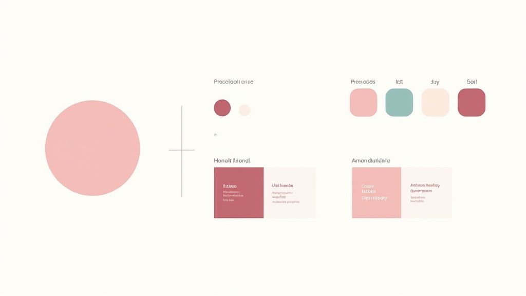
Think of your brand's visual identity as its wardrobe. It's the collection of elements—logos, colors, fonts, and images—that work together to express its personality and make it instantly recognizable. When these assets are harmonized, they don't just look good; they build trust and make your brand unforgettable.
Logos: Your Brand’s Signature
A logo is much more than a pretty picture; it’s the face of your company. It’s the single most powerful tool for instant recall, and its impact on the bottom line is very real. In fact, 68% of businesses credit consistent branding with a revenue increase of 10%–20%.
The numbers speak for themselves. A staggering 75% of consumers say they recognize a brand by its logo alone, which is why getting this one symbol right is so crucial. When that logo is used consistently across every platform, from your website to your social media, it can boost revenue by an incredible 23%. To protect that power, it's vital to enforce strict rules around clear space and color usage so the logo's impact is never diluted.
Color Palettes and Typography Systems
Color is a language without words. It sets a mood, triggers emotions, and creates a seamless experience for your audience. A well-chosen palette isn’t just about picking your favorite colors; it's a strategic decision that considers cultural context, emotional resonance, and, of course, legibility.
Typography, on the other hand, is your brand's voice. The fonts you choose dictate whether your brand sounds authoritative, friendly, modern, or traditional. A solid typography system establishes a clear visual hierarchy, guiding the reader’s eye and making your message easy to digest.
- Mood boards are perfect for connecting color swatches to the emotional vibe you're aiming for.
- Color explorations let you test how different combinations look in real-world scenarios, both on-screen and in print.
- Font pair testing is all about finding that perfect harmony between your headlines and body text.
Iconography and Photography Styles
Icons are visual shorthand. They take complex ideas and distill them into simple, universally understood symbols that help users navigate and understand information in a split second. Similarly, a distinct photography style—defined by consistent filters, subjects, and framing—tells a compelling story and adds a layer of authenticity.
Creating templates for both icons and photos is a smart move. It streamlines content production and ensures that every image, no matter who creates it, feels like it came from the same brand.
To pull these concepts together, it's helpful to see how each asset functions within the larger system. This table breaks down the purpose and key considerations for each core component of your brand's visual identity.
Comparison of Core Brand Assets
| Asset Type | Purpose | Key Considerations |
|---|---|---|
| Logo | Establishes the core identity and acts as a signature. | Scalability for all sizes, clear space rules, and consistent color usage. |
| Color Palette | Evokes specific emotions and ensures brand consistency. | Psychological impact, accessibility (contrast), and mood alignment. |
| Typography | Creates a consistent voice and visual hierarchy. | Legibility across devices, harmonious font pairings, and clear usage rules. |
| Iconography | Simplifies complex information and aids navigation. | Visual clarity at small sizes, stylistic uniformity, and intuitive design. |
| Photography | Tells the brand story and builds an emotional connection. | Consistent composition, defined editing style (filters), and high resolution. |
Seeing the assets laid out like this clarifies their individual roles and helps you prioritize where to focus your efforts first. Combining palette tests with real photos and icon sketches in a mood board is a fantastic way to develop a cohesive visual direction from the get-go.
And as you build these assets, don't forget where they'll live. Extending your branding across channels requires a strategic approach, which you can explore further in our guide on how graphic design assets perform on social media.
Brand guidelines are the blueprint that keeps every visual element aligned.
Documenting Rules in a Brand Guide
A brand guide, or style guide, is your rulebook. It's a central document that details exactly how to use your logo, which color codes to apply, what the font hierarchy is, and how to treat imagery. This isn't about limiting creativity; it's about empowering your team to create with confidence.
By including clear "do" and "don't" examples, you can prevent common mistakes and ensure every asset produced is perfectly on-brand. For businesses with a physical presence, this consistency is just as important in the real world. A cohesive storefront experience starts with mastering store signage design to create an inviting and instantly recognizable space.
Action Plan for Cohesive Assets
Getting started doesn't have to be overwhelming. A structured approach ensures every asset you create aligns with your brand's core values from day one.
- Gather inspiration. Collect examples of visuals that resonate with your brand's personality.
- Build mood boards and style tests. Experiment with colors, fonts, and imagery to find the right feel.
- Create asset templates. Design reusable templates for social media posts, presentations, and other common collateral.
- Compile the brand guide. Document all your rules and decisions in one accessible place.
- Train your teams. Make sure everyone who creates content understands and follows the guidelines.
Flexibility and Adaptation
A great brand identity isn't rigid—it's flexible. Your assets need to look just as good on a tiny smartphone screen as they do on a massive billboard. This means designing systems that can adapt without losing their integrity.
- Responsive logos ensure your mark is legible no matter the size.
- Secondary color palettes give you flexibility for seasonal campaigns or special promotions while staying on-brand.
The digital world is always changing, so it's smart to regularly review your assets and update your guidelines. One startup, for instance, made a small tweak to its logo's spacing and saw a 10% jump in click-through rates almost overnight.
These results prove that thoughtful graphic design isn't just about making things look good; it directly influences how people perceive and interact with your brand. By prioritizing your core assets and documenting the rules, you give your team the tools they need to make your brand's voice clear, consistent, and unmistakable.
Getting from Idea to Impact: The Design Process and Collaboration
A great brand identity doesn’t just appear out of thin air. It’s the result of a deliberate, structured process that guides teams from a simple creative brief all the way to the polished final designs.
Think of it as building a house. You wouldn't just start laying bricks without a blueprint. Each phase, from initial research to detailed prototypes, is about building clarity and ensuring every design choice is consistent and on-brand. Just as crucial is collaboration—getting marketers, copywriters, designers, and key decision-makers on the same page from day one.
So, what does that journey look like? It typically breaks down into a few key steps:
- Creative Brief: This is the foundation. It clearly outlines the project's goals, who the audience is, and the brand's unique tone of voice.
- Market Research: Before sketching anything, you need to understand the landscape. This means looking at competitors, spotting industry trends, and really digging into the target audience's needs and wants.
- Wireframes: These are the skeletal layouts. For a website or a brochure, wireframes map out where everything goes and how information flows, long before any color or imagery is added.
- Prototype Mockups: Now we're adding flesh to the bones. Wireframes evolve into visual drafts that start to look and feel like the real thing, allowing for interactive testing.
- Final Assets: This is the finish line. The team delivers everything needed to bring the brand to life: logos, style guides, templates, and all the files ready for production.
From Brief to Final Polish: Workflow Stages
At the very beginning, a solid brief is everything. It sets the scope of the project and defines what success will look like, preventing a lot of headaches down the road.
From there, the wireframing stage is all about structure. It lets the team test the hierarchy and layout of information without getting distracted by colors or fonts. Once the blueprint is solid, prototypes bring it to life, giving everyone a chance to weigh in on user experience, interactions, and whether the design truly captures the brand's voice.
Throughout this process, using tools with built-in version control is a lifesaver. It keeps everyone on the same page and avoids the classic "which version is the final one?" nightmare.
When collaboration works well, it’s magic. Approvals happen faster, and the team spends less time on rework and more time creating.
Here’s a real-world example: A fintech startup was struggling with endless design revisions. By implementing staged milestones and holding quick weekly check-ins between the design and marketing teams, they cut their revision cycles by a whopping 40%. Every decision was logged on a shared board, which put an end to conflicting feedback.
The Tools of the Trade
Today’s design work is all about seamless collaboration. Designers often live in tools like Adobe Creative Cloud or Figma, which are built for real-time teamwork.
These platforms aren't just for creating—they’re for collaborating. Features like live commenting, shared asset libraries, and instant updates mean the entire team can see progress as it happens.
This screenshot gives you a peek into how Illustrator's cloud libraries work. By sharing assets like logos, color palettes, and icons, everyone stays on-brand, whether they're designing a social media graphic or a new webpage.
| Tool | Strengths | Best For |
|---|---|---|
| Adobe CC | The industry standard, with an 80% market share. | Complex illustrations and print-ready designs. |
| Figma | Incredible real-time collaboration right in your browser. | Rapid prototyping and gathering quick feedback. |
Feedback Loops, Design Sprints, and Staying on Track
To keep a project from going off the rails, you need regular feedback cycles. This avoids any nasty surprises late in the game and ensures the design work stays aligned with the overall strategy.
One of the best ways to do this is with a design sprint. A typical sprint is a focused, week-long effort that moves from brainstorming and sketching to prototyping and review. It’s a fantastic way to balance creative exploration with the practical constraints of budgets and deadlines.
A good sprint needs a clear agenda, timed sessions to keep things moving, and concrete action items at the end. To make them even more effective:
- Schedule a kickoff meeting, a midpoint review, and a final walkthrough.
- Use simple templates for comments to keep feedback specific and actionable.
- Assign priority levels (e.g., "must-have" vs. "nice-to-have") so the team knows what to tackle first.
And once you have those designs locked in, you’ll want to know how to create robust brand guidelines to keep everything consistent.
Getting Past Common Bottlenecks
We’ve all been there: a project stalls because stakeholder feedback is vague, contradictory, or just… late.
A great way to prevent this is to assign a single person to facilitate reviews and to use structured templates for comments. Quick check-in meetings can also help, as can consolidating all feedback into one annotated mockup so everyone can see the requested changes in context.
A few practical tools can make a huge difference:
- A feedback matrix: A simple spreadsheet listing requested changes, who requested them, and who is responsible for making them.
- A status dashboard: A visual way to track where each design is in the review process and what the deadlines are.
- Version tags: Clearly labeling major milestones (e.g., "V1_ClientReview," "V2_Final") to eliminate file confusion.
The demand for this kind of strategic design work isn't slowing down. Between 2023 and 2033, the graphic design market in the U.S. is expected to grow by about 2%, adding around 6,600 jobs. The North American market is already worth over $19.65 billion, with the average designer earning about $31.01 per hour. You can dive deeper into these industry stats on Exploding Topics.
Measuring What Matters: Progress and Impact
How do you know if your design process is actually working? You track it. Measuring both speed and quality is key.
Important indicators include how long it takes to get approvals, how many revision cycles a design goes through, and how satisfied stakeholders are with the process. You can also connect design work directly to business results by using analytics tools in your marketing campaigns to see how design changes affect user engagement.
- Test logo recall in customer surveys to see if your branding is memorable.
- Monitor click-through rates on visual ads to see which designs drive action.
- Analyze feedback turnaround time to spot and fix bottlenecks in your sprints.
One team I know increased their approval speed by 25% just by implementing a simple feedback dashboard that showed everyone where things stood.
By connecting progress metrics to clear goals, teams can see what’s working, justify their design investments, and give stakeholders the confidence that every visual choice is strengthening the brand's impact. It’s a data-informed approach that allows you to adapt quickly and make sure your brand always puts its best foot forward.
Measuring Branding Impact
So, you've invested in a killer visual identity. How do you know it's actually working? Measuring the impact of your branding isn't just about feeling good about your designs; it's about connecting creative work to tangible business results. It’s the only way to truly prove the ROI of your graphic design efforts.
Key Metrics To Track
When we talk about impact, we're really looking at a few core areas. Are more people aware of your brand than before? Can they recall your logo when prompted? Do your visual campaigns actually get people to stop scrolling and interact? Most importantly, are those visuals influencing people to take action, like signing up or making a purchase?
Here are some practical ways to get those answers:
- Use brand lift studies to get a clear before-and-after picture of awareness.
- Run simple recall tests in surveys to see if people remember your logo—strong brands see recall rates of over 73%.
- Dive into your analytics dashboards to track click-through rates (CTR) on visual ads.
- Keep an eye on social engagement—likes, shares, and comments on your visual posts tell you what's resonating.
Gathering Quantitative Data
Numbers don't lie. Analytics platforms like Google Analytics are your best friend here, giving you hard data on how your visual assets perform. You get a direct look at impressions, CTR, and how long people stick around on a page.
This data is incredibly powerful. It means you can A/B test different images, tweak a button color, or adjust a layout and see the results almost immediately. We've seen a small ecommerce brand boost its CTR by 15% just by changing a button color. Another client saw a 22% increase in time on page after a simple layout adjustment. These aren't just vanity metrics; they're direct feedback telling you how to refine your designs for better performance.
Qualitative Feedback And Surveys
While numbers tell you what is happening, qualitative feedback tells you why. Surveys and direct feedback are fantastic for getting a read on the tone and emotional sentiment your visual assets evoke.
A great tactic is to ask participants to describe your logo's personality using a list of adjectives. This simple exercise can uncover surprising gaps between the message you think you're sending and what people are actually receiving.
"Visual design that resonates emotionally drives loyalty." – Jenna Lee, Marketing Expert
You can also use social listening tools like Sprout Social to monitor conversations on platforms like Twitter or Instagram. This gives you a raw, unfiltered look at how customers feel when you launch a new logo or campaign.
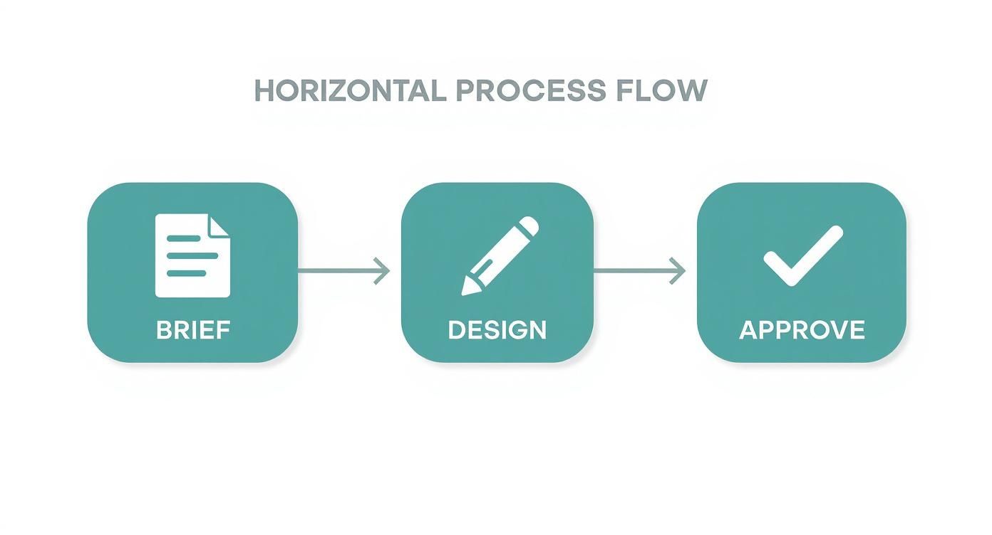
The infographic above illustrates how teams can streamline their creative process, moving from brief to design to approval. Clear workflows like this are essential because they prevent delays and endless revisions, allowing teams to focus on creating and measuring impactful work.
Connecting Metrics To Tools
To get a complete picture, you need to combine different metrics and the right tools for the job. Here's a quick breakdown of what that looks like in practice.
| Key Metrics for Branding Impact | ||
|---|---|---|
| Metric | Purpose | Measurement Method |
| Brand Awareness Lift | See if more people in your target audience recognize your brand over time. | Run pre- and post-campaign surveys using tools like Google Surveys. |
| Logo Recognition Rate | Test how easily people can identify your brand from your logo alone. | Use simple visual quizzes or recall tests in platforms like Typeform. |
| Visual Engagement Rate | Understand which visual assets capture audience attention and encourage interaction. | Track likes, shares, comments, and saves on social media management platforms. |
| Conversion Influence | Connect specific design elements to user actions like clicks, sign-ups, or sales. | Set up goals and conversion tracking in your web analytics platform. |
By grounding your creative decisions in data, you can stop guessing and start knowing which assets are performing well and which ones need a little more work.
Putting Data Into Action
Collecting data is only half the battle. The real magic happens when you use it. Get your designers and marketers in the same room every week to review the numbers and decide on next steps.
A simple, structured process works best:
- Identify which metric is lagging behind. Is CTR on an ad low?
- Brainstorm a specific design fix. Maybe the call-to-action needs more contrast, or the layout is too busy.
- Run an A/B test with the new version against the original.
- Analyze the results and repeat the process.
This feedback loop ensures your brand's visual identity isn't static. It evolves based on real audience preferences, turning your creative output into a reliable engine for growth.
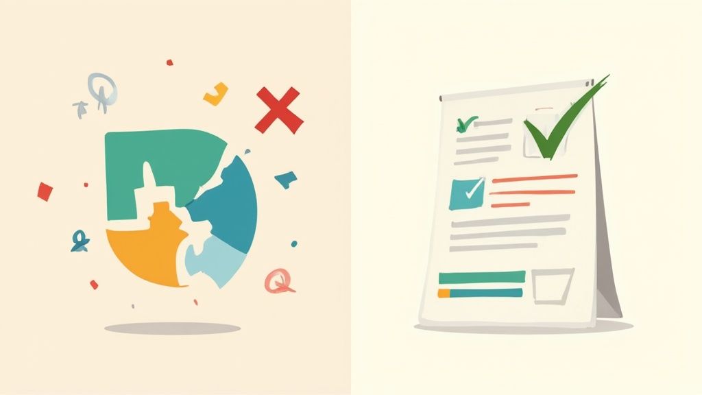
Common Design Mistakes to Avoid
Even with the best intentions, it's easy to fall into design traps that can slowly but surely chip away at brand trust. Think of your visual identity like a delicate ecosystem—one wrong move can throw the whole thing out of balance. Great graphic design for branding isn't just about making things look good; it's also about knowing what not to do.
Many brands stumble over what seem like minor slip-ups: a stretched logo on a social media banner, a hard-to-read font on a new webpage. These little mistakes add up, creating a sense of sloppiness that tells customers you don't care about the details. The good news is, with a bit of awareness and some solid guidelines, most of these pitfalls are entirely avoidable.
Overlooking Inconsistency
By far the most common branding blunder is letting your visual assets run wild. This is what happens when someone on the team squashes the logo to fit a space, grabs a "close enough" color, or uses a random font because it was the default. Each of these small compromises dilutes your brand's power. Over time, that kind of inconsistency can slash revenue by up to 23%.
The antidote is a rock-solid brand style guide. It’s not just a nice-to-have; it's the official rulebook for your visual identity, spelling out exactly how to use your logo, what the color codes are, and which fonts to use where.
A brand guide doesn't stifle creativity. It sets the boundaries so your team can create with freedom and consistency, knowing they're always on-brand.
Disregarding Typography and Readability
Picking a font just because it looks "cool" is a classic mistake. If your audience has to squint or struggle to read your message, you've already lost them. Bad typography—fonts that are too small, have poor color contrast, or are just too fancy—creates friction. And when things are difficult, people just move on.
Readability should always be your top priority. Make sure your text is clear and effortless to read on a phone, a desktop, and everything in between. Test your font choices in actual designs, not just in a dropdown menu.
Common Preventative Strategies
Keeping your brand looking sharp as you grow requires a proactive approach. A few simple habits can help you dodge the most common design bullets and maintain a strong, coherent identity.
- Build a comprehensive style guide: This is your brand's bible. Document everything—logo clear space, primary and secondary color palettes, font hierarchies, the works.
- Schedule regular design audits: At least once a quarter, do a sweep of all your marketing materials. Hunt down and fix any inconsistencies that have slipped through the cracks.
- Create simple testing protocols: Before a new design goes live, check it on different devices. Get a few fresh eyes on it. This small step can catch huge usability problems before they see the light of day.
Common Questions Answered
Diving into graphic design for your brand can feel like a big undertaking, and it's natural to have questions. Let's tackle some of the most common ones that pop up when teams start building their visual identity.
How Do I Choose the Right Colors and Fonts?
This is all about getting to the heart of your brand's personality and who you're trying to talk to. Before you even think about specific shades or typefaces, ask yourself: What feeling do we want to evoke? Are we serious and professional, or are we vibrant and playful?
Once you have that figured out, you can start exploring. Look into basic color psychology—blue often conveys trust, while yellow feels optimistic. The same goes for fonts; a sharp serif font feels traditional and established, whereas a clean sans-serif can feel modern and approachable. The key is to experiment. Create a few mood boards, test combinations, and see what truly feels like you.
What Actually Goes Into a Brand Style Guide?
Think of a style guide as your brand's rulebook. It's the one document everyone can turn to for a straight answer on how to use your visual assets, ensuring everything looks consistent, no matter who creates it.
A solid guide should always include:
- Logo Rules: Clear instructions on how to use the logo, including minimum sizes, spacing requirements, and variations.
- Color Palette: The exact color codes (hex, RGB, and CMYK) for your primary and secondary colors. No guesswork allowed.
- Typography System: The specific fonts for headlines, body text, and captions, along with size and weight guidelines.
- Image Guidelines: Direction on the style of photography or illustration that fits your brand.
- Voice and Tone: A quick guide on how the brand should sound in writing, which complements the visual style.
The best guides include simple "do this, not that" examples. It’s the easiest way to prevent someone from stretching your logo or using a color that's just a little bit off.
A great style guide isn't about limiting creativity; it's about building a strong, recognizable brand. It empowers your entire team to be consistent, which is how you build trust and recognition over time.
How Can We Tell If Our Visual Branding Is Working?
Measuring design's impact is less about feelings and more about connecting visuals to business results. You can track concrete metrics to see what’s resonating with your audience. Start by measuring brand recall and logo recognition with simple customer surveys.
On digital platforms, keep an eye on engagement for your visual posts or the click-through rates on visually-driven ads. It's also smart to mix this hard data with qualitative feedback. Ask people what they think and how your visuals make them feel. This combination of numbers and human insight will show you exactly what's working and where a small design tweak could make a big difference.
Ready to build a brand that not only looks great but also delivers real results? The team at ReachLabs.ai blends creative design with smart strategy to craft brand identities that people remember. Let's build your visual story together. Visit us at https://www.reachlabs.ai to get started.

