A visual brand identity is the sum of all the design elements a company uses to paint a picture of itself for the world. Think of it as your company's signature style. It's how people recognize you in a split second, long before they've read a single word or figured out what you do. It's a system of visual cues that quietly communicates your personality, your values, and your promise.
Understanding Your Brand's Visual Language
Think about meeting someone new. You automatically register their clothes, their haircut, even the way they carry themselves. All these little details combine to create a distinct impression, giving you a sense of who they are. A visual brand identity does the exact same thing for a business. It’s the consistent look and feel that makes you unmistakable.
These elements aren't just for show; they're powerful strategic tools. They're designed to work together, creating a unified system that signals what your brand is all about.
Your visual brand identity isn’t just what your audience sees; it’s what they feel. It’s the silent ambassador that works around the clock to build trust, convey quality, and create an emotional connection with your customers.
This system is built from several core components, and each one plays a specific part in shaping how people perceive you. While the logo often gets all the attention, it’s really the harmony between all the elements that creates a truly magnetic identity.
Why a Cohesive Visual System Matters
Let's face it, the market is crowded. Standing out is tough. A strong visual brand identity is your best bet for cutting through that noise. In fact, research shows that a staggering 55% of a brand’s first impression is based entirely on its visuals. That's a snap judgment made in milliseconds as someone scrolls through a feed or skims a webpage. You can dig deeper into how these quick impressions are formed with these branding statistics from dash.app.
When done right, a well-defined visual identity achieves a few critical goals for your business:
- Builds Instant Recognition: Consistent visuals make your brand familiar. People can spot you easily, whether it's on your website, a social post, or a billboard.
- Creates Trust and Credibility: A professional, unified look sends a clear signal: you're established, you're reliable, and you care about the details.
- Communicates Your Brand Personality: Are you fun and high-energy? Or are you more sophisticated and buttoned-up? Your colors, fonts, and images tell that story for you.
- Differentiates You from Competitors: A unique visual style stops you from blending into the background. It helps you carve out your own space in the market.
Ultimately, a strong visual identity ensures that every time a customer interacts with you—from an Instagram ad to a sales presentation—they get the same clear, consistent message. That consistency is what great brand experiences are built on.
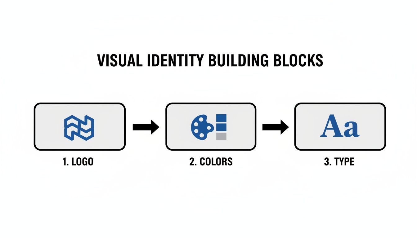
The Building Blocks of a Strong Visual Identity
A strong visual identity doesn't just appear out of thin air. It's a system, meticulously crafted so that every single component works together to tell the same compelling story. Think of it like a band—the guitarist, drummer, and vocalist are all unique, but their real magic happens when they're all playing in sync.
These core elements are the foundation of how your brand shows up in the world, communicating its essence without uttering a single word. Getting them right is the key to building a brand that people remember and trust.
Before we dive into each component, let's get a high-level view of how these pieces fit together. Each one serves a distinct strategic purpose, from grabbing attention to building an emotional connection.
Table: Core Elements of a Visual Brand Identity
| Component | Primary Function | Key Consideration |
|---|---|---|
| Logo | Instant Recognition | Must be simple, scalable, and memorable. |
| Color Palette | Emotional Connection | Colors evoke feelings; choose a palette that reflects your brand’s personality. |
| Typography | Brand Voice & Tone | The fonts you use give your words character—are they bold or refined? |
| Imagery | Storytelling | Photos and illustrations show your brand’s world and values in action. |
| Iconography | Simplifying Information | Icons act as a universal shorthand, guiding users and clarifying concepts. |
Each of these elements plays a vital role. When they're all aligned, they create a cohesive and powerful brand presence that resonates with your audience on a much deeper level.
The Logo: The Cornerstone of Recognition
Your logo is the face of your brand. It’s the visual anchor, the signature, and often the very first thing a potential customer sees. A great logo is far more than a pretty picture; it's a strategic tool that needs to be simple, memorable, and incredibly versatile.
Look at Apple's iconic bitten apple. It's recognized instantly across the globe and manages to convey sophistication and ease all on its own. It works perfectly on a giant billboard and just as well as a tiny app icon. Your logo is the visual shorthand for everything your company stands for, making it the most critical piece of the puzzle.
A logo is the face of your brand. It must be distinct and adaptable, serving as the constant visual thread that ties all your marketing efforts together, from a business card to a Super Bowl ad.
Color Palette: The Emotional Trigger
Color is one of the most powerful tools in your non-verbal communication kit. The colors you choose can trigger specific emotions, shape how people perceive your brand, and even drive purchasing decisions. It’s a proven fact: color can boost brand recognition by up to 80%.
Think about the cheerful, optimistic yellow of Mailchimp—it makes the brand feel friendly and easy to use. Now contrast that with the deep, serious blues used by financial institutions like Chase Bank to signal security and trustworthiness. A well-chosen color palette ensures consistency and forges an immediate emotional link with your audience.
Your palette should have a clear structure:
- Primary Colors: These are your one to three main colors. They'll be the most dominant and are what people will most associate with your brand.
- Secondary Colors: These colors complement your primary hues. Use them to highlight important info, add some visual flair, and give your designs depth without stealing the show.
- Neutral Colors: Think shades of white, gray, and black. These are essential for creating balance and breathing room, making sure your text is readable and your primary colors really pop.
Typography: The Voice of Your Brand
If the logo is your brand's face, typography is its voice. The fonts you select say a tremendous amount about your brand's personality. Are you modern and minimalist? Or are you traditional and elegant? Typography gives your written words character, turning plain text into a branding powerhouse.
A solid typography system creates a clear visual hierarchy, which makes your content a breeze to read and navigate. You should set clear guidelines for different font weights and sizes for everything—headlines, subheadings, body copy, and calls-to-action. This guarantees that every piece of content, from your website to a formal report, speaks with one consistent, recognizable voice. If you want to dig deeper into creating this kind of unity, check out our guide on graphic design for branding.
Imagery and Photography: The Storyteller
The images you use—be they photos, illustrations, or graphics—are your brand’s storytellers. They offer a peek into the world of your brand, showing your products in real-life situations, highlighting your team culture, or breaking down complex ideas into something people can grasp instantly.
Your imagery needs a consistent style that aligns with your brand’s overall personality. A brand like Nike, for instance, uses powerful, action-packed photos of athletes to inspire and motivate. This is a world away from a brand like Headspace, which uses charming, simple illustrations to evoke a sense of calm and approachability. Defining your unique imagery style ensures every visual you share is another chapter in the same cohesive story. To do this well, you need to understand the fundamentals. For example, learning the key design principles for banners can show you how these elements come together in a real-world application.
Iconography and Other Visual Elements
Beyond the big four, smaller visual touches like icons, patterns, and textures add another layer of personality and usefulness to your brand identity. Icons are brilliant for simplifying complex information and guiding people through a website or app. They're a universal language that improves usability while reinforcing your brand’s aesthetic.
In the same way, custom patterns or textures can be used for backgrounds on your website, social media posts, or product packaging to add depth and create a look that is uniquely yours. These supporting details are the finishing touches that pull the entire system together, making your brand truly distinct at every single touchpoint.
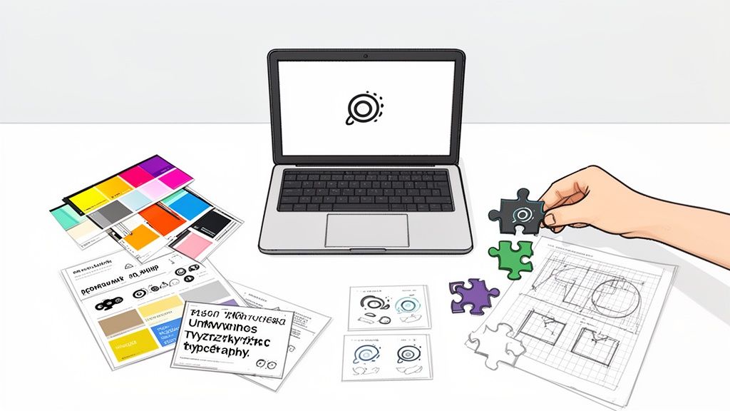
How to Create Your Visual Brand Identity Step by Step
Building a killer visual identity isn't about a random stroke of creative genius. It's a deliberate process, a structured journey that takes your brand’s big ideas and turns them into something people can actually see and recognize. Think of it as a roadmap that ensures every visual choice you make has a real purpose behind it.
Following a clear framework helps you sidestep the common trap of designing in a vacuum. This process connects your mission directly to the colors, fonts, and images that will represent you out in the wild, creating an identity that doesn’t just look good, but works hard for your business.
Step 1: Define Your Core Brand Strategy
Before you even think about colors or logos, you have to nail down your brand's foundation. This is the absolute, non-negotiable first step. Your visual identity isn’t just art—it’s a communication tool built to express your strategy. Without that strategy, your visuals are just decoration with no direction.
Start by getting crystal clear on these questions:
- What's our mission? Beyond making money, why do we exist?
- Who are we talking to? Get specific about your target audience—their demographics, what makes them tick, and what problems they need solved.
- What's our brand personality? If your brand was a person, what three words would describe it? (e.g., Confident, innovative, approachable).
- What's our secret sauce? What do we offer that no one else does?
This strategic groundwork becomes the creative brief for everything that follows, ensuring every design decision pushes your core goals forward. For a deeper dive into this foundational work, check out our complete guide on how to create a brand identity.
Step 2: Conduct a Competitive Visual Audit
Once you know who you are, it's time to see who you're up against. A competitive audit helps you map out the visual landscape of your industry. The goal here isn't to copy what others are doing, but to find your own space to stand out.
Pick three to five of your key competitors and analyze their visual identities. Look for patterns. Are they all using shades of blue to look trustworthy? Is everyone leaning on bold, modern fonts? This exercise will quickly show you the visual clichés to avoid and the gaps you can strategically fill.
Step 3: Develop a Distinct Mood Board
A mood board is where your abstract brand personality starts to become a tangible aesthetic. It's basically a visual collage—a collection of images, textures, color palettes, and fonts that, together, create the exact look and feel you're aiming for.
This step is the bridge between your strategy and the actual design work. It gets all your stakeholders on the same page about the creative direction before you invest a ton of time and money. The mood board becomes your visual north star, guiding every asset you create.
A mood board is more than just a collection of pretty pictures. It's a strategic tool that validates your creative direction, aligns your team, and sets the emotional tone for your entire visual brand identity.
Step 4: Design the Core Visual Components
Alright, now it’s time for the fun part: designing the foundational elements of your visual identity. Guided by your strategy and your mood board, this is where the building blocks of your brand come to life.
These core components are the workhorses that will do the heavy lifting for your brand recognition.
Each element—the logo, colors, and typography—has to be designed to work in harmony with the others. Together, they create a versatile and consistent visual language.
Don’t underestimate the power of these elements. Research shows that 60% of consumers will actually avoid brands with unappealing logos, even if they have good reviews. This just goes to show how critical a well-designed identity is for getting and keeping customers.
Step 5: Document Everything in Brand Guidelines
The final, and arguably most important, step is to write it all down. Brand guidelines (or a style guide) are the official rulebook for how your visual identity should be used. This document is what ensures you look consistent everywhere, from your website to a quick social media post.
Your guidelines should give clear, simple instructions on:
- Logo usage: Rules for clear space, minimum size, and definite "don'ts."
- Color palette: The exact HEX, RGB, and CMYK values for all your brand colors.
- Typography: The font hierarchy, including which weights and sizes to use for headlines, body copy, etc.
- Imagery style: Guidelines for photography and illustrations to keep the vibe consistent.
As you put it all together, learning how to create a style guide is the key to long-term success. This documentation turns your visual identity from a collection of files into a scalable, manageable system that empowers your entire team to represent the brand perfectly every time.
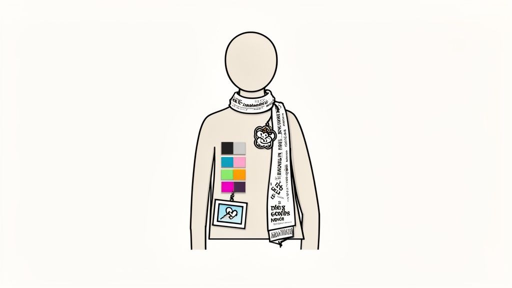
Applying Your Visual Identity Across Every Channel
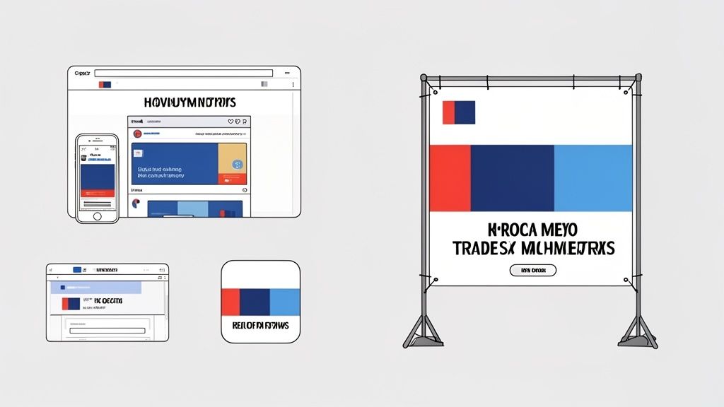
A killer visual identity is useless if it just sits in a folder. Designing the perfect logo and color palette is really just step one. The real magic happens when you apply those elements with relentless consistency everywhere your audience sees you.
Think of it like a uniform—it only works if everyone wears it the same way, every single time. This isn't just about looking buttoned-up. It's about building a predictable, trustworthy experience that subtly reinforces who you are at every turn. When customers see the same fonts, colors, and logo on your website, in their inbox, and on their social feed, they start to recognize and trust you.
This discipline isn't just a "nice-to-have," either. It directly impacts your bottom line. Brands that keep their look and feel consistent across all platforms see an average 33% increase in revenue. That's a huge lift, proving that a smart, consistent visual strategy is a powerful engine for growth.
Your Website: The Digital Flagship
Your website is ground zero for your visual identity. It's your digital storefront, your central hub, and where people will spend the most time with your brand. Every single pixel needs to be on-point.
- Logo Placement: Keep your logo in a consistent spot, usually the top-left corner of the header, and make sure it links back home. Don't sleep on the favicon—that tiny icon in the browser tab is a small but mighty piece of brand real estate.
- Typography Hierarchy: Stick to your defined font styles for headings (H1, H2, H3), body copy, and buttons. This does more than just look good; it improves readability and guides the user through the page.
- Color Usage: Use your primary and secondary colors with purpose. They should draw the eye to the most important things, like calls-to-action and navigation links. Your neutral colors are there to create a clean, uncluttered backdrop that lets your main brand colors pop.
Social Media Profiles: A Cohesive Feed
Social media moves fast, but that's no excuse to get sloppy. Each of your profiles should feel like an unmistakable extension of your brand, even if the format is different.
You need to adapt your visual identity to fit the unique quirks of each platform while keeping the core vibe intact. This means using your official logo or a simplified brand mark for profile pictures and designing cover photos that ooze your brand's personality. Every image, video, and graphic you post should use your color palette and fonts, creating a unified feed that stops people from scrolling right past you.
If you're looking for a blueprint on how to document these rules, our guide on how to create brand guidelines is the perfect place to start.
Email Campaigns and Sales Decks
Your direct lines of communication—think email newsletters and sales proposals—are critical moments to reinforce your brand. These are often the channels where you're asking for a sale or a commitment, so building trust through visual consistency is non-negotiable.
Every email sent and every presentation delivered is an opportunity to strengthen your brand. Inconsistent visuals in these high-stakes moments can create a subtle sense of disorganization, undermining the very trust you’re trying to build.
Use branded templates for all your email campaigns, making sure the header, footer, and CTA buttons are all aligned with your visual identity. Likewise, every sales deck should come from a master template that locks in your logo, colors, and fonts. This empowers your sales team to always present a polished, unified front, ensuring that no matter how someone interacts with you, they get the same reliable brand experience.
How to Keep Your Visual Brand Sharp
Think of your visual identity as a garden, not a statue. You can't just create it once and expect it to stay perfect forever. It needs regular attention to thrive. If you let it go, even the most beautiful design can get messy, outdated, or just plain inconsistent, which chips away at the trust you've built with your customers.
Keeping your brand in good shape means it stays relevant and continues to help your business grow. This involves a simple rhythm: measure how it's performing, keep things consistent, and make smart updates when needed. This isn't about micromanaging your team; it's about giving them the tools to protect a hugely valuable company asset.
Is Your Visual Identity Actually Working?
So, how can you tell if your visuals are pulling their weight? You have to get past "I think it looks good" and dig into what the data says. Measuring the real-world impact of your branding tells you what’s connecting with people and what’s falling flat.
Here are a few straightforward ways to measure this:
- Brand Recall Tests: Can people pick your logo or brand style out of a lineup? Run simple surveys. If they can, you know your identity is memorable enough to cut through the clutter.
- A/B Test Your Visuals: This is perfect for digital marketing. On your website or in an ad, test two versions of a button—one in your main brand color, one in a secondary color. See which one gets more clicks. This gives you hard proof of how specific visual choices affect what users do.
- Check Social Media Engagement: Look at the shares, saves, and comments on your visual posts. Are the posts that stick to your brand guidelines getting more love than the ones that go off-script? This is a great way to see if your audience notices and appreciates a consistent look.
How to Maintain Your Brand for the Long Run
Once you know what's effective, you need a system to keep it that way. This is all about brand governance—basically, setting up rules of the road so that staying on-brand is the easy choice, not a chore.
A brand without clear guidelines is like a ship without a rudder. It might look impressive tied to the dock, but it's going to drift aimlessly once it's out on the open water, confusing customers and losing value.
To keep everything consistent and under control, put these practices into place:
- Build a Central Asset Library: This is non-negotiable. All your logos, color hex codes, fonts, and approved photos need to live in one easy-to-find, cloud-based spot. This single step will prevent countless headaches, like someone using an ancient logo they found buried on their desktop.
- Run Regular Brand Audits: Schedule a "brand spring cleaning" at least once a year. Go through everything—your website, social media profiles, sales presentations, even email signatures. You'll be amazed at the little inconsistencies you find, and you can fix them before they become big problems.
- Define a Process for Updates: Your brand will need to evolve. When it's time for a change—whether it's a minor tweak or a major refresh—have a clear process. Who proposes the change? Who signs off on it? How is it rolled out to the whole team? This stops well-meaning but rogue "updates" that fragment your brand's appearance.
By actively measuring and maintaining your visual identity, you ensure it stays a powerful, cohesive force that builds recognition and supports your business's growth.
Common Visual Branding Mistakes You Must Avoid
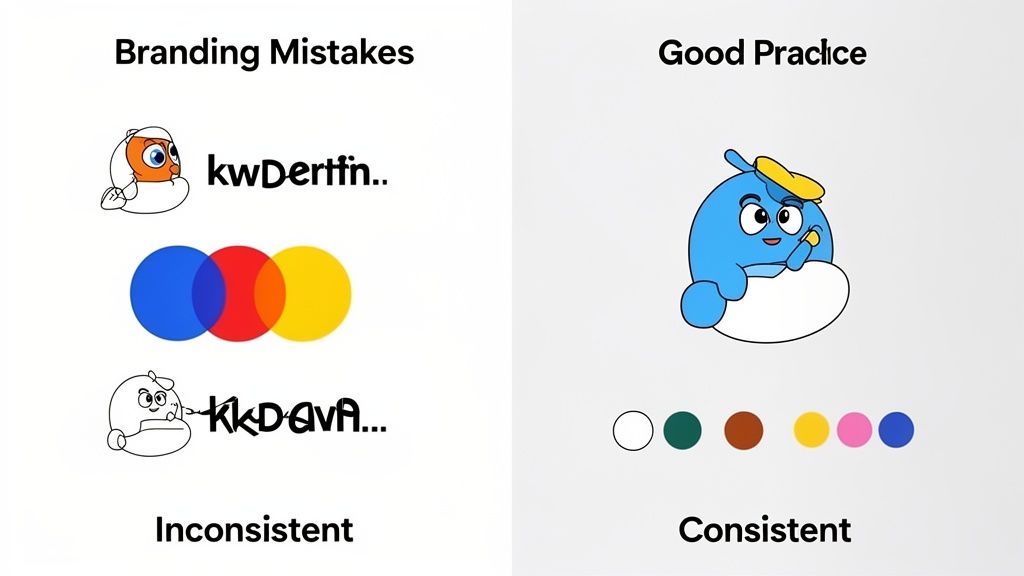
Creating a memorable visual brand is as much about dodging common pitfalls as it is about nailing the creative side. Seeing where others have gone wrong can save you a ton of headaches, costly redesigns, and customer confusion down the line. It's a classic case of an ounce of prevention being worth a pound of cure.
One of the biggest blunders is thinking your logo is your brand. Businesses pour money into a single mark but forget to build the world around it—the specific colors, fonts, and photo styles that give it meaning. This leaves the brand feeling hollow and inconsistent wherever it shows up.
Another trap is getting caught up in fleeting design trends. Sure, it’s tempting to go with what’s hot right now, but a brand built on a fad will look stale in a year. The best visual identities are built to last because they’re grounded in strategy, not the flavor of the month.
Overlooking Usability and Consistency
Even a brilliant visual system can fall apart if it's not practical. What's the point of a gorgeous 50-page brand guide if your team finds it too confusing to use? Your guidelines need to be simple, accessible, and designed for real people—marketers, salespeople, and partners—to apply correctly.
Without that easy-to-follow playbook, inconsistency creeps in. One department starts using its own colors, another goes rogue with fonts, and suddenly your brand looks fractured and unprofessional.
A visual identity is a promise of consistency. Every time a logo is stretched, an off-brand color is used, or a random font appears, that promise is broken, subtly telling customers you don’t pay attention to the details.
The key is to treat your visual identity as a living, breathing system, not a project you finish and forget.
Three Common Traps and How to Sidestep Them:
- The "Logo-Only" Mindset: Go beyond the logo from day one. Build out a complete visual toolkit with a defined color palette, a clear typography hierarchy, and a specific imagery style.
- Designing in a Vacuum: Your visual identity should be a direct reflection of your brand strategy, personality, and audience. It can't just be a collection of things that look cool.
- Neglecting Governance: Set up a central place for brand assets and create dead-simple guidelines. This makes it easy for everyone in the company to be a brand champion, keeping things consistent at every touchpoint.
Got Questions About Visual Identity? We've Got Answers.
Even when you have a solid plan, a few questions always seem to pop up during a brand project. It's totally normal. Here are some quick, no-nonsense answers to the most common things we hear from marketers and founders.
How Often Should I Refresh My Visuals?
There's no single magic number here. A good rule of thumb is to give your brand a quick health check every year and think about a more serious refresh every 5-10 years.
But forget the calendar for a second. The real triggers are business-driven, not time-driven. You should be thinking about a refresh if:
- You've pivoted your strategy or are chasing a new audience.
- Your brand just plain looks old next to the competition.
- You're launching new products or expanding into new countries.
- You just went through a merger or hit a major company milestone.
A refresh isn't about chasing the latest design trend; it’s about making sure your brand’s look still matches its mission.
What’s the Difference Between a Logo and a Visual Identity?
This one trips a lot of people up, but it’s a critical distinction. Think of it this way: your visual identity is the entire outfit, while your logo is the cool, custom-made jacket that pulls it all together.
A logo is a single mark. A visual brand identity is the complete system—the colors, fonts, photos, and design rules—that surrounds the logo and gives it a world to live in.
A logo on its own is just a graphic. It needs the whole system behind it to tell your story and create a feeling people remember.
Can a Small Business Really Have a Strong Visual Identity?
Not only can you, you absolutely must. A powerful visual identity isn't about a big budget; it's about being consistent and smart. For a small business, a cohesive look is one of your best tools for building trust and looking like a serious player right from the start.
Keep it simple. You don't need a massive, hundred-page brand book. Just lock in a professional logo, a core color palette with two or three colors, and one or two fonts you use for everything.
If you can apply just those few things consistently across your website and social media, you'll immediately look more credible than competitors who are all over the place. It’s all about discipline, not a giant design budget.
A strong visual brand identity is your secret weapon for standing out and connecting with the people who matter. At ReachLabs.ai, we live and breathe this stuff, creating brand strategies that don't just look good—they drive real growth. See how our creative services can elevate your brand's presence.

