
A great marketing report isn't just a data dump. It's a story. It’s a strategic tool that frames your data into a clear narrative, answering the big business questions and showing why the numbers matter, not just what they are. This initial planning is the difference between a report that gets a quick glance and one that actually drives decisions.
Setting the Stage Before You Build Your Report
Honestly, the most important work happens long before you even think about making a chart. Firing up your analytics platform without a clear plan is like starting a road trip with no destination in mind. You'll definitely be busy, but you won't end up anywhere useful.
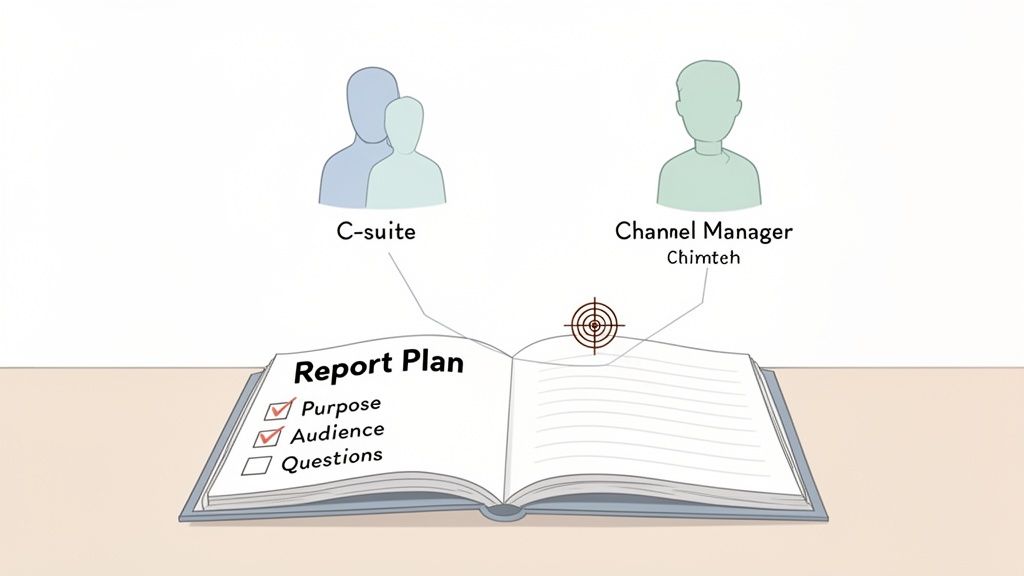
The whole point is to build something that speaks directly to the people reading it and answers their most pressing questions. It all starts by asking: "Who is this for, and what do they really need to know?"
A truly effective report is never one-size-fits-all. What your CEO needs to see is worlds away from what your social media manager cares about. Your report has to respect that.
Defining Your Audience and Objectives
The best way to start is by having real conversations with your stakeholders. Don't just ask them for a list of metrics. Instead, ask them what business questions keep them up at night. This simple change in how you frame the conversation is a game-changer.
For instance, your CMO might say they want to see "website traffic." But if you dig a little deeper, you might find what they're really asking is, "Are our top-of-funnel investments bringing in qualified leads that actually close?" Understanding that distinction helps you tell a much more powerful story.
Think about the different needs:
- The C-Suite (CEO, CFO): They want the 30,000-foot view. Stick to the big stuff: Customer Acquisition Cost (CAC), Marketing ROI, and revenue contribution. They care about business impact, not the click-through rate on a single ad.
- Marketing Leadership (Director, VP): They're focused on channel performance and team efficiency. They'll want to see metrics like leads by source, conversion rates across the funnel, and how you're pacing against the budget.
- Channel Managers (SEO, PPC, Social): These are your specialists. Their reports need the nitty-gritty details specific to their channel—keyword rankings, cost-per-conversion, or engagement rates per post.
A report tailored to its audience becomes an indispensable tool for decision-making. A generic report becomes just another unread email.
Aligning Data with Strategic Goals
Once you know who you're talking to, you have to make sure your data is solid. Before you build anything, it's worth understanding the real cost of bad data quality. If your inputs are flawed, your insights will be useless, no matter how pretty the charts are. A good report is built on a foundation of trustworthy information.
With clean data, you can start connecting your metrics to the company's bigger goals. If the business is focused on breaking into a new region this quarter, your report should absolutely highlight metrics on brand awareness, lead gen, and sales from that specific area.
This kind of alignment is a core part of good marketing operations, making sure everything marketing does is measurable and clearly tied to business outcomes.
When you take the time to set the stage—defining your audience, clarifying goals, and ensuring data integrity—you stop creating simple documents. You start building powerful engines for strategic growth.
Anatomy of a High-Impact Marketing Report
Now that you know your audience and what you need to achieve, let's get into the nitty-gritty of building the report. A great marketing report isn't just a data dump. It’s a story. It guides your reader from the 30,000-foot view right down to the on-the-ground details, and most importantly, tells them what to do next.
Think of it like building a case. You start with the headline, present the evidence, and end with a closing argument. Every piece has its purpose.
Before we dive into each section, here's a quick-reference table that breaks down the anatomy of a modern, effective marketing report. This is the blueprint I follow to make sure every report I create is comprehensive, clear, and actionable.
Anatomy of a Modern Marketing Report
A quick-reference guide to the essential sections and their primary purpose in a comprehensive marketing report format.
| Report Section | Primary Goal | Key Metrics to Include | Target Audience |
|---|---|---|---|
| Executive Summary | Deliver the "bottom line" upfront. | Top 2-3 wins/losses, key insights, primary recommendations. | C-Suite, VPs, Directors |
| KPI Dashboard | Provide a scannable snapshot of performance vs. goals. | MQLs, CAC, Mktg-Sourced Revenue, Conversion Rates. | All Stakeholders |
| Channel Performance | Explain the "why" behind the KPIs, channel by channel. | Traffic, CTR, CPL, ROAS, Engagement Rate. | Marketing Team, Directors |
| Budget vs. Actual | Show financial accountability and explain spending decisions. | Planned Spend, Actual Spend, Variance per channel/campaign. | Finance, C-Suite, Directors |
| Insights & Learnings | Connect the dots and highlight what you've discovered. | Surprising trends, campaign effectiveness, audience behavior. | All Stakeholders |
| Recommendations | Outline clear, data-backed next steps. | "Start," "Stop," and "Continue" actions for the next period. | All Stakeholders |
This structure ensures that anyone, from a busy CEO to a hands-on channel manager, can get exactly what they need from the report in minutes.
The All-Important Executive Summary
Let's be real: your executive summary might be the only thing your leadership team reads. This is your moment to land the most important takeaways immediately. Don't treat it like a fluffy intro; it's a condensed version of the entire story.
Your summary needs to nail three things right away:
- What were our biggest wins and misses? Get straight to the most significant results.
- Why did it happen? Briefly touch on the key factors that drove those results.
- What should we do now? State your top one or two recommendations.
A powerful summary weaves performance, insights, and actions together. It sets the stage for the deep dive that follows and ensures your key message is heard loud and clear.
Laying Out Your Key Performance Indicators
Right after the summary, give your readers a dashboard of the vital signs. This is where you present the top-level KPIs you agreed upon with stakeholders. It’s the "what" of your report, presented in a clean, scannable format.
Forget about cramming dozens of metrics onto one page. Focus on the numbers that truly define success. For a B2B software company, that might look like this:
- Marketing Qualified Leads (MQLs): 450 (110% of goal)
- MQL-to-SQL Conversion Rate: 25% (On target)
- Customer Acquisition Cost (CAC): $4,200 (5% below target)
- Marketing-Sourced Revenue: $1.2M (98% of goal)
Presenting your KPIs this way allows anyone to quickly see if things are on track. But this is just the beginning of the story.
A common mistake is to present the KPI dashboard as the conclusion. In reality, these numbers are conversation starters. They raise the questions that the rest of your report is built to answer.
Diving Deep with Channel-Specific Analysis
This is where the real analysis happens. You’ll break down performance channel by channel, connecting specific marketing activities back to the high-level KPIs you just showed. How exactly did SEO, paid ads, and email contribute to that $1.2M in revenue?
Organize this section with clear subheadings for each channel (SEO Performance, Paid Media, Email Marketing, etc.).
But don't just list metrics. Tell a story. Instead of saying, "organic traffic went up," explain how a 15% increase in organic traffic from high-intent blog posts directly led to a 20% jump in demo requests. That’s how you connect the dots.
For those looking to build truly compelling reports, using Business Intelligence and Power BI tools is a game-changer. These platforms help you pull data from all your different channels into one place, making it much easier to see the full picture and tell a cohesive story.
Budget vs. Actuals: A Clear Financial Picture
Nothing builds trust faster than being transparent about the budget. Every solid marketing report needs a section that clearly compares what you planned to spend versus what you actually spent.
Keep it simple. A straightforward table is usually best, broken down by channel or major campaign.
| Channel | Planned Spend | Actual Spend | Variance |
|---|---|---|---|
| Google Ads | $20,000 | $19,500 | -$500 |
| LinkedIn Ads | $15,000 | $16,200 | +$1,200 |
| Content | $8,000 | $8,000 | $0 |
| Total | $43,000 | $43,700 | +$700 |
The numbers are only half the story, though. Always add a short paragraph explaining any big differences. For example, you could explain that the overspend on LinkedIn was a strategic move to double down on a campaign that was delivering leads well below the target CPL. This adds crucial context and shows you’re actively managing the budget, not just spending it.
Choosing Metrics That Actually Matter for Each Channel
Let's be honest: vanity metrics are the empty calories of marketing analytics. They look impressive on a slide but offer zero strategic value. Reporting on things like social media likes or a spike in website traffic without any context is like bragging about how loud your car's engine is without checking if you're actually moving. A truly great marketing report cuts through that noise to focus on the numbers directly tied to business growth.
The trick is to dig deeper than surface-level data. You need to select key performance indicators (KPIs) that tell a meaningful story about what each channel is contributing. Every channel has a different job to do, so it only makes sense that their success metrics should be just as specific. This is how your report transforms from a simple summary into a powerful diagnostic tool.
Think of your report's structure like this—KPIs are the bridge connecting the high-level summary to the nitty-gritty analysis.

This visual really drives home the point. KPIs aren't just a list of numbers; they are the evidence that supports your summary and gives your analysis real teeth.
Measuring SEO Beyond Rankings
For way too long, SEO reports have been obsessed with keyword rankings. While it’s nice to know where you stand on a search results page, that number alone doesn't pay the bills. The real purpose of SEO is to drive valuable organic traffic that helps the business grow.
So, instead of just listing out keyword positions, let's shift the focus to metrics that show genuine business impact.
- Organic Traffic to Converting Pages: Don't just show me the overall traffic number. I want to see the organic traffic hitting your money pages—the demo request form, the pricing page, the contact form. A lift here is a much clearer signal of success.
- MQLs from Organic: This is the ultimate proof. How many new, qualified leads did your SEO efforts bring in this month? If you're not tying organic performance directly to lead gen, you're missing the point.
- High-Authority Backlinks Acquired: It’s all about quality, not quantity. Report on the new backlinks you’ve earned from relevant, authoritative sites. Those are the links that actually move the needle on your domain authority.
A report that shows a keyword dropping from position #3 to #4 might look bad at first glance. But if it also shows a 25% increase in organic MQLs, it tells a far more valuable story. It proves your strategy is attracting the right people, not just more people.
Paid Media Metrics That Prove ROI
When it comes to paid media, it's all about efficiency and return on investment. Every single dollar you spend needs to be accounted for with clear, measurable results. Your report can't just stop at clicks and impressions; stakeholders need to know if their money is actually working.
To tell a compelling story about your paid campaigns, these are the metrics that matter:
- Cost Per Acquisition (CPA): This is your north star. How much are you paying to get a new customer? You should be tracking this by campaign and channel to see where your budget is performing best.
- Return on Ad Spend (ROAS): For every dollar you put in, how many are you getting back? A 4:1 ROAS means you’re generating $4 in revenue for every $1 spent—a powerful metric that speaks directly to the C-suite.
- Lead-to-Customer Rate: Of all the leads your ads brought in, what percentage actually became paying customers? This metric is crucial because it connects your ad spend directly to bottom-line growth.
If you're looking to build out an even more robust reporting dashboard, we've put together a guide with more marketing performance metrics examples to get you started.
Social Media and the Rise of New Channels
Measuring the true impact of social media has always been a bit tricky. Sure, engagement metrics like likes and shares can give you a pulse on brand health, but they rarely connect directly to revenue. To make them count, you have to show how social activity influences the customer journey. Focus on metrics like website clicks from social posts, conversions tracked with UTM parameters, and growth in brand-owned communities (like a private Slack or Discord).
At the same time, the ad world is going through a massive shift. Retail Media Networks (RMNs) have exploded onto the scene, delivering what some studies show are 1.8x better results than traditional digital ads. The data suggests they can drive a nearly 3x improvement in purchase intent, making them a channel you can't afford to ignore. With retail media spend on track to hit $169 billion by 2025, any forward-thinking marketing report needs to have a dedicated section for RMN performance.
By carefully choosing metrics that reflect the actual purpose of each channel, your marketing report becomes an indispensable tool. It stops being a boring list of numbers and starts telling a clear, compelling story about how your marketing efforts are driving real, tangible business results.
Weaving AI and Advanced Analytics into Your Reporting
Modern marketing reports are no longer just a look in the rearview mirror. They’re becoming predictive engines, and AI is the fuel. Bringing artificial intelligence and advanced analytics into the mix fundamentally changes your marketing report format, evolving it from a static document into a forward-looking strategic tool.
The truth is, AI is already reshaping our day-to-day work. A staggering 46% of marketers now use AI to help scale creative production. As you can see in these digital advertising trend insights, this isn't some far-off trend; it’s happening right now.
This explosion in AI-generated content means our reports need to keep up. We have to start answering new, critical questions. Are the AI-driven creatives actually improving engagement? Are they lowering our cost per acquisition? Your reports need sections dedicated to auditing AI’s performance to prove its value.
Moving Beyond Flawed Attribution Models
For far too long, marketers have leaned on last-click attribution. It’s the model that gives 100% of the credit for a sale to the very last click a customer made. It’s tidy, easy to explain, and almost always wrong. This model completely ignores the rich, complex journey the customer took to get there—the blog post that sparked their interest, the social ad that kept your brand top-of-mind, or the webinar that sealed the deal.
This oversimplified view leads to terrible budget decisions. You might slash the budget for a brilliant top-of-funnel video campaign because it didn't drive last-click conversions, all while missing that it was the crucial first handshake with your most valuable customers.
Relying on last-click attribution is like giving all the credit for a championship win to the player who scored the final point, ignoring the assists, defense, and teamwork that made the victory possible.
To paint a more honest picture, modern reports need to embrace more sophisticated ways of measuring what’s actually working.
Embracing Advanced Measurement Techniques
To get a real handle on ROI, your reporting has to evolve. Two powerful methods are leading the charge here: incrementality testing and media mix modeling. These approaches help you finally separate correlation from causation.
-
Incrementality Testing: Think of this as a scientific experiment for your ads. You run a controlled test, showing ads to one group while holding them back from a similar control group. The difference in conversions between the two groups is your "incremental lift"—the sales that happened only because people saw your ads. Including these results adds a layer of undeniable proof to your reports.
-
Media Mix Modeling (MMM): This is a "big picture" statistical analysis. It looks at historical data across all your channels—ad spend, seasonality, promotions, even economic trends—to figure out how each element contributes to your overall goals. It helps answer tough questions like, "If we boost our TV budget by 10%, what can we expect to see in sales?" For a great primer, check out our guide on what marketing mix modeling is and how it works.
Building these advanced analytics into your reporting does more than just give you better data. It shows a commitment to financial accountability. You can prove efficiency, confidently trim the fat from underperforming channels, and deliver ROI calculations your CFO will actually believe. This is how you turn reporting from a routine task into a strategic, decision-making powerhouse.
Turning Your Data Into Actionable Recommendations
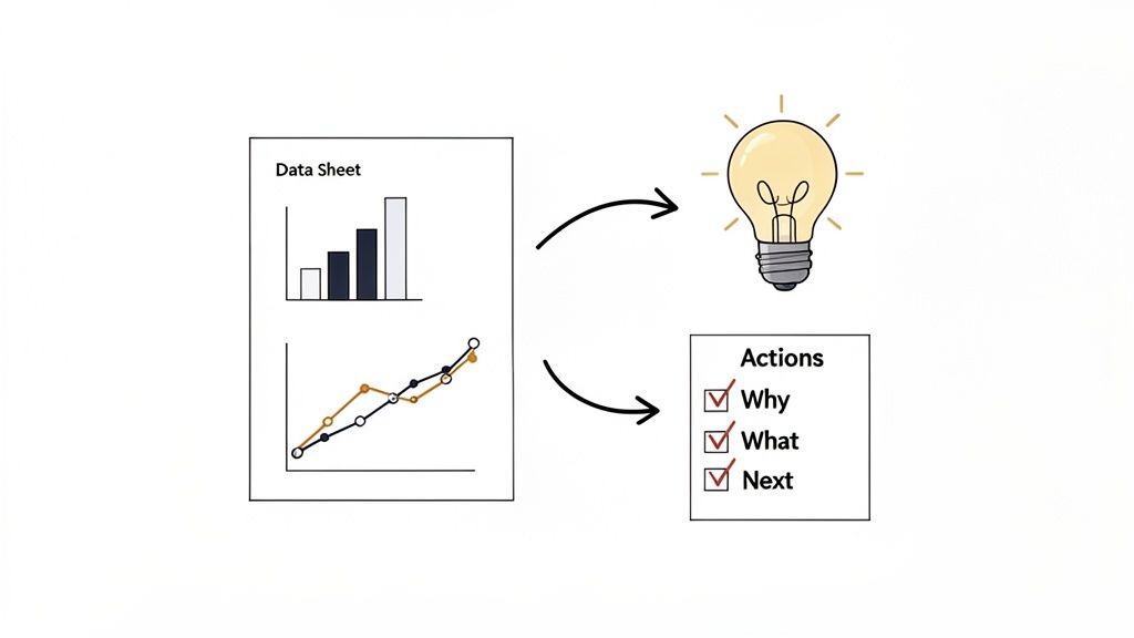
Let's be honest: this is where your marketing report goes from being a recap to a roadmap. It's the most critical part of the entire document. Data is just noise until you connect it to a purpose. A report that just states what happened is a history lesson; a report that explains why it happened and what to do next is how you drive growth.
Think of the recommendations section as your closing argument. It’s where you bring everything together—the KPIs, the channel performance, the budget—and present a clear, confident path forward. This is where your expertise really has to shine.
To get there, you need to shift your mindset from simply observing trends to truly interpreting them.
From Observation to Interpretation
First, let's get clear on the difference between an observation and an insight. An observation is a fact pulled from your data. An insight is the "so what?" behind it. It’s the story the data is trying to tell.
- Observation: "Organic traffic from our target keyword cluster increased by 25% this month."
- Insight: "The 25% jump in organic traffic was driven by our new bottom-of-funnel content. This is attracting higher-intent visitors and directly led to a 15% lift in demo requests."
See the difference? The insight provides context and connects the dots to a real business outcome. It sets the stage for a powerful recommendation.
To do this well, your report needs to be built on solid measurement. The old ways of doing things, like last-click attribution, are fading fast because they often over-attribute conversions by 15-30%. Modern reporting uses more sophisticated methods like geo-tests and media mix modeling to connect marketing efforts to lifetime value. This is a big deal, especially since 37.3% of CMOs still say they struggle to prove the ROI of their branding efforts. If you want to dive deeper, you can accelerate marketing performance with modern trends.
Crafting Recommendations That Inspire Action
Once you have your insights, you can build your recommendations. Vague suggestions like "improve social media" are totally useless. Every recommendation needs to be specific, measurable, achievable, relevant, and time-bound (SMART).
A simple but incredibly effective way to structure this is the "Start, Stop, Continue" model. It forces you to be clear and gives stakeholders an immediate action plan.
Your goal isn't just to be right; it's to be understood. Clear, concise recommendations are far more likely to get approved and funded than a complex, data-heavy analysis.
Here’s what that looks like in practice, building on our earlier insight:
- Start: Launch a targeted PPC campaign to amplify our best-performing bottom-of-funnel blog posts. Our goal is to increase demo requests by another 10% in Q3.
- Stop: Pause the $5,000 monthly spend on the top-of-funnel display campaign. It has a high cost-per-click and a poor conversion rate.
- Continue: Double down on what's working. Let's create two more in-depth articles targeting our high-intent keyword cluster, using the same successful format.
Prioritizing Your Recommendations
You’ll probably come up with a dozen great ideas, but dropping them all on someone at once is a recipe for inaction. You have to prioritize. The best way to do this is by weighing potential impact against the level of effort required.
A simple matrix can make this crystal clear:
| Impact/Effort | High Impact | Low Impact |
|---|---|---|
| Low Effort | Quick Wins | Fill-in Tasks |
| High Effort | Major Projects | Time Sinks |
Focus your main recommendations on the Quick Wins. These are the high-impact, low-effort moves that deliver immediate value and build momentum for your strategy. Save the Major Projects for bigger strategic planning meetings.
When you present a clear, prioritized list of actions, your marketing report stops being a simple update and becomes an essential tool that actively pushes the business forward.
Common Questions About Marketing Report Formats
Even with the best plan in place, you're always going to run into questions when you start building out your reports. Honestly, it's the little details that often make the difference between a report that gets read and one that collects digital dust. Let's tackle some of the most common questions I hear from other marketers.
Getting these right will help you sidestep common mistakes and make sure your reports are not just insightful, but actually get used.
How Often Should I Send Marketing Reports?
There’s no magic number here. The right reporting cadence depends entirely on who’s reading it. If you don't match the frequency to the audience, all your hard work is for nothing.
- For the C-Suite: Think monthly or quarterly. They need the 30,000-foot view of performance and trends, not the daily nitty-gritty. This timing is perfect for strategic planning.
- For Marketing Leadership: Bi-weekly or monthly usually works best. This gives them enough data to track progress toward quarterly goals and shift budgets or strategies as needed.
- For Channel Managers: This is where you get granular. A weekly report is often essential for the folks in the trenches making tactical tweaks to campaigns.
And of course, for any big campaign or product launch, you'll want to create a dedicated post-campaign report. This is your chance to do a deep dive on what worked, what flopped, and what you learned for next time.
What Are the Best Tools for Creating Reports?
The "best" tool really comes down to what you're trying to accomplish. Are you focused on automation? Killer visuals? A compelling narrative? There are great options for every scenario.
If you're building automated dashboards that pull from different sources, you can't go wrong with industry workhorses like Looker Studio (what we used to call Google Data Studio), Tableau, or Power BI. These are fantastic for blending data from places like Google Analytics and various ad platforms into one clean view.
But if your report is more about telling a story, you might find it easier to just embed your charts directly into a Google Slides or PowerPoint deck. This gives you way more control over the narrative flow. And don't forget about all-in-one platforms; if your team lives in a tool like HubSpot, its built-in reporting features are surprisingly robust and can save you a ton of time.
How Can I Make My Reports More Engaging?
Let's be real: nobody wants to read a boring report. To keep your audience from glossing over your work, you have to focus on clarity and telling a story with your data.
Always lead with a punchy executive summary that spells out the key takeaways right away. From there, lean heavily on visuals. Use charts, graphs, and even heatmaps to break up walls of text and make your points pop. Please, avoid burying your audience in dense tables and long-winded paragraphs.
The most important thing you can do for engagement is to always answer the "so what?" behind every number. Don't just show the data—explain what it means for the business and give clear, actionable next steps. This one change transforms a passive report into an active strategy tool.
Structure your report with clear headings for each section and metric. A little color-coding can also go a long way—think green for good trends and red for areas that need attention. It’s a simple visual cue that immediately tells the reader how things are going. By making your report easy to scan and understand, you create something people will actually want to read and act on.
Ready to turn your marketing reports from simple data dumps into strategic growth drivers? The specialists at ReachLabs.ai can help you build a data-driven strategy that truly moves the needle. Start building your roadmap to success with us today.


