
When we talk about graphic design for social media, we’re not just talking about making things look nice. It’s about creating visuals that stop someone mid-scroll, get a message across in a flash, and actually get people to engage. It’s the art of building a visual language that cuts through the noise of a crowded feed and creates a brand people remember.
Why Visual Design Is Your Social Media Superpower
Think about your own scrolling habits. What actually makes you stop and look? It’s rarely a big chunk of text. More often, it’s a stunning photo, a clever infographic, or a video with graphics that just pop. That’s the real job of graphic design on social media—to be the visual hook that makes your content impossible to just scroll past.
Imagine your social media feed is a packed city street. Every single post is a storefront trying to get people’s attention. A shop with a boring, uninspired window display gets ignored, even if its products are amazing. But the one with a vibrant, thoughtfully designed display? That’s the one that pulls people inside. Your social media graphics are your digital storefront.
The Science of Seeing Before Reading
It’s just how our brains work. We process images up to 60,000 times faster than text. It’s a biological shortcut. A powerful visual can convey a complex idea or trigger an emotion in the blink of an eye. Great graphic design plays directly into this.
- It simplifies the complex. A good infographic can turn a page of dense data into something anyone can understand in seconds.
- It builds an emotional connection. The right colors and imagery can set a mood and make people feel something about your brand.
- It creates instant recognition. A consistent visual style makes your content immediately familiar to your followers.
Standing Out in a Vast Digital Crowd
The sheer volume of content on social media is staggering. By 2025, there will be an estimated 5.45 billion users worldwide, with most people spending hours on these platforms every day. In an arena that crowded, generic visuals just disappear. You can dive deeper into these game-changing social media statistics on sonary.com.
This is where strong graphic design becomes an absolute necessity. It’s what allows you to cut through all that noise and leave a real impression.
Good design isn’t just a pretty layer on top; it’s the soul of how a brand communicates. It’s your silent ambassador, working 24/7 to build trust and familiarity with every single post.
At the end of the day, putting real effort into your social media graphics isn’t just about aesthetics—it’s a smart business move. It turns a simple post into a powerful tool that grabs attention, builds connections, and encourages your audience to take action. In a world where visuals speak loudest, it gives your brand a voice.
The Core Principles of Standout Social Design
Great social media design isn’t just about making things look pretty. It’s a strategic game of guiding a viewer’s eye and landing a message, all in the split second it takes them to scroll past. Mastering a few fundamental principles can turn a good graphic into one that truly stops the scroll.
Think of these principles less like rigid rules and more like the essential ingredients you need for any compelling design.
When these core ideas work in harmony, your audience just gets it. They instantly understand what you’re trying to say without having to piece it together. That effortless communication is what separates amateur design from the pros.
Create a Clear Visual Hierarchy
Visual hierarchy is all about arranging your design elements to show what’s most important. Think of yourself as a tour guide for your audience’s eyes—you need to tell them exactly where to look first, then second, then third. Without that clear path, people get lost and just keep scrolling.
You can build a strong hierarchy with a few simple techniques:
- Size and Scale: Whatever you want people to see first—a killer headline, a product shot—should be the biggest thing on the screen. It’s an instant attention-grabber.
- Color and Contrast: A bright, bold call-to-action button practically jumps off a muted background. Use color to strategically spotlight the most important information.
- Placement: We’re trained to see things at the top or in the center of a design as the main event. Use that to your advantage.
By controlling these factors, you create a design that isn’t just attractive but is also incredibly easy to digest at a glance.
“Hierarchy is not about making things look different; it’s about making them look like they belong to a system. It’s about creating a visual language that is easy for users to understand and navigate.”
This structured approach makes sure your main message is always the star of the show. For a deeper dive, our guide on how graphic design and social media work together has even more insights.
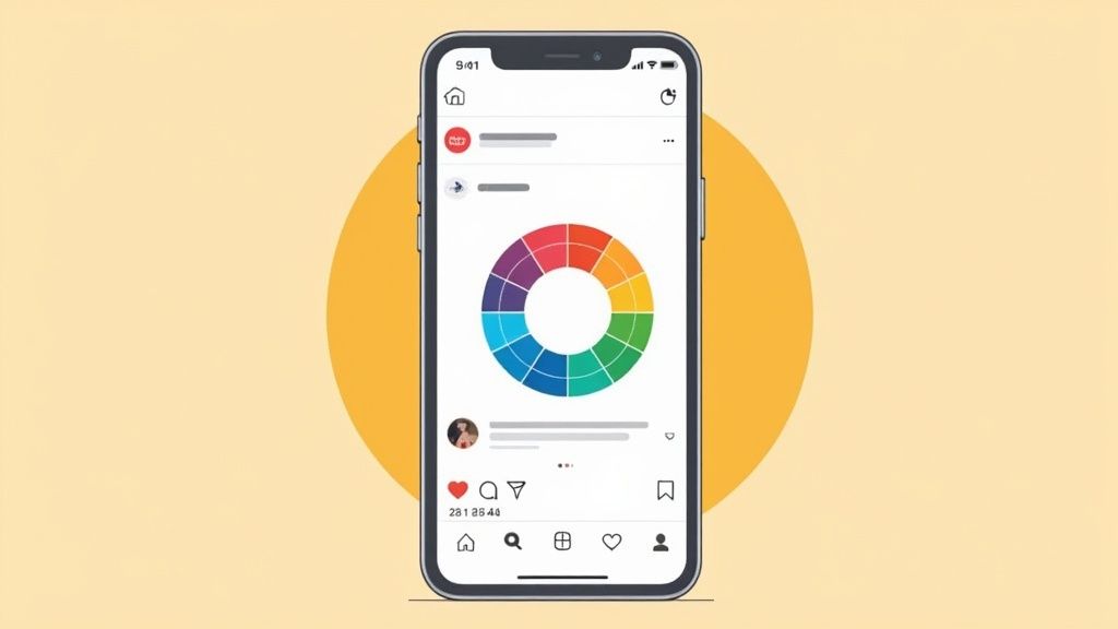
Harness the Power of Color Psychology
Color is way more than just a pretty decoration. It’s a powerful tool that triggers emotions and shapes how people feel about your brand. The right colors can instantly set the tone for your message. A spa, for instance, would lean on soft greens and blues to create a vibe of calm and relaxation.
On the flip side, a fast-food brand often splashes red and yellow everywhere to stir up feelings of hunger and urgency. Understanding these deep-seated associations is a massive advantage in social media design.
- Blue: This color often signals trust, security, and professionalism. It’s a go-to for tech and financial companies for a reason.
- Red: Red screams excitement, passion, and urgency. It’s fantastic for grabbing attention during a flash sale.
- Green: This one’s all about growth, health, and nature, making it perfect for wellness brands or eco-friendly products.
- Yellow: Yellow gives off vibes of optimism, warmth, and happiness. Use it to create an energetic and welcoming feel.
Your color palette shouldn’t be an accident. It should be a deliberate choice that strengthens your brand identity and the specific mood you want to create with every single post.
Master Typography and Readability
If your brand had a voice, typography would be it. The fonts you pick say a lot about your personality. Are you modern and sleek? Elegant and classic? Or maybe fun and a little quirky? Keeping your typography consistent is a non-negotiable part of building a recognizable brand on social media.
But here’s the catch: style can never, ever trump readability. Your audience, scrolling on tiny phone screens, needs to be able to read your message without squinting.
Key Typography Tips:
- Limit Your Fonts: Don’t go crazy. Stick to two or three fonts that work well together to avoid a cluttered, unprofessional mess. A common trick is to use one for headlines and another for body copy.
- Ensure High Contrast: Your text color needs to pop against the background. Light text on a light background is a recipe for an unreadable post.
- Consider Font Size: Before you post, check your design on a mobile phone. Is the text big enough to read comfortably without having to pinch and zoom?
Ultimately, the best typography finds that sweet spot between expressing your brand’s personality and giving your audience a smooth, effortless reading experience.
Adapting Your Visuals for Each Social Platform
Creating a killer graphic is only half the battle. A design that racks up thousands of likes on Instagram might be a total dud on LinkedIn. Why? Because great graphic design in social media isn’t a one-size-fits-all game—it’s about speaking the native visual language of each platform.
Think of it like this: you wouldn’t wear a tuxedo to a casual beach party. You might look sharp, but you’d stick out for all the wrong reasons. Every social platform is a different event with its own unwritten dress code. Your job is to show up in the right outfit, every single time.
This means tweaking your visuals to fit the unique culture, formatting, and user expectations of each network. A platform-aware strategy is what makes your creative work actually connect with people, boosting your reach and impact wherever you post.
Instagram: A Hub for Polished Aesthetics
Instagram is basically the world’s biggest art gallery. People scroll through expecting to see beautiful photography, sleek graphics, and feeds that just look good. It’s a place where aesthetics rule, and your brand’s visual identity is always on display.
The vibe here is all about inspiration, beauty, and storytelling. Your graphics should be clean, compelling, and often aspirational. You’re not just selling a product; you’re building a lifestyle around your brand.
Key Visual Strategies for Instagram:
- Cohesive Feed Curation: Don’t just post randomly. Plan your grid to create a consistent look and feel. Using similar color palettes, filters, or content themes makes your feed instantly recognizable and inviting.
- High-Impact Stories: Stories are where you can be more dynamic and interactive. Use animated text, fun stickers, and well-designed video overlays to grab attention in that first second.
- Reels and Video Graphics: For Reels, create eye-catching cover images and add clear, easy-to-read text overlays. Since so many people watch with the sound off, your graphics have to do the heavy lifting.
LinkedIn: A Platform for Professional Authority
LinkedIn is the digital boardroom. People are there to network, learn something new, and grow in their careers. The visual tone reflects this: it’s professional, informative, and often data-driven. Flashy, overly casual graphics just feel out of place and can actually hurt your brand’s credibility.
On LinkedIn, your goal is to establish yourself as an authority and share valuable insights. Your designs should communicate expertise and trustworthiness—think of them as visual aids for a high-stakes presentation.
On LinkedIn, your graphics should add value before they add flair. Clarity and professionalism are the currencies of credibility on this platform.
What works best on LinkedIn?
- Data-Driven Infographics: Clean, well-organized infographics that break down industry data, survey results, or complex processes are gold. They make dense information easy to digest and highly shareable.
- Branded Quote Cards: Share powerful insights from industry leaders (or your own team) using professional, clean templates that feature your company’s logo and colors.
- Carousel Posts: Use a series of connected graphics to tell a story or walk your audience through a complex topic step-by-step. This format is great for engagement because it encourages people to swipe for more.
TikTok and X: Authentic, High-Energy Visuals
Platforms like TikTok and X (formerly Twitter) are all about what’s happening right now. The visual style is less polished and more raw and authentic. Overly produced, corporate-looking graphics can feel jarring and out of touch in these fast-moving feeds.
On TikTok, it’s all about jumping on trends, being relatable, and entertaining your audience. Graphic elements like text overlays and stickers should feel native to the app—bold, direct, and often with a sense of humor. For X, your visuals need to be punchy and concise, designed to stop someone mid-scroll.
This simple breakdown shows how a small choice, like your font, can dramatically impact how people engage with your content.
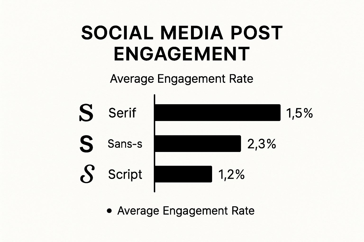
The numbers don’t lie. Clean, modern Sans-serif fonts consistently outperform others, which tells us that readability and clarity are huge drivers of interaction on almost every platform.
Platform-Specific Visual Design Cheat Sheet
To succeed, you need to understand the user’s mindset on each platform. Are they leaning back to be entertained, or leaning in to learn something? This quick cheat sheet breaks down the essentials.
| Platform | Primary Audience Mindset | Optimal Visual Content | Key Design Tip |
|---|---|---|---|
| “Show me something beautiful.” | High-quality photos, polished graphics, Reels, Stories | Maintain a cohesive aesthetic and a visually stunning grid. | |
| “Teach me something valuable.” | Infographics, charts, data visualizations, carousels, quote cards | Prioritize clarity, professionalism, and information value over flair. | |
| TikTok | “Entertain me. Make me laugh.” | Short-form video with native text/stickers, trend-based content | Embrace authenticity. Make it look like it was made on TikTok. |
| X (Twitter) | “What’s happening right now?” | Memes, GIFs, short video clips, impactful quote graphics | Design for the scroll. Make it bold, simple, and instantly gettable. |
This table is a great starting point, but always remember to watch your own analytics to see what truly connects with your specific audience on each channel.
Building Your Social Media Design Toolkit
Having the right design tools doesn’t just make your job easier—it’s like unlocking a creative superpower. The right software can take a frustrating, time-consuming task and turn it into something you actually enjoy, all while leveling up the quality of your work. But let’s be honest, the sheer number of options out there can be paralyzing.
The best way to approach this is to think of it like stocking a kitchen. You don’t need every single gadget on the market. You just need a few reliable knives, pans, and utensils that suit what you’re trying to cook. Your choice should come down to your skill level, your budget, and what your social media content really needs.
This isn’t just a nice-to-have skill, either. The global graphic design market is valued at over $60 billion, and skilled designers in the US are pulling in an average of $31.11 per hour. This demand highlights just how crucial it is to get a handle on the tools of the trade, especially since original graphics are the number one visual content type for building a solid brand. You can dig into the growth of the graphic design market on explodingtopics.com to see the full picture.
For Speed and Simplicity: The User-Friendly Platforms
For most of us—small businesses, marketers, and solo creators—the name of the game is creating great-looking graphics without spending all day on them. This is where template-based platforms are absolute lifesavers. They eliminate the steep learning curve of professional software and let just about anyone produce something that looks fantastic.
- Canva: This is the undisputed champion for social media. Canva is packed with millions of templates, stock photos, and easy-to-use graphics. Its drag-and-drop editor is so intuitive you can knock out anything from an Instagram Story to a detailed LinkedIn carousel in just a few minutes. The free plan is surprisingly powerful and more than enough for many to get started.
- Adobe Express: This is Adobe’s answer to Canva, and it’s a strong one. It brings a user-friendly editor to the table but backs it up with professional assets from Adobe Fonts and Stock. Its AI features, like generating templates from a text prompt, can be a massive time-saver when you’re just trying to get some ideas flowing.
These platforms are perfect for the daily grind of content creation, where getting things done efficiently is what matters most.
Think of these tools as your trusty, all-purpose skillet. They handle most everyday jobs beautifully and give you consistent results without needing a master chef’s training.
For Ultimate Control: The Professional Suites
There are times, however, when you need total creative freedom and the ability to control every single pixel. For that, nothing beats a professional-grade design suite. These tools have a much steeper learning curve and come with a subscription, but their capabilities are practically limitless.
The Adobe Creative Cloud is the industry standard, and for good reason. It’s a powerhouse collection of specialized apps that all work together seamlessly.
- Photoshop: Still the undisputed king of photo editing and raster graphics. It’s your go-to for manipulating images, creating complex visual compositions, and designing intricate graphics from scratch.
- Illustrator: This is the master of vector graphics. You’ll use Illustrator for designing logos, icons, and infographics that need to be scaled up or down without ever losing a drop of quality.
- Premiere Pro & After Effects: These are your essentials for video. Premiere Pro is for cutting and editing video clips, while After Effects is where you create stunning motion graphics, animations, and visual effects.
Investing in a professional suite is the right move when your brand’s visual identity is a core part of your business strategy. It’s for when you need to do things that template-based tools simply can’t handle. This is the professional chef’s knife set—specialized, razor-sharp, and capable of incredible precision in the right hands.
Integrating Design into a Winning Content Strategy
Truly effective social media design isn’t about making a handful of beautiful, isolated posts. It’s about building a complete visual system where every single graphic, video, and Story fits together to tell a larger brand story. When you get this right, your design stops being just decoration and becomes a serious business asset that gets real results.
Think of it this way: when design is baked into your content strategy from the beginning, it’s no longer an afterthought. It becomes a core part of your marketing engine, ensuring every visual you post is both attractive and purposeful. Each piece reinforces who you are and nudges your audience toward a specific goal.
Develop a Social-First Style Guide
A brand style guide is your bible for visual consistency. But for social media, you need a version that’s built for the fast-paced, always-on nature of the platforms. This is the rulebook that guarantees your brand looks and feels the same, even if multiple people on your team are creating content.
Your social-first guide should clearly lay out:
- Core Color Palette: Your primary and secondary colors, complete with the specific HEX codes for digital screens.
- Typography Rules: The exact fonts for headlines, body text, and calls-to-action, chosen for perfect readability on a small phone screen.
- Logo Usage: Simple guidelines on where and how to place your logo so it’s present but not overpowering.
- Imagery Style: The specific vibe of photography or illustration that screams “your brand.” Is it bright and airy, or dark and moody?
This document is the key to scaling up your content production without watering down your brand identity. You can see how this fits into the bigger picture in our guide to building a social media strategy for small business.
Use Design to Optimize and Convert
Great design isn’t just about looking good; it’s a powerful tool you can use to improve performance. A/B testing your ad creative is the perfect example. Create two versions of an ad graphic—maybe you only change the background color or the text on the button—and you can gather hard data on what your audience actually responds to.
When a design is tested and optimized, it’s no longer just a creative whim. It becomes a data-backed tool for conversion. This process turns your creative hunches into predictable marketing wins.
This data-driven approach takes the guesswork out of the equation. It lets you systematically fine-tune your visuals to get higher click-through rates, lower your ad costs, and ultimately, drive more sales.
Create Templates for Core Content Pillars
To keep your quality high without overwhelming your creative team, it’s smart to build a set of flexible templates for your main content themes. For instance, if you regularly post customer testimonials, industry tips, and company news, create a unique—yet cohesive—template for each.
This approach streamlines your workflow, making sure even a last-minute post looks polished and on-brand. The time you invest upfront in creating these templates pays for itself over and over again through saved time and a consistently strong brand presence.
This visual consistency is more important than ever. Global social media ad spending is projected to hit a staggering $276.7 billion in 2025. And with 78% of consumers saying they prefer to learn about products through short videos, compelling design is your ticket to capturing their attention. By integrating design into your strategy, you’re setting your brand up to compete in a crowded, visually-driven world. You can dig into more of these trends in the latest social media statistics on sproutsocial.com.
Common Design Mistakes and How to Fix Them

Even the most experienced brands sometimes stumble, making simple design mistakes that can seriously hurt their social media game. The good news is that understanding graphic design in social media often just means dodging a few common traps that turn viewers off.
Most of these errors happen when we forget how people actually use social media. They’re scrolling fast, usually on a small phone screen. A design that looks perfect on a big desktop monitor can easily become a jumbled, unreadable mess on a phone, getting scrolled past in an instant.
Ignoring Mobile Readability
One of the most frequent slip-ups is using tiny text or low-contrast colors. If your audience has to squint to read your message, you’ve already lost them. The fix is refreshingly simple: check your design on a phone before you hit “post.”
- Before: Picture thin, light-gray text layered over a busy, colorful photo. On a phone, those words just melt into the background, making your point completely invisible.
- After: Now, imagine that same photo but slightly darkened. The text is now bold, white, and much larger. The contrast is sharp, and the headline grabs the eye immediately.
That one small tweak shows you respect the mobile experience and makes your content accessible to almost everyone.
Good design isn’t just what you add; it’s what you thoughtfully remove. Simplifying your visuals to focus on a single, clear message is the fastest way to make your content more effective.
Lacking Brand Consistency
Another all-too-common issue is a complete lack of visual consistency. When every post is a free-for-all of different colors, fonts, and logos, it just looks messy and unprofessional. Your audience never gets the chance to build that split-second recognition as they scroll.
The solution? Create a basic brand style guide for your social media and stick to it.
- Before: A feed where one post is neon green, the next is pastel, and a third uses a totally different font. The logo placement is all over the map. It looks chaotic and fails to build any kind of brand identity.
- After: Every post now uses a defined color palette and a consistent set of fonts. The logo always sits in the same spot. Suddenly, the feed looks cohesive, polished, and instantly recognizable, which builds trust over time.
Frequently Asked Questions About Social Media Design
Once you get past the basic principles of social media design, the real-world questions start popping up. How do you actually put it all into practice day after day?
Let’s tackle some of the most common hurdles people face when trying to build a killer visual strategy.
How Do I Keep My Brand Visually Consistent?
Consistency is what makes a brand feel familiar and trustworthy. The secret? A social media style guide. Think of it as a simple playbook that anyone on your team can follow to ensure every post, story, or video looks and feels like it came from you.
This isn’t about being rigid; it’s about creating a strong foundation. Your guide should cover the essentials:
- Logo: Lay down the law on placement, clear space, and minimum size. You want it seen and respected.
- Colors: Pinpoint your primary and secondary color palettes. Include the exact HEX codes so there’s no guesswork.
- Fonts: Select specific, web-friendly fonts that capture your brand’s personality for headlines and body text.
With these rules in place, you create a sandbox for creativity that still keeps everything recognizably yours.
What Are the Correct Image Sizes for Each Platform?
Ah, the million-dollar question. Platforms love to change their image specs, making it a nightmare to keep up. My advice? Stop trying to memorize exact pixel dimensions.
Instead, get comfortable with the core aspect ratios that dominate social media. Most of your needs will be covered by these three:
- 1:1 (Square): Your go-to for Instagram and Facebook feed posts. It’s classic and clean.
- 9:16 (Vertical): The undisputed king of Stories, Reels, and TikTok. Go tall or go home.
- 1.91:1 (Horizontal): Perfect for link preview images on platforms like Facebook and X.
By designing around these key ratios, you can create one master visual and then easily adapt it for different channels. It’s a smarter, faster way to work that ensures your content always looks sharp.
Should I Use AI Tools for Graphic Design?
AI tools are a game-changer for speeding things up, but you need to approach them with the right mindset. They’re fantastic for kicking off the creative process—think brainstorming ideas, generating background textures, or quickly mocking up different ad variations to test.
But relying on them completely is a mistake. AI can sometimes produce generic or off-brand results that lack a human touch. Your strategic eye is still the most important tool you have. It’s what ensures the final design is original, on-brand, and actually connects with your audience. To see just how much great visuals matter, check out our guide on how to boost your social media engagement.
Treat AI as a powerful creative assistant, not a replacement for your own expertise.
At ReachLabs.ai, we bring together creative vision and smart strategy to build a visual identity that gets noticed. See how our full-service team can transform your social media and deliver results that matter. https://www.reachlabs.ai


