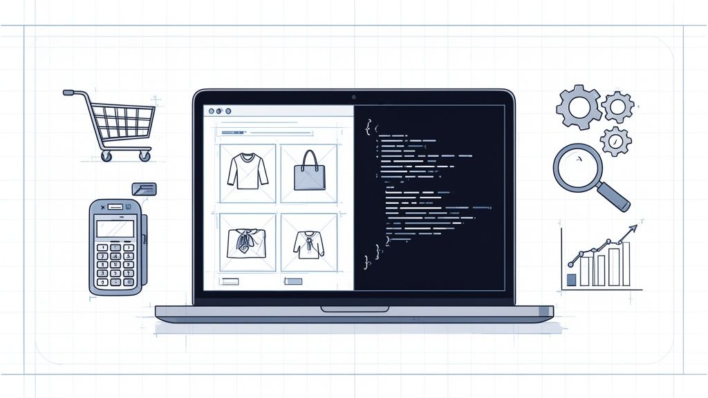
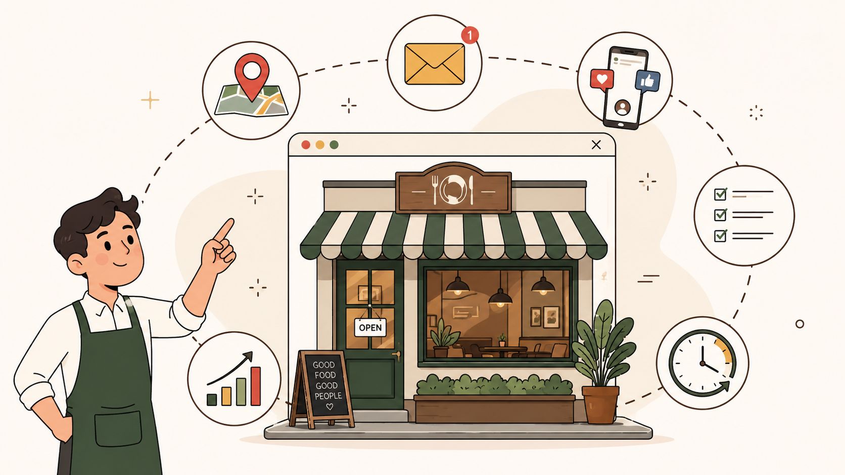
Let’s get real for a moment. Anyone can pick a slick theme and launch an online store. But building an ecommerce business that actually thrives? That’s a completely different ballgame. The real challenge isn’t just getting online; it’s creating a digital experience that turns casual browsers into loyal customers who come back again and again.
Your Blueprint For High-Growth Ecommerce
So, what’s the secret sauce? It’s not one thing, but a carefully measured blend of intuitive design, rock-solid technical performance, and a relentless focus on data. Think of this guide as your roadmap, built from years of launching and scaling online stores. We're going to break down the pillars that support real, sustainable growth.
Customer expectations for online shopping are at an all-time high, and businesses are investing heavily to keep up. This trend is fueling massive growth in the web development market, which is the engine behind every great ecommerce site.
The market is on track to jump from USD 74.69 billion in 2025 to a staggering USD 104.31 billion by 2030. You can dig into more of these web development statistics and trends on esparkinfo.com.
This isn't just about building more websites. It's about building smarter websites that deliver the speed, personalization, and seamless experience that modern shoppers demand.
The Core Stages of Ecommerce Development
Bringing a successful ecommerce site to life isn't a single sprint; it’s a marathon run in distinct stages. Getting a handle on this process is crucial for managing your budget, setting realistic timelines, and making sure no critical steps are missed. Each phase logically builds on the one before it.
Here’s a high-level look at how a project typically unfolds.
| Phase | Key Objective | Primary Activities |
|---|---|---|
| Strategy & Planning | Define goals and project scope. | Market research, competitor analysis, platform selection, budget allocation. |
| Design (UX/UI) | Create a user-centric and intuitive interface. | Wireframing, prototyping, visual design, user journey mapping. |
| Development | Build the functional website. | Front-end coding (HTML/CSS), back-end programming, database setup. |
| Launch & Optimization | Go live and continuously improve. | Final testing, deployment, analytics tracking, A/B testing, SEO monitoring. |
Getting these stages right is non-negotiable. A sharp strategy ensures you're building the right store for the right audience. Great design and development ensure you build it correctly. But it's that final stage, optimization, where the real magic happens—transforming your site from a one-time project into a powerful, long-term revenue generator.
Crafting Your Ecommerce Strategy and Choosing a Platform
I've seen countless ecommerce projects go off the rails for one simple reason: they skipped the homework. Building a successful online store isn't about picking a cool theme; it's about having a rock-solid plan before a single line of code is written. This initial strategy work is where you turn your business goals into a real blueprint for development.
It all starts with knowing exactly who you're selling to. And I don't mean just basic demographics. You need to build out detailed buyer personas. What keeps your ideal customers up at night? What are their real motivations for buying? Where do they hang out online? Getting this picture crystal clear will guide every single decision you make from here on out.
Once you know your audience, you need to look at who they’re currently buying from. Pinpoint your top three to five competitors and do a deep dive. Don't just browse their homepage; go through their entire checkout process. Add items to your cart. Abandon it. See what happens. Find out what they're doing well and, more importantly, where they're dropping the ball. Those gaps are your openings.
Defining Your Unique Value Proposition
With a clear view of your customer and the competition, you can zero in on your unique value proposition (UVP). This is your promise. It's the core reason someone should give you their money instead of a competitor. Your UVP is where your customer's needs and your brand's strengths collide.
This isn’t just a fluffy marketing slogan. Your UVP is a practical tool that should directly influence your website's features and design.
- Selling on price? Your design needs to scream "deal." Think prominent discount banners, easy price comparisons, and a no-frills checkout.
- Selling exclusive, high-end products? You'll need a premium design with stunning photography, compelling product stories, and a luxurious feel.
- Selling on incredible service? Your site better have a live chat widget front and center, a comprehensive FAQ, and contact info that's impossible to miss.
A well-defined strategy acts as a filter for every feature request and design choice, ensuring you only invest in what truly drives value for your customers and your business. It prevents scope creep and keeps your project focused on generating a return on investment.
Selecting the Right Ecommerce Platform
Choosing your platform is easily one of the biggest decisions you'll make. This is the engine of your entire store, and it affects everything—your daily operations, your future ability to grow, and your long-term costs. There's no single "best" platform, only the one that's best for your business right now.
Instead of getting bogged down in endless feature lists, let's look at a couple of real-world scenarios.
Scenario 1: The Agile Startup
A brand-new direct-to-consumer business needs to get online fast, test its product idea, and keep costs down. The main goals are speed and simplicity.
- Best Fit: An all-in-one platform like Shopify or BigCommerce is perfect here. They give you pre-made themes, built-in payment processing, and a user-friendly backend. You can get a professional-looking store up and running in a matter of weeks, not months. You sacrifice some deep customization, but getting to market quickly is the name of the game.
Scenario 2: The Complex Catalog
A B2B distributor is juggling tens of thousands of products, has different pricing for various customer groups, and needs to sync everything with its existing ERP system.
- Best Fit: This calls for a more heavy-duty, customizable solution like Adobe Commerce (Magento) or a headless commerce setup. These systems are designed for complexity. To manage that much product data effectively, implementing a Product Information Management (PIM) system isn't a luxury; it's a necessity for scaling. The upfront cost and development time are higher, but they provide the power and flexibility needed for complex, large-scale operations.
Ultimately, your platform choice should be a direct reflection of the strategy you just built. Don’t choose a platform just because you've heard of it. Choose it because it's the right tool to bring your vision to life and support your growth for years to come.
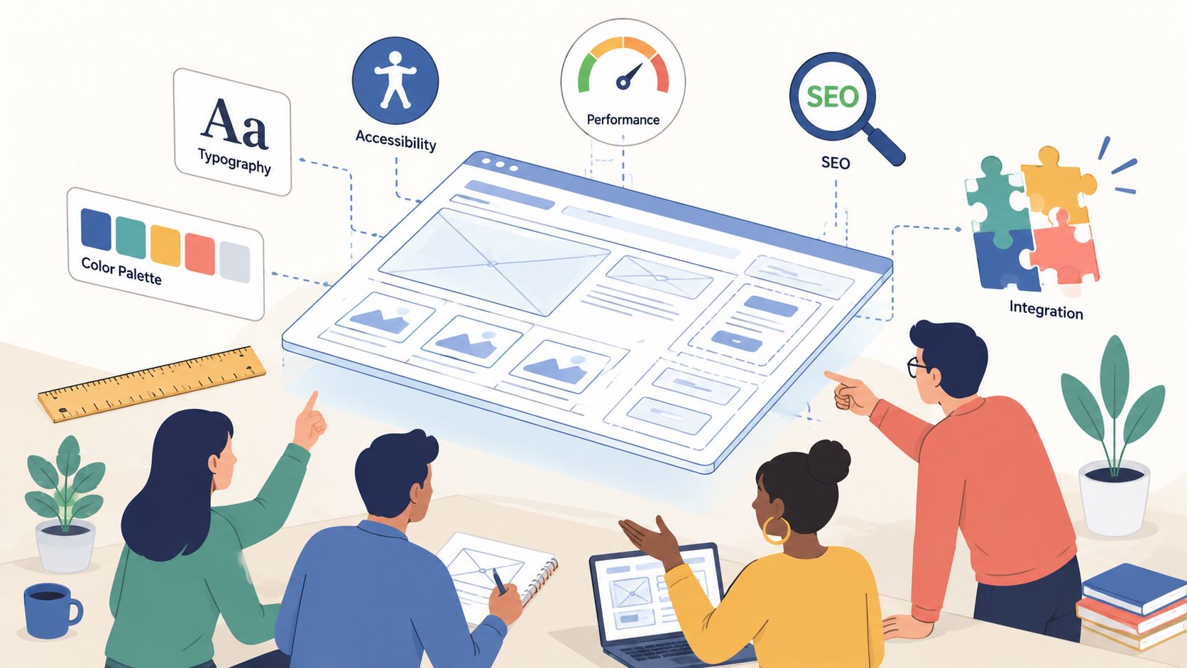
Designing an Ecommerce Experience That Converts
Great e-commerce design is more than just a pretty storefront. It’s a deliberate, psychological journey you create for your visitors. Every layout choice, every product photo, and even the color of the "Add to Cart" button is a tool you can use to guide customers from casual browsing to a completed purchase. This is where UX (user experience) and UI (user interface) design come together to do one thing: convert.
If you think design is just fluff, think again. The cost of a bad user experience is staggering—we're talking about a $1.42 trillion loss for businesses every year. With cart abandonment rates stuck around 75.6%, it's painfully clear that a clunky or confusing site is actively losing you money. In fact, a single bad online experience is enough to make 52% of shoppers abandon a brand for good.
Your goal is to make buying feel effortless, almost instinctual. You want to dismantle any friction that might cause hesitation, building a sense of trust and momentum that carries a customer all the way through checkout.
Building Intuitive Site Navigation
Your site’s navigation is the map to your products. If it's a mess, you're essentially handing potential customers a crumpled, unreadable map and wishing them luck. They won't stick around. The best navigation is so intuitive that users find what they want without a second thought.
Here’s how to get your navigation right:
- Think Like Your Customer: Organize your product categories based on how a real person would look for them, not how your inventory is structured internally. Use common, everyday terms.
- Create a Clear Hierarchy: For larger catalogs, mega menus can be a lifesaver, but they must be clean and organized. Use obvious parent categories that expand into specific subcategories to avoid overwhelming your visitors.
- Implement Breadcrumbs: This is a simple but powerful tool. A breadcrumb trail (e.g., Home > Men's > Shoes > Running Shoes) shows users exactly where they are and lets them easily step back without hitting their browser's back button a dozen times.
Let's put this into practice. Imagine someone is searching for "women's black leather boots." An ideal navigation flow lets them find it in three clicks or less: Shoes > Women's > Boots, and then they can simply filter by "black" and "leather." That’s the kind of effortless discovery that leads to sales.
This decision-making process between simplicity and robust customization is a fundamental part of your e-commerce journey.

As you can see, your core business needs will point you toward either a straightforward, easy-to-manage platform or a more complex solution built for deep customization.
Designing High-Converting Product Pages
This is it—the digital sales floor where a customer decides "yes" or "no." Your product page has to do the heavy lifting of a real-life salesperson. It must be persuasive, packed with information, and visually compelling.
To make your product pages work for you, focus on these critical elements:
- High-Quality Visuals: Don't skimp here. Show off your product from every angle with high-resolution images. Add video to show it in action or 360-degree views to let customers explore. They can't touch it, so your visuals have to do the work.
- Persuasive Copy: Stop listing features and start selling benefits. How does your product make your customer's life better, easier, or more enjoyable? Your words have a massive impact, so investing in professional copywriting for websites that’s engineered to sell is always a smart move.
- An Unmistakable Call-to-Action (CTA): Your "Add to Cart" button needs to pop. Use a contrasting color that immediately draws the eye. There should be zero confusion about the single most important action a user can take on this page.
Building Trust and Reducing Checkout Friction
Even with a perfect product page, a shopper can get cold feet at the last second. Your job is to build their confidence and make the final steps as smooth and painless as possible.
Trust is earned through transparency. Display security badges (like your SSL certificate), a crystal-clear return policy, and customer reviews—especially those with photos. Reviews are gold; 93% of consumers say they read online reviews before making a purchase.
The foundation for a trustworthy and functional site often starts with the right technology. For example, choosing the best WooCommerce theme for WordPress can give you a huge head start by ensuring your design is both beautiful and optimized for performance right out of the box.
Finally, streamline your checkout process into a well-oiled machine:
- Always offer a guest checkout option. Forcing account creation is a notorious conversion killer.
- Keep the process clean, either on a single page or with a clear progress bar showing the steps.
- Auto-fill address information whenever possible.
- Be upfront about all costs—shipping, taxes, everything. No one likes surprises at the final step.
Remember, every form field you eliminate and every click you save brings you one step closer to locking in that sale.
Mastering Mobile-First Ecommerce Development
Let's get one thing straight: if you're not designing for mobile first, you're not just behind the curve—you're building for a customer that barely exists anymore. A true mobile-first approach isn't about making your desktop site "fit" on a phone. It's the exact opposite. You design the core experience for the smallest screen, perfecting it for the device in your customer’s hand, and then you expand that experience for larger screens.
This isn't just a trend; it's where the money is.

The data is impossible to ignore. Mobile devices now account for over 59% of all online retail sales around the globe and a solid 44.2% of ecommerce sales right here in the U.S. But here's the number that should keep you up at night: the mobile cart abandonment rate is a staggering 85.65%. More often than not, that's a direct result of clunky navigation and painfully slow load times. You can see more on these pivotal ecommerce trends on thefrankagency.com.
From Responsive Design to App-Like Experiences
The foundation of any good mobile experience is responsive design. This is non-negotiable. It means your site’s layout, images, and text automatically reflow to provide a great experience on any device, from a tiny smartphone to a huge desktop monitor.
But in 2024, responsive design is just the starting line. The real game-changer is the Progressive Web App (PWA). PWAs use modern browser features to give your website the feel and functionality of a native mobile app, without the hassle of the app store.
- App-Like Feel: Users can "install" your PWA to their home screen, receive push notifications, and even browse offline.
- No App Store Needed: You sidestep the entire app store submission and approval process. A PWA is just a website, accessible to anyone with a browser.
- Blazing Fast: PWAs are designed for speed, caching content so the site loads almost instantly after the first visit.
A PWA gives you the best of both worlds: the broad reach of the web combined with the sticky, engaging features of a native app. It's a powerful tool for driving repeat business without needing to build and maintain separate iOS and Android apps.
The Critical Role of Mobile Page Speed
On mobile, speed isn't a feature; it's the whole user experience. Every single second a customer waits for your page to load, you can practically watch your conversion rate drop. It’s why Google is so focused on Core Web Vitals—these metrics measure the real-world experience of your users, with a heavy emphasis on loading performance.
A slow mobile site is a revenue killer. Plain and simple. To get your speed up to par, there are a few technical optimizations that are absolutely essential:
- Image Optimization: Compress every image, but do it smartly so you don't lose visual quality. Using modern formats like WebP is a huge win.
- Lazy Loading: Don't load what the user can't see. Make sure images and videos only load as they scroll into view.
- Minimize Code: Every line of code adds weight. Minify your CSS, JavaScript, and HTML files to trim the fat.
- Leverage Browser Caching: Tell your users' browsers to save static parts of your site (like your logo and CSS files) so they don't have to re-download them on every single visit.
A Practical Mobile Audit Checklist
To make sure your mobile experience truly delivers, grab a phone and run through this quick audit. These are the details that separate a frustrating site from one that’s a joy to use.
Navigation and Usability
- Thumb-Friendly Design: Are your buttons big enough to be tapped easily? Is there enough space around them to prevent accidental clicks?
- Sticky Navigation: Does the main menu or a "back to top" button stay fixed as you scroll down a long page?
- Simplified Forms: Are your forms as short as possible? Are the fields large and easy to tap into, with auto-fill enabled?
Content and Readability
- Legible Font Size: Is your main text at least 16px? Nobody should have to pinch-and-zoom to read about your products.
- High Contrast: Can you easily read the text against the background? Low-contrast designs are an accessibility and usability nightmare.
Performance and Checkout
- Fast Load Times: Be honest. Does your site load in under 3 seconds on a typical mobile network? Use a tool like PageSpeed Insights to check.
- Streamlined Checkout: How many taps does it take to buy something? Minimize steps, remove distractions, and make it dead simple to give you money.
You can build the most beautiful, visually stunning online store, but if no one can find it, it's just an expensive hobby. The real money in ecommerce is made behind the scenes, in the technical guts of your website. This is where search engine optimization (SEO) and site performance come together—they're not just buzzwords; they're the engine that drives discovery and, ultimately, sales.
Think about it. Google and other search engines are like librarians for the entire internet. Your job is to make it dead simple for them to find your products, understand what they are, and feel confident recommending them to shoppers. This all starts with a solid foundation in on-page SEO built specifically for the chaos of an ecommerce catalog.

This isn't about gaming the system. It's about sending clear, consistent signals to search engines about what you sell and why your pages are the best answer for a searcher's query. Get this right, and you'll see a steady stream of organic traffic heading your way.
Winning with On-Page Ecommerce SEO
Good on-page SEO for an online store is so much more than just sprinkling some keywords around. It’s a methodical process of structuring your content and metadata to match exactly how real people search for the things you sell.
Let's start with the most valuable digital real estate you have:
- Product Titles: Your page titles need to be crystal clear. A great formula I've seen work time and again is
Brand - Product Name - Key Feature. For instance, "Aura Glow – Vitamin C Serum – For Brightening Skin." It’s descriptive for both humans and search bots. - SEO-Friendly URLs: Keep your URLs short, sweet, and readable. A URL like
/products/auraglow-vitamin-c-serumis worlds better than/products/item-1298ab-?cat=45. One tells a story; the other is just noise. - Compelling Meta Descriptions: This is your 160-character sales pitch right on the search results page. Don't just list keywords. Write a mini-ad that tempts people to click by highlighting a unique benefit or a special offer.
But the basics only get you so far. To really pull ahead of the competition, you need to use more advanced tactics. Schema markup is probably the most powerful tool in your arsenal here. It's a bit of code that gives search engines specific details about your products, which they then use to create "rich snippets"—those eye-catching search results with star ratings, prices, and stock levels.
Those little extras make your listings pop off the page, seriously boosting click-through rates and building trust before a user even lands on your site.
Managing Complex Site Structures
As your store grows, so does the complexity. One of the biggest technical headaches I see with larger stores is faceted navigation—those handy filters for size, color, brand, etc. They’re fantastic for shoppers but can create a nightmare for SEO: duplicate content.
If every filter combination creates a new URL that Google can crawl, you'll end up with thousands of nearly identical pages. This waters down your site's authority in a hurry. The fix is to use canonical tags (rel="canonical"), which essentially tell search engines, "Hey, all these similar pages? This one is the real master copy. Please index it and ignore the others."
A smart internal linking strategy is also mission-critical. You need to create pathways that guide both users and search engine crawlers to your most important pages. Link from blog posts to related products. Link from one product to another. This helps spread "link equity" (think of it as ranking power) throughout your site, giving your most valuable product and category pages the authority they need to rank well. For a much deeper look at this, our guide on link building for ecommerce sites is a great resource.
Performance is Non-Negotiable
Here’s a hard truth: all the SEO in the world won't save a slow website. Site speed isn't just a confirmed Google ranking factor; it's a conversion killer. Studies have shown that a mere one-second delay in mobile page load time can slash conversion rates by up to 20%.
Getting your site to load lightning-fast isn't optional. Here's what you need to focus on:
- Aggressive Image Optimization: Compress every single image. Use modern formats like WebP. I’ve seen beautiful product photos that are 1MB or more—that’s a performance crime. An optimized image can look just as good at a fraction of the file size.
- Leverage Browser Caching: This is a simple setting that tells a visitor's browser to save static parts of your site, like your logo and CSS files. When they come back, those files load instantly from their own computer instead of being downloaded all over again.
- Use a Content Delivery Network (CDN): A CDN is a network of servers around the world that stores copies of your site. When a customer visits, they're served content from the server physically closest to them. This is a game-changer for reducing lag, especially if you sell to a global audience.
At the end of the day, performance and technical SEO are two sides of the same coin. A fast, well-structured, and easily discoverable store isn't just a "nice-to-have"—it's the bedrock of any successful ecommerce business.
9. Launching and Continuously Improving Your Ecommerce Site
Getting your ecommerce site live is a huge milestone, but it’s really just the beginning. Think of your launch day not as the finish line, but as the starting gun for the real race. The difference between a store that fizzles out and one that scales into a major brand often comes down to what happens after the site goes live.
Before you even think about flipping that switch, you need to run through a meticulous pre-launch check. This isn’t just about catching a few typos; it's a full-blown dress rehearsal for your entire customer experience. We’re talking about stress-testing everything from the first click on an ad to the final "thank you" page after a purchase.
So many businesses get excited and rush this part, only to face easily avoidable issues on day one. To make sure you’re not one of them, we strongly recommend following a detailed guide. This complete website relaunch checklist is an excellent resource for catching those common pitfalls and ensuring your launch goes off without a hitch.
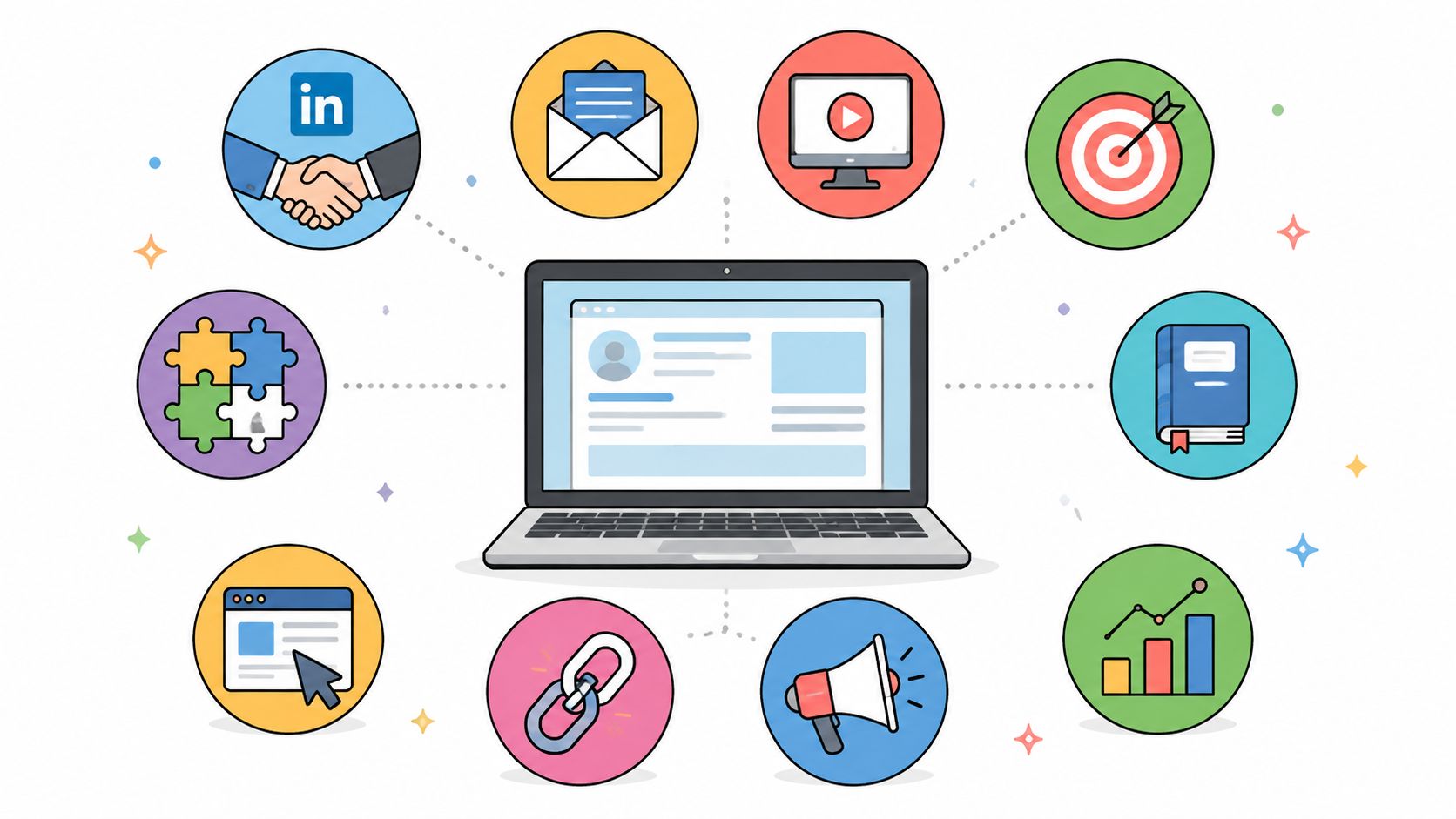
Using Data to Drive Growth
Once your site is live and taking orders, your new best friends are data and analytics. Tools like Google Analytics 4 aren't just nice-to-haves; they are the eyes and ears of your business, showing you exactly how people are interacting with your store. Don't just get hung up on the total number of visitors.
Your job is to dig into the patterns. Where are people leaving your site? Which product pages get a ton of views but almost no "add to carts"? This data isn't just a collection of numbers—it's a treasure map pointing directly to your biggest opportunities for improvement.
Your most important metrics—the vital signs of your business—are your key performance indicators (KPIs). Keep a close eye on your conversion rate, average order value (AOV), and customer lifetime value (CLV). These numbers tell you what's working and, more importantly, what’s costing you money.
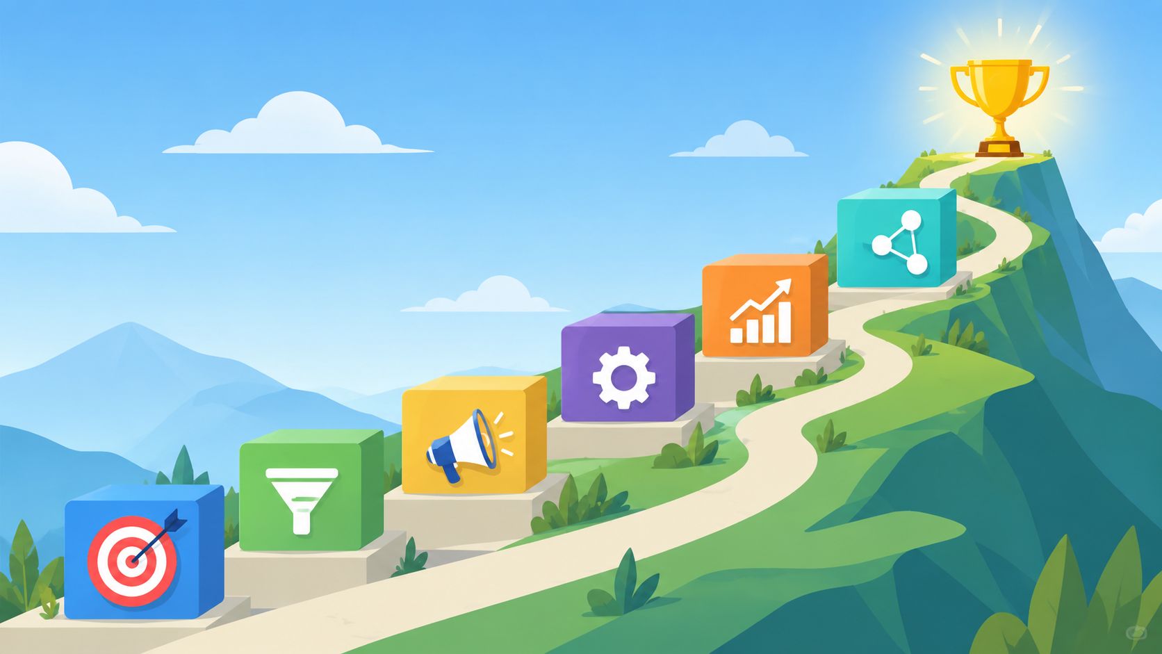
The Art of Conversion Rate Optimization
This brings us to the world of Conversion Rate Optimization (CRO). Put simply, CRO is the process of using data and user feedback to get more visitors to do what you want them to do—buy something. It’s a methodical approach, swapping out guesswork for data-backed decisions.
The engine behind great CRO is A/B testing. This is where you create two slightly different versions of a page (version A and version B) and show them to different groups of users to see which one performs better.
You can A/B test just about anything. Seriously.
- Headlines: Does "Shop Our New Spring Arrivals" perform better than "Warm Weather Styles Are Here"?
- Calls-to-Action (CTAs): Does a green "Add to Cart" button get more clicks than a blue one? Is "Buy Now" more effective than "Add to Bag"?
- Page Layouts: What happens if you move your customer reviews to be directly below the product title instead of at the bottom of the page?
The goal is to stop guessing and start knowing. Every test you run teaches you something valuable about your customers. Over time, these small, incremental wins compound, leading to significant boosts in revenue and a much more effective online store.
Frequently Asked Questions
When you're diving into an ecommerce project, a few big questions always come up around cost, timelines, and the tech involved. Getting straight answers on these is key to planning a project that doesn’t spiral out of control. Let's tackle some of the most common ones I hear from clients.
How Much Does an Ecommerce Website Cost in 2026?
There's no simple answer here—the cost of an ecommerce site really depends on how ambitious you want to get.
If you're just starting out or testing a new product, a basic Shopify store using a well-designed theme is a fantastic entry point. Getting that set up with some light customization might only run you a few thousand dollars.
On the other hand, if you're looking for a completely unique, custom-built experience on a platform like BigCommerce or a headless setup, the budget climbs fast. These projects can easily start at $25,000 and go well over $100,000.
What drives that price? It's all about the details: the depth of custom design work, the number of third-party systems you need to connect (like an ERP or CRM), and the experience of the development team you hire. Always remember to budget for ongoing costs like maintenance, hosting, and marketing, not just the initial build.
What Is Headless Commerce and Do I Need It?
Think of headless commerce as separating your storefront (the "head") from all the back-end machinery that runs your business (the "body"). This architecture gives you incredible freedom to create unique shopping experiences on a website, a mobile app, or any other digital device you can dream up.
It's an excellent choice for established brands that need to innovate quickly and deliver highly personalized customer journeys. The ability to update the user experience without touching the back-end logic is a massive advantage for agile marketing and design teams.
But all that flexibility comes with a higher price tag and needs more development muscle to manage. For most startups and small-to-medium-sized businesses, a traditional platform like Shopify is the smarter choice. You can always make the move to headless when your business has the scale and the need for deep customization to justify the investment.
How Long Does It Take to Build an Ecommerce Website?
Just like cost, the timeline is all about complexity.
A straightforward, template-based Shopify store can be up and running surprisingly fast—often in as little as 4-6 weeks. It's perfect if your main goal is getting to market quickly.
A more customized project with unique design work and special features will naturally take a bit longer, usually landing in the 3-4 month range.
For a complex, enterprise-level site with heavy custom coding and multiple system integrations, you should be prepared for a timeline of 6 months or more. That timeframe isn't just for coding; it includes essential phases like strategy, design, migrating all your content, and rigorous testing to ensure a smooth launch.
Ready to build an ecommerce experience that drives real growth? At ReachLabs.ai, we blend data-driven strategy with expert design and development to create online stores that convert. Start your project with us today!
