
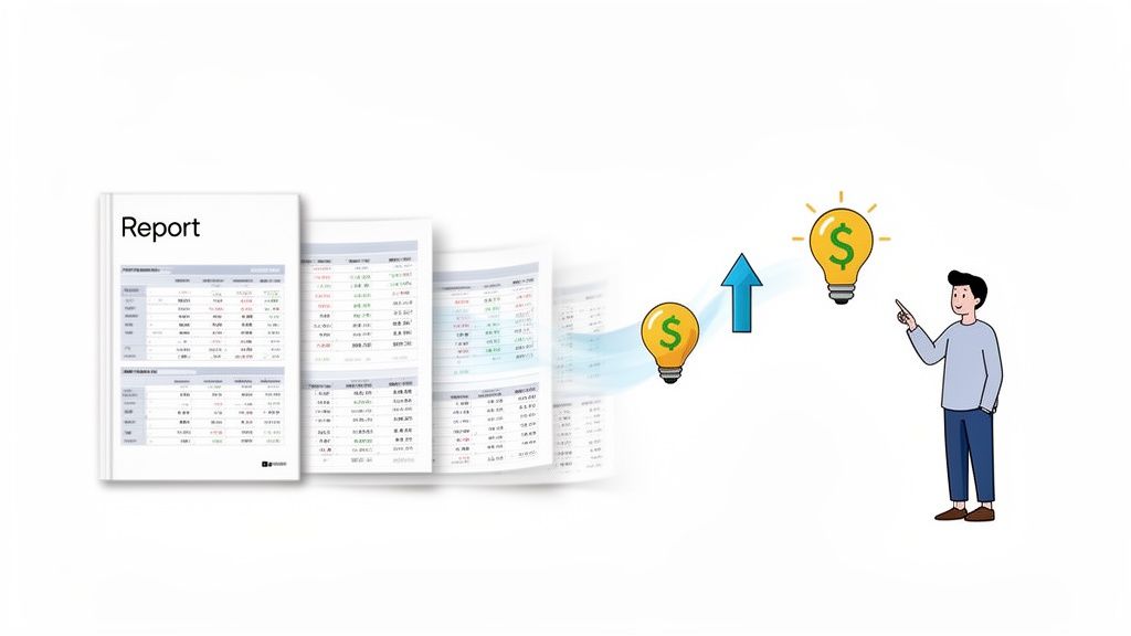
A good digital marketing report does more than just present data—it tells a story that proves your value, justifies your budget, and maps out your next move. It’s the most powerful tool you have for communicating performance, celebrating wins, and showing stakeholders exactly where the next growth opportunities are.
When done right, your report transforms a pile of metrics into a clear, compelling narrative that drives smart business decisions.
Your Digital Marketing Report Is More Than Just Numbers
Let's be real for a second. Most digital marketing reports are overwhelming data dumps that end up unread in an inbox. We're here to fix that. Stop thinking of your report as a monthly chore and start seeing it as your chance to tell a powerful story—one that secures budgets, fine-tunes strategy, and proves just how valuable your work is.
Too many marketers get lost in the weeds, presenting spreadsheets packed with clicks, impressions, and follower counts. This leaves leadership and clients asking the dreaded question: "So what?" This guide gives you a practical framework to turn that raw data into a story that decision-makers actually look forward to reading.
The Shift from Data Dumps to Strategic Narratives
The biggest issue with most reports is a total lack of context. Sure, a 20% increase in website traffic looks good on paper, but it's a hollow victory without the "why" and "what's next." Did a high-performing blog post drive that traffic, signaling an opportunity for a paid promotion? Or was it the result of a social media campaign that brought in a ton of low-quality leads?
A truly effective report answers these questions before they're even asked. It connects the dots between your day-to-day work and the company's bottom line. Your report stops being a static document and becomes a catalyst for action. The real goal here is to graduate from being a data presenter to a strategic advisor.
The best marketing reports don’t just show what happened; they explain why it happened and recommend what to do next. They're forward-looking guides, not just historical records.
Why This Matters More Than Ever
The need for sharp, insightful reporting has never been greater. With the digital ad market projected to hit an incredible $843 billion by 2025, companies are investing heavily in online channels. That huge influx of cash means marketers need to be laser-focused on tactics that are both scalable and measurable.
Consider this: SEO is responsible for 93% of website traffic, and 97% of consumers look up a company online before deciding to engage. These aren't just interesting stats; they're proof that you need reports that clearly show ROI. You can dig deeper into digital marketing statistics and their impact on strategy to see just how critical this is.
To make your reports truly indispensable, build them on these four pillars:
- Audience-Centric Focus: Customize every chart and insight for the person who will be reading it. The CEO and the social media manager need different information.
- Clear Connection to Goals: Draw a straight line from marketing KPIs to big-picture business objectives, like revenue growth or customer lifetime value.
- Actionable Recommendations: Don't just present the data. Provide clear, concrete next steps based on what you've found.
- Visual Clarity: Use clean, simple visuals. Make complex information easy to understand in a quick glance.
This guide will show you how to build a report that nails all of these points, ensuring your work gets the attention and credit it deserves.
First Things First: Who Is This Report For and What Do They Care About?
Before you even dream of pulling a single metric or opening a dashboard, stop. Take a minute and ask yourself two simple but critical questions: Who am I building this for? And what do they actually need to know? Getting this right from the start is the single most important thing you can do to create a report that people actually read and use.
A report for your CEO should look nothing like the one you send to your social media manager. I've seen it a thousand times: marketers create a massive, one-size-fits-all data dump, hoping something in there will be useful. That's a recipe for a report that gets filed away and completely ignored. It’s the difference between delivering real business intelligence and just adding to the noise.
Let's make sure your hard work actually makes an impact.
Figure Out What Your Audience Really Wants to Know
The key to creating a report people love is to think less about their job title and more about the specific business questions they're trying to answer every day. The C-suite and the people in the marketing trenches are solving completely different problems, so your report needs to speak their language.
For example, a CEO or CMO is laser-focused on the big picture. They think in terms of revenue, market position, and profitability—not click-through rates.
They’re asking questions like:
- How much pipeline and revenue did marketing drive last quarter?
- What’s our Customer Acquisition Cost (CAC), and is it getting better or worse?
- Are we keeping up with our main competitors?
On the other hand, a channel manager—your SEO specialist or paid media buyer—needs the nitty-gritty details to do their job well. They live in the tactical data that, when optimized, ladders up to those big-picture results.
Their questions are far more granular:
- Which ad copy from our last A/B test got the best CTR?
- Did that new batch of backlinks move the needle on our target keyword rankings?
- What’s the conversion rate on our new landing page, and where are people dropping off?
Making different versions of your report for these audiences isn't creating more work; it’s making your work matter.
The goal isn't to just throw numbers on a page; it's to provide answers. A truly great report anticipates what your audience is asking and presents the data to answer those questions directly.
How to Have a Quick Chat with Stakeholders (Without Making It Awkward)
If you’re not 100% sure what your audience cares about, don't guess. Just ask them. A quick, informal chat can give you all the clarity you need. This doesn't have to be a big, formal meeting on the calendar; a 15-minute conversation is usually all it takes.
Here are a few simple questions to get the ball rolling:
- "When you think about marketing's success, what are the top one or two things that really matter to you?" This cuts right to their definition of a "win."
- "What information would help you make better decisions?" This frames your report as a strategic tool, not just a homework assignment.
- "Is there anything you see in reports now that feels like noise or isn't useful?" This is gold—it tells you exactly what to cut so the important stuff stands out.
Doing this little bit of upfront work ensures you’re not wasting hours pulling metrics nobody looks at. It also shows you’re a strategic partner who’s focused on delivering value, turning your report from a simple requirement into an essential tool for the entire business.
Choosing KPIs That Tell the Real Story
It’s time to get real about our metrics. A thousand new followers or a sudden traffic spike feels good, but what does it actually do for the business? If we can't connect those numbers to the bottom line, they're just vanity metrics. The real magic happens when we handpick Key Performance Indicators (KPIs) that tell an honest story about growth.
When you nail your KPIs, your report stops being a simple list of things you did and becomes a strategic roadmap. It shifts the conversation from "what happened" to "what we made happen." This is how you create a dashboard that weaves a compelling narrative and helps everyone make smarter, data-driven decisions.
Who you're reporting to drastically changes what you should highlight. A CEO needs the 30,000-foot view, while a marketing manager needs to be in the weeds.
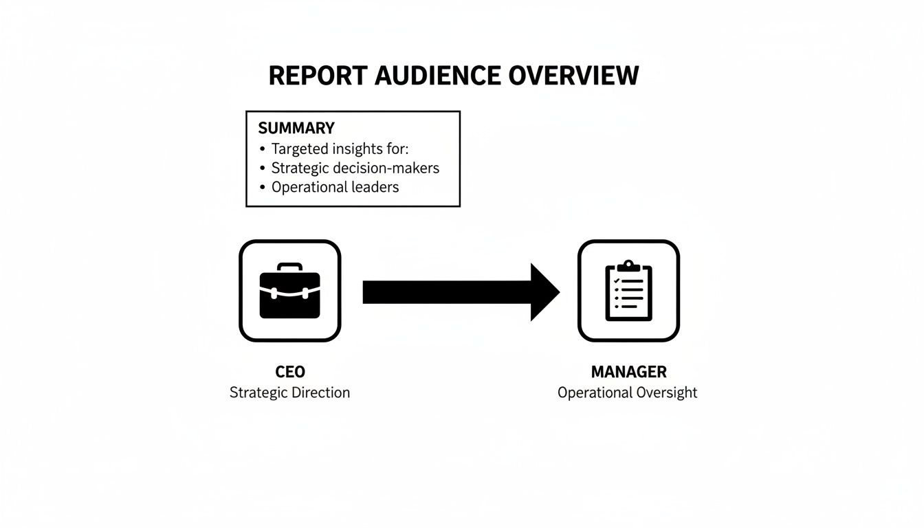
As you can see, executives are watching high-level numbers like ROI and Customer Acquisition Cost. Managers, on the other hand, need tactical metrics like conversion rates and lead quality to guide their teams effectively day-to-day.
Connect Every Metric to a Business Goal
Here’s a rule I live by: every single KPI in your report must trace a direct line back to a core business objective. No exceptions. If you can't articulate how a metric helps increase revenue, lower costs, or boost customer satisfaction, it doesn't earn a spot in your report.
Think about a SaaS company aiming to grow its monthly recurring revenue (MRR). Reporting on "total leads" is vague. A much sharper approach is to track Marketing Qualified Leads (MQLs) that book product demos, and then zero in on the MQL-to-Customer Conversion Rate. Now you're directly linking marketing activities to new revenue.
A vanity metric might get you a pat on the back. A business-aligned KPI gets you a bigger budget. It’s all about showing how you move the needle.
To help you get started, here's a quick guide to some of the most impactful KPIs for major marketing channels, broken down by the marketing funnel.
| Channel | Awareness KPIs | Engagement KPIs | Conversion KPIs |
|---|---|---|---|
| SEO & Content | Keyword Impressions, Organic Traffic | Bounce Rate, Time on Page, Backlinks | Organic Conversion Rate, Goal Completions |
| PPC Advertising | Impressions, Reach, Click-Through Rate (CTR) | Ad Engagement Rate, Quality Score | Cost Per Acquisition (CPA), Return on Ad Spend (ROAS) |
| Email Marketing | Open Rate, List Growth Rate | Click-Through Rate (CTR), Unsubscribe Rate | Conversion Rate, Revenue Per Email |
| Social Media | Reach, Follower Growth, Brand Mentions | Engagement Rate, Shares, Comments | Website Clicks from Social, Social-Driven Leads |
This table is just a starting point. The key is to select the metrics from each category that most accurately reflect what you're trying to achieve with that specific channel.
Selecting KPIs for SEO and Content Marketing
With SEO, it’s all too easy to get obsessed with keyword rankings. While rankings are a decent health indicator, they aren't the main event. What truly matters is what that visibility generates for the business.
Instead of just celebrating a #1 spot, focus on KPIs with more substance:
- Organic Conversion Rate: What percentage of your search visitors are actually filling out a form, making a purchase, or signing up? That’s the real win.
- Branded vs. Non-Branded Traffic: Seeing a steady climb in non-branded traffic is a huge signal that your SEO is reaching new audiences who didn't know you existed.
- Organic-Driven Revenue: For any e-commerce site, this is the holy grail. It’s the dollar amount directly attributable to your SEO work.
For content, look beyond page views. The better question is, "What did people do after reading?" Track things like Blog-Sourced MQLs or Content-Assisted Conversions to show how your articles are greasing the wheels of your sales funnel.
PPC KPIs That Go Beyond Clicks
In paid advertising, efficiency is the name of the game. Clicks and impressions are just the cost of entry; they don't prove your campaigns are actually making money. A solid PPC report focuses squarely on the financial return.
These are the metrics that will get your executive team's attention:
- Cost Per Acquisition (CPA): This is your efficiency North Star. How much does it cost, on average, to acquire one paying customer through your ads?
- Return on Ad Spend (ROAS): The classic "money in, money out" metric. For every dollar you spend on ads, how many dollars in revenue are you generating?
- Quality Score (Google Ads): While it feels technical, a high Quality Score directly lowers your CPA. Reporting on improvements here shows you’re a savvy operator, optimizing for both relevance and cost.
If you want to go deeper, exploring a wide range of marketing performance metrics examples can give you a much clearer picture of what truly drives business growth.
Social Media KPIs That Measure True Engagement
Social media is the land of vanity metrics. Follower counts and likes are easy to chase but notoriously hard to connect to real business value. To make your social reporting count, you have to dig deeper for signs of genuine interest.
Try focusing your report on these instead:
- Engagement Rate Per Post: This cuts through the noise of a large audience, showing you how compelling your content actually is.
- Website Clicks from Social: How many people are you successfully pulling from the social platform over to your website, where the real action happens?
- Audience Sentiment: Are the conversations about your brand positive, negative, or neutral? Modern tools can quantify this, giving you a valuable pulse on brand health.
Weaving Your Data into a Compelling Narrative
Once you’ve wrestled all your data into one place, the real art begins. This is where you move beyond spreadsheets and dashboards from tools like Google Analytics, Search Console, and your CRM. Your job is to transform those rows of numbers into a story that actually means something to the business. It’s the difference between saying what happened and explaining why anyone should care.
A classic mistake I see all the time is just exporting charts and slapping them onto a slide. That’s not a report; it’s a data dump. An effective report interprets the data for your audience. But before you even think about sharing a single number, you absolutely have to validate it. Cross-reference your CRM leads with your analytics goals. Make sure everything lines up. Bad data will torpedo your credibility faster than anything else.
Start with a Punchy Executive Summary
Your report's structure is everything, and it should always, always start with an executive summary. Think of this as the entire story in a nutshell, crafted specifically for the CEO or stakeholder who has five minutes between meetings.
This isn't a fluffy intro. It needs to be concise and hit these key points:
- The Bottom Line: Kick it off with a single sentence that sums up performance. For example, "Q3 saw a 15% increase in marketing-generated revenue, mostly driven by a surge in organic growth."
- The Big Wins: Pinpoint two or three of your best achievements and connect them directly to business goals. No vanity metrics here.
- Honest Challenges: Briefly touch on what didn't work. Acknowledging underperforming areas shows you're on top of it and not trying to hide anything.
- Next Steps: Clearly state your top recommendations for the next quarter. Make them actionable.
Putting this right at the top ensures even the busiest exec gets the critical takeaways. The rest of the report then becomes supporting evidence, not required reading.
Tell a Story with Channel-Specific Insights
After the summary, it's time to dive into the details, channel by channel. This is your chance to connect the dots. Don't just say, "Organic traffic went up by 10%." Explain the why behind the what. Maybe a new cluster of blog posts finally started ranking, or a technical SEO fix from last month is finally paying off by improving crawlability.
For instance, a quick look at this user acquisition report from Google Analytics tells a clear story.
Right away, we can see that "Direct" and "Organic Search" are doing the heavy lifting, bringing in the vast majority of new users. This tells us our brand recognition is strong and our SEO efforts are the main engine for growth. That’s an insight you can build a strategy around.
The best reports aren't just rearview mirrors showing where you've been. They're a compass, showing you exactly where you are and guiding you on where to go next.
Look to the Future with Clear Recommendations
Every piece of data you present should pave the way for a recommendation. This is what turns a passive document into an active, strategic tool that drives decisions.
If your report shows that LinkedIn ads have a fantastic conversion rate but your Facebook campaigns are struggling, the recommendation isn't just to "keep monitoring." It's something decisive, like, "We recommend reallocating 20% of the Facebook budget to scale our high-performing LinkedIn campaigns next month."
We also have to keep an eye on the bigger picture. Technology doesn't stand still, and right now, AI is reshaping everything. A staggering 71% of marketers are planning to invest at least $10 million into it over the next three years. That optimism is shared by 83% of CMOs, and for good reason—AI can personalize emails for over 4 billion daily users and completely overhaul SEO strategies. You can get more details about the rise of AI in marketing on Marketing Dive. A truly great report acknowledges these shifts and suggests how to adapt.
By framing your report as a story—with a clear beginning (the summary), a detailed middle (channel insights), and a forward-looking end (recommendations)—you make it an indispensable guide for growth, not just another file in a folder.
Visualizing Data for Maximum Impact and Clarity
Let's be honest: a spreadsheet full of numbers isn't going to capture anyone's attention. Data is just noise until you give it a voice, and that's where visualization comes in. An effective report doesn't just present data; it makes that data easy to understand at a glance, guiding your audience straight to the key takeaways.
Think about it. Raw data rarely tells a story on its own. It's the difference between saying your organic traffic grew by 15,000 sessions and showing a sharply rising line graph that makes that growth feel significant. Visuals transform abstract figures into a tangible narrative about your marketing performance.
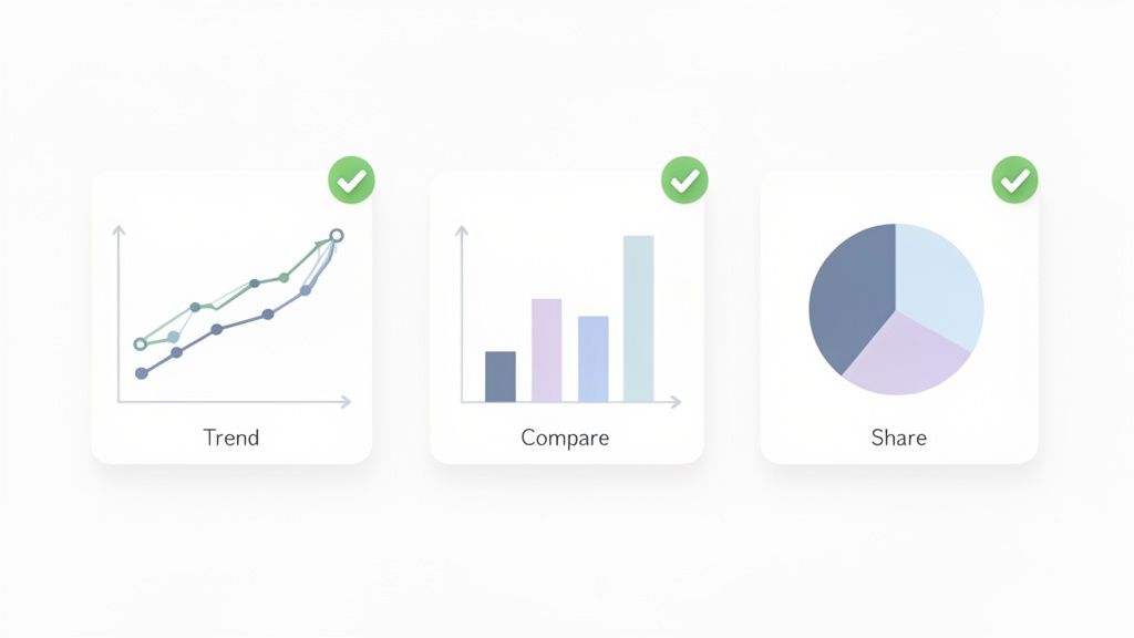
Choosing the Right Chart for Your Story
The type of chart you pick can make or break your point. Each visual has a specific job, and matching the right one to your data is a skill that will immediately elevate your reports from good to great.
Here are the workhorses of marketing reporting and when to deploy them:
-
Line Charts for Trends: Want to show progress over time? A line chart is your go-to. It’s perfect for tracking metrics like website traffic, lead volume, or social media follower growth. It instantly answers the question, "Are we trending up or down?"
-
Bar Charts for Comparisons: When you need to stack different channels or campaigns against each other, a bar chart is your best friend. It makes it incredibly easy to see which ad campaign delivered the highest ROAS or which blog category drove the most engagement.
-
Pie Charts for Composition: Use these with care, but they're brilliant for showing parts of a whole. A classic example is breaking down your website traffic sources (Organic, Social, Direct, etc.). The golden rule? Keep the slices to a minimum—more than five or six and it just becomes a confusing mess.
Your visuals should simplify, not complicate. If a chart needs a paragraph of explanation, it’s not doing its job. The best graphics speak for themselves, pointing the viewer directly to the insight that matters.
Tools That Make Visualization Easy
You don't need to be a data scientist or a graphic designer to create compelling visuals. There are some fantastic tools out there that connect directly to your data sources and handle all the heavy lifting. To really bring your data to life, leveraging data visualization dashboards is the way to go.
Tools like Looker Studio (formerly Google Data Studio) and Tableau are industry standards for a reason. Looker Studio is often the best place to start; it's free and plays nicely with all the other Google products you're already using.
If you're looking for a little inspiration on what's possible, checking out different marketing dashboard examples can give you some great ideas for your own layouts. You can find some excellent ones here: https://www.reachlabs.ai/marketing-dashboard-examples/
A Quick Checklist for Clean Visuals
Before you call a chart done, run it through this quick mental checklist. It'll ensure every visual you create is clear, clean, and effective.
- Is it clearly labeled? Make sure every axis, data series, and color has a clear and concise label. No guesswork allowed.
- Is it simple? Ditch the 3D effects, busy backgrounds, and distracting colors. Let your data be the hero.
- Does it tell one clear story? Every chart should have a single, obvious takeaway.
- Is it accessible? Use high-contrast colors and fonts that are easy to read. Your report should be understandable for everyone.
Turning Your Report into a Catalyst for Action
A brilliant report is useless if it just sits in an inbox, gathering digital dust. The whole point of this exercise is to spark real change. This is where your hard-won insights translate into tangible business actions, turning your report from a simple look-back into a roadmap for what’s next.
The key is to build a consistent rhythm. Whether it’s monthly or quarterly, sticking to a schedule creates anticipation and holds everyone accountable. If you really want to level up, consider adopting a better quarterly business review format that shifts the focus from just reporting numbers to driving strategic outcomes.
Leading a Productive Review Meeting
Your presentation is where the magic really happens. This isn't the time to just read your slides aloud. Your job is to guide a strategic conversation, focusing on the story the data is telling and steering everyone away from getting bogged down by vanity metrics.
Here’s how to make those meetings count:
- Assign Ownership: Every recommendation needs a name next to it. Clearly define who is responsible for each action item and pin down a realistic timeline for getting it done.
- Encourage Discussion: This is a conversation, not a lecture. Leave plenty of room for questions and debate. The best insights often come from a healthy back-and-forth among the team.
- Track Implementation: Make sure to follow up on the agreed-upon actions in your next report. This closes the loop, creating a powerful cycle where insights lead directly to execution and measurable results.
A strong presentation also keeps an eye on the horizon. For example, did you know the influencer marketing industry exploded from $1.7 billion in 2016 to a staggering $24 billion today? With 76% of social media users saying influencers sway their purchasing decisions, highlighting trends like this shows you’re not just reporting on the past—you're preparing for the future.
The purpose of a report isn't to be right; it's to get it right. Use your review meeting to align the team, make decisive calls, and build momentum for the future.
Ultimately, your report should be the starting point for the next great campaign. This all comes back to a core principle: understanding how to measure marketing campaign success is the foundation of this entire process.
Got Questions About Marketing Reports? We’ve Got Answers.
Even the most seasoned marketers run into a few tricky spots when it comes to reporting. It’s completely normal. Let’s tackle some of the most common questions that pop up, so you can build your reports with total confidence.
How Often Should I Actually Send These Things?
There's no magic number here. The right cadence depends entirely on who’s getting the report and what they need to do with it. Sending a daily firehose of data to your CEO is just as bad as giving your PPC specialist a single report once a quarter.
Think about it from their perspective:
-
Weekly for the "In-the-Weeds" Team: The people running your ads or managing your SEO need data fast. A weekly check-in gives them just enough information to tweak campaigns, fix what's broken, and double down on what's working. It’s all about agility.
-
Monthly for Management: Your marketing manager or department head is thinking bigger. They're tracking progress against monthly targets and managing budgets. A comprehensive monthly report gives them the perfect altitude to make informed decisions without getting lost in the daily noise.
-
Quarterly for the C-Suite: Executives are focused on the bottom line and long-term strategy. They don’t need to know click-through rates. A quarterly report is ideal for showing them high-level trends, overall marketing ROI, and how your efforts are impacting the business's strategic goals.
What Are the Best Tools for Automated Reporting?
Let's be clear: pulling data by hand is a recipe for burnout and mistakes. Using an automated tool isn't a luxury; it's a necessity for any team that values its time and sanity. The "best" tool really depends on your budget, your data sources, and your team's technical comfort level.
For starters, Looker Studio (what we all used to call Google Data Studio) is an incredible and free option. If most of your data is in the Google universe (GA4, Google Ads, etc.), it's a no-brainer.
But when you need to pull in data from a dozen different sources and create more advanced visualizations, you might need more firepower. That’s where tools like Tableau or Power BI come in. They’re a bigger investment in both time and money, but the power they give you to blend and analyze complex data is unmatched.
The right tool is simply the one that your team will actually use—one that saves you hours of manual work and makes the data speak for itself. Start with what you need, not what looks fanciest.
Okay, But How Do I Report on a Campaign That Totally Bombed?
It happens. Every marketer has a campaign that just didn't land. The most important thing you can do is face it head-on. Trying to spin the numbers or bury the bad news will destroy your credibility faster than anything else.
Honesty is your best policy.
First, own the results. Present the data clearly and explain what happened. But don't stop there. The crucial next step is to explain why you think it underperformed. Was the targeting off? Did the message miss the mark? Was the offer not compelling enough?
Then, and this is the most critical part, come to the table with a plan. Outline the specific, concrete steps you're taking to fix it. This proactive approach turns a "failure" into a valuable lesson and shows that you're a strategic thinker who learns, adapts, and improves. It builds trust, even when the numbers don't look great.
At ReachLabs.ai, we do more than just pull numbers—we turn data into a growth strategy. Our team builds reports that tell a clear story, justify your marketing spend, and pave the way for real, sustainable results. Learn how our data-driven approach can elevate your marketing strategy.


