
Revitalize Your Online Presence
Your website is your digital storefront. To improve user engagement, conversions, and search engine visibility, a strategic redesign is essential. This website redesign checklist covers eight crucial steps for a successful website transformation. By following these guidelines, you’ll learn how to create a user-centered online experience that achieves your business objectives. This list provides a roadmap for improved site architecture, performance, accessibility, and more, ensuring your site is ready for 2025 and beyond.
1. Define Clear Website Goals and User Personas
A successful website redesign hinges on a deep understanding of both your business objectives and your target audience. Before diving into the aesthetics and technical aspects of your redesign website checklist, take the time to define clear website goals and develop detailed user personas. This foundational step ensures that every design and functionality decision aligns with what you want to achieve and what your users need. This crucial first step sets the stage for a user-centered design approach, ensuring the revamped website resonates with your target audience while fulfilling your business objectives.
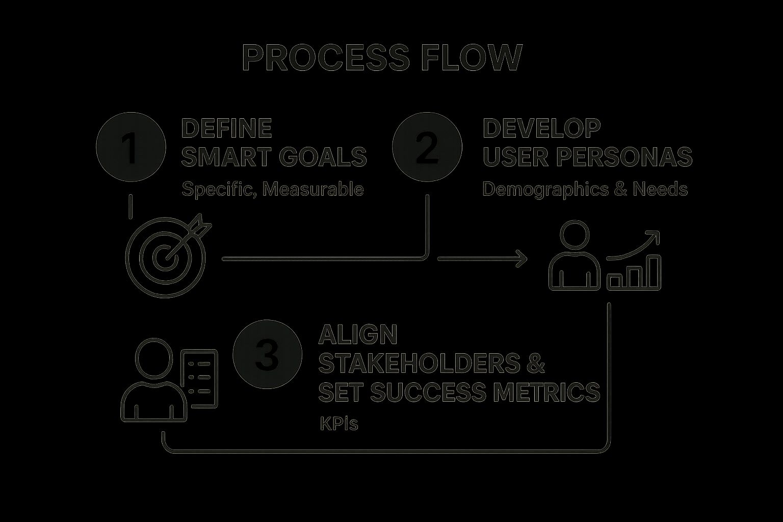
The infographic above illustrates the cyclical process of defining website goals and user personas. It starts with understanding your business objectives and then moves to identifying your target audience. This information is then used to create user personas and define specific, measurable website goals. The process emphasizes the importance of continuous refinement and validation of these elements throughout the redesign project. As shown, feedback loops ensure the goals and personas remain aligned and relevant.
This approach provides clear direction for the entire redesign process, preventing costly revisions and ensuring a focused, effective outcome. Features like goal-setting frameworks (using SMART goals), user persona development templates, stakeholder alignment processes, and success metrics definition are essential tools for this stage. Leveraging these tools allows you to define concrete, measurable objectives and create representative user profiles to guide design choices.
Examples of Successful Implementation:
- Airbnb: Their redesign focused on the goal of “belonging anywhere,” with personas ranging from budget travelers to luxury seekers, effectively catering to a broad user base.
- Mailchimp: Their redesign centered on making complex email marketing tools accessible to small business personas, simplifying the user experience and expanding their market reach.
Actionable Tips for Defining Goals and Personas:
- Use analytics data from your existing site to inform persona development, providing a data-driven foundation.
- Conduct stakeholder interviews to align business and user goals, ensuring all key perspectives are considered.
- Set both quantitative goals (e.g., conversion rates, bounce rates) and qualitative goals (e.g., brand perception), offering a comprehensive view of success.
- Revisit and validate goals at key milestones during the redesign process, allowing for adjustments based on evolving insights.
Pros:
- Provides clear direction for the entire redesign process.
- Prevents feature creep by focusing on essential elements.
- Enables more accurate ROI measurement post-launch.
- Helps resolve conflicting priorities among stakeholders.
Cons:
- Can be time-consuming to develop comprehensive personas.
- May require external research if user data is limited.
- Goals might shift during the redesign process, requiring flexibility.
Learn more about Define Clear Website Goals and User Personas
This initial step in the redesign website checklist is crucial as it lays the groundwork for all subsequent decisions. By defining clear goals and understanding your target audience through well-defined personas, you ensure that the new website effectively serves both business needs and user expectations, ultimately leading to a more successful redesign. This methodical approach prevents wasted resources and maximizes the impact of your redesigned website.
2. Conduct a Comprehensive Content Audit
A crucial step in any website redesign is conducting a comprehensive content audit. This involves systematically reviewing all existing website content—from blog posts and landing pages to videos and infographics—to determine what to keep, update, merge, or remove. This process ensures content quality, relevance, and alignment with your new website goals while preventing bloat and outdated information, which can negatively impact user experience and SEO. A thorough audit allows you to strategically curate your content, offering visitors valuable and up-to-date information.

This audit deserves its place on the redesign website checklist because it directly impacts the effectiveness of the new site. Without understanding the strengths and weaknesses of your current content, you risk carrying over problems and missing opportunities to improve. A content audit provides the foundation for a strong content strategy moving forward.
Features involved in conducting a content audit often include content inventory spreadsheets to track all content pieces, performance metrics analysis to identify top performers, SEO evaluation tools to assess keyword rankings and backlinks, and content categorization systems to organize and group similar content. This process can leverage tools like Screaming Frog, Semrush, or Ahrefs to crawl your website, analyze existing content, and identify technical SEO issues.
Pros of a Content Audit:
- Identifies high-performing content worth preserving: You can pinpoint your best-performing assets and ensure they are prominently featured on the redesigned website.
- Uncovers gaps in content strategy: The audit reveals areas where your content is lacking and highlights opportunities to create new, relevant content.
- Prevents SEO losses during migration: By mapping out 301 redirects for removed or merged content, you maintain your search engine rankings and avoid broken links.
- Reduces redundant or outdated content: Cleaning up unnecessary content improves site navigation and user experience.
Cons of a Content Audit:
- Can be extremely time-intensive for large websites: Auditing thousands of pages requires significant time and resources.
- Requires cross-departmental coordination: Input from marketing, SEO, and content teams is essential for a successful audit.
- May necessitate difficult decisions about legacy content: You might need to remove content with historical value but limited current relevance.
Examples of Successful Content Audits:
- HubSpot’s website redesign included auditing over 10,000 blog posts, resulting in redirecting or updating thousands of URLs to align with their new content strategy.
- Moz’s content audit led to pruning 15% of their content but, counterintuitively, increased overall organic traffic by 30% by focusing on high-quality, relevant pieces.
Actionable Tips for Conducting a Content Audit:
- Use tools like Screaming Frog, Semrush, or Ahrefs to crawl and analyze existing content, identifying technical SEO issues and content gaps.
- Create a decision matrix for keep/update/merge/delete decisions, ensuring consistent criteria are applied across all content pieces.
- Document 301 redirect plans for content being removed or merged to avoid 404 errors and maintain SEO equity.
- Involve SEO specialists early in the content audit process to ensure technical SEO considerations are addressed.
- Prioritize updating high-traffic pages first to maximize the impact of your redesign efforts.
When redesigning your website, a comprehensive content audit is not just recommended—it’s essential. It provides a data-driven roadmap for your content strategy, ensuring your new website is populated with relevant, high-performing content that resonates with your target audience. Learn more about Conduct a Comprehensive Content Audit to understand how a structured content marketing workflow can complement your redesign website checklist and ensure long-term content success.
3. Implement Mobile-First Responsive Design
In today’s mobile-centric world, a website redesign checklist wouldn’t be complete without prioritizing mobile responsiveness. Implementing a mobile-first responsive design is crucial for reaching your target audience effectively and maximizing your website’s performance. This approach starts by designing and developing the website for mobile devices first, then progressively enhancing the design and functionality for larger screens like tablets and desktops. This ensures an optimal experience for users on smartphones, where a significant portion of web traffic originates, while maintaining a consistent brand experience across all devices.

Mobile-first responsive design relies on several key features: fluid grid layouts that adapt to different screen sizes, flexible images and media that scale proportionally, CSS media queries that apply different styles based on screen dimensions, touch-friendly interface elements optimized for finger navigation, and a progressive enhancement methodology that adds features for larger screens without compromising the mobile experience. This earns its place in the redesign website checklist because it directly addresses the changing landscape of how users interact with websites.
This approach offers numerous advantages. It significantly improves SEO, aligning with Google’s mobile-first indexing, which prioritizes the mobile version of a website for ranking. The limited screen space on mobile devices forces content prioritization, leading to a more streamlined and user-friendly experience. Furthermore, mobile-first design typically improves page load performance, contributing to better user engagement and conversion rates. Successful examples of mobile-first design abound. The Boston Globe’s responsive redesign became an industry benchmark, while Etsy’s mobile-first approach reportedly led to a 30% increase in mobile conversions.
However, there are some potential drawbacks to consider. Focusing on mobile first can sometimes constrain design possibilities for larger desktop experiences, requiring careful planning to ensure feature parity. It also necessitates more thorough testing across various device types and screen sizes. Initially, development time might increase due to the layered approach of building for mobile first and then expanding for larger screens.
Pros:
- Improves SEO with Google’s mobile-first indexing
- Forces content prioritization due to limited screen space
- Improves page load performance
- Reaches the growing mobile audience effectively
- Future-proofs design for emerging devices
Cons:
- Can constrain design possibilities for desktop experiences
- Requires more thorough testing across device types
- May increase development time initially
Tips for Implementation:
- Use frameworks like Bootstrap or Tailwind CSS to facilitate responsive development.
- Test designs on actual devices, not just browser emulators, for the most accurate representation of the user experience.
- Consider touch targets (minimum 44×44 pixels, as per Apple’s guidelines) for improved usability on touchscreens.
- Prioritize content by importance for mobile views, ensuring key information is readily accessible.
- Implement responsive images using
srcsetandsizesattributes for optimal image loading and performance across devices.
By following these tips and considering the pros and cons, you can effectively implement a mobile-first responsive design that will optimize your website for the ever-expanding mobile audience and contribute to a successful website redesign.
4. Optimize Site Architecture and Navigation
A critical step in any website redesign is optimizing its architecture and navigation. Site architecture refers to how content is organized, structured, and connected throughout your website. A well-planned architecture ensures users can intuitively find what they’re looking for, leading to a positive user experience and supporting your SEO goals through logical content hierarchies. This is crucial for any redesign as it directly impacts both user satisfaction and search engine visibility.
Effective site architecture relies on several key features: well-structured navigation menus, a logical URL structure, breadcrumb implementation, robust search functionality, and the use of site mapping tools. These elements work together to create a seamless browsing experience. For example, clear navigation menus act as a roadmap, guiding users through different sections of your website. A logical URL structure, using keywords and clear hierarchy, not only helps users understand where they are on the site but also assists search engines in indexing your content. Breadcrumbs provide a visual trail, allowing users to easily backtrack and understand their current location within the site’s hierarchy. Finally, a powerful search function becomes essential, particularly for larger sites with extensive content, allowing users to quickly find specific information.
Examples of successful navigation design abound. Apple, known for its minimalist approach, focuses its navigation on key product categories, making it easy for users to find what they need. Conversely, Amazon, with its vast product catalog, employs a more complex navigation system combining categories, filters, and personalized recommendations. Both approaches are effective for their respective audiences and business models.
Tips for Optimizing Your Site Architecture:
- Card Sorting: Conduct card sorting exercises with representative users to understand how they categorize information and inform your website’s category organization. This invaluable user research method provides insights into how your target audience thinks about your content.
- Miller’s Law (7±2): Limit the number of main navigation items to around 7 (plus or minus 2). This helps avoid overwhelming users with too many choices.
- Descriptive Labels: Use clear and descriptive labels for navigation items rather than clever or vague terms. Ensure the language resonates with your target audience.
- Robust Search: Implement a robust search function with filters for larger sites. This allows users to refine their search results and find precisely what they need.
- Visual Sitemap: Create a visual sitemap before development begins. This provides a blueprint for your site’s structure and helps identify potential navigation issues early in the process.
Pros of Optimizing Site Architecture:
- Reduced Bounce Rates: Helps users find content quickly, reducing frustration and encouraging them to stay on your site.
- Improved SEO: Logical content hierarchies support SEO efforts, making it easier for search engines to crawl and index your site.
- Enhanced Content Discoverability: Makes it easier for users to find all the valuable content on your site, increasing engagement.
- Supports Scalability: A well-planned architecture supports future content growth without requiring significant restructuring.
Cons of Optimizing Site Architecture:
- Balancing Simplicity and Comprehensiveness: It can be challenging to balance a simple, user-friendly navigation with the need to accommodate a comprehensive range of content.
- Stakeholder Interests: Balancing the needs and desires of different stakeholders can require compromise.
- User Testing: Significant user testing may be necessary to validate the effectiveness of the chosen architecture.
Including site architecture and navigation optimization in your redesign website checklist is essential because it lays the foundation for a positive user experience. By focusing on user needs and implementing best practices, you can create a website that is both easy to navigate and optimized for search engines, ultimately contributing to the success of your online presence. This aspect of website redesign, popularized by information architecture experts like Peter Morville, Louis Rosenfeld, and Jakob Nielsen, is crucial for achieving your online goals and connecting effectively with your target audience.
5. Enhance Website Performance and Speed
Website performance and speed are crucial factors in the success of any online presence. This is a critical item in your redesign website checklist because a slow website can severely impact user experience, conversion rates, and search engine rankings. Website performance optimization focuses on minimizing load times and maximizing responsiveness across all devices and connection speeds. A fast-loading website translates to a better user experience, higher conversion rates, improved SEO, and stronger overall business performance. When redesigning your website, prioritizing performance ensures you’re building a solid foundation for success.
This aspect encompasses several key features:
- Image optimization techniques: Compressing and resizing images without significant quality loss. Using modern image formats like WebP.
- Code minification and compression: Removing unnecessary characters from HTML, CSS, and JavaScript files to reduce file sizes.
- Browser caching implementation: Leveraging browser caching allows returning visitors to load your website faster by storing static assets locally.
- Content Delivery Networks (CDNs): Distributing your website’s content across multiple servers globally, ensuring faster loading times for users regardless of their location.
- Performance monitoring tools: Regularly assessing your website’s performance using tools to identify bottlenecks and areas for improvement. A slow website can negatively impact user experience and search engine rankings. Regularly conducting a website speed test can help you identify areas for improvement and ensure your website is performing optimally. As the article Website Speed Test: A Practical Guide to Boosting Your Site Performance from CLDY points out, consistent monitoring is key.
Pros of prioritizing website speed:
- Improves search engine rankings: Page speed is a confirmed Google ranking factor.
- Reduces bounce rates: 53% of mobile users abandon sites that take longer than 3 seconds to load.
- Increases conversion rates: Faster websites lead to more completed transactions and inquiries.
- Enhances user satisfaction and engagement: A smooth, responsive website encourages visitors to explore and interact.
Cons to consider:
- May require technical expertise: Implementing advanced optimizations may require specialized knowledge.
- Can create tension between rich visual design and performance goals: Balancing high-quality visuals with optimal performance requires careful planning.
- Requires ongoing maintenance and monitoring: Performance optimization is an ongoing process, requiring regular checks and adjustments.
Examples of successful implementation:
- Pinterest: Reduced perceived wait times by 40% and saw a 15% increase in search engine traffic and sign-ups by prioritizing performance.
- The Financial Times: Found that a 1-second delay in page load time resulted in a 4.9% drop in article views, demonstrating the tangible impact of speed on user engagement.
Actionable tips for optimizing website performance during your redesign:
- Use WebP image format with fallbacks for broad browser support: WebP offers superior compression and quality compared to traditional formats.
- Implement lazy loading for images and videos: Only load media content when it’s visible in the viewport, improving initial page load time.
- Minimize HTTP requests by combining CSS/JS files: Fewer requests mean faster loading.
- Enable GZIP compression on your server: Compresses files before sending them to the user’s browser, reducing file size and transfer time.
- Use performance testing tools like Google PageSpeed Insights, GTmetrix, and WebPageTest: Identify areas for improvement with these industry-standard tools.
- Consider a headless CMS or static site generation for maximum performance: These approaches can significantly improve website speed.
When redesigning your website, prioritizing performance isn’t just a technical consideration—it’s a strategic imperative. By focusing on speed and responsiveness, you’ll create a website that not only ranks well in search results but also delivers a superior user experience, ultimately leading to improved conversions and business growth. Including performance optimization in your redesign website checklist is a crucial step in ensuring the long-term success of your online presence.
6. Implement Accessibility Standards
Implementing accessibility standards is a crucial step in any website redesign. Web accessibility ensures that people with disabilities, including those with visual, auditory, motor, or cognitive impairments, can effectively perceive, understand, navigate, and interact with your website. Following established guidelines, such as the Web Content Accessibility Guidelines (WCAG), isn’t just ethically responsible; it also offers significant benefits for your business and all your users. This vital component deserves a place in your redesign website checklist because it impacts a significant portion of your potential audience, safeguards you against legal issues, and generally leads to a better user experience for everyone.
How it Works: Web accessibility relies on several key principles:
- Perceivability: Information and user interface components must be presentable to users in ways they can perceive. This includes providing text alternatives for non-text content (like images), captions and transcripts for multimedia, and adaptable content that can be presented in different ways without losing information or structure.
- Operability: User interface components and navigation must be usable. This means making all functionality available from a keyboard, giving users enough time to interact with time-limited content, and avoiding content that can trigger seizures.
- Understandability: Information and the operation of the user interface must be understandable. This includes making text content readable and understandable, making web pages appear and operate in predictable ways, and helping users avoid and correct mistakes.
- Robustness: Content must be robust enough that it can be interpreted reliably by a wide variety of user agents, including assistive technologies. This ensures compatibility with current and future user tools.
Features to Include in Your Redesign:
- WCAG 2.1 Compliance Framework: Adopt WCAG 2.1 as the foundation of your accessibility efforts. This internationally recognized standard provides specific success criteria for different levels of conformance (A, AA, and AAA). Aim for at least WCAG 2.1 AA compliance.
- Semantic HTML Structure: Use HTML elements for their intended purpose. This helps assistive technologies understand the structure and meaning of your content.
- Keyboard Navigation Support: Ensure all interactive elements can be accessed and used solely with a keyboard.
- Screen Reader Compatibility: Optimize your website for screen readers, which are used by people with visual impairments.
- Color Contrast Analyzers: Utilize tools to check the contrast between foreground and background colors to ensure sufficient contrast for users with low vision.
Pros:
- Reaches a Wider Audience: The World Health Organization estimates that 15% of the global population lives with some form of disability. Implementing accessibility standards allows you to reach this significant segment of potential customers.
- Reduces Legal Liability Risks: Websites that are not accessible can face legal challenges. Implementing accessibility standards helps mitigate these risks.
- Improves SEO: Accessible websites often have better structured content and metadata, which benefits SEO.
- Enhances Usability for All Users: Many accessibility features, such as clear navigation and well-structured content, improve the user experience for everyone.
- Demonstrates Corporate Social Responsibility: Prioritizing accessibility showcases your commitment to inclusivity and social responsibility.
Cons:
- Can Require Additional Development Time and Expertise: Implementing accessibility can require dedicated development time and expertise, especially for complex websites.
- May Limit Certain Design Choices: Some design choices, such as complex animations or unusual navigation patterns, might need to be adapted to meet accessibility guidelines.
- Requires Ongoing Testing and Maintenance: Accessibility is not a one-time fix. Ongoing testing and maintenance are required to ensure your website remains accessible as it evolves.
Examples of Successful Implementation:
- Microsoft: Microsoft’s commitment to accessibility has resulted in improved user engagement across all segments. Their inclusive design principles have influenced product development across the company.
- Target: After settling a $6 million lawsuit for website inaccessibility, Target implemented comprehensive accessibility improvements, demonstrating the potential legal and financial ramifications of non-compliance.
Actionable Tips for Your Redesign:
- Use Automated Testing Tools: Tools like WAVE, axe, and Lighthouse can help identify accessibility issues early in the development process.
- Provide Alt Text for All Images: Include descriptive alt text for all images that convey meaning. This allows screen readers to describe the image to users with visual impairments.
- Ensure Forms Have Proper Labels and Error Messages: Clearly label form fields and provide helpful error messages to guide users.
- Maintain Sufficient Color Contrast: Aim for a color contrast ratio of at least 4.5:1 for normal text and 3:1 for large text.
- Test with Keyboard Navigation and Screen Readers: Test your website using only a keyboard and with various screen readers to ensure full functionality and usability.
- Consider Implementing an Accessibility Overlay Tool: While not a complete solution, overlay tools can help address some accessibility issues and provide ongoing compliance monitoring.
Popularized By:
- W3C Web Accessibility Initiative (WAI): The WAI develops the WCAG standards and provides resources and support for web accessibility.
- Marcy Sutton: A prominent accessibility advocate and developer who has contributed significantly to the field.
- The A11Y Project: A community-driven effort to make digital accessibility easier.
7. Integrate Analytics and Conversion Tracking
Integrating comprehensive analytics and conversion tracking is a non-negotiable step in any website redesign project. This crucial process, a cornerstone of any successful redesign website checklist, allows you to measure the impact of your changes, understand user behavior, and continuously optimize your site for better performance. Without it, you’re essentially flying blind, unable to quantify the success of your efforts or identify areas for improvement. This preparation enables data-driven decision-making, providing a baseline for measuring the effectiveness of the redesign and pinpointing underperforming areas. Ultimately, it helps calculate the ROI of your redesign efforts.
How it Works:
Analytics and conversion tracking involves implementing a system that captures user interactions on your website. This includes page views, clicks, scroll depth, time spent on page, and more. By setting up specific conversion goals – actions you want users to take, like filling out a form or making a purchase – you can track how effectively your redesigned site is driving those desired outcomes. Tools like heatmaps and session recordings provide visual insights into user behavior, revealing how visitors navigate your site and where they might encounter friction.
Features and Benefits:
- Web analytics platforms: Tools like Google Analytics 4 provide a wealth of data on website traffic and user behavior.
- Conversion goal setup: Define specific actions you want users to take and track their completion rates.
- Event tracking implementation: Monitor specific interactions like button clicks, video plays, and file downloads.
- Heatmap and session recording tools: Visualize user behavior with tools like Hotjar or Crazy Egg.
- A/B testing capabilities: Test different versions of your design to identify what resonates best with your audience.
These features empower you to make data-driven decisions, optimize your site for conversions, and demonstrate the value of your redesign efforts.
Examples of Successful Implementation:
- Spotify: By implementing comprehensive event tracking, Spotify gained a deep understanding of how users interact with its music discovery features, allowing them to refine algorithms and improve user experience.
- The Guardian: Enhanced analytics implemented as part of their redesign revealed unexpected reading patterns, leading to content strategy adjustments and improved engagement.
Actionable Tips:
- Pre-Launch Setup: Set up Google Analytics 4 and Google Tag Manager before launching your redesigned website to capture data from day one.
- Define Clear Goals: Define and implement conversion goals aligned with your specific business objectives.
- Custom Dashboards: Create custom dashboards for stakeholders with relevant KPIs.
- Ecommerce Tracking: Implement enhanced ecommerce tracking for online stores to analyze product performance and sales funnels.
- Visual Behavior Analysis: Use tools like Hotjar or Crazy Egg for visual user behavior analysis.
- Privacy Compliance: Ensure your analytics implementation complies with privacy regulations like GDPR and CCPA.
Pros and Cons:
Pros:
- Enables data-driven decision making
- Provides baseline metrics to measure redesign success
- Identifies underperforming areas for improvement
- Helps calculate ROI of redesign efforts
Cons:
- Can raise privacy concerns without proper implementation
- Requires ongoing analysis and management
- May need specialized expertise for advanced tracking setups
Learn more about Integrate Analytics and Conversion Tracking This resource can provide you with further insights into setting up effective marketing dashboards and visualizing your data.
This item is crucial in the redesign website checklist because it provides the necessary framework for measuring the success of the redesign and making continuous improvements based on data. Popularized by industry leaders like Avinash Kaushik and Simo Ahava, and championed by the Google Analytics team, the importance of robust analytics cannot be overstated. It empowers you to transform your website from a static entity into a dynamic, evolving platform optimized for user engagement and business growth.
8. Develop a Comprehensive Testing Strategy
A crucial step in any website redesign is developing a comprehensive testing strategy. This process ensures your revamped site functions flawlessly, provides an optimal user experience, and meets all technical and business requirements before going live. Thorough testing is essential for identifying and resolving issues across various devices, browsers, and user scenarios, ultimately contributing to a successful launch and minimizing post-launch headaches. This is a vital part of any redesign website checklist.
What is it and how does it work?
A comprehensive testing strategy involves a multi-faceted approach encompassing various testing methodologies. It’s about more than just checking if buttons click; it’s about validating the entire user journey, ensuring content accuracy, and confirming the site’s performance under stress. This includes:
- Cross-browser testing protocols: Verifying your website renders correctly and functions as expected across different browsers like Chrome, Firefox, Safari, and Edge.
- Mobile device testing procedures: Ensuring responsiveness and usability on various screen sizes and operating systems (iOS, Android).
- Usability testing methodologies: Evaluating the site’s ease of use and user-friendliness through real-world user testing.
- Accessibility validation processes: Checking compliance with accessibility guidelines (WCAG) to ensure the site is usable for people with disabilities.
- Load/performance testing tools: Assessing the site’s speed and stability under different traffic loads.
- Content QA frameworks: Reviewing all content for accuracy, consistency, and adherence to brand guidelines.
Examples of Successful Implementation:
- Facebook: Renowned for their rigorous testing process, Facebook utilizes automated tests, manual quality assurance, and phased rollouts to catch and address issues before they impact a large user base.
- BBC: The BBC’s website redesigns often include extensive user testing with diverse audience segments, ensuring the site caters to a broad range of needs and preferences.
Why This Deserves Its Place in the List:
Launching a redesigned website without proper testing is like driving a new car without brakes. It’s risky and can lead to disastrous consequences. A comprehensive testing strategy mitigates this risk, ensuring a smooth launch and positive user experience. It validates the investment made in the redesign and builds confidence among stakeholders.
Pros:
- Prevents critical errors at launch
- Identifies usability issues before they impact real users
- Validates that business requirements are met
- Builds confidence among stakeholders
- Reduces post-launch emergency fixes
Cons:
- Can be time-consuming and potentially delay launch timelines
- May require specialized testing resources or tools
- Cannot catch every possible issue or edge case
Actionable Tips:
- Create a comprehensive test plan covering functionality, usability, performance, and accessibility.
- Use browser testing platforms like BrowserStack or CrossBrowserTesting.
- Conduct usability testing with 5-7 users per target segment.
- Implement automated testing where possible (unit tests, integration tests).
- Test in real-world conditions with various connection speeds and devices.
- Create a bug tracking system with priority levels to manage identified issues.
- Consider A/B testing critical changes before full implementation.
When and Why to Use This Approach:
A comprehensive testing strategy should be implemented before launching any redesigned website. This proactive approach ensures that the site functions correctly, meets user expectations, and achieves its intended business objectives. Skipping this crucial step can result in a poorly performing site, frustrated users, and ultimately, damage to your brand.
Popularized By:
- Steve Krug (Don’t Make Me Think) – Emphasizes user-centered design and usability testing.
- Jakob Nielsen (usability testing methodologies) – A pioneer in the field of usability engineering.
- BrowserStack (testing platform) – Provides tools for cross-browser and mobile device testing.
Redesign Website Checklist Comparison
| Checklist Item | Implementation Complexity 🔄 | Resource Requirements ⚡ | Expected Outcomes 📊 | Ideal Use Cases 💡 | Key Advantages ⭐ |
|---|---|---|---|---|---|
| Define Clear Website Goals and User Personas | Medium – requires research & alignment | Moderate – stakeholder input, data analysis | Clear direction, aligned objectives, ROI measurement | Early redesign planning, stakeholder alignment | Prevents feature creep, resolves conflicts |
| Conduct a Comprehensive Content Audit | High – extensive review and coordination | High – cross-team collaboration, SEO tools | Content relevance, gap identification, SEO preservation | Large sites needing content cleanup or reorg | Reduces redundancy, improves SEO |
| Implement Mobile-First Responsive Design | Medium-High – coding & testing across devices | Moderate – dev expertise, device testing | Optimized mobile UX, better SEO, future-proof design | Mobile-heavy traffic sites, modern UX priorities | SEO benefit, improves mobile conversions |
| Optimize Site Architecture and Navigation | Medium – planning, user testing required | Moderate – UX research, testing | Intuitive navigation, reduced bounce rates, SEO gains | Sites with complex content or large catalogs | Enhances discoverability, scalable structure |
| Enhance Website Performance and Speed | Medium-High – technical optimizations needed | Moderate-High – dev time, monitoring tools | Faster load times, improved SEO, higher conversions | Sites with slow load times or high traffic demand | Boosts engagement, reduces bounce rates |
| Implement Accessibility Standards | Medium – development and ongoing testing | Moderate – expertise in accessibility standards | Broader audience reach, SEO improvements, legal compliance | Sites aiming for inclusivity and legal safety | Improves usability for all, reduces risks |
| Integrate Analytics and Conversion Tracking | Medium – setup and configuration complexity | Moderate – analytics tools, ongoing analysis | Data-driven insights, tracked conversions, ROI calculation | Sites focusing on measurable performance | Enables optimization, identifies growth areas |
| Develop a Comprehensive Testing Strategy | High – multi-layered testing protocols | High – specialized tools, testers, time | Reliable functionality, UX validation, reduced post-launch issues | All redesigns requiring quality assurance | Prevents errors, builds stakeholder confidence |
Launch with Confidence and Optimize Continuously
Redesigning your website is more than just a facelift; it’s a strategic investment in your online presence. From defining clear goals and understanding your user personas to optimizing for mobile and ensuring accessibility, using a redesign website checklist ensures you cover all the crucial bases. This checklist empowers you to create a website that not only looks great but also performs exceptionally well, driving conversions and achieving your business objectives. Key takeaways include the importance of a thorough content audit, implementing a mobile-first approach, prioritizing site speed, and integrating analytics for ongoing performance measurement. Mastering these concepts is invaluable for creating a user-centered online experience that translates into tangible business results, setting the stage for sustained growth and success.
A successful website redesign doesn’t end with the launch. The digital landscape is constantly evolving, and continuous monitoring, optimization, and adaptation are crucial for maintaining a competitive edge. By consistently analyzing user behavior and website performance data, you can identify areas for improvement and ensure your website continues to meet the ever-changing needs of your target audience. Remember, your website is a dynamic tool, and its ongoing success requires ongoing attention.
Ready to transform your online presence with a strategic website redesign? ReachLabs.ai specializes in helping businesses navigate the complexities of website redesign, offering tailored strategies and expert execution based on proven best practices. Visit ReachLabs.ai today to learn how we can help you achieve your digital goals in 2025 and beyond.


