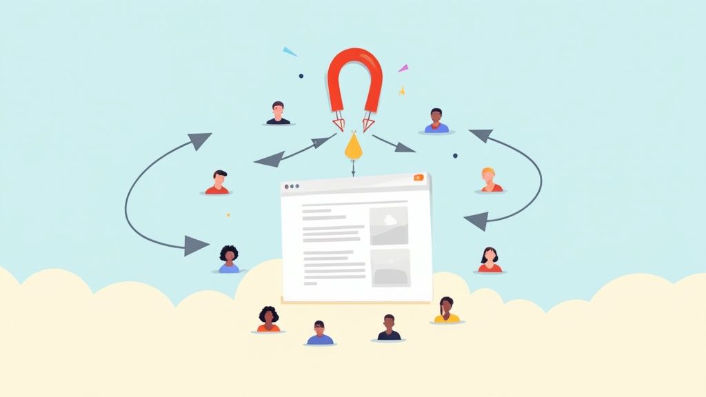
Before you can even think about fixing a high bounce rate, you have to play detective. You need to figure out why people are leaving your site in the first place. More often than not, the culprits are things like painfully slow load times, a confusing user experience, or content that completely misses the mark on what the visitor expected. If you focus on these core problems, you'll see the biggest improvements, fast.
Why High Bounce Rates Signal a Deeper Problem
We’ve all been there. You open up your analytics, see a high bounce rate, and your stomach drops. But that number is more than just a metric; it's a flashing red light indicating a serious disconnect between your website and your audience. A bounce is simple: someone lands on your page, doesn't find what they need, and hits the "back" button without clicking a single thing.
Think of it as a direct signal of visitor frustration. Each one of those bounces is a missed opportunity. It’s a potential customer who bailed because the page took too long to load. It's a reader who felt tricked because the content didn't deliver on the headline's promise. It's a mobile user who couldn't deal with a clunky, non-responsive design.
The Real Cost of a High Bounce Rate
When you really start to unpack it, a high bounce rate bleeds into every part of your business. It's like trying to fill a leaky bucket—wasting your most precious resources, from your marketing budget to your team's effort. Every dollar you spend on a Google or Facebook ad that leads to an immediate bounce is a dollar down the drain.
A high bounce rate is essentially your audience telling you, "This isn't what I wanted." Ignoring that feedback is one of the most expensive mistakes a business can make online.
Once you understand how a high bounce rate creates a domino effect, you see how urgent it is to fix it. This is the typical journey from a simple user disconnect to real, tangible business losses.

As you can see, a poor user experience isn't just a minor issue. It's the starting point for lost revenue and wasted marketing spend. Every bounce chips away at your growth potential and undermines all the hard work you put into getting people to your site.
Here's how that damage really breaks down in the real world:
- Wasted Ad Spend: You're literally paying to bring people to a page that they can't wait to leave. It's the digital equivalent of burning cash with zero return on investment.
- Missed Conversion Opportunities: Every single person who bounces is a potential lead, a sale, or a new subscriber you just lost. Over a year, that adds up to a staggering amount of lost revenue.
- Damaged Brand Perception: A frustrating website experience leaves a bad taste. Visitors start to associate your brand with poor quality, making them unlikely to ever come back or recommend you to others.
- Lower Search Rankings: While bounce rate isn't a direct ranking factor, it often goes hand-in-hand with things search engines do care about, like low-quality content and poor user engagement.
Ultimately, figuring out how to reduce your bounce rate isn't just about tweaking a number in Google Analytics. It's about rebuilding the foundation of your online presence so that every single visitor has a compelling reason to stick around, engage with your content, and become a customer.
To get you started, here's a quick checklist of the most impactful strategies we'll be covering. Think of this as your roadmap to turning those bounces into valuable engagement.
Quick Wins Checklist to Reduce Bounce Rate
| Strategy Area | Key Action | Potential Impact on Bounce Rate |
|---|---|---|
| Analytics Audit | Verify tracking codes are correct & filtering out bots. | High |
| Page Speed | Compress images and enable browser caching. | High |
| User Experience | Ensure mobile-first design and clear calls-to-action. | High |
| Content Relevance | Align page content with the ad or link that brought them. | Very High |
| Audience Targeting | Refine ad campaign targeting to reach the right people. | Medium |
| A/B Testing | Test different headlines and hero sections. | Medium |
By tackling these areas one by one, you're not just lowering a percentage; you're creating a better, more effective experience for every person who visits your website.
Winning the Battle Against Slow Page Speed
Before a visitor even reads your headline, your website’s speed has already made a powerful first impression. In a world of instant gratification, a slow-loading page is the quickest way to send someone packing. It's the most fundamental technical hurdle you have to clear if you want to keep people around.
The numbers don't lie. As page load time drags on from 1 to 10 seconds, the probability of a bounce can skyrocket by a shocking 123%. Think about that. Even a one-second delay can slash page views by 11% and drop customer satisfaction by 16%. With nearly half of all users admitting they'll abandon a site that takes longer than two seconds to load, speed isn’t a "nice to have"—it's an absolute must.
This is where we move past the general idea of "speed" and into the concrete metrics that Google uses to judge user experience on the ground: the Core Web Vitals.
Understanding Core Web Vitals
Think of Core Web Vitals as the three legs of the stool supporting a fast, smooth user journey. Nailing these is a direct path to lowering your bounce rate.
-
Largest Contentful Paint (LCP): This is all about perceived load speed. It measures how long it takes for the largest visual element on the screen—usually a big image or a block of text—to appear. A slow LCP feels like you're just staring at a blank page, which is a major driver of frustration and bounces.
-
First Input Delay (FID): FID measures responsiveness. It’s the time between a user’s first action (like a click) and the moment the browser can actually start processing it. A high FID is what makes a site feel sluggish and unresponsive, like it’s ignoring you.
-
Cumulative Layout Shift (CLS): This one is all about visual stability. Have you ever tried to click a button, only to have an ad load and shove it out of the way? That’s a layout shift. It’s incredibly annoying and a surefire way to make people leave.
Getting these metrics right is a game-changer. Across the board, sites that meet Google's Core Web Vitals standards typically see a 20-30% drop in bounces.
Actionable Steps to Boost Your Page Speed
Okay, we've diagnosed the problem. Now for the fix. You don't need to be a senior developer to see some major gains here. Start with these high-impact changes.
Optimize Your Images
Images are almost always the heaviest things on a webpage. If they aren't optimized, they're like an anchor dragging your load time down.
-
Compress everything. Use a tool like TinyPNG or ImageOptim to shrink file sizes without a noticeable drop in quality. It’s a simple drag-and-drop that can make a huge difference.
-
Use modern formats. Switch to next-gen image formats like WebP. They offer much better compression than old-school JPEGs and PNGs, meaning smaller files and faster loads.
-
Implement lazy loading. This is a clever trick that tells the browser not to load images that are "below the fold" until the user actually scrolls down to them. It makes the initial page view appear much faster.
Streamline Your Code
Bloated code and too many scripts are silent speed killers. The browser has to download, parse, and execute every single line before your page is ready to go.
Your goal should be to load only what is absolutely necessary for the initial view. Anything else can wait. This simple principle is the core of effective performance optimization.
A great place to start is by deferring non-critical JavaScript. This lets the browser load all the important visual stuff first and deal with less urgent scripts later. You should also minify your CSS, JavaScript, and HTML. This process strips out all the unnecessary characters and spaces from your code, making the files smaller without changing how they work.
Our web audit checklist can help you systematically pinpoint these and other technical areas that need attention.
Leverage Caching and a CDN
Finally, two of the most powerful tools in your speed-boosting arsenal are browser caching and a Content Delivery Network (CDN).
-
Browser Caching: This tells a visitor's browser to save parts of your website (like your logo, CSS files, etc.) on their device. The next time they visit, the page loads almost instantly because most of it is already there.
-
Content Delivery Network (CDN): A CDN is basically a network of servers spread across the globe that stores copies of your site. When someone from, say, London visits your site, the content is delivered from a server in Europe instead of one in California. This drastically reduces latency for your international audience.
For more hands-on instructions, you can find many detailed guides on website performance optimization that walk you through the process for your specific platform. By methodically tackling these technical bottlenecks, you’re not just improving a few metrics—you’re creating a better, faster, and more welcoming experience from the very first second.
Once your site is lightning-fast, the next big hurdle is the on-page experience. A cluttered, confusing page is a surefire way to send visitors bouncing right back to their search results. You have to think of your design as a silent guide for your user—it needs to be welcoming, clear, and totally intuitive.
A great design naturally directs the visitor's eye where you want it to go. This is all about establishing a strong visual hierarchy. Your most critical elements, like the main headline and your call-to-action (CTA) button, should pop. You don't need a massive overhaul; sometimes, simple tweaks to font size, color contrast, and spacing are all it takes to create a logical flow that encourages people to stick around.
Don't underestimate the power of white space, either. Pages crammed with text and images are overwhelming. Giving your content room to breathe makes it far more scannable and easier to digest, which is absolutely essential for holding someone's attention these days.
Prioritizing the Mobile-First Journey
In this day and age, designing for a desktop computer first is a recipe for disaster. With more than half of all web traffic coming from mobile devices, a clunky mobile experience is simply not an option. If your visitors are pinching, zooming, and struggling to hit tiny buttons on their phones, they're gone.
A true mobile-first approach isn't just about shrinking your desktop site. It’s about completely rethinking the user's journey on a smaller screen.
- Simplified Navigation: Keep menus clean and simple. The "hamburger" icon is a common solution, but make sure your most important pages are still incredibly easy to find.
- Thumb-Friendly CTAs: Buttons and links need to be big enough for a thumb to tap easily without hitting something else by mistake.
- Readable Typography: Your text has to be legible without the user needing to zoom in. Use clean fonts with enough spacing between lines.
The difference is night and day. A great mobile layout feels effortless. A bad one just feels broken. Make sure you test your site on actual phones and tablets—not just a browser simulator—to catch those frustrating little issues that cause people to leave.
Simplify Your Navigation for Better Flow
Imagine walking into a huge department store with no signs telling you where anything is. That’s exactly how a user feels when they land on a site with confusing navigation. Your main menu is their map, and if it's a disaster, they'll just walk out.
The goal here is to make it almost comically easy for people to find what they came for. A complicated, multi-level dropdown menu with a dozen options is just plain overwhelming. Instead, strip your main navigation down to only the most essential pages.
A visitor who can't find what they want in a few clicks will assume you don't have it. Your menu should only feature the most critical paths your user needs to take.
Just look at how usability pros like the Nielsen Norman Group handle their site navigation. It’s clean, logical, and puts clarity above everything else.

This kind of clear, uncluttered header with obvious categories makes it simple for anyone to find their way around. This builds user confidence and cuts down on the friction that leads directly to bounces. You're aiming for a structure so intuitive that a first-time visitor can guess where a link goes before they even click it.
Rethink Intrusive Pop-Ups and Ads
Nothing makes a user want to leave a site faster than an aggressive pop-up that assaults them the second the page loads. Yes, lead generation is important, but a full-screen pop-up that blocks the content they came to see is a top cause of high bounce rates. It completely shatters their experience before it even starts.
This doesn't mean you have to kill pop-ups altogether. It just means you have to be smarter about how you use them.
User-Friendly Alternatives to Aggressive Pop-Ups
| Tactic | Description | Why It Works |
|---|---|---|
| Time-Delayed Pop-Up | The pop-up appears only after a user has been on the page for a set time, like 30 seconds. | It gives the visitor a chance to engage with your content first, making the offer feel less intrusive. |
| Scroll-Triggered Pop-Up | The pop-up is triggered when a user scrolls a certain percentage down the page, like 70%. | This targets visitors who are already engaged, making them more receptive to your offer. |
| Exit-Intent Pop-Up | A pop-up appears only when the user's cursor moves toward the top of the browser, signaling they're about to leave. | It's a last-chance effort to grab their attention without disrupting their initial browsing session. |
A great way to capture attention without being annoying is by implementing exit-intent technology. By swapping out those immediate interruptions for thoughtful, user-triggered prompts, you can still generate leads without torpedoing your on-page experience and your bounce rate.
Deliver Content That Actually Matches User Intent

More often than not, a bounce happens because of a broken promise. It’s that simple. Your page title and meta description set an expectation, but the content on the page didn't deliver. This is probably the single biggest reason people hit the back button.
Think of it this way: your title tag is a contract with the searcher. If you promise an "Ultimate Guide" but serve up a flimsy 300-word blog post, you've broken their trust. They won't stick around to see what else you have to offer; they'll just leave.
This goes deeper than just avoiding clickbait headlines. It’s about truly understanding the user intent behind the keywords people are searching for. Someone looking for "best running shoes for beginners" wants a straightforward comparison of a few great options, not a textbook on the history of footwear.
Decode User Intent Before You Even Write a Word
To create content that keeps people on the page, you have to do a little detective work first. Luckily, all the clues you need are right there on the first page of Google.
Just search for your target keyword and take a hard look at what’s already ranking.
What kind of content is Google showing?
- Informational Intent: Are the top results guides, blog posts, and "how-to" articles? This tells you people are looking for answers.
- Commercial Intent: Seeing a lot of product pages, category pages, and reviews? Searchers are in buying mode.
- Navigational Intent: Is the brand’s own homepage the #1 result? People are just trying to get to a specific site.
By studying the search engine results page (SERP), you can basically reverse-engineer what works. If every top result is a list-style post, trying to rank with a dense, academic whitepaper is just asking for a high bounce rate. Match the format and depth that users have already voted for with their clicks.
Don't try to fight the SERP. If Google is clearly showing that users want video content for a specific query, one of the smartest things you can do is embed a helpful video. It’s a fantastic way to hold their attention.
Structure Your Content for Scanners, Not Readers
Let’s be honest: people don’t read online, they scan. You have just a few seconds to convince a new visitor that your page holds the answer they’re looking for. A giant wall of text is an instant turn-off.
You have to break your content into bite-sized, scannable pieces. This isn't just about making it look pretty; it's about respecting your reader's time and helping them find what they need, fast.
Here are a few tactics I always use:
- Use Descriptive Subheadings: Break up your article into logical sections with clear H2s and H3s. This creates a mini table of contents on the page, letting people jump right to the information they care about most.
- Embrace Bullet Points: When you're listing out features, steps, or benefits, lists are your best friend. They stand out visually and make complex info much easier to digest.
- Keep Paragraphs Short: I try to stick to 1-3 sentences per paragraph, max. This creates a ton of white space, which makes the content feel less intimidating, especially on a phone.
- Use Bold Text Strategically: Bolding key phrases and important numbers helps guide the reader's eye down the page, allowing them to absorb the main points without reading every single word.
Creating content that really connects is a mix of art and science. For a deeper look at these ideas, check out our full guide on how to create engaging content that grabs your audience's attention.
Turn Dead Ends into Pathways With Internal Links
If a visitor gets to the end of your article and has nowhere to go, they're going to leave. A page without a clear next step is a dead end.
Smart internal linking is the answer. It can turn a single page view into a longer session by guiding users to other relevant content on your site.
Think of it as making a helpful suggestion. If someone is reading your post on "the benefits of content marketing," it's a no-brainer to link them to another piece on "how to build a content calendar."
This strategy accomplishes two crucial things:
- It gives the user more value, keeping them on your site and engaged with your brand longer.
- It passes link equity between your pages, which is a nice little boost for your SEO.
When you nail the user intent, structure your content for easy scanning, and provide clear paths to explore more, you give people every reason to stick around. You've fulfilled your promise, and that's a massive win in the battle against high bounce rates.
Attracting the Right Visitors from the Start

Sometimes, a sky-high bounce rate has absolutely nothing to do with your website. It's a traffic problem. You could have the slickest, fastest, most user-friendly page on the internet, but if the wrong people are landing on it, they’ll leave. Every single time.
The real battle against bounce rate often starts long before someone even loads your site. It begins with the ad they clicked, the search query they typed, or the social media post that caught their eye. When there’s a mismatch between what you promise and who you attract, you’re just asking for bounces. The most powerful shift you can make is to stop focusing on getting more visitors and start obsessing over getting the right ones.
Diagnosing Your Traffic Sources
Alright, time to put on your detective hat. Pop open your analytics and head straight for the traffic acquisition reports. This is where you’ll find the breadcrumbs that lead you to which channels are sending you gold and which are sending you… well, bounces.
Look at the bounce rate (or engagement rate, if you're in GA4) for each source and medium. You might find a real "aha!" moment. For instance, maybe your organic search traffic sticks around, but a specific paid social campaign has a staggering 90% bounce rate. That's a huge clue. It tells you the problem isn’t your website; it's the targeting or messaging of that one campaign.
A high bounce rate from a single traffic source isn't a website failure. Think of it as a marketing signal. Don't rush to change your page—first, change how you're sending people to it.
Once you’ve pinpointed the problem channels, you can dig in and figure out why the numbers look that way. Then you can fix it.
Refining Your Paid Campaign Targeting
When it comes to paid ads on platforms like Google Ads or Meta, precision is the name of the game. Vague targeting is like casting a giant net with huge holes in it. You might catch a lot of initial traffic, but most of it will slip right through. The goal is to get laser-focused on who sees your ads.
Start with your audience segments. Are you targeting a massive, generic interest like "business"? Or are you zeroing in on "small business owners interested in accounting software"? The more granular you get, the better the traffic quality will be. This all hinges on having a crystal-clear profile of your ideal customer. If you need a refresher, our guide on how to identify your target audience is a great place to start.
Next, give your ad copy a hard look. Does the headline make a promise your landing page immediately delivers on? If your ad screams "Get a Free Demo," that landing page better have a demo signup form right at the top. Any disconnect between the ad and the page creates confusion, and confusion leads to an instant exit.
Leveraging Long-Tail Keywords for Organic Traffic
This same logic applies directly to your SEO strategy. It feels great to rank for a massive "head" keyword like "marketing automation," but the traffic you get can be all over the place. People searching that term could be students writing a paper, competitors snooping around, or just folks who aren't really sure what they need.
This is where long-tail keywords become your secret weapon.
These are longer, more specific phrases that tell you exactly what a searcher wants. The intent is baked right in.
Just look at the difference:
- Head Keyword: "CRM software" (Tons of traffic, but vague intent and likely a high bounce rate)
- Long-Tail Keyword: "best CRM software for a small real estate team" (Less traffic, but sky-high intent and a much lower bounce rate)
The person searching that long-tail phrase has a specific problem and is actively hunting for a solution. If your page is the answer to that very specific question, they're going to stick around and read what you have to say. By building your content around these high-intent phrases, you attract a pre-qualified audience that’s ready to engage, solving your bounce rate problem at the source.
Unpacking Bounce Rate: Your Top Questions Answered
Even with the best playbook, you're bound to have questions when you start digging into your bounce rate. It's one of those metrics that seems simple on the surface but has a ton of nuance depending on your site, your industry, and what you’re trying to achieve.
Let’s tackle some of the most common questions I hear. Getting these sorted will help you move from reading about this stuff to actually making a difference.
What Is a Good Bounce Rate, Anyway?
This is the million-dollar question, and the honest answer is: it depends. There's no magic number that works for everyone. A "good" bounce rate is completely tied to the context of the page, where the traffic is coming from, and the industry you're in.
Think about it this way: a high bounce rate on a blog post isn't necessarily a bad thing. Someone could land, find the exact answer they needed in 30 seconds, and leave happy. That's a win, even though it counts as a bounce. Same goes for a contact page—they grab your phone number and go. But a high bounce rate on a product page or a critical landing page? That’s a serious red flag.
To give you a rough idea, here are some typical (and very general) ranges:
- E-commerce & Retail: You'll often see numbers between 20% and 45%.
- Lead Generation Sites: These tend to hover in the 30% to 55% range.
- Blogs & Content Sites: Don't be surprised to see rates from 35% to over 60%.
The most important benchmark isn't some industry average; it's your own historical data. Your goal should be to consistently improve your bounce rate over time, not to hit an arbitrary number someone else set.
Is Bounce Rate Still Important in Google Analytics 4?
Yes, it absolutely is, but the game has changed. The old Universal Analytics defined a bounce as any session where someone looked at only one page and left. Simple, but not always insightful.
Google Analytics 4 (GA4) is much smarter about it. Now, a bounce is the opposite of an "engaged session." A session is considered engaged if the visitor stays for longer than 10 seconds, triggers a conversion event, or clicks to a second page. This is a huge improvement. It means someone who lands on your blog, reads for two minutes, and then leaves is no longer a bounce.
This new definition makes bounce rate a far more powerful diagnostic tool. A high bounce rate in GA4 is a much clearer signal that visitors truly didn't find what they were looking for. So while the math is different, its value in spotting problems is actually greater than before.
How Long Should I Wait to See Results?
This is where patience really pays off. After you’ve rolled out a few fixes, the temptation to check your analytics every five minutes is real. Resist it. True results don't show up overnight, and you need to let enough data roll in to spot a genuine trend.
As a rule of thumb, give it at least two to four weeks before you start drawing any firm conclusions. This period is long enough to smooth out any random daily spikes or dips, giving you a clear picture of whether your changes are actually working. You're looking for a steady, sustained downward trend, not a one-day blip on the radar.
Ready to turn those bounces into conversions? ReachLabs.ai combines data-driven insights with world-class talent to create a website experience that keeps your ideal customers engaged. Discover how our integrated strategies can elevate your brand's performance.


