
Crafting a powerful pitch deck is all about telling a compelling story. Think of it as a concise, visual narrative—usually just 10-15 slides—that lays out your business idea, the problem you're tackling, your brilliant solution, and the massive market waiting for it. This isn't just a presentation; it's your ticket to securing that crucial next meeting with an investor.
Why Your Pitch Deck Is More Than Just Slides
Before you even think about firing up PowerPoint or hunting for the perfect template, you need a mental shift. A great pitch deck isn't your entire business plan squished into a few slides. It’s a strategic tool with one singular goal: to spark enough interest to land a follow-up conversation.
Consider it the movie trailer for your business, not the full-length feature film. This distinction is everything. Investors are buried in decks every single day, so you have to craft an argument that’s both gripping and incredibly easy to grasp.
The Three-Minute Test
Picture this: an investor clicks open the attachment in your email. You don't have an hour to walk them through every detail. You have mere seconds to grab their attention and just a few minutes to hold it.
It’s not just a guess—research shows that investors spend an average of only 3 minutes and 44 seconds on each pitch deck. Your ability to communicate your vision clearly and quickly is paramount.
This tight timeframe means every single slide must have a clear purpose. Every word needs to count, and every visual element has to reinforce your story. Dense slides, confusing jargon, and unnecessary fluff are the quickest ways to get your deck tossed into the "pass" pile. A truly great pitch respects the investor's time by cutting straight to the chase.
Story First, Always
Your most important job is to build a narrative. Investors listen to countless ideas, but what sticks with them are the powerful stories that resonate on both a logical and emotional level. Your story needs to answer a few core questions right away:
- What's the big, urgent problem you're solving? Hook them from the very beginning by making it relatable.
- What's your unique, elegant solution? Make your value proposition crystal clear.
- Why is this a massive opportunity? Paint a picture of the market potential and your vision for what's next.
- Why is your team the one to pull this off? Build trust and credibility in your ability to execute.
Framing your content around these questions transforms a simple presentation into a persuasive argument. To really dive deep into building this kind of narrative, our complete https://www.reachlabs.ai/brand-storytelling-framework/ is a great resource for defining your core message.
While the storytelling approach is a constant, you might need to tweak the specifics for your audience. If you're targeting B2B investors, for example, a specialized guide on how to create a pitch deck for B2B investors can provide insights tailored to their unique expectations.
Ultimately, keeping your deck between 10 and 15 slides is the sweet spot. Decks in this range have been shown to be 43% more successful at raising funds than those that are too long or too short. They provide just enough detail to be compelling without overwhelming the reader. Nailing this balance is the first real step toward creating a pitch deck that gets you in the door.
Building Your Core Story, Slide by Slide
With the storyteller mindset in place, it’s time to start building your narrative, one slide at a time. This isn’t about just dropping content into a template. Think of it as constructing a logical, persuasive argument where each slide naturally leads to the next. The real goal here is to create a seamless flow that guides an investor from initial curiosity all the way to conviction.
The classic pitch deck structure is a well-trodden path for a very good reason—it works. It hits all the key points an investor needs to see: the problem, your solution, a look at the product, the market size, your business model, go-to-market plan, your team, financials, and of course, the ask. This structure is the skeleton; your unique story is what adds the muscle and heart.
The infographic below shows how your deck moves through the review process, from an investor's first glance to landing that crucial meeting.
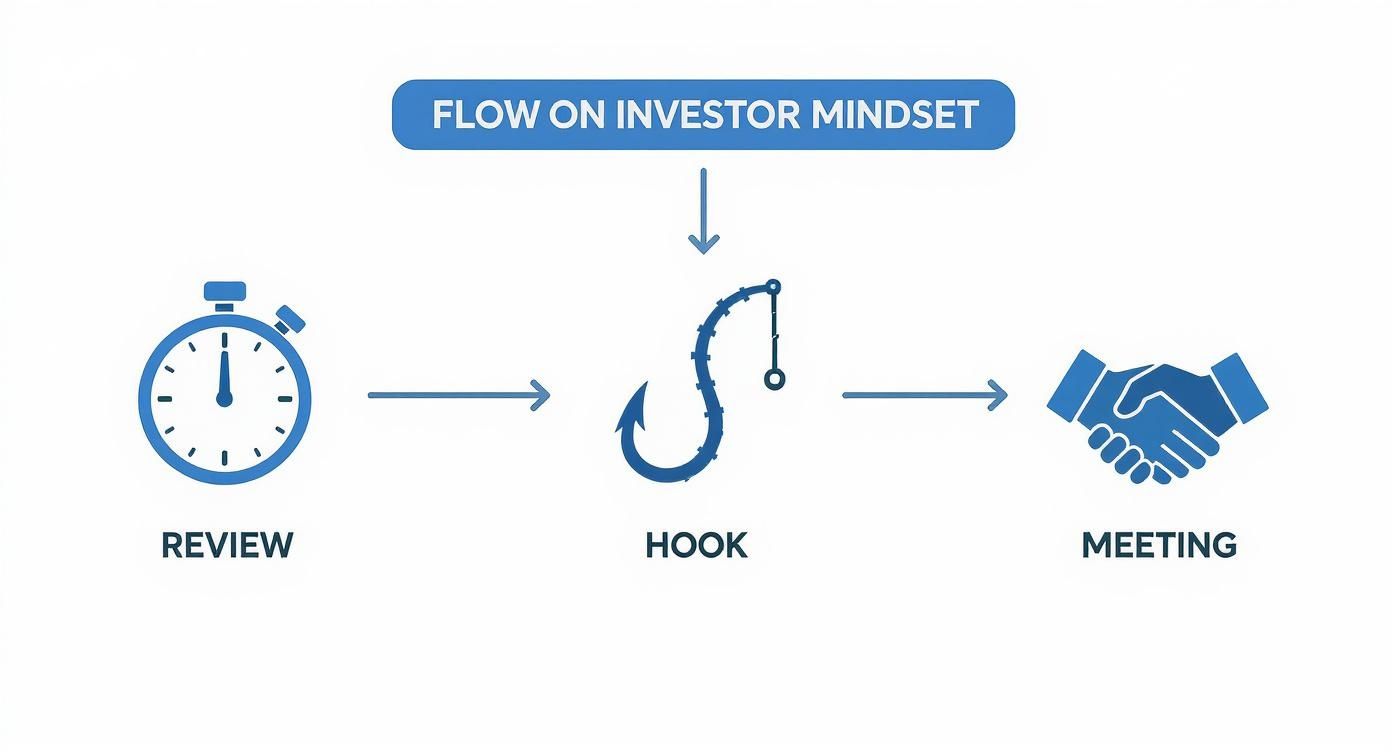
As you can see, you have a very short window to grab their attention. That initial hook is everything.
The 12 Essential Pitch Deck Slides and Their Purpose
To help you visualize the flow, I've broken down the core slides you'll need to build. This table outlines the typical sequence and the main job each slide needs to do.
| Slide Number | Slide Title | Core Purpose |
|---|---|---|
| 1 | Company Intro | Grab attention with a compelling one-liner that explains what you do. |
| 2 | Problem | Make the pain point real, urgent, and relatable. |
| 3 | Solution | Present your unique approach as the clear answer to that problem. |
| 4 | Product (How it Works) | Show, don't just tell. Use visuals to demonstrate the user experience. |
| 5 | Market Size (TAM/SAM/SOM) | Quantify the opportunity and show you're targeting a significant market. |
| 6 | Business Model | Explain exactly how your company will make money. Be direct and clear. |
| 7 | Go-to-Market Strategy | Detail your plan for acquiring your first customers. |
| 8 | Competitive Landscape | Position your company against alternatives and highlight your unique edge. |
| 9 | Team | Prove you have the right people to execute the vision. |
| 10 | Traction / Milestones | Show progress and momentum with key metrics or achievements. |
| 11 | Financial Projections | Provide a realistic forecast of your future growth and financial needs. |
| 12 | The Ask | Clearly state how much you're raising and what the funds will be used for. |
Think of this as your narrative checklist. Each slide is a chapter in the story you're telling the investor.
The Opening Hook: Problem and Solution
Your first few slides need to establish immediate relevance. It all starts with the Problem. This is your chance to create a sense of urgency and get heads nodding.
- Make it relatable: Frame a pain point that's easy to grasp, even for someone outside your industry.
- Quantify the pain with data: Don't just say, "businesses struggle with X." Instead, try, "70% of businesses lose Y amount of revenue because of X." The numbers make it real.
- Tell a mini-story: Use a specific persona or a quick scenario to make the problem tangible.
Right after you’ve detailed the problem, your Solution slide should feel like a breath of fresh air. It must directly and obviously solve the pain you just described. Avoid getting bogged down in technical jargon or a long list of features. Focus on the core value. If the problem is a tangled mess, your solution is the sharp pair of scissors that cuts right through it.
Defining Your Universe: Market and Competition
You've established the "why," so now it's time to prove the "where" and "who." This is where you zoom out and show investors the sheer scale of the opportunity.
Your market slide needs to clearly define your Total Addressable Market (TAM), Serviceable Available Market (SAM), and Serviceable Obtainable Market (SOM). These aren't just acronyms to check off a list; they prove you’ve done your homework and have a grounded, realistic plan for entry. A classic founder mistake is claiming a massive, generic market. Trust me, investors are far more impressed by a well-defined niche you can actually dominate.
Next up is the competition. Your competition slide shouldn't just be a wall of logos. It has to be a strategic analysis that smartly positions your company.
A strong competitive analysis slide doesn’t say, “We have no competitors.” Instead, it says, “Here’s the landscape, here’s how others are tackling it, and here’s our unique advantage that lets us win.”
This simple shift in framing shows you're aware of the challenges and have a clear-eyed strategy. A great way to get ideas for this is to look at how successful companies have framed their own edge. Checking out various pitch deck examples can give you some fantastic inspiration.
The Engine Room: Product and Business Model
Now that the market opportunity is clear, let's get into the mechanics of how your business actually runs. The Product slide is your chance to make your solution tangible. Use clean mockups, screenshots, or even a link to a short demo video. This isn't the place for a dry feature list; it’s for showing the user experience and revealing that "aha!" moment.
From there, your Business Model slide has one simple job: answer the question, "How do you make money?" Be incredibly direct. Whether it's a SaaS subscription, transaction fees, or hardware sales, just spell it out. If an investor can't easily explain your revenue model to their partner over dinner, you’ve made it too complicated.
Finally, your Go-to-Market slide explains how you'll actually reach your customers. It's the bridge connecting your amazing product to the market you just defined. This is your action plan, detailing your initial channels, marketing tactics, and sales process. It’s the roadmap that shows you know how to turn your big vision into a pipeline of paying customers.
Designing a Deck That Amplifies Your Message

You’ve poured everything into crafting the perfect story for your startup. But here’s the hard truth: even the most compelling narrative will get lost if it’s presented in a clumsy, poorly designed deck.
Think of your deck’s design as its body language. It's the first impression you make, communicating professionalism, credibility, and attention to detail before you’ve even uttered a word. The point isn’t to become a graphic designer overnight. It's about creating a clean, polished visual experience that supports your message, not distracts from it.
A great design guides an investor’s eyes, making complex ideas feel simple and reinforcing your brand's legitimacy. When you're figuring out how to create a pitch deck that actually gets results, don't ever underestimate the power of good aesthetics.
Establish a Cohesive Visual Identity
I’ve seen it a hundred times—decks that jump between random fonts, clashing colors, and inconsistent layouts. It immediately feels chaotic and amateurish, and that's not the impression you want to make. Before you even think about dropping content onto your slides, you need to establish a simple, strong visual foundation.
This doesn't have to be complicated. Just focus on a few key elements:
- A Limited Color Palette: Pick two or three brand colors and stick with them. Use one for headers, another for your main text, and maybe a third as an accent to make key data pop.
- Clean Typography: Choose one or two fonts that are incredibly easy to read on a screen. You can't go wrong with classic sans-serif options like Helvetica, Arial, or Open Sans.
- Consistent Branding: Your logo should be in the exact same spot on every single slide, usually tucked away in a corner. It’s a tiny detail, but it ties the entire presentation together and subtly reinforces your brand from beginning to end.
This visual discipline makes your deck look like a unified, professional document. That, in turn, makes your whole company feel more buttoned-up and ready for investment.
Prioritize Readability and White Space
One of the most common mistakes I see founders make is trying to cram an entire business plan onto a single slide. The result is a "wall of text" that investors will either ignore completely or dread trying to read.
Remember, your deck is a visual aid. It’s meant to supplement what you're saying, not serve as your personal teleprompter.
Your guiding principle for slide design should be this: one core idea per slide. If you try to say three things at once, you’ll end up communicating nothing.
The best way to achieve this is by embracing white space—the empty areas around your text and graphics. White space isn't wasted; it's an active design element. It gives your content room to breathe, reduces the mental effort required from your audience, and naturally draws their attention to what really matters. Keep your text minimal and let your visuals do the talking.
Use Visuals to Clarify and Persuade
Visuals are your secret weapon for making dense information digestible and your story more compelling. Instead of writing a long paragraph to describe a market trend, show it with a clean, simple chart.
- Charts and Graphs: Bar charts are great for comparisons, line graphs are perfect for showing trends over time, and pie charts work for breaking down proportions. Just make sure you label everything clearly and use that accent color you chose to highlight the most important data point.
- High-Quality Mockups: If you’re showcasing a product, use polished mockups of your app on a phone screen or your software on a laptop. This helps investors immediately visualize your product being used in the real world.
- Avoid Stock Photo Clichés: Nothing screams "generic" like a stock photo of business people shaking hands or staring thoughtfully at a whiteboard. If you must use images, make sure they’re high-quality and directly relevant to your point.
This visual-first approach makes your data more memorable and your product feel more tangible. Take a look at the early deck from Copy.AI. They brilliantly used visuals to showcase impressive growth, turning a simple number like $2.4 million in ARR into a powerful story of rapid market adoption that investors couldn't ignore.
Ultimately, great design is all about clarity. It cuts through the noise and lets your core message shine. By building a consistent visual identity, prioritizing readability, and using smart visuals, you'll create a deck that doesn't just tell your story—it amplifies its impact.
Nailing Your Financials and The Ask

Alright, this is where investors really lean in. Your financial slides and your investment "ask" aren't just numbers—they're the ultimate test of your credibility and strategic mind. If you nail this section, you prove you're not just a dreamer with a great idea, but a founder who can actually execute.
Let's be clear: every investor knows your projections are educated guesses. What they're really looking for is the logic behind them. A deck with fantastical, unsupported revenue claims is one of the fastest ways to get a "no." They need to see that you fundamentally understand how your business makes money.
Your goal here is to present a financial forecast that feels both ambitious and grounded in reality. That means building your projections from the ground up, based on assumptions you can actually defend. This is how you build trust.
Building Defensible Financial Projections
Forget pulling numbers out of thin air. A rock-solid financial model always starts with bottom-up assumptions. Instead of making a broad claim like, "We'll capture 1% of a billion-dollar market," you have to show the math.
Start by mapping out the core drivers of your business. For a SaaS company, for example, that thought process looks something like this:
- Lead Generation: How many visitors can we realistically drive to our website each month?
- Conversion Rate: What percentage of those visitors will start a free trial?
- Sales Conversion: Of those trial users, how many will actually become paying customers?
- Average Revenue Per User (ARPU): What's our average monthly subscription price?
When you connect these specific assumptions, you create a believable chain of logic that leads directly to your revenue forecast. It’s infinitely more compelling because it shows you’ve thought through the granular steps of winning a customer.
Investors don’t fund spreadsheets; they fund founders who understand their business inside and out. Your financial slide is your proof that you have a firm grasp on the key metrics that will drive your company's success.
To get your 'Ask' and projections right, you absolutely need a robust financial model. You can learn how to build an accurate and persuasive one with this guide on investor-ready financial modeling for startups to make sure your numbers tell a convincing story.
Key Metrics That Matter Most
While a full P&L is important down the line, seasoned investors will zoom in on a few key unit economics first. These numbers instantly reveal the health and scalability of your business. Be ready to highlight and defend them.
- Customer Acquisition Cost (CAC): The total sales and marketing cost to get one new customer. Be brutally honest and thorough here.
- Lifetime Value (LTV): The total revenue you expect from a single customer over their entire time with you.
- LTV to CAC Ratio: This is the magic number. A healthy ratio, typically 3:1 or better, proves you have a sustainable business where customers are worth far more than they cost to acquire.
- Months to Recover CAC: How many months does it take for a new customer to pay back their acquisition cost? The faster, the better.
Showcasing these metrics proves your financial savvy. It tells investors you’re focused on building a scalable, long-term business, not just chasing vanity metrics.
Structuring "The Ask"
The "Ask" slide is the grand finale of your pitch. You've built a powerful case, and now it's time to state exactly what you need. This slide has to be direct, justified, and strategic.
Your ask is so much more than a number; it’s a plan. A vague request like "we need $1 million for growth" just sounds weak. You have to show precisely how that capital will fuel specific, measurable milestones.
Here’s a simple framework that works:
-
State the Amount Clearly: "We are raising $1.5 million in a seed round." Say it with confidence.
-
Detail the Use of Funds: Break down exactly where the money is going. A simple pie chart is great for this. For instance:
- 40% Product Development (Hire 2 senior engineers)
- 35% Sales & Marketing (Expand digital ad spend, attend key trade shows)
- 15% Key Hires (Bring on a Head of Sales)
- 10% Operational Expenses
-
Tie Funds to Milestones: This is the most critical piece. Connect the money to what you'll achieve with it. For example, "This $1.5 million gives us an 18-month runway to achieve $1 million in ARR, acquire 500 new enterprise customers, and launch our V2 platform."
This simple shift turns your request for money into a strategic investment proposal. It gives investors a crystal-clear picture of what their capital buys and what success looks like on the other side. For more on this critical slide, dive into our detailed guide on https://www.reachlabs.ai/how-to-pitch-to-investors/.
Polishing Your Pitch Until It Shines
Your first draft is never the final one. I’ve seen countless founders make the mistake of thinking they can whip up a deck, send it out, and just wait for the term sheets to roll in. That’s one of the quickest ways to fail at fundraising.
The real work starts after you’ve got all the core slides together. This is where you polish, refine, and transform a good draft into a razor-sharp, persuasive tool that actually gets investors to lean in. The goal is to eliminate every last bit of friction or confusion, letting an investor glide through your story and grasp your vision without hitting a single snag.
Seeking Brutally Honest Feedback
You’re too close to your own project. I guarantee it. What feels completely obvious to you is often a mystery to a fresh pair of eyes. That’s why getting feedback isn't just a nice-to-have; it’s a non-negotiable part of the process.
But here’s the thing: not all feedback is created equal. Asking your mom or your best friend might feel good, but it won’t strengthen your pitch. You need input from people who actually understand the game.
- Mentors and Advisors: Start here. They already have context on your business and can give you strategic feedback that’s both direct and genuinely helpful.
- "Friendly" Investors: Got any investors in your network you respect but aren't on your primary target list? Ask them for 15 minutes of their time. Frame it as a feedback session, making it crystal clear you're not asking for money, just their expertise.
- Industry Experts: Find people who live and breathe your market. They're the ones who can poke holes in your market assumptions or competitive analysis in a way that a generalist investor simply can't.
When you present your deck, shut up and listen. Seriously. Resist the urge to jump in and defend every slide. Take meticulous notes and pay special attention to the questions they ask—those are direct clues pointing to what’s unclear or unconvincing in your story.
The All-Important Clarity Check
Once you’ve gathered some expert feedback, it’s time for a different kind of test. This one is my favorite because it’s so simple yet so revealing. Can someone with zero industry knowledge understand the absolute basics of your business in under three minutes?
Find a smart, articulate person who knows nothing about your space. A friend in a totally different industry works great. Show them only your first three slides: the Intro, the Problem, and the Solution. If they can’t immediately tell you what you do, who you do it for, and what pain you solve, you have a clarity problem. This simple test forces you to strip out the jargon and nail your core message.
Don’t ever mistake simplicity for a lack of sophistication. The most brilliant founders I've met are the ones who can explain an immensely complex idea in a way a fifth-grader could understand. That’s the level of clarity you should be aiming for.
Creating Different Versions for Different Contexts
One of the most common rookie mistakes is using a single, one-size-fits-all deck for every situation. In reality, you need at least two distinct versions to be effective.
-
The "Email" Deck (The Reader): This is the one you’ll send out as a PDF. It has to be a standalone document, meaning it needs a bit more text to provide context since you won't be there to narrate. The key here is self-sufficiency; the story has to be perfectly clear without your voiceover.
-
The "Presentation" Deck (The Visual): This is the version you’ll use when you're actually pitching, whether in a room or on a Zoom call. This deck should be incredibly visual and sparse on text. Think of it as the backdrop for your story, not a script you read from. It should be all about powerful images, key data points, and headline-style text that drives your main points home.
Having both versions ready means you’re always using the right tool for the job. Sending a dense, text-heavy presentation deck by email is a recipe for getting ignored. And trust me, nothing is more boring than watching a founder read from a text-heavy deck during a live pitch.
Your Final Pre-Flight Checklist
Before you hit "send" on that first email, you need to do one last, meticulous check. This final pass is what separates the polished, professional founders from the sloppy and rushed ones.
I've put together a quick checklist to make sure you've covered all the bases. This might seem basic, but you’d be amazed how many decks I've seen with glaring typos or busted links. Every detail matters.
Pitch Deck Pre-Send Checklist
| Check Item | Status (Done/Needs Review) | Notes |
|---|---|---|
| Spelling and Grammar | Use a tool like Grammarly, then have a human proofread it. No excuses. | |
| Consistent Formatting | Check that fonts, colors, and logo placement are identical on every slide. | |
| Broken Links or Images | Click every single link and make sure all your images load correctly. | |
| Correct File Format | Always, always send as a PDF. It locks in your formatting. | |
| File Size Check | Keep it under 10MB. Anything larger can cause email attachment issues. | |
| Contact Info is Clear | Your name, email, and phone number need to be on the final slide. Make it easy for them. |
Running through this checklist ensures your first impression is a strong one. A flawless presentation signals to investors that you’re a founder who sweats the details—and that's exactly the kind of person they want to back.
Answering Your Toughest Pitch Deck Questions
Even with a solid plan, you're bound to run into a few tricky questions when building your pitch deck. That's a normal part of the process. I've heard just about every question in the book from founders, so let's tackle some of the most common ones head-on.
How Long Should My Pitch Deck Be?
Aim for 10 to 15 slides. Period. An investor’s most valuable resource is their time, and showing you respect that makes a great first impression.
Data backs this up time and time again—decks in this sweet spot just perform better. The trick is to be ruthless about sticking to one core idea per slide. Let strong visuals do the heavy lifting and keep your text brief. Anything over 15 slides is a red flag that you can't distill your story, and you risk losing your audience before you even get to the ask.
What's The Single Biggest Mistake To Avoid?
Hands down, the most damaging mistake is a lack of clarity. This isn't just about avoiding jargon; it's about making your entire concept immediately understandable. Too many founders cram their slides with dense text, thinking more detail equals more credibility. It doesn't.
An investor who isn't a subject-matter expert in your niche needs to "get it" within the first couple of minutes. If they can't quickly grasp what problem you solve and how your business makes money, they're not going to stick around to figure it out. They'll just move on to the next deck in their inbox.
Your deck has to pass the "stranger test." Can a smart person outside your industry explain your business after seeing just the first three slides? If not, you need to simplify your message. Clarity always wins.
Should I Have a Team Slide If I Am a Solo Founder?
Yes, absolutely. In fact, for a solo founder, this slide is even more critical. Investors are betting on people, often more than the idea itself. Your "Team" slide just becomes the "Founder" slide, and it's your chance to shine.
This is your space to showcase why you are the person to make this happen. Highlight your unique experience, your passion, and any past wins that prove you can execute. This is where you build trust. You can also feature key advisors here to show you're not going it completely alone. The goal is to convince them you have the grit and expertise to build this business from the ground up.
How Much Detail Should I Put in Financial Projections?
Your financial slide is about showing you understand the levers of your business, not about proving you're a CPA. Keep it high-level and focused on the big picture.
A simple 3 to 5-year forecast is all you need. Focus on the metrics that truly matter:
- Revenue
- Key user metrics (like active users or customers)
- Gross Margin
- EBITDA
What investors really want to see are the assumptions behind your numbers. How did you arrive at your customer acquisition cost? What's your projected conversion rate? They know these are just educated guesses. What matters is that your logic is sound, realistic, and defensible. That’s what gives them confidence in you.
Putting together a pitch deck that tells a powerful story and anticipates investor questions is a huge step toward getting funded. At ReachLabs.ai, we work with founders to build investor-ready pitch decks that get meetings. Let us help you build the deck that wins your next meeting.


