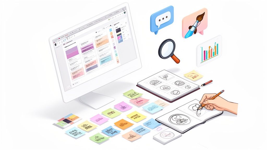
A powerful brand identity is so much more than a cool logo. It’s the gut feeling people have about you, and that feeling is built on a solid strategic foundation: your mission, vision, and core values. To get this right, you have to dig deep into where you stand in the market, how customers see you, and what your competitors are up to. This ensures every single thing you create, from your messaging to your visuals, feels authentic and hangs together perfectly.
Laying the Groundwork for a Powerful Brand Identity
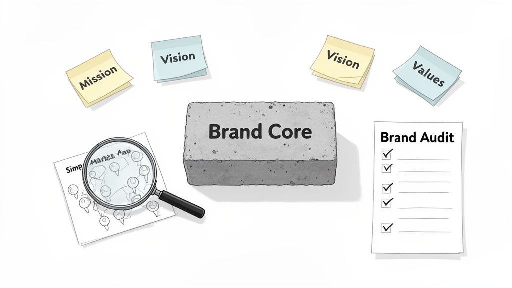
Before you even think about colors or fonts, the real work begins. I always tell my clients to think of this phase like pouring the concrete foundation for a skyscraper. If you rush it or skip it, everything you build on top is going to be wobbly and inauthentic.
This is all about getting to the soul of your business. It's where you ask the tough questions and get brutally honest about who you are, who you're for, and why anyone should care. Without that clarity, your brand just won't have the conviction to connect with people in a way that matters. If you want a full walkthrough of the entire journey, you can dive deeper into how to create a brand identity that people remember.
Conduct a Thorough Brand Audit
First things first, you need to take an unflinching look in the mirror. A brand audit gives you a clear snapshot of how you're perceived, both inside and outside the company. It’s a vital reality check, showing you what’s working and what’s not, so you aren’t building an identity on pure guesswork.
Make sure your audit hits these key areas:
- Internal Perception: Talk to your team and stakeholders. How do they describe the company’s purpose? What do they think the values are? Their answers will tell you a lot about the existing culture your brand identity needs to reflect.
- External Perception: Get feedback from your actual customers. What words do they use when talking about you? Their perspective is gold because, ultimately, your brand is defined by your audience, not by you.
- Customer Experience: Walk through every single touchpoint a customer has with your brand. From the first ad they see to the post-purchase support ticket. Is the experience consistent? Does it feel like you?
Analyze Your Competitive Landscape
No brand operates in a bubble. You have to know what your competitors are doing to find your own unique space in the market. This isn’t about copying them—it’s about finding the gaps and figuring out how you can be different and better.
Don't just look at their products and pricing. Dig into their visual identity, their tone of voice, and the core messages they push. Ask yourself: what emotional chord are they striking with their customers? This analysis will shine a light on unclaimed territory and help you nail down a unique selling proposition (USP) that makes you the obvious choice for your target audience.
A strong brand is built on a truth that is both unique to the company and relevant to the customer. This discovery phase is all about unearthing that truth so it can guide every single decision you make from here on out.
Define Your Mission, Vision, and Values
Once you have a clear picture of your internal and external world, it's time to solidify the pillars of your brand strategy. These aren't just fluffy corporate statements; they are the strategic compass that will guide every decision your brand makes.
- Mission Statement: This is your "why." It defines your purpose, what you do, who you serve, and the impact you want to have. Keep it short, actionable, and inspiring.
- Vision Statement: This is your "where." It’s an aspirational picture of the future you’re working to build, giving your team a long-term direction to rally behind.
- Core Values: These are the non-negotiable principles that dictate how your company behaves. I recommend sticking to 3-5 key values to keep them memorable and ensure they can actually be woven into your day-to-day culture.
These elements form the bedrock of your brand. They make sure that when you get to the fun stuff like logo design and taglines, every choice is anchored in a clear, consistent, and authentic strategy.
Finding Your Place in the Market with Clear Messaging
Once you've done the internal work to understand your brand's core truths, the real challenge begins: translating that clarity into a story that actually connects with your ideal customer. This is all about building the narrative that makes you the only logical choice for the right people.
It’s where your strategy gets a voice. This isn’t about just picking nice-sounding words; it’s about crafting a precise, compelling message that cuts through all the noise out there. And it all starts with knowing exactly who you're talking to.
Get to Know Your Ideal Customer
Before you write a single word of copy, you have to know who's on the other end. The best way I’ve found to do this is by creating detailed customer personas. A persona is essentially a semi-fictional character you build from market research and real data about your existing customers. It gives a face and a story to your target audience, which makes it infinitely easier to talk to them, not just at them.
Don't just stop at basic demographics. A truly useful persona goes much deeper.
- Goals and Motivations: What are they really trying to accomplish in their life or work? What drives them?
- Challenges and Frustrations: What's getting in their way? What keeps them up at night?
- Communication Preferences: Where do they get their information? Are they on LinkedIn, Instagram, or TikTok? Do they trust podcasts or industry blogs?
- Watering Holes: Think about where they hang out, both online and off. This could be specific Subreddits, industry conferences, or local meetups.
For instance, a brand selling sustainable coffee might create a persona named "Eco-Conscious Erica." She's a 32-year-old graphic designer who genuinely cares about ethical sourcing, shops at local farmers' markets, and follows environmental advocates on social media. This level of detail is gold. It helps the brand craft messaging that speaks directly to Erica’s values, not just her need for caffeine.
Craft a Powerful Positioning Statement
Now, let's talk about your positioning statement. This is a purely internal tool, but it’s the strategic core of all your external messaging. It’s a concise description of your target market and a clear picture of how you want them to see your brand.
Here’s a simple but incredibly effective framework I always come back to:
For [Target Audience], [Your Brand] is the only [Category/Industry] that delivers [Unique Benefit/Differentiator] because [Reason to Believe].
Let's apply this to a hypothetical project management tool built for small creative agencies. Their positioning statement might sound something like this: "For small creative agencies drowning in client feedback, our platform is the only project management tool that integrates visual annotation directly into task management, because we believe creatives should spend more time creating and less time digging through email chains."
See how that works? It clearly defines the audience, the unique benefit, and the "why" behind it. This statement becomes your North Star for every piece of marketing copy you create. If you want to dig deeper, exploring a complete brand messaging framework can provide even more structure for these efforts.
Develop Your Key Messages and Tagline
With your positioning locked in, you can start building out your core messages. This is where you create a memorable tagline and a sharp "elevator pitch" that anyone in your company can rattle off perfectly.
Your tagline is the public-facing slogan that bottles up your brand’s essence. Think about Nike's "Just Do It" or Apple's "Think Different." The goal is short, catchy, and evocative.
A brand's ability to connect emotionally is everything. In fact, 71% of consumers say brand recognition is a priority before they make a purchase. This trust translates directly into loyalty, with repurchase rates that are 60% higher for brands they know. And in today’s world, authenticity is king—84% of consumers say it influences their buying decisions, a stark reminder to honor the connections you build.
Your elevator pitch is that 30-second summary of what you do, who you do it for, and why it's a game-changer. It's the perfect tool for networking events, sales calls, or even just explaining what you do at a party. When everyone on your team tells the same compelling story, you reinforce your brand at every single touchpoint, building the kind of recognition that truly drives growth.
Bringing Your Brand to Life with a Visual System
People form an impression in a split second, and in business, that impression is almost always visual. This is where all your strategic groundwork—your mission, values, and positioning—starts to become something real that people can see and connect with.
Your brand’s visual system is its non-verbal language. It communicates your personality and promise before a single word is even read. The goal is to create a cohesive look and feel that shows up consistently everywhere, making your brand instantly recognizable and triggering the right feelings in your audience.
Your Logo Is the Face of Your Brand
Think of your logo as the cornerstone of this entire system. It's the most concentrated expression of your brand, and it has to be memorable, versatile, and built to last. A great logo works just as well on a giant billboard as it does as a tiny favicon in a browser tab.
There are a few classic approaches to logo design, and the right choice really depends on your brand's name and personality.
- Wordmarks: These are font-based logos that lean on the business name itself, like Google or Coca-Cola. They're a fantastic choice for companies with a catchy, unique name.
- Lettermarks (Monograms): Using the brand’s initials, like HBO (Home Box Office) or NASA, this is a smart move for businesses with long or hard-to-pronounce names.
- Icon or Symbol Logos: Think of the Apple logo or the Twitter bird. The best ones become so iconic they don’t even need the brand name next to them to be recognized.
- Combination Marks: This style combines a wordmark with an icon, giving you the best of both worlds. Brands like Spotify and Adidas use this so they have the flexibility to use the icon or text separately.
The most effective logos are born from your brand strategy, not just a design trend. They should visually represent the core promise you’ve already defined. This is a critical step in learning how to create a brand identity that lasts.
Choosing Your Color Palette
Color is an incredibly powerful tool because it plugs directly into human emotion. The colors you choose will become a signature for your brand, instantly communicating a feeling. Blue, for example, often conveys trust and professionalism, while yellow can feel optimistic and energetic.
To really nail this, it helps to have a solid understanding of color theory in web design and how different palettes shape perception. Don't just pick your personal favorites; think strategically about the feelings you want your audience to associate with your brand.
I always advise clients to start by selecting one or two primary colors that truly align with the brand's core personality. From there, you can add a few secondary or accent colors that complement them. This limited palette is the secret to ensuring consistency and preventing your visuals from looking chaotic.
To give you a clearer picture, here’s a breakdown of the key visual elements and what they do for your brand.
Core Elements of a Visual Identity System
| Visual Element | Primary Function | Key Considerations |
|---|---|---|
| Logo | Serves as the primary, most recognizable symbol of the brand. | Versatility (works at all sizes), Timelessness (avoids fleeting trends), and Relevance (reflects brand values). |
| Color Palette | Evokes emotion and establishes a consistent mood across all materials. | Psychological associations, audience perception, and ensuring sufficient contrast for accessibility. |
| Typography | Sets the brand's voice and tone; ensures readability of all text. | Legibility across digital and print, clear hierarchy (headings vs. body), and alignment with brand personality. |
| Imagery & Icons | Creates a cohesive visual narrative and communicates complex ideas quickly. | Style (photography vs. illustration), subject matter, and consistency in editing or design. |
These components work together to build a strong, unified visual presence that people will remember.
Typography That Speaks Your Language
The fonts you use are just as important as your colors. Typography doesn't just deliver your message; it sets the tone. A modern, clean sans-serif font like Helvetica can make a brand feel approachable and up-to-date, while a classic serif font like Garamond might suggest tradition and authority.
As a general rule, stick to two or three fonts max. You'll typically want one for headings and another for body text to create a clear visual hierarchy. No matter what, the most important factor is readability. A beautiful font is useless if your audience struggles to read what you've written.
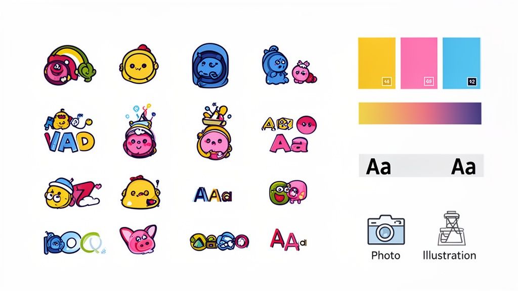
Completing the Picture with Imagery and Icons
Your visual identity isn't complete without considering photography, illustrations, and iconography. These elements help create a complete visual language. Do you use bright, candid photos of real people, or sleek, professional product shots on a solid background?
This choice should be deliberate and consistent. If your brand is playful and creative, maybe you lean into custom illustrations. If you're a luxury brand, high-end, atmospheric photography will be a much better fit.
The key is to document all these choices. Once these visual elements are defined, they need to be compiled into a central document. You can find out more by exploring our guide on how to create brand guidelines, which will serve as your team's bible for keeping everything consistent.
Finding Your Voice and Setting the Right Tone
If your visuals are how your brand looks, its voice is how it talks. This is the distinct personality that should shine through in every single word you write, from a splashy website headline to a quick customer support chat.
Think of it this way: your voice makes your brand feel human. It turns a faceless company into a character your audience can actually get to know and connect with.
Voice is Who You Are, Tone is How You Say It
People often mix up brand voice and tone, but the difference is simple. Your brand voice is your fixed personality—it’s who you are at your core. It doesn’t change day-to-day.
Your tone, on the other hand, is the emotional inflection you use in different situations. You wouldn't use the same tone to celebrate a customer’s big win as you would to apologize for a shipping delay, right? But both conversations should still sound like they're coming from the same person.
Define Your Brand as a Person
Here’s a simple exercise I always use with clients to get the ball rolling: imagine your brand is a person walking into a room. What are they like? This little trick helps pull the concept out of the abstract and into something tangible.
Start by just brainstorming adjectives. Is this person witty? Serious? Inspiring? Quirky? Don't hold back—get specific.
Once you have a good list, whittle it down to 3-5 core attributes. This focus is crucial for keeping your voice consistent and not muddled. For each attribute, I find it incredibly helpful to also define what it’s not. This creates clear guardrails for anyone writing for you.
For example:
- Playful, but not childish. (We love clever wordplay, but we’re not telling silly jokes.)
- Confident, but not arrogant. (We speak with authority, but we never talk down to our audience.)
- Helpful, but not overbearing. (We give clear guidance, but we trust our audience to be smart.)
Use Archetypes and Sliders for Clarity
Another great tool is leaning on brand archetypes. These are universally understood character types—like the Hero, the Sage, or the Jester—that give you a mental shortcut to a personality. A brand that embodies the Sage archetype (think Google) will naturally have a knowledgeable, authoritative voice. A Jester brand (like Old Spice) will be all about humor and irreverence.
To fine-tune things even more, try using attribute sliders. Put two opposing traits on either end of a spectrum and mark where your brand lands.
| Trait Spectrum | Your Brand's Position |
|---|---|
| Formal <—> Casual | Leans heavily toward Casual |
| Humorous <—> Serious | Sits mostly in the middle |
| Traditional <—> Modern | Strongly Modern |
| Accessible <—> Exclusive | Firmly Accessible |
This kind of visualization gives your team a practical guide they can actually use. It’s a great way to turn a high-level concept into a day-to-day communication style. Understanding exactly what a brand voice is and how to define it really is the foundation for all your messaging.
Adjusting Your Tone for the Moment
Once your voice is locked in, adjusting your tone for different contexts becomes much more intuitive. The goal is to match the tone to the platform and the audience's mindset, all while staying true to your core personality.
A brand voice builds recognition and trust, but the right tone builds a relationship. You always want to sound like yourself, just adapted for the specific conversation you're having.
Let's imagine your brand voice is supportive and friendly. Here’s how the tone would shift:
- Instagram Post: Energetic and fun ("You’ve got this! ✨ Show us what you're creating with #OurBrand.")
- Support Email: Empathetic and reassuring ("I'm so sorry you're running into trouble. Let's work together to get this sorted out for you.")
- Blog Post: Informative and encouraging ("Here’s a step-by-step guide to help you master this technique. We know you’ll do great things.")
See? The underlying voice—supportive and friendly—is the same in each case. Only the tone changes. This adaptability is what makes your brand feel authentic and emotionally intelligent, strengthening your connection with your audience every time you communicate.
Bringing Your Brand Identity to Life
You've done the hard work—the soul-searching, the strategy sessions, the design sprints. Now you have a brilliant brand identity. But here's the thing: it's completely useless if it just sits in a Google Drive folder, collecting digital dust. This is where the rubber meets the road, turning all those abstract ideas into a living, breathing part of your business.
The real magic happens when you build a practical framework that gets your entire team on the same page. This isn't just about preventing someone from using the wrong logo. It's about creating a predictable and trustworthy experience for your audience. When every single touchpoint—from a tweet to a sales invoice—feels like it comes from the same place, you build recognition that fosters real loyalty.
Build Your Brand Guidelines Document
Think of your brand guidelines as the "single source of truth" for your brand. It’s the go-to manual that anyone, from a new hire in marketing to a freelance designer you just brought on, can use to understand exactly how to represent you. Without it, consistency is left to chance, and your carefully built identity will start to fray at the edges almost immediately.
Don't panic—this doesn't need to be a 100-page dissertation. It just needs to be clear, comprehensive, and genuinely useful.
Here are the absolute must-haves for your guidelines:
- Logo Usage: Show, don't just tell. Provide clear examples of how to use your logo correctly. Define rules for minimum size, the clear space that must be left around it, and how it should look on different backgrounds. Just as important, show what not to do—no stretching, recoloring, or other brand crimes.
- Color Palette: Be specific. List the exact color codes (HEX, RGB, CMYK) for your primary and secondary colors. Go a step further and explain their roles: which colors are for headlines, which are for body text, and which are for calls-to-action? This ensures visual harmony everywhere.
- Typography Rules: Define your type hierarchy. Name your primary and secondary fonts and outline the specific weights and sizes for H1s, H2s, body copy, and captions. This small detail is what makes written communication look polished and intentional.
- Voice and Tone Examples: This is where you bring your brand's personality to life. Include short, practical snippets of how your brand sounds in different situations. What does a celebratory announcement sound like? An apology to a customer? A technical explanation? Give your team real-world examples to follow.
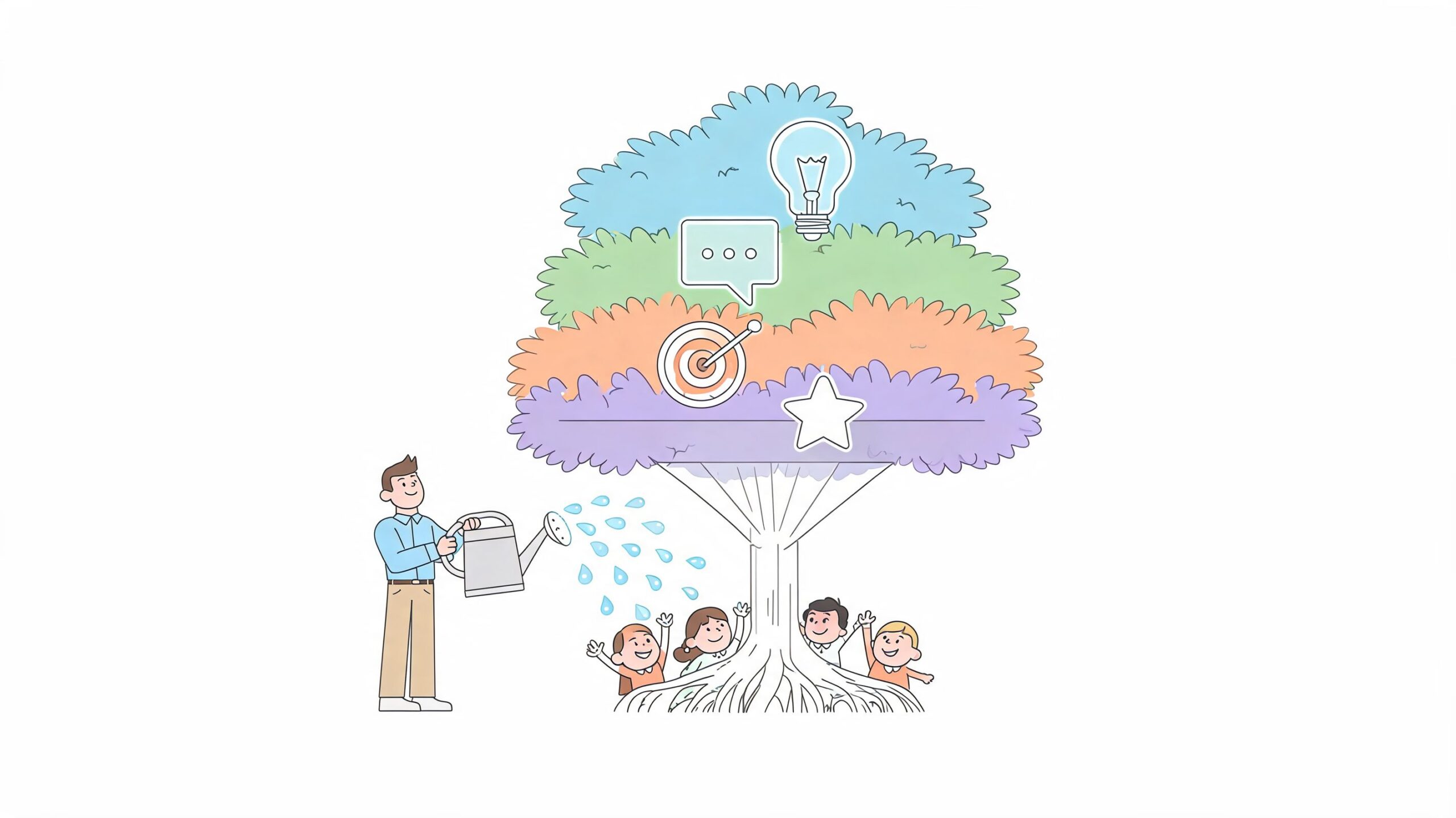
Getting your brand's voice down and knowing how to adapt its tone is a game-changer for consistent communication.
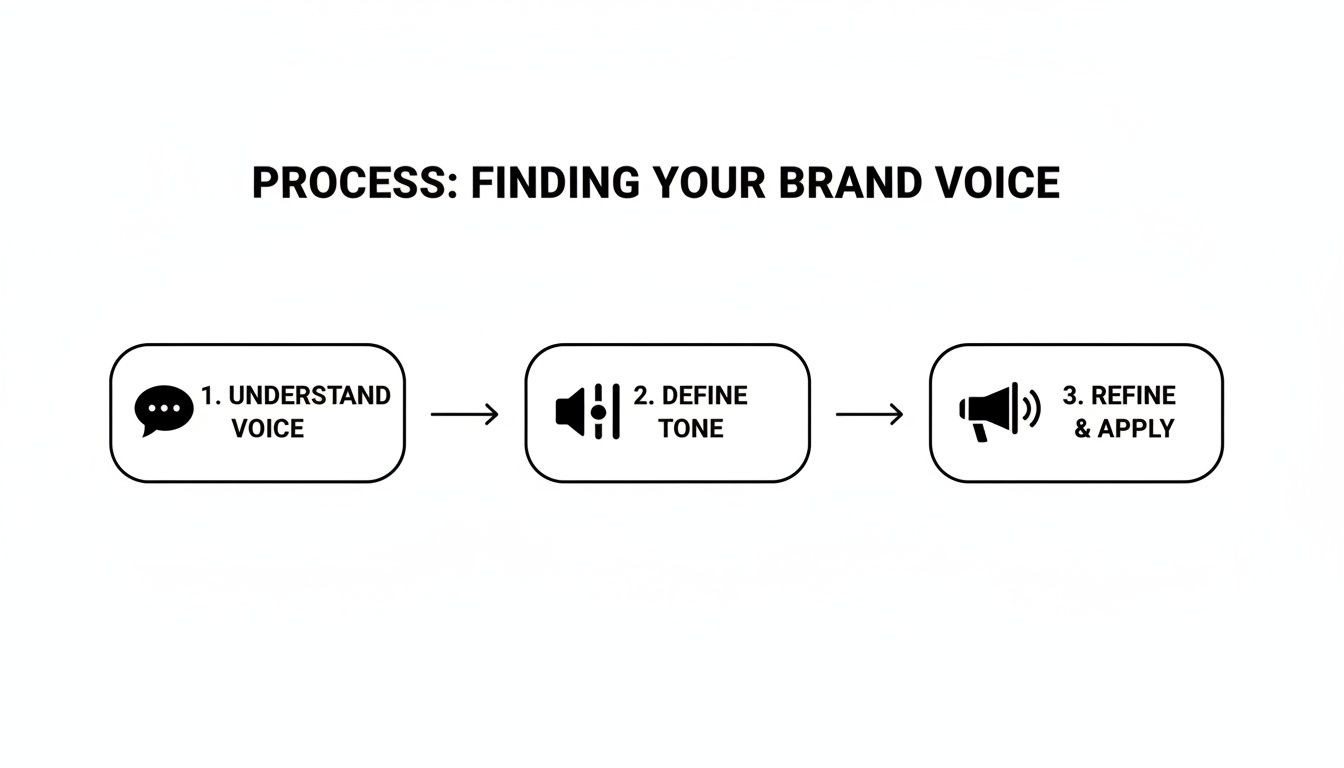
This visual really captures how your core voice remains steady, while your tone can flex depending on the context of the conversation.
Create Your Roll-Out Implementation Checklist
With your guidelines ready, it's time to roll up your sleeves and update your identity across every single customer touchpoint. A checklist is your best friend here. It turns a massive, overwhelming project into a series of manageable tasks. Organize it by category and assign owners to keep things moving.
This is more than a fresh coat of paint; it's a systematic overhaul with a real financial upside. Some fascinating branding statistics show that 68% of companies say brand consistency contributes to 10-20% additional revenue growth. Why? Because consistency builds trust, and trust turns casual browsers into loyal customers. On the flip side, a shocking 15% of companies still have no brand guidelines, which leads to the kind of disjointed messaging that erodes confidence. If you're curious, you can dig deeper into branding's impact on revenue growth at dash.app.
Your checklist needs to be thorough, covering both your digital and physical worlds.
Digital Asset Checklist
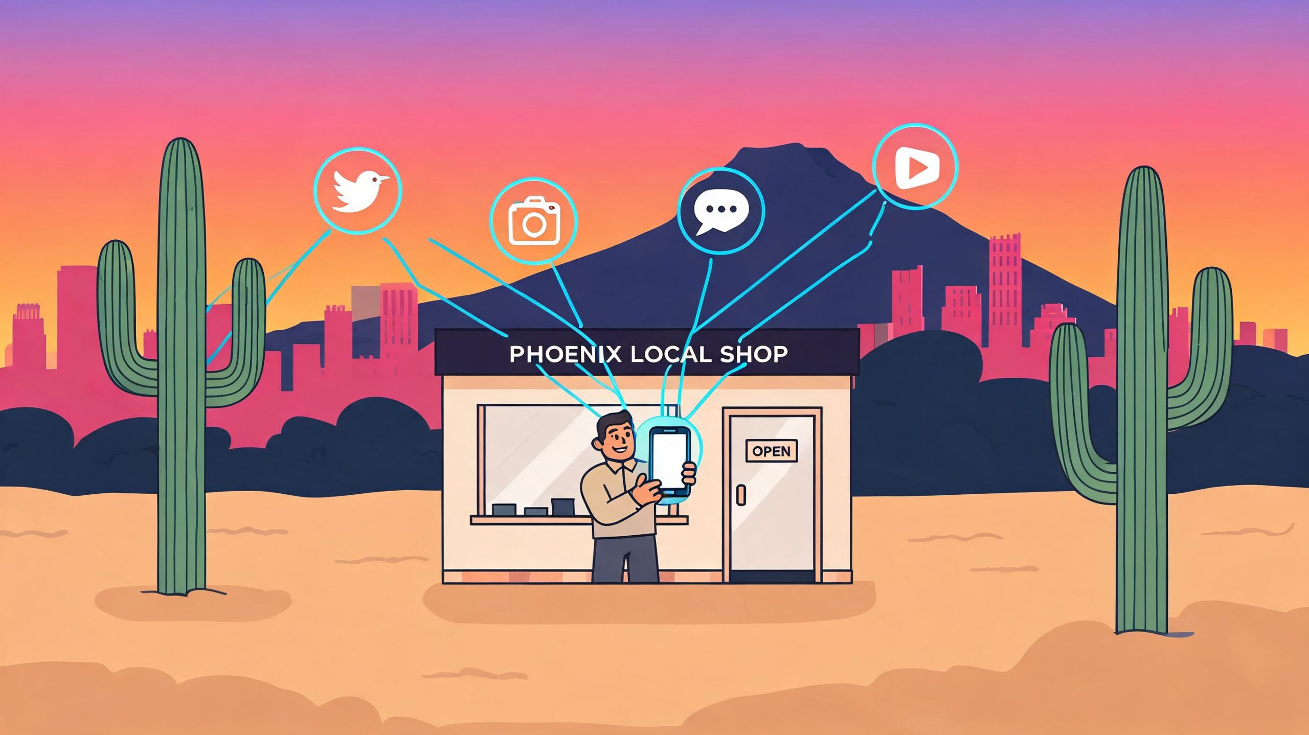
- Website: Logo, color scheme, fonts, and imagery across all pages. Don't forget the favicon!
- Social Media Profiles: Profile pictures, cover photos, and bios need a refresh to reflect the new voice.
- Email Marketing: Redesign email templates (newsletters, transactional emails) and update all signatures.
- Digital Ads: Recreate ad creative for all active campaigns to align with the new look and feel.
- Presentations: Update all internal and external slide decks—from sales pitches to all-hands meetings.
Physical Asset Checklist
- Business Cards & Stationery: Time to redesign and reorder letterheads, envelopes, and business cards.
- Product Packaging: Plan a smooth transition to new packaging that aligns with the brand refresh.
- Marketing Collateral: Update all brochures, flyers, and trade show banners.
- In-Store Signage: If you have a physical location, update all interior and exterior signs.
A brand identity roll-out is a company-wide effort. The ultimate goal is to turn your entire team into brand ambassadors who understand, believe in, and consistently reinforce the identity you’ve worked so hard to build.
By creating solid guidelines and executing a structured roll-out, you ensure your brand identity doesn't just look good on paper—it thrives in the wild, consistently and effectively, wherever your audience finds you. This is how you turn a great identity into a powerful business asset.
Got Questions? Let's Clear Things Up
As you start working on your brand, a few key questions almost always come up. People often throw around terms like "brand identity," "branding," and "brand image" as if they're the same thing, but they absolutely are not. Knowing the difference is key, because it tells you what you can control versus what you can only hope to influence.
Let's untangle these concepts and tackle a few other common hurdles. Getting this straight from the start will give you the confidence to build your brand without falling into the usual traps.
Brand Identity vs Branding vs Brand Image
Before we go any further, let's get this sorted. These three terms are the bedrock of brand strategy, and I see them get mixed up all the time. Think of it as a chain reaction: you do one thing, which creates a second, which results in a third.
It's a crucial distinction, so here’s a simple table to make it stick.
| Term | Definition | Example |
|---|---|---|
| Branding | The action. This is the ongoing process of shaping your brand—from research and strategy to designing visuals and writing copy. | Nike running campaigns with the "Just Do It" slogan and sponsoring top athletes. |
| Brand Identity | The output. These are the tangible assets you create—logo, colors, fonts, voice, and messaging. It’s your brand’s toolkit. | The iconic Nike "swoosh," the bold Futura Condensed Extra Black font, and their motivational tone. |
| Brand Image | The result. This is what lives in your audience's head—their gut feeling and perception of you, built from every interaction. | People see Nike as a symbol of determination, peak performance, and athletic empowerment. |
In short, branding is the work you put in to create your brand identity, which in turn shapes your brand image in the public's mind. You directly control the first two, but the third is the ultimate prize you have to earn.
How Long Does This Actually Take?
Everyone wants to know the timeline, but there's no magic number. A nimble startup, laser-focused on its launch, might hammer out its core brand identity in a few weeks to a couple of months. On the other hand, a larger company going through a rebrand could easily spend six months or more navigating internal approvals, deep-dive research, and a phased rollout.
But here’s the real deal: creating the initial assets is just the starting pistol. Building genuine brand recognition and a solid reputation is a long game. It takes years of consistency.
Don't rush the foundation. A brand identity slapped together on a weak strategy will eventually crack, forcing a costly and painful rebuild down the road. Take the time to get it right from the start.
Can I Build a Real Brand Identity on a Shoestring Budget?
Yes, absolutely. A big budget is nice—it gets you access to top-tier agencies and ad placements—but a powerful brand identity isn't about how much you spend. It’s about clarity and consistency. Some of the most beloved brands started out with little more than a great idea and a ton of hustle.
If you're working with a tight budget, here's where to focus your energy:
- Nail the Strategy First: Your mission, audience, and unique positioning are the most critical pieces of the puzzle. This part costs you nothing but focused brainpower.
- Use Smart Design Tools: You don't need a world-famous designer on day one. Platforms like Canva have become incredibly powerful for creating a professional-looking logo, social media templates, and other visuals.
- Own a Niche: Don't try to be everything to everyone. It's far cheaper and more effective to connect deeply with a small, passionate audience that gets what you're doing.
- Tell Your Story: A genuine founder's story or a powerful mission can forge an emotional connection that money simply can't buy. Authenticity is magnetic.
At the end of the day, your most valuable assets are authenticity and consistency—and neither has a price tag. A well-defined identity, applied with discipline over time, will always win against a big-budget brand that lacks a soul.
Ready to build a brand that truly connects with your audience? The experts at ReachLabs.ai take a collective approach, blending data-driven insights with world-class creative talent to elevate your brand's voice and drive real results. Discover how our tailored strategies can help you innovate and thrive by visiting us at https://www.reachlabs.ai.

