
Visualizing Success: Why Marketing Dashboards Matter
Stop wasting time sifting through scattered data. This listicle provides eight marketing dashboard examples using tools like Google Looker Studio, Tableau, and Databox to streamline your 2025 marketing strategy. Learn how these platforms transform your metrics into actionable insights, allowing you to quickly assess campaign performance, identify growth opportunities, and make data-driven decisions. We’ll cover key features, pros, cons, and pricing for each tool, helping you choose the perfect marketing dashboard solution for your needs. Explore these marketing dashboard examples and unlock the potential of your data.
1. Google Data Studio (now Looker Studio)
Looking for a powerful yet free solution to visualize your marketing data? Looker Studio (formerly Google Data Studio) is Google’s free data visualization platform that empowers you to create interactive and informative marketing dashboards. By connecting to various data sources, including Google Analytics, Google Ads, YouTube Analytics, and even CSV files, Looker Studio allows you to transform raw data into easily digestible, customizable dashboards. This makes it an ideal choice for individuals and teams already invested in the Google marketing ecosystem, offering a seamless experience and centralized reporting. It’s a prime example of a versatile marketing dashboard, offering a flexible solution for a variety of reporting needs. This platform helps you tell compelling stories with your data, making it easier to identify trends, monitor key performance indicators (KPIs), and ultimately make more data-driven decisions.
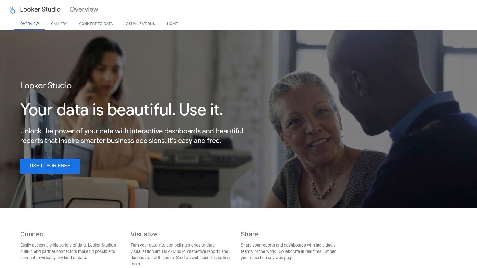
Looker Studio’s drag-and-drop interface simplifies dashboard creation, allowing even non-technical users to build compelling visualizations. You can track website traffic, social media engagement, advertising campaign performance, and more, all within a single, unified view. Need to calculate customer lifetime value or track conversion rates across multiple channels? Looker Studio allows you to create custom metrics and calculations tailored to your specific business objectives. Real-time data collaboration features enable teams to work together on dashboards simultaneously, streamlining the reporting process and ensuring everyone stays informed. Furthermore, a rich template gallery offers pre-built marketing dashboards for various use cases, providing a jumpstart for those new to the platform. For example, pre-built templates for SEO performance reporting can help you quickly visualize keyword rankings and organic traffic trends. Similarly, dedicated social media dashboards can track engagement metrics across platforms like Facebook and Instagram. These features contribute to Looker Studio deserving its place as a top marketing dashboard example.
Features:
- Wide range of data connectors for Google and third-party platforms (some require paid connectors)
- Drag-and-drop interface for easy dashboard creation
- Real-time data collaboration and sharing capabilities
- Custom calculations and metrics creation
- Template gallery with pre-built marketing dashboards
- Interactive data exploration and filtering
- Customizable report themes and branding
Pros:
- Free to use with unlimited reports
- Seamless integration with Google marketing products
- Highly customizable visualizations
- Real-time collaboration features
Cons:
- Learning curve can be steep for advanced features, such as blended data sources and complex calculated fields.
- Some third-party data connections require paid connectors.
- Limited customer support compared to paid dashboarding solutions.
- Can be slow with very large datasets.
Website: https://lookerstudio.google.com/
Implementation Tips:
- Start with a clear objective for your dashboard. What key metrics do you need to track?
- Explore the template gallery to find a pre-built dashboard that aligns with your needs.
- Connect your relevant data sources and familiarize yourself with the data available.
- Utilize the drag-and-drop interface to customize the visualizations and layout.
- Share your dashboard with stakeholders and encourage collaboration.
Looker Studio offers a compelling value proposition, especially for businesses already using Google’s suite of marketing tools. While some advanced functionalities may require a deeper understanding of the platform, the free access, extensive integration capabilities, and customizable features make it a strong contender in the marketing dashboard landscape. Compared to other tools like Tableau or Power BI, which often come with hefty price tags, Looker Studio provides a robust free alternative, making data visualization accessible to businesses of all sizes.
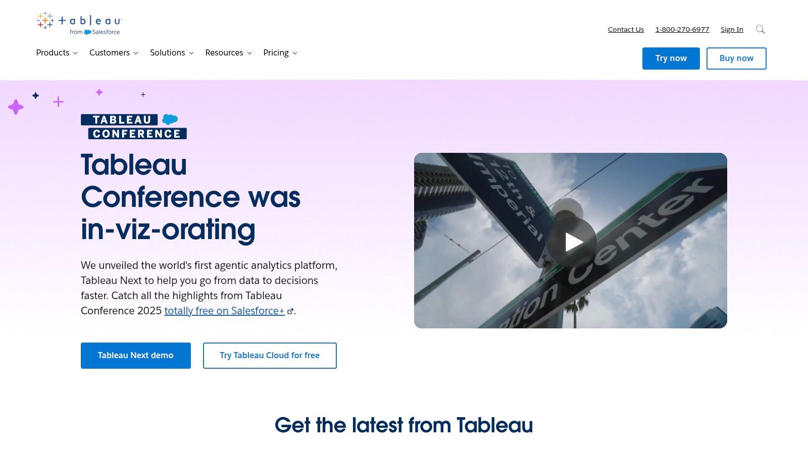
2. Tableau
Tableau stands out as a leading choice for building robust marketing dashboards, empowering marketers to transform raw data into actionable insights. Its strength lies in combining powerful data visualization with in-depth analytics, enabling users to explore complex datasets, uncover hidden trends, and ultimately make data-driven decisions that optimize marketing performance. Tableau truly shines when handling large datasets and offers sophisticated visualization options specifically tailored for marketing analytics, making it a powerful tool for demonstrating ROI and campaign effectiveness. This makes it a highly effective tool for crafting compelling marketing dashboard examples.
For example, imagine tracking the performance of a multi-channel marketing campaign. Tableau can seamlessly integrate data from various sources like Google Ads, social media platforms, and email marketing tools. You can then visualize the data in interactive dashboards, showing key performance indicators (KPIs) like website traffic, conversion rates, customer acquisition cost (CAC), and return on ad spend (ROAS) for each channel. This allows marketers to quickly identify which channels are performing well and which need adjustments, leading to a more optimized and effective campaign. Tableau’s drag-and-drop interface simplifies the process of building these complex dashboards, even for users with limited technical expertise.
Tableau’s key features further enhance its value for marketing professionals. Its advanced data visualization capabilities go beyond standard charts and graphs, offering interactive maps, heatmaps, and treemaps to reveal deeper insights. The drag-and-drop interface makes dashboard creation intuitive, while robust data blending and integration options ensure you can connect to virtually any data source. Mobile-responsive dashboard designs allow you to access your data on the go, and AI-powered analytics with Tableau’s Ask Data feature allows users to query data using natural language.
Pros:
- Exceptional visualization capabilities: Create visually stunning and informative dashboards that communicate complex data effectively.
- Handles large and complex datasets efficiently: Analyze massive datasets without compromising performance.
- Strong community and learning resources: Access a wealth of online resources, tutorials, and a vibrant community for support and best practices.
- Regular feature updates and improvements: Benefit from ongoing development and enhancements to the platform.
Cons:
- Relatively high price point compared to alternatives: Tableau’s licensing fees can be a significant investment, especially for smaller businesses.
- Steeper learning curve for beginners: While the drag-and-drop interface simplifies many tasks, mastering the full range of Tableau’s features requires time and effort.
- Can be resource-intensive on less powerful computers: Working with large datasets may require a powerful computer for optimal performance.
- Some features require additional purchases: Certain advanced features may require separate licenses or subscriptions.
Website: https://www.tableau.com/
Tableau’s pricing varies depending on the license type (Creator, Explorer, or Viewer) and deployment option (cloud or on-premise). Contact Tableau directly for specific pricing details. System requirements will depend on the deployment method and data volume, but generally a modern computer with sufficient RAM and processing power is recommended.
Compared to tools like Google Data Studio (which is free) or Power BI, Tableau offers more advanced visualization and analytical capabilities. However, these advanced features come at a higher price point and may require a steeper learning curve. For those seeking a powerful and flexible solution for building sophisticated marketing dashboards and are willing to invest the time and resources, Tableau is a top contender. One implementation tip is to start with a clear objective and define the key metrics you want to track before diving into dashboard creation. This will help you focus your efforts and create a more effective and insightful dashboard.
3. Databox: Streamline Your Marketing Data with Ease
Databox is a powerful business analytics platform tailored for marketers seeking a centralized view of their performance data. It stands out among marketing dashboard examples for its ease of use and wide range of integrations, making it a strong contender for businesses of all sizes. By connecting to popular marketing platforms like Google Analytics, HubSpot, Facebook Ads, and over 70 others, Databox eliminates the need to jump between different platforms, saving you time and effort. This allows you to focus on extracting actionable insights and optimizing your marketing strategies rather than wrestling with data collection. Whether you’re tracking website traffic, social media engagement, or advertising ROI, Databox provides a comprehensive overview of your marketing efforts.
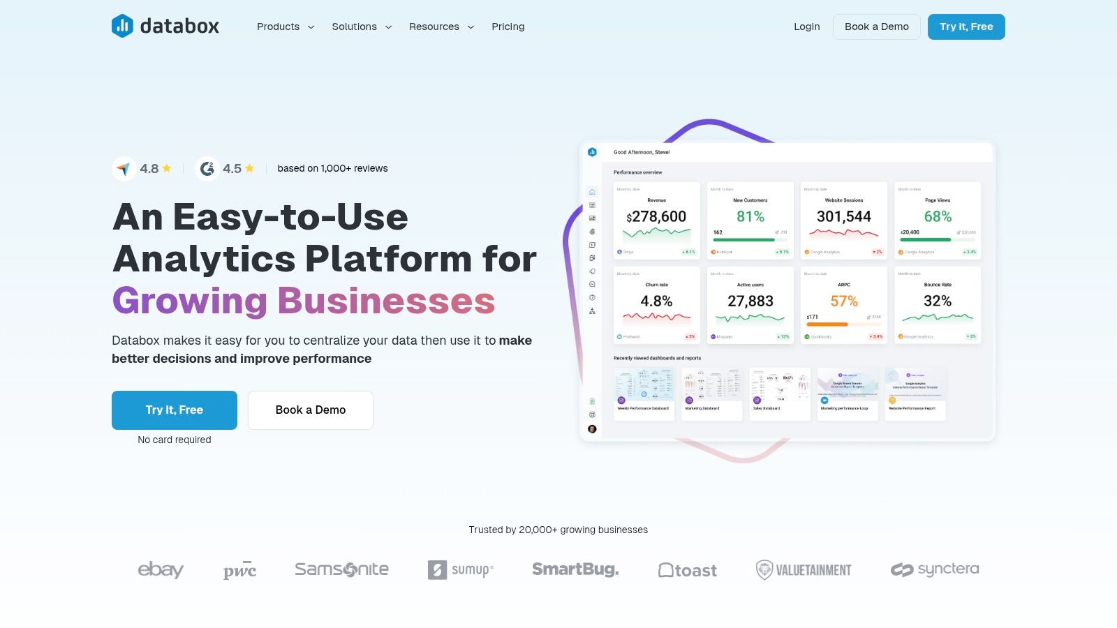
For marketing professionals, having a clear view of key performance indicators (KPIs) is crucial. Databox excels in this area, offering pre-built marketing dashboard templates and custom goal-setting functionality. This allows you to quickly visualize your progress towards specific objectives, such as increasing lead generation or boosting brand awareness. Furthermore, automated reporting features enable you to schedule and deliver performance reports directly to stakeholders, ensuring everyone stays informed about the latest campaign results. This streamlined reporting process frees up valuable time for more strategic activities. Imagine receiving a daily performance scorecard delivered straight to your inbox or mobile device – Databox makes this a reality.
Small and medium-sized business owners will appreciate Databox’s user-friendly interface and minimal setup requirements. Even without extensive technical expertise, you can quickly connect your data sources and create insightful dashboards. Content creators and social media managers can benefit from tracking engagement metrics across different social media platforms, enabling data-driven content optimization and audience growth. Corporate brand strategists can leverage Databox’s comprehensive data visualization capabilities to monitor brand performance and identify areas for improvement.
Pricing and Technical Requirements: Databox offers a variety of pricing tiers, including a free option for those looking to explore its basic features. Paid plans unlock additional features and integrations, catering to the needs of growing businesses. The platform is cloud-based, eliminating the need for complex installations or dedicated server infrastructure.
Pros:
- User-Friendly Interface: Minimal setup and intuitive navigation make it easy to get started.
- Comprehensive Mobile Experience: Dedicated mobile app allows for on-the-go performance monitoring.
- Affordable Pricing: Offers a free plan and competitively priced paid tiers.
- Excellent Alerting and Notification System: Stay informed about critical performance changes.
Cons:
- Limited Customization: Less customizable than some enterprise-level analytics platforms.
- Limited Advanced Data Analysis: While suitable for monitoring KPIs, it may lack the depth for complex statistical analysis.
- Occasional Syncing Delays: Some users have reported occasional delays with data syncing from certain sources.
- Some Advanced Features Only Available in Higher-Tier Plans: Access to all features requires a premium subscription.
Implementation Tip: Start by identifying your core marketing KPIs and selecting a pre-built dashboard template that aligns with your goals. Connect your relevant data sources and customize the dashboard to fit your specific needs. Explore the automation features to streamline reporting and free up your time for strategic decision-making.
Website: https://databox.com/
Databox earns its spot in this list of marketing dashboard examples due to its user-friendliness, comprehensive mobile experience, and affordable pricing. It’s an excellent choice for businesses looking to consolidate their marketing data and gain actionable insights without the complexity of more advanced analytics platforms.
4. Klipfolio: A Powerful Marketing Dashboard Example for Data Integration
Klipfolio is a robust cloud-based dashboard platform ideal for marketing teams who need to unify data from various sources to gain a holistic view of their performance. This makes it a strong contender amongst marketing dashboard examples, particularly for those seeking advanced customization and data manipulation capabilities. Whether you need a quick overview with pre-built metrics or a deep dive with custom dashboards, Klipfolio caters to various skill levels with its dual offering of PowerMetrics and custom dashboarding functionality. This flexibility makes it suitable for anything from tracking website traffic and social media engagement to monitoring complex multi-channel marketing campaigns.
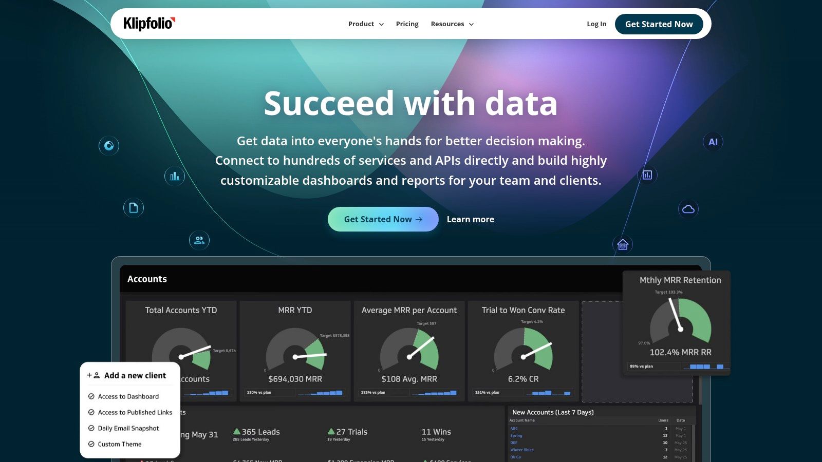
For instance, imagine you’re managing a campaign across Google Ads, Facebook Ads, and email marketing. Klipfolio allows you to pull data from each platform into a single dashboard, providing a unified view of campaign performance. You could track key metrics like cost per acquisition (CPA), click-through rates (CTR), and conversion rates across all channels, enabling data-driven decisions and optimized budget allocation. Furthermore, Klipfolio’s real-time data refreshing capabilities ensure your insights are always up-to-date, allowing for agile responses to changing market dynamics.
Klipfolio offers a rich feature set designed to empower marketing professionals: an extensive library of pre-built marketing metrics and visualizations, real-time data refreshing, powerful formula editing for custom calculations, flexible dashboard sharing and user permission settings, and responsive design for both desktop and mobile viewing. This allows marketers to tailor dashboards to their specific needs, visualizing data in a way that’s most insightful for their team and stakeholders.
Pros:
- Excellent data manipulation capabilities: Klipfolio’s strength lies in its ability to transform and combine data from different sources, providing a holistic view of marketing performance.
- Strong data connector library: With over 100 integrations, Klipfolio connects to a wide array of marketing platforms and data sources.
- Highly flexible and customizable: From pre-built metrics to custom formulas, Klipfolio caters to various needs and technical skill levels.
- Good value for feature set offered: Klipfolio provides a comprehensive suite of features at a competitive price point.
Cons:
- Steeper learning curve: Mastering Klipfolio’s advanced features can take time and effort compared to more user-friendly alternatives like Google Data Studio.
- Dated interface: While functional, the interface may feel less modern compared to newer dashboarding tools.
- Complex dashboards require technical knowledge: Building highly customized dashboards can require some technical expertise, especially when using custom formulas and data transformations.
- Customer support response times can be slow: Some users have reported delays in receiving support assistance.
Pricing: Klipfolio offers a tiered pricing structure based on the number of users and data sources. Specific pricing details are available on their website.
Technical Requirements: As a cloud-based platform, Klipfolio requires only a web browser and an internet connection.
Implementation Tips: Start with pre-built metrics and visualizations to get familiar with the platform. Gradually explore the custom dashboarding features and leverage Klipfolio’s extensive documentation and support resources.
Klipfolio earns its place in this list of marketing dashboard examples because of its powerful data integration and manipulation capabilities. While it may have a steeper learning curve, the flexibility and customization options make it an excellent choice for marketing teams that need to combine data from multiple sources and create highly tailored visualizations to monitor their performance. For more information and to explore Klipfolio’s offerings, visit https://www.klipfolio.com/.
5. HubSpot Marketing Dashboard
HubSpot’s Marketing Dashboard is a powerful component of their broader marketing platform, providing a centralized hub for monitoring and analyzing your inbound marketing activities. This makes it a prime example of a marketing dashboard done right, especially for businesses already invested in the HubSpot ecosystem. Whether you’re tracking website traffic, email campaign performance, social media engagement, or lead generation efforts, the HubSpot Marketing Dashboard offers a unified view, enabling data-driven decision-making. This dashboard is ideal for marketing teams seeking a streamlined solution integrated with their CRM and sales processes.
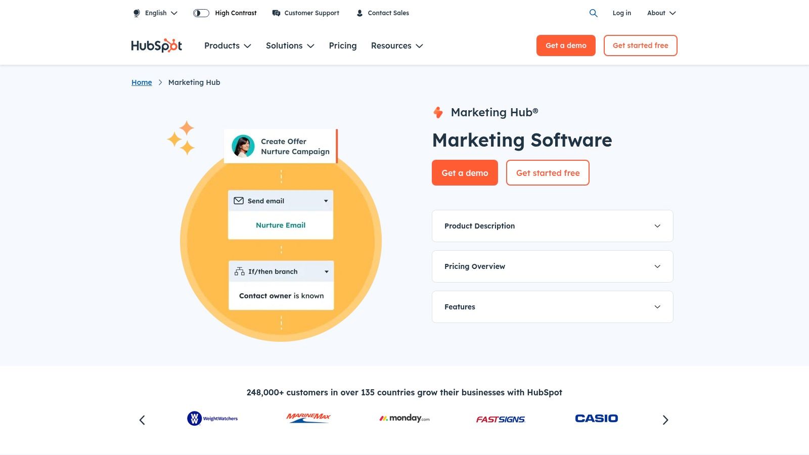
One of the key strengths of HubSpot’s Marketing Dashboard is its comprehensive integration with other HubSpot tools. This seamless connection allows for a holistic view of the customer journey, from initial website visit to becoming a loyal customer. Imagine tracking a campaign’s effectiveness from the first click on a social media ad, through email nurturing, and finally to a closed deal – all within a single dashboard. This level of integration provides invaluable insights into what’s working and what needs adjustment in your marketing strategy. For example, you can quickly identify which blog posts are generating the most qualified leads, allowing you to focus content creation efforts on similar topics.
The HubSpot Marketing Dashboard includes features like integrated analytics for all HubSpot marketing tools, campaign performance tracking with attribution modeling, a custom report builder for tailored metrics, funnel analytics visualizing the customer journey, and built-in A/B testing reporting. These tools empower marketers to understand the ROI of their activities and optimize campaigns for better results.
Pros:
- Seamless integration: Connects effortlessly with HubSpot’s CRM and sales tools for a 360-degree view of the customer.
- User-friendly interface: Easy to navigate and requires minimal technical setup, allowing marketers to focus on analysis rather than configuration.
- Comprehensive inbound marketing measurement: Tracks all aspects of inbound marketing, from website traffic to lead conversions.
- Regular updates: HubSpot continuously adds new features and improvements to their reporting tools.
Cons:
- Best value with multiple HubSpot products: While the dashboard is part of the Marketing Hub, its full potential is realized when used in conjunction with other HubSpot products.
- Higher-tier plans for advanced reporting: Some advanced features, like custom event tracking and predictive analytics, are locked behind higher-priced plans.
- Limited customization: While offering a good range of reports, customization options are less extensive than those found in dedicated dashboarding tools.
- Cost: Can be a significant investment for small businesses, especially when utilizing multiple HubSpot products.
HubSpot offers a tiered pricing structure for its Marketing Hub, starting with a free version for basic functionalities. Paid plans unlock additional features and reporting capabilities, scaling with the needs of growing businesses. You can find detailed pricing information on their website: https://www.hubspot.com/products/marketing.
Implementation Tip: Start by identifying your key performance indicators (KPIs) and then customize your dashboard to track those metrics. HubSpot offers pre-built templates and reports to get you started quickly.
Compared to standalone dashboarding tools like Databox or Google Data Studio, HubSpot’s offering prioritizes ease of use and integration within its ecosystem. If you’re already using HubSpot’s CRM and marketing tools, the Marketing Dashboard provides a convenient and powerful way to monitor your marketing performance. This dashboard deserves a place on this list because it represents a strong, all-in-one solution for businesses seeking a centralized and user-friendly marketing analytics platform within the HubSpot ecosystem.
6. Domo
Domo is a powerful, enterprise-grade business intelligence platform offering a robust solution for building and customizing interactive marketing dashboards. It allows marketing teams to consolidate data from various sources, visualize key performance indicators (KPIs), and gain actionable insights. If your team needs to manage and analyze large datasets, forecast trends, and collaborate effectively on data-driven decisions, Domo deserves serious consideration as a central hub for your marketing analytics. This platform distinguishes itself through advanced data governance, robust data integration capabilities, and AI-powered insights, making it a particularly compelling option for larger organizations. Domo’s place in this list of marketing dashboard examples stems from its ability to handle complex data scenarios and provide a comprehensive view of marketing performance.
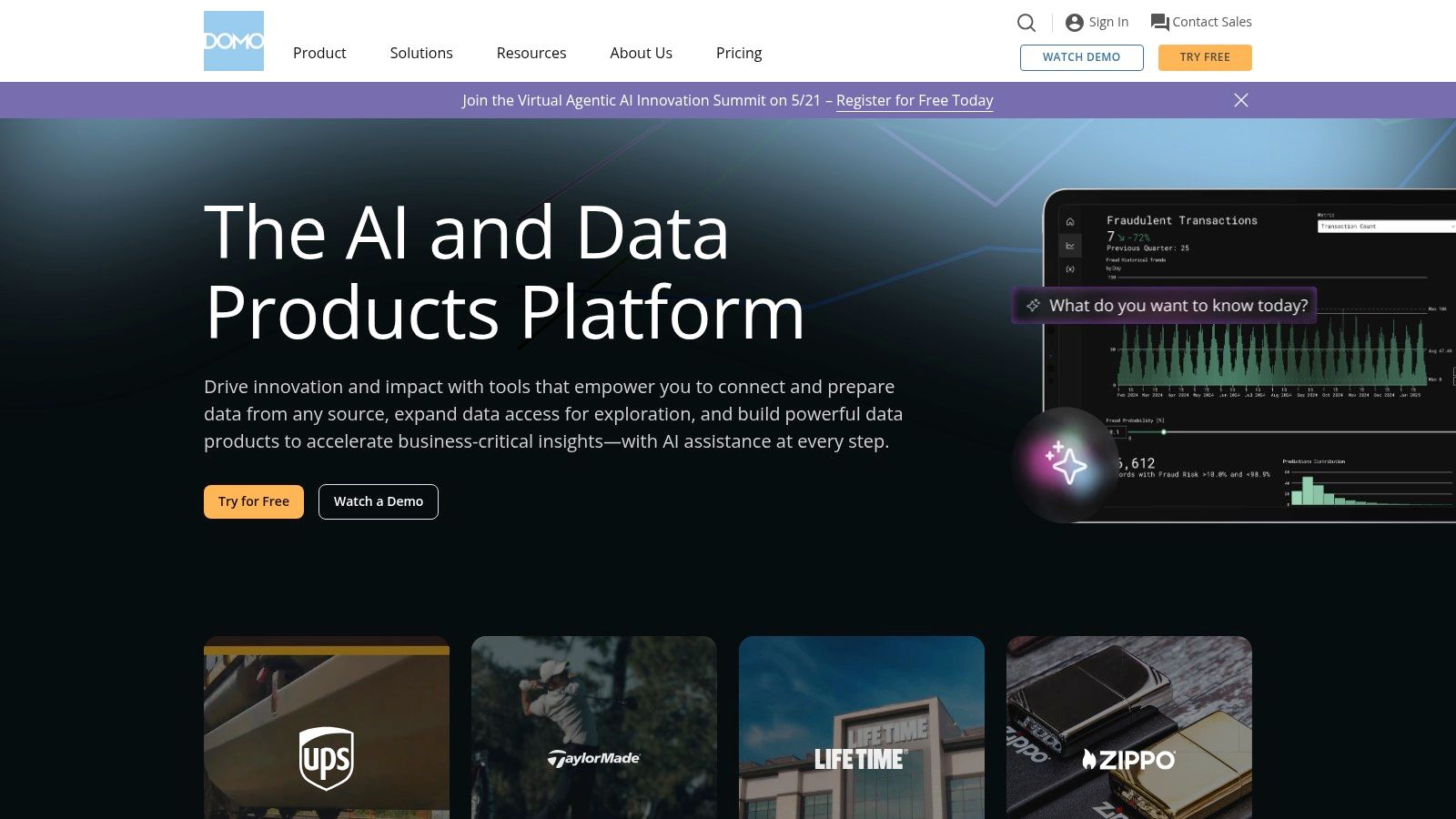
One of Domo’s strengths lies in its extensive data integration capabilities. With over 1,000 pre-built connectors, it can seamlessly pull data from various marketing channels, CRM systems, advertising platforms, and other relevant sources. Built-in ETL (Extract, Transform, Load) tools further enhance data preparation and transformation, ensuring data cleanliness and consistency. Domo also leverages AI to offer predictive insights and recommendations, helping marketers proactively identify opportunities and potential challenges. For example, you could connect your social media, email marketing, and CRM data to analyze campaign performance across all channels and predict future customer behavior.
For larger teams, Domo’s collaborative features are invaluable. Users can share dashboards, engage in discussions within the platform, and work together to interpret data. This fosters a more data-driven culture within the marketing department and facilitates better decision-making. Domo’s mobile-first approach also allows for on-the-go access to critical data, empowering teams to stay informed and responsive regardless of location. The platform’s modern and intuitive user interface further enhances usability, even for those without deep technical expertise.
However, Domo’s robust functionality comes at a premium price point, making it less accessible for smaller businesses with limited budgets. Implementation can also be resource-intensive, potentially requiring dedicated personnel or external consultants. While the user interface is generally user-friendly, some advanced features may require technical expertise. Finally, customer support experiences have been reported to be inconsistent, which is something to consider when making a long-term investment in a platform like Domo.
Features:
- Over 1,000 pre-built connectors for data integration
- Built-in ETL tools for data preparation and transformation
- AI-powered insights and recommendations
- Enterprise-grade security and governance
- Collaborative features including discussions within dashboards
Pros:
- Extremely powerful data processing capabilities
- Modern, intuitive user interface
- Mobile-first approach with excellent app experience
- Strong collaboration features for team analysis
Cons:
- High price point puts it out of reach for smaller businesses
- Can require significant implementation resources
- Some advanced features require technical expertise
- Customer support quality can be inconsistent
Website: https://www.domo.com/
Domo is an ideal solution for enterprise-level marketing teams seeking a comprehensive, data-driven platform. However, smaller businesses or those with limited technical resources might find it more beneficial to explore alternative marketing dashboard examples offered by more budget-friendly and less complex tools.
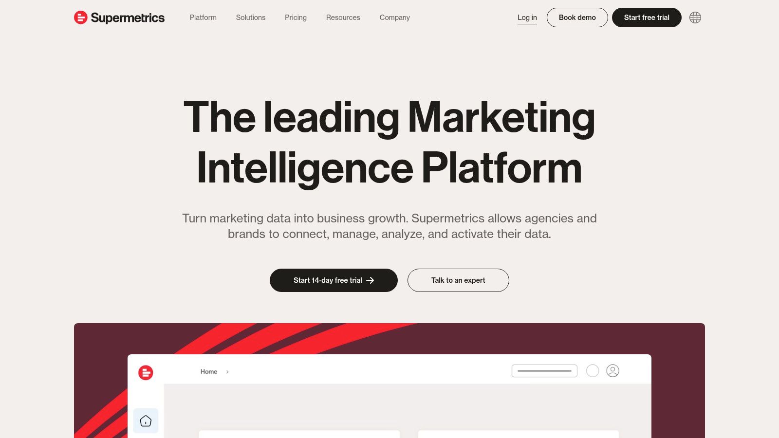
7. Supermetrics
Supermetrics isn’t a standalone marketing dashboard example like some of the other tools on this list. Instead, think of it as a powerful data pipeline. It allows marketers to pull data from a vast array of sources and pipe it directly into the tools they’re already comfortable using, such as Google Sheets, Google Data Studio, Excel, and Power BI. This is a game-changer for those who want highly customized marketing dashboards within familiar environments without needing to wrestle with APIs or complex coding. Supermetrics empowers you to build bespoke marketing dashboards tailored to your specific KPIs, offering a flexible approach to data visualization and analysis.
Imagine effortlessly combining Facebook Ads data with Google Analytics metrics, or blending LinkedIn engagement stats with your CRM data, all within a single Google Sheet or a dynamic Data Studio dashboard. This cross-channel view is where Supermetrics truly shines. It breaks down data silos and provides a holistic understanding of your marketing performance. For example, a social media manager could use Supermetrics to track campaign performance across multiple platforms in one spreadsheet, allowing for quick analysis and optimization. Similarly, a marketing analyst can create a comprehensive report in Data Studio, blending website traffic data with paid advertising spend and lead generation metrics, providing a 360-degree view of marketing ROI.
Supermetrics integrates with over 80 marketing data sources, covering major social media platforms, advertising networks, SEO tools, and more. Its automated data refreshing feature ensures your dashboards are always up-to-date, with customizable scheduling options to fit your reporting cadence. Furthermore, Supermetrics provides access to historical data and enables bulk data transfers, making it a valuable tool for trend analysis and in-depth reporting. The query manager feature allows you to save and reuse data pulls across multiple reports, saving you time and ensuring consistency.
Features:
- 80+ marketing data source integrations (Facebook Ads, Google Ads, LinkedIn Ads, Instagram Insights, Twitter Ads, Google Analytics, and more)
- Automated data refreshing on customizable schedules
- Historical data access and bulk data transfers
- Cross-channel marketing data blending capabilities
- Query manager for reusing data pulls across reports
Pros:
- Works with tools marketers already know and use (Google Sheets, Data Studio, Excel, Power BI)
- No coding required for complex data integrations
- Flexible pricing based on specific connector needs (allowing you to only pay for the data sources you need)
- Excellent for cross-channel marketing performance tracking
Cons:
- Not a dashboard solution itself – requires another platform for visualization
- Costs can add up when connecting to multiple data sources
- Occasional data refresh reliability issues have been reported
- Limited data transformation capabilities compared to dedicated ETL tools
Pricing: Supermetrics utilizes a connector-based pricing model. You choose the connectors for the platforms you need, and pricing varies based on the chosen connectors and the features included. Check their website for the most up-to-date pricing information.
Technical Requirements: Supermetrics requires an account and a license for the chosen connectors. It integrates directly with your chosen destination platform (Google Sheets, Data Studio, etc.) and handles the data transfer behind the scenes.
Implementation Tip: Start with a clear understanding of the data you need and the dashboards you want to create. Select the necessary connectors and experiment with different visualizations in your chosen platform. Supermetrics’ documentation and support resources are helpful during the initial setup.
Supermetrics earns its place on this list of marketing dashboard examples because it provides a bridge between disparate data sources and the tools marketers already love. While it’s not a dashboarding solution in itself, its flexibility, wide range of integrations, and ease of use make it an invaluable asset for creating truly custom, data-driven marketing dashboards. Visit the Supermetrics website for more information and to explore its features.
8. Power BI
Microsoft Power BI earns its spot on this list of top marketing dashboard examples due to its robust data analysis and visualization capabilities, especially beneficial for businesses already utilizing the Microsoft ecosystem. This powerful tool allows marketing professionals to transform raw data from various sources into interactive and insightful marketing dashboards, enabling data-driven decision-making.
Power BI shines in its ability to connect to a wide range of data sources, from Excel spreadsheets and CSV files to cloud-based databases and marketing APIs. This flexibility allows marketers to create a comprehensive view of their campaigns, consolidating data on website traffic, social media engagement, lead generation, sales conversions, and more, all within a single dashboard. For instance, a social media manager could track key metrics like follower growth, engagement rates, and reach across different platforms, while a marketing analyst can monitor website traffic sources, conversion rates, and customer behavior. These marketing dashboard examples showcase Power BI’s versatility in catering to different roles and needs within a marketing team.
One of Power BI’s standout features is its natural language query capability, powered by the Q&A feature. This allows users to ask questions about their data in plain English, such as “What was our website traffic last month?” or “Which campaign generated the most leads?”, and receive visual answers in the form of charts and graphs. This intuitive interface empowers even non-technical users to explore data and gain insights without needing to write complex queries.
Features:
- Natural language query (Q&A): Ask questions in plain English and receive visual answers.
- Extensive data modeling and DAX formula language: Manipulate and analyze data with powerful formulas.
- AI-powered insights and anomaly detection: Identify trends and outliers automatically.
- Embedded analytics options: Share dashboards externally with clients or partners.
- Strong Excel integration: Leverage familiar Excel functionalities for data analysis.
Pros:
- Cost-effective: A free desktop version is available, and the Pro tier is affordably priced.
- Powerful data transformation capabilities: Power Query simplifies data cleaning and preparation.
- Excellent integration with other Microsoft products: Seamlessly connect with Excel, Azure, and other Microsoft services.
- Regular monthly updates: Benefit from continuous improvements and new features.
Cons:
- Steeper learning curve for advanced features: Mastering DAX and data modeling can take time.
- Sharing capabilities limited in the free version: Collaboration and external sharing require a Pro license.
- Most valuable when using Microsoft’s data ecosystem: Integration with non-Microsoft products can be less seamless.
- Mobile experience not as robust as some competitors: While mobile viewing is possible, the experience could be improved.
Pricing: Power BI Desktop is free to use. Power BI Pro is priced per user per month, offering enhanced features like collaboration, sharing, and larger data capacity. Premium and Embedded options are available for larger organizations with more advanced needs. Check the Power BI website for the latest pricing information.
Technical Requirements: Power BI Desktop runs on Windows. Power BI service is accessible through a web browser. Mobile apps are available for iOS, Android, and Windows devices.
Implementation Tips:
- Start with a clear objective for your marketing dashboard. What key metrics do you want to track?
- Connect to your relevant data sources and clean your data before visualizing it.
- Utilize the Q&A feature to explore your data and identify insights.
- Experiment with different chart types and visualizations to find the most effective way to present your data.
- Share your dashboards with relevant stakeholders and encourage data-driven decision-making.
Power BI provides a powerful and versatile platform for creating compelling marketing dashboards. While there is a learning curve, the extensive features, affordability, and integration with the Microsoft ecosystem make it a valuable tool for marketing professionals seeking to gain data-driven insights and improve their campaigns. Comparing it to similar tools like Tableau or Google Data Studio, Power BI stands out as a particularly strong choice for organizations already invested in Microsoft products. It provides a cost-effective way to create insightful marketing dashboard examples that can be tailored to specific business needs.
Marketing Dashboard Tools Feature Comparison
| Tool | Core Features ✨ | User Experience ★★★★☆ | Value Proposition 💰 | Target Audience 👥 | Unique Selling Points 🏆 |
|---|---|---|---|---|---|
| Google Data Studio | Free, Google ecosystem connectors, customizable reports | Intuitive drag-and-drop, real-time collaboration | ★★★★★ Free to use | Google tool users, small to mid teams | Seamless Google integration, unlimited reports |
| Tableau | Advanced visualizations, AI analytics, mobile-friendly | Powerful but complex; steep learning curve | ★★★☆☆ Premium pricing | Data analysts, large enterprises | Handles huge datasets, AI Ask Data feature |
| Databox | 70+ marketing integrations, goal tracking, alerts | User-friendly, mobile app available | ★★★★☆ Affordable with free tier | Marketers needing quick KPI dashboards | Automated reporting, daily scorecards |
| Klipfolio | Real-time data refresh, flexible formula editing | Flexible but steeper learning curve | ★★★★☆ Good value | Marketing teams needing customization | Extensive integrations, powerful data manipulation |
| HubSpot Marketing Dashboard | Integrated inbound marketing analytics, A/B testing | Easy setup, CRM integrated | ★★★☆☆ Costly without full HubSpot suite | HubSpot users, inbound marketers | HubSpot CRM synergy, marketing funnel analysis |
| Domo | 1000+ connectors, AI insights, enterprise security | Modern UI, mobile optimized | ★★☆☆☆ High price | Large enterprises, advanced BI users | Enterprise governance, collaborative dashboards |
| Supermetrics | 80+ data connectors, automated refresh, cross-channel | Works with known tools, no coding needed | ★★★☆☆ Pay per connector | Marketers wanting flexible data pipelines | Data pipeline service, broad source coverage |
| Power BI | Natural language queries, DAX, Excel integration | Powerful but steep learning curve | ★★★★☆ Cost-effective Pro and free options | Microsoft ecosystem organizations | Strong MS Office integration, embedded analytics |
Elevate Your Brand with Data-Driven Decisions
From the versatile Looker Studio to the robust Power BI, this article explored a range of marketing dashboard examples, each offering unique strengths for different needs. Whether you’re a social media influencer tracking engagement or a corporate strategist monitoring multi-channel campaigns, the right dashboard can transform raw data into actionable insights. Key takeaways include the importance of selecting a tool that integrates with your existing data sources, allows for customization to visualize your key performance indicators (KPIs), and offers collaborative features for team alignment. Remember, effective marketing dashboards should not only display data but also empower you to identify trends, diagnose problems, and optimize your strategies.
Choosing the right tool depends on your specific requirements. For smaller businesses or those focused on specific marketing channels, tools like Databox or the HubSpot Marketing Dashboard might be perfect. Larger organizations with complex data needs might benefit from more robust platforms like Tableau or Domo. If you need seamless integration with various data sources, Supermetrics can be invaluable. When implementing these tools, consider factors such as the technical expertise required, the level of customization needed, and the overall cost. To further enhance your data-driven approach, consider implementing a customer health score. This metric provides a comprehensive view of customer engagement and satisfaction, allowing you to proactively address potential churn risks. Learn more about how to create and use a customer health score.
By embracing the power of data visualization and analysis, you can make informed decisions that drive measurable results. Unlock the full potential of your marketing efforts by choosing the perfect dashboard and transforming data into your competitive advantage. Ready to take your marketing to the next level with data-driven insights? ReachLabs.ai specializes in leveraging cutting-edge marketing dashboards to help businesses like yours achieve significant growth and enhanced brand visibility. Visit ReachLabs.ai today to discover how our expertise can transform your data into a roadmap for success.


