
Building Your Content Analytics Foundation (The Right Way)
It’s easy to get excited about a blog post hitting a million page views, but let’s be real: your boss wants to know how that traffic impacts the bottom line. Meaningful analysis begins when we step away from these “vanity metrics” and start focusing on KPIs that actually show a clear return on investment.
KPIs That Actually Predict Success
Knowing how to analyze content performance means digging deeper than surface-level numbers. Sure, page views are a start, but they don’t tell you the whole story. The real question is: what are people doing after they land on your page? This is where engagement metrics become your secret weapon.
This focus on true engagement is a big reason why you see more in-depth articles today. The average blog post length has shot up by over 70% in the last decade, now averaging around 1,427 words. This isn’t about adding fluff; it’s a deliberate strategy to capture and hold attention, which helps lower your bounce rate. A high bounce rate is a major red flag, telling you that your content isn’t living up to the visitor’s expectations. You can explore more content marketing statistics to see how these trends are shaping strategy.
This chart visualizes the delicate balance between keeping users engaged and preventing them from leaving before they can convert.
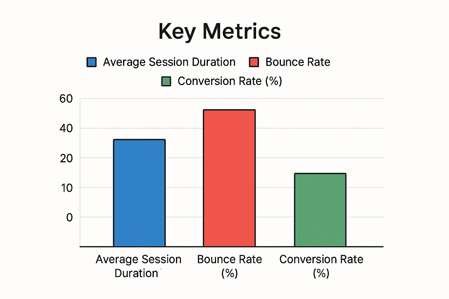
It’s a clear reminder that even with great engagement time, a clunky user experience can send your bounce rate soaring and stop potential customers in their tracks.
But which KPIs should you actually be tracking? It’s not a one-size-fits-all answer, as the right metrics depend entirely on the content format. Here’s a quick breakdown to help you focus your efforts.
| Content Type | Primary KPI | Secondary KPI | Success Benchmark |
|---|---|---|---|
| Blog Post | Time on Page / Engagement Rate | Scroll Depth, Organic Traffic | Average Time on Page > 2 minutes |
| Video | Average Watch Time | Audience Retention, Play Rate | Audience Retention > 40% |
| Whitepaper/Ebook | Conversion Rate (Downloads) | Leads Generated, Cost Per Lead | Landing Page Conversion Rate > 25% |
| Webinar | Attendee Rate | Audience Engagement (Polls, Q&A) | 40-50% of registrants attend live |
| Case Study | Demo/Consultation Requests | Time on Page, Downloads | 5% of readers request a consultation |
The main takeaway here is to always align your KPIs with the specific goal of each piece of content. A blog post is often for attracting an audience, while a whitepaper is built for generating qualified leads.
Setting Up Systems That Give Answers
To get these kinds of insights, you need to go beyond the default dashboards. A tool like Google Analytics is powerful out of the box, but its real value comes from custom configurations that track business outcomes, not just traffic. Instead of just counting visitors, set up event tracking for actions that signal real interest.
For instance, you could track:
- Scroll depth: Are people actually reading to the end of your 1,500-word articles?
- Newsletter sign-ups: Which blog posts are most effective at growing your subscriber list?
- Asset downloads: How many people downloaded that new case study or whitepaper?
- Time on key pages: How long do potential customers spend on your pricing or features pages before booking a demo?
These are the leading indicators that tell you if your content is truly influencing the bottom line.
This sharp focus on meaningful metrics is your best defense against analysis paralysis. When you know exactly what you’re looking for—actions that are tied to revenue—you stop drowning in a sea of irrelevant data. You’re no longer just reporting on activity; you’re telling a strategic story of how content creates customers. And that’s the only story your leadership team really wants to hear.
Choosing Analytics Tools That Actually Deliver Results
So you’ve got your tracking set up. What’s next? The market is overflowing with analytics tools, all promising to unlock amazing insights. The truth is, you don’t need a dozen different platforms. You just need a couple of smart choices that give you real answers, not just a mountain of data. For most teams, the journey starts by really getting to know the most powerful free tool out there.
Beyond the Basic Dashboard in Google Analytics 4
Everyone has Google Analytics 4 (GA4), but very few teams use it to its full potential. They tend to stick to the pre-built reports, completely missing where the real value is. The secret is the “Explore” section, where you can build custom reports that answer your specific business questions. Instead of just asking, “how many people visited the blog?” you can dig deeper and ask, “which topics from our summer campaign led to the most newsletter signups from our US audience?”.
Here’s a look at a custom exploration I built in GA4. It’s set up to track conversions from specific content clusters.

This kind of focused view immediately tells you which content themes are actually working, which is exactly what you need to guide your strategy. Honestly, learning how to analyze content performance inside GA4 is the single most valuable analytics skill you can build.
Complementing Your Stack with Affordable Tools
GA4 is fantastic at telling you what is happening on your site, but it can’t always tell you why. That’s where a few specialized tools come in. Think of them as the perfect accessories for your main analytics setup. For instance, if you see a high exit rate on a key page in GA4, that’s a what, but it’s a mystery. A heatmap tool like Hotjar can solve it by showing you exactly where people stopped scrolling or what non-clickable element they keep trying to click. It reveals a design issue that GA4 simply can’t see.
Other powerful additions to your toolkit include:
- SEO Tools: You can’t fly blind in search. Platforms like Ahrefs or Semrush are essential for understanding where you rank, what your competitors are up to, and which keywords are driving traffic.
- User Survey Tools: Sometimes the best way to get an answer is just to ask. You can embed tools like SurveyMonkey or Typeform right into your content to get direct feedback from your audience.
Are Expensive Platforms Worth the Investment?
Finally, you have the big, all-in-one marketing platforms. Are they worth the eye-watering price tag? My answer is: it depends entirely on your team’s size and needs. For a smaller team, these platforms can be a huge distraction—like having a race car engine in a vehicle that never leaves the garage.
However, for a large company trying to coordinate multiple product lines and content teams, an integrated platform can bring all your data together and create a single source of truth. The decision to invest should be driven by a clear, existing pain point—like an inability to track the full customer journey across multiple channels—not by a fancy sales pitch. Don’t buy an expensive tool hoping it will magically fix your strategy; get your strategy right first, and then find the tool that supports it.
Uncovering the Real Story Behind Your Content Data
The right analytics tools will give you plenty of numbers, but they rarely hand you the answers on a silver platter. The real skill in analyzing content performance is learning to be a data detective, piecing together clues to understand the story of your audience’s journey.

From Numbers to Narratives
A high bounce rate is a classic red flag, but a standalone number like an “85% bounce rate” is practically useless. I once worked with a SaaS company that was stuck on this exact problem. By segmenting their traffic sources, they found that visitors from organic search had a perfectly reasonable bounce rate. The real issue was traffic from a specific guest post they sponsored, which had a sky-high 95% bounce rate.
The data told a story: the guest post was setting the wrong expectations and sending unqualified visitors who took one look and left. The insight wasn’t “our landing page is bad,” but rather “our partner’s messaging is misaligned with our offer.” That’s a specific problem you can actually solve by working with that partner to update their article.
Identifying Gaps and Opportunities
Data doesn’t just reveal problems; it also highlights what your audience secretly wants. For instance, a marketing blog might notice that their articles about “AI tools for small business” consistently pull in 2x more newsletter sign-ups per 1,000 views than any other topic. While these posts might not have the highest traffic yet, that strong conversion rate is a massive signal. It’s your audience telling you exactly what they find valuable.
This pattern points to a content gap that is also a huge opportunity. The clear action is to create an entire content pillar around that theme. This kind of analysis helps you lean into what’s working, a key part of building a content program that gets results. You can explore this further in our guide on how to measure marketing campaign success.
Making Data Digestible for Your Team
Finding these stories is only half the battle; you also have to share them in a way that gets people to act. Don’t just drop a spreadsheet in a channel and expect magic to happen. Instead, translate your findings using a simple framework:
- What: State the core data point. “Our ‘How-To’ videos have a 70% average watch time, while our expert interviews only average 30%.”
- So What: Explain the business impact. “This shows our audience is far more engaged with practical, instructional content, and we’re losing viewers on our interview-style videos.”
- Now What: Propose a clear, strategic action. “Our conclusion is to shift 50% of the video budget from interviews to creating more ‘How-To’ tutorials next quarter.“
Mastering Engagement and Conversion Tracking
Seeing patterns in your data is a great first step, but the real win is connecting those patterns directly to business results. While likes and shares feel good, they don’t pay the bills. To truly show your content’s worth, you have to get good at tracking conversions.
From First Click to Final Purchase
The path a customer takes today is rarely a straight line. Someone might find your blog through a search, leave, see a targeted ad on social media a week later, click a link in your email, and finally decide to buy after a colleague’s recommendation. This messy reality makes attribution—the process of giving credit for a conversion—incredibly complex. Instead of getting stuck trying to build a perfect multi-channel model, successful teams take a more practical approach.
Start by getting a clear view of two key moments:
- First-Touch Attribution: Which piece of content first brought a new person into your ecosystem? This shows you what’s working for brand discovery and growing your audience at the top of the funnel.
- Last-Touch Attribution: What was the very last thing someone interacted with right before they converted? This tells you what content is powerful enough to close the deal and inspire immediate action.
While this doesn’t map out the entire winding journey, it gives you actionable bookends. You can confidently say, “This blog series is fantastic for attracting new people,” and “This case study is a rockstar at getting them to sign up.”
What Does a “Conversion” Really Mean?
A huge part of analyzing content performance is tracking your conversion rate, which is simply the percentage of users who complete a specific, valuable action. That action isn’t always a sale. It could be downloading a whitepaper, signing up for a webinar, or booking a demo. A high conversion rate is proof that your content is persuading your audience to take the next step.
For instance, creating compelling video can be especially powerful, as a majority of consumers want to see more video content from the brands they follow. Tracking social shares also offers a strong signal of engaging content that is amplifying your reach. Discover more compelling content statistics to see how different formats perform.
To set realistic goals, it helps to see how others are doing. Below are some general benchmarks to give you a starting point.
Conversion Rate Benchmarks by Industry and Content Format
Industry-specific conversion rate data showing realistic benchmarks for different content types and business sectors
| Industry | Blog Posts | Video Content | Email Content | Social Posts |
|---|---|---|---|---|
| B2B SaaS | 1-2% (Newsletter Signup) | 5-10% (Webinar Reg.) | 3-5% (Demo Request) | 0.5-1% (CTR) |
| E-commerce | 0.5-1% (Purchase) | 2-4% (Add to Cart) | 15-25% (CTR) | 1-2% (Purchase) |
| Healthcare | 2-4% (Appointment Req.) | 3-5% (Info Download) | 5-8% (CTR) | 1-3% (Learn More) |
| Education | 3-5% (Form Fill) | 10-15% (Enrollment) | 10-20% (CTR) | 2-4% (Apply Now) |
These figures are just guides, not strict rules. The real goal isn’t to just hit an arbitrary number but to create your own internal baseline. From there, you can enter a cycle of testing, learning, and improving over time. By tying content directly to these tangible actions, you’re finally measuring what truly matters: your content’s real impact on business growth.
Turning Performance Insights Into Content That Converts
So you’ve got a dashboard full of conversion data. That’s a great start, but if you don’t act on it, it’s just a collection of expensive, pretty charts. The most effective content teams know how to turn these analytical discoveries into real improvements that push business goals forward. This is where the real work of analyzing content performance starts: turning numbers into action. It’s how you go from just reporting on what happened to actively creating a more successful future for your content.
Prioritizing Your Optimization Efforts
Let’s be realistic: you can’t fix everything at once. With limited time and resources, you have to be smart about where you focus. The key is to find the changes that promise the biggest return for your effort. I always suggest a simple framework based on impact.
Start by hunting for pages with high traffic but low conversions. These are your golden opportunities. A small tweak on a page that gets 10,000 visitors a month will have a much greater impact than a complete overhaul of a page that only gets 100 visitors. Prioritizing this way is essential for maximizing the ROI of your content marketing. This focus ensures you’re not just staying busy, but being truly productive.
From Small Tweaks to Strategic Pivots
Once you’ve chosen a piece of content to improve, your optimizations will likely fall into two categories.
- Small Tweaks: These are the quick, surgical changes you can deploy and test almost immediately. Think about rewriting a bland headline, changing a CTA button color, adding an internal link to a page that converts well, or updating an old statistic. These small wins can add up to make a big difference over time.
- Strategic Pivots: These are the larger-scale changes you make based on clear, long-term trends in your data. For instance, if you notice your long-form text guides are consistently underperforming while short videos on the same subjects get triple the engagement, it might be time for a pivot. This could mean reimagining a low-performing blog post as a video script or a shareable infographic.
I’ve personally seen teams double their engagement rates just by adding a more persuasive call-to-action right at the point where scroll depth data showed users were leaving. Another team managed to triple their lead generation from a single, forgotten article by transforming it into an interactive quiz. Your analytics tell you what is happening; your job is to creatively test why it’s happening and how you can fix it. This cycle of testing, measuring, and iterating is what turns good content into content that truly converts.
Creating Your Sustainable Performance Strategy

Fixing content that isn’t working is a necessary part of the job, but it’s a reactive game. The real win is building a system that keeps you from constantly putting out fires in the first place. Lasting success comes from a forward-thinking strategy where performance analysis is baked in from the beginning, not just something you check after the fact.
It’s about moving away from chasing one-off wins and building a reliable engine that delivers results every single quarter. This proactive mindset is the foundation of how to analyze content performance for real, long-term growth.
Building Your Data-Driven Content Calendar
Let’s be honest, most content calendars are just glorified schedules that dictate what gets published and when. A truly strategic calendar is a living document, powered by performance data that guides your entire creation process. For example, if your analytics show that case studies with customer quotes are bringing in a high number of demo requests, your calendar should actively prioritize more of them. You let the data, not your gut, tell you what your audience really wants.
This turns planning into a strategic activity. You can use insights from your analytics to jump on seasonal trends or answer the exact questions people are typing into Google. To make this work, you need to structure this information so your team can act on it. You can get a running start by using a solid content marketing strategy template that’s built to integrate these performance insights directly into your workflow.
Establishing Effective Feedback Loops
A data-powered calendar gives you a plan, but a feedback loop makes sure that plan stays relevant and gets better over time. This isn’t about nervously checking Google Analytics every morning. It’s about setting up a consistent rhythm for review. We’ve found that a quarterly performance review is the perfect cadence to identify meaningful trends without getting distracted by daily noise.
During these sessions, your team should get focused on answering a few core questions:
- Which content themes or topics drove the most valuable actions, like sign-ups or downloads?
- What new formats did we try, and how did they stack up against our existing content?
- Did any particular traffic channels, like organic search or social media, punch above or below their weight?
- What were our biggest “duds” this quarter, and what can we learn from them so we don’t repeat the mistake?
This process fosters a culture where decisions are informed by data. The aim isn’t to point fingers for what failed but to learn and adapt together.
Balancing Consistency with Smart Experimentation
Finally, a sustainable strategy isn’t just about doubling down on what’s already working. That’s a clear path to stagnation. You have to save some room for smart experiments to discover your next big win. A good rule of thumb is to dedicate 10-15% of your content resources to trying new things.
This could mean testing a new video format, writing for a slightly different audience segment, or promoting an article on a channel you’ve never touched before. These are the calculated risks that prevent your content from becoming stale and help you stay ahead of the curve.
Your Content Performance Action Plan
All this theory is great, but real progress happens when you put it into practice. Let’s translate everything into a clear roadmap you can start on today. This isn’t about doing everything at once; it’s about taking the right first steps to build momentum.
Your Initial Setup Checklist
This is your foundation. Get these pieces in place within the next month to start gathering meaningful data. Don’t aim for perfection; aim for progress.
- Define Your “North Star” Metric: First, choose one primary KPI that directly aligns with a business goal. For example, if your goal is lead generation, your North Star could be “MQLs from content.” This becomes your ultimate measure of success and keeps everyone focused.
- Identify 3-5 Supporting KPIs: Select a few secondary metrics that act as leading indicators for your North Star. Think of them as the breadcrumbs leading to your main goal. This could include things like newsletter sign-ups, scroll depth on key pages, or demo requests from blog posts.
- Configure Your Analytics: Now it’s time to actually track this. You’ll need to set up event tracking in a tool like Google Analytics 4 for each of your chosen KPIs. This step is absolutely crucial for understanding how to analyze content performance effectively.
- Create a Shared Dashboard: Build a simple, one-page dashboard showing your North Star and supporting KPIs. Make it accessible to the entire team. Transparency fosters alignment and helps everyone see how their work contributes to the bigger picture.
Your Ongoing Analysis Routine
Once you have about 90 days of data, you can begin a regular review cycle. This routine turns analysis from a chore into a strategic habit that drives continuous improvement.
- Schedule a Quarterly Review: Put a recurring calendar invite on the books for your content team. This isn’t just another meeting; it’s the dedicated time where strategy happens. Consistency is key.
- Run a Content Audit: Before each meeting, identify your top five and bottom five performing pieces of content based on your North Star metric. This isn’t about placing blame; it’s about spotting patterns in what works and what doesn’t.
- Propose Concrete Actions: For each underperforming piece, suggest one specific update. Could you rewrite the intro to be more engaging? Add a new CTA? Embed a relevant video? For your top performers, brainstorm how to replicate their success. Is it the format? The topic? The promotion?
- Document and Assign: Every meeting should end with clear action items, owners, and deadlines. This ensures that all those great insights translate into actual work getting done. Accountability is what turns discussion into results.
Executing this plan consistently takes discipline. If you need a team of specialists to turn these data-driven insights into content that delivers, ReachLabs.ai is ready to help.


