
The Evolution of Data Visualization in Modern Marketing
Data visualization has become essential for marketing success. It’s no longer a supplementary tool, but a core component of effective marketing strategies. Teams use visual data interpretation to find hidden opportunities, transforming raw data into actionable insights. This fundamentally changes how marketing decisions are made, moving from intuition to data-driven strategies.
From Static Charts to Interactive Dashboards
The tools and techniques for marketing data visualization have come a long way. We’ve moved past static charts and graphs to interactive dashboards and dynamic visualizations. This lets marketers explore data in real time, identify trends, and make faster, data-informed decisions. For instance, real-time dashboards allow marketers to track campaign performance and adjust strategies based on live data. This adaptability is essential in today’s rapidly changing marketing world.
Democratizing Data Across the Organization
Data visualization has made insights accessible to everyone. Visual data representations are much easier to grasp than spreadsheets or reports filled with numbers. This means everyone, from entry-level employees to the CMO, can understand and interpret complex marketing data. This shared understanding promotes collaboration and alignment across teams. The rise of remote work has further increased the use of visualization platforms, equipping teams to stay aligned and responsive no matter where they are.
This market expansion demonstrates the growing importance of data visualization for marketing choices. The global data visualization market, valued at approximately USD 4.2 billion in 2024, is expected to reach USD 8.2 billion by 2033, growing at a CAGR of 7.38%. This growth is driven by the increasing need to understand complex data like customer behavior and market trends, leading to improved decision-making. Find more detailed statistics here: Explore the data visualization market
The Impact on Marketing ROI
Data visualization in marketing results in more effective campaigns and a higher return on investment. By visualizing key performance indicators (KPIs), marketers can clearly identify what strategies are working and what isn’t. This allows for better resource allocation, optimizing campaigns for maximum impact. This data-driven approach is changing how businesses operate, providing a competitive advantage.  The following sections delve into specific visualization techniques and applications, exploring how you can use these tools to improve your own marketing performance.
Choosing the Right Visualizations for Marketing Impact
Not all data visualizations are created equal, especially when it comes to marketing. This section explores which visualization formats deliver the most impact for specific marketing objectives. We’ll examine real-world examples of how top brands choose visualizations that answer their most pressing questions, including when to use different chart types, from campaign performance dashboards to attribution models showcasing ROI.
Matching Visualizations to Marketing Objectives
Selecting the right visualization depends on the story you want to tell. For instance, a line chart perfectly illustrates trends over time, like website traffic or sales growth. Bar charts, on the other hand, effectively compare different categories, such as engagement across various social media platforms. For a complete view of multiple metrics, dashboards offer a comprehensive perspective on campaign performance. This broad view enables marketers to quickly identify areas for improvement.
The following infographic demonstrates the prevalence of these visualization types among marketers:
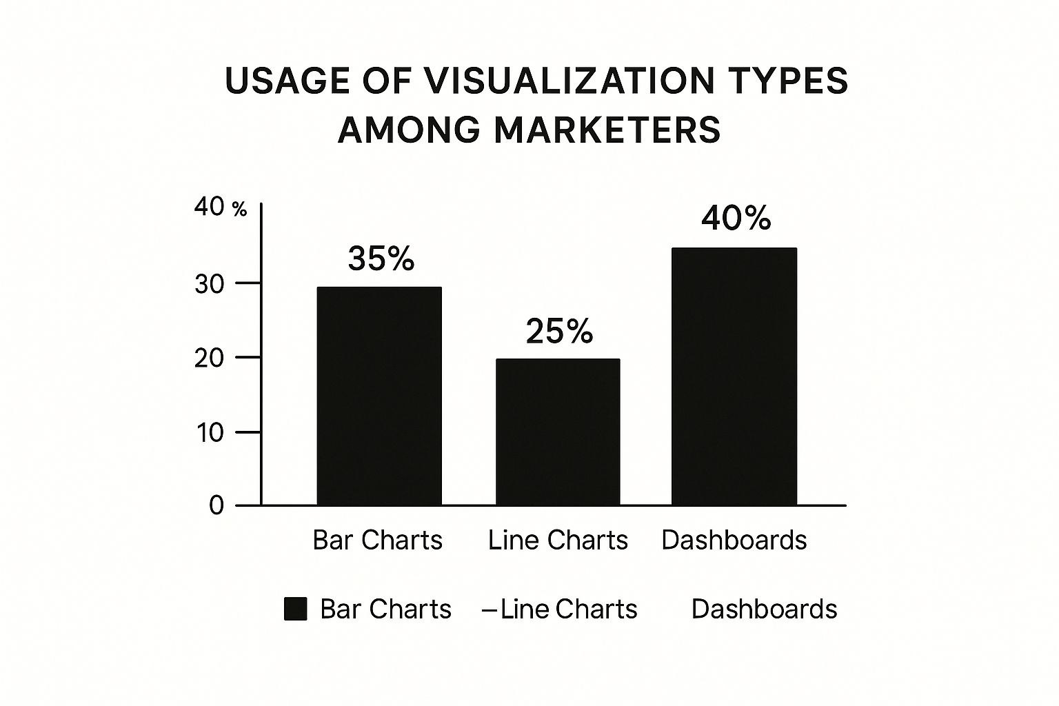
As the infographic reveals, dashboards are the most commonly used visualization, employed by 40% of marketers. Bar charts and line charts trail closely behind at 35% and 25%, respectively. This underscores the importance of combining a comprehensive overview with detailed data comparisons for truly effective marketing analysis.
The Psychology of Visualization Effectiveness
Different visualizations resonate with different audiences. Clear, concise charts focusing on key metrics are crucial for data-driven executives. However, creative teams may find more visually engaging representations that emphasize trends and patterns more useful. Understanding these nuances allows you to tailor your visualizations for maximum impact, no matter the audience.
This is especially relevant when presenting data to stakeholders. The right visualization can simplify complex data, leading to better-informed decision-making. For example, a heatmap could visualize customer engagement across different web pages, pinpointing areas for improvement. This brings us to the importance of choosing the right tools for impactful marketing visualizations.
To help you choose the right visualization for your needs, here’s a comparison table highlighting the strengths and applications of various visualization types:
Marketing Visualization Types and Their Applications
| Visualization Type | Best Marketing Application | Key Benefits | Complexity Level | Example Use Case |
|---|---|---|---|---|
| Line Chart | Tracking trends over time (e.g., website traffic, sales) | Shows changes and progress clearly | Low | Monitoring website traffic growth month over month |
| Bar Chart | Comparing performance across categories (e.g., social media engagement) | Easy to understand and compare values | Low | Comparing lead generation across different social media channels |
| Dashboard | Monitoring overall campaign performance | Provides a holistic view of multiple metrics | Medium to High | Tracking key metrics like website traffic, conversion rates, and social media engagement in a single view |
| Heatmap | Visualizing website user behavior | Identifies areas of high and low engagement | Medium | Analyzing user clicks and scrolls on a landing page |
| Scatter Plot | Identifying correlations between variables (e.g., ad spend and conversions) | Reveals relationships between data points | Medium | Exploring the correlation between ad spending and sales conversions |
This table summarizes the key considerations for choosing a visualization type, from complexity level to specific applications. By understanding these differences, marketers can effectively communicate data insights.
Tools and Techniques for Effective Visualizations
Numerous tools help marketers create compelling visualizations. From spreadsheet software like Microsoft Excel and Google Sheets with built-in charting capabilities to specialized data visualization platforms like Tableau and Datawrapper, selecting the right tool is essential. Consider factors like your budget, technical expertise, and the complexity of the data you’re working with. Additionally, various online resources provide templates and best practices for effective visuals.
Best Practices for Marketing Visualizations
Here are some key takeaways for creating effective marketing visualizations:
- Keep it simple: Focus on the essential data points to avoid overwhelming your audience.
- Use clear labels and titles: Make sure your visualizations are easy to understand at a glance.
- Choose the right chart type: The visualization should match the data and narrative you want to convey.
- Consider your audience: Tailor your visualizations to resonate with your target stakeholders.
- Use color strategically: Highlight key insights with color, but avoid distracting color schemes.
By following these best practices and choosing the right visualization methods, you can unlock your marketing data’s full potential and drive meaningful results.
Data-Driven Marketing Decisions That Drive Growth
Data visualization is changing the way marketing decisions are made. Instead of relying on intuition, marketers are now using visual data to inform their strategies. This allows marketing teams to go beyond basic reporting and understand the reasons behind the numbers. For instance, if website traffic decreases, data visualization can identify the specific pages or campaigns causing the drop.
This detailed understanding allows for more focused and effective solutions.
From Insight to Action: The Power of Visual Data
Progressive marketing leaders are using visualization frameworks to speed up decision-making and improve campaign results. Imagine having a clear, visual map of your customer journey, showing precisely where customers leave. This allows you to optimize those specific points, ultimately increasing conversion rates. This proactive approach to data analysis is a key advantage in today’s competitive market.
Modern businesses are increasingly using data visualization for strategic marketing decisions, and the supporting statistics are compelling. Companies using advanced visualization platforms report an average 20% increase in business growth. The adoption of these technologies has grown by roughly 65%.
Organizations using these tools are 70% more likely to make data-driven decisions. The use of interactive dashboards, a popular application of data visualization, has increased by over 75%. Dashboards allow real-time monitoring of Key Performance Indicators (KPIs) and flexible responses to changing market conditions. This data-focused approach improves understanding of customer engagement, conversion rates, and campaign performance, ultimately boosting Return on Investment (ROI) in markets worldwide. Want to learn more? Find more detailed statistics here
Real-Time Dashboards: Enabling Agile Marketing
Real-time visualization dashboards are crucial for agile marketing. These dashboards provide immediate insight into how campaigns are performing, enabling teams to quickly identify and address problems. This allows for rapid reallocation of resources from underperforming channels to those with a higher ROI, maximizing both efficiency and impact. This responsiveness is essential in the fast-paced digital marketing environment.
Democratizing Insights Across Marketing Departments
Data visualization democratizes insights, making data accessible and understandable for everyone, from entry-level employees to the Chief Marketing Officer (CMO). This shared understanding improves cross-functional alignment by providing a common visual language for discussing performance. Imagine a marketing team where everyone easily understands campaign performance through interactive dashboards.
This shared understanding breaks down communication barriers and encourages collaborative problem-solving.
Building Cross-Functional Alignment Through Visual Data
A shared visual understanding of marketing performance strengthens cross-functional alignment. When everyone can see the same clear, visual data, communication improves, and informed decisions happen more efficiently. This shared understanding allows for collaborative strategy development, which ultimately optimizes resource allocation and fuels growth. For example, sales and marketing teams can work together effectively when they both clearly understand the customer journey visualized through a shared dashboard.
This eliminates potential confusion and fosters a unified approach to achieving marketing objectives. By creating a culture of data-driven decision-making through effective visualization, organizations empower their marketing teams to fully utilize their data, leading to significant results and sustained growth.
Crafting Customer Journey Visualizations That Convert
Customer journey visualizations are essential for marketing success, but only when executed effectively. This section offers a practical framework for creating customer journey maps that reveal hidden conversion opportunities. You’ll learn how to combine quantitative metrics like conversion rates and engagement times with qualitative insights such as customer feedback and survey results to build multi-dimensional visualizations that tell the complete customer story.
Visualizing the Entire Customer Experience
Effective journey maps go beyond simple touchpoint analysis. They delve into the emotional landscape of the customer experience. We’ll explore techniques for visualizing emotional states at critical touchpoints, identifying conversion barriers, and uncovering journey gaps your competitors may have overlooked.
For example, a visualization might show a significant decrease in customer satisfaction after interacting with a specific support channel. This insight could lead to an immediate review and improvement of that channel. Using visualized real-time data, marketers can make faster, data-driven adjustments to their strategies. For more detailed examples, see some real time data visualization examples.
Additionally, visualizing the different channels customers use throughout their journey provides a multi-channel perspective, revealing how online and offline touchpoints contribute to the overall experience. This holistic view empowers marketers to optimize each channel for smoother transitions and increased conversions.
Gathering the Right Data and Choosing the Right Tools
Creating impactful journey maps requires the right data. We’ll explore effective methods for gathering both quantitative and qualitative data to inform your visualizations. This might include website analytics, CRM data, customer surveys, and social media listening.
This diverse data paints a complete picture of the customer journey. Choosing the right tools is also crucial. We’ll discuss available software options that make journey mapping accessible to your entire team. From simple spreadsheet programs like Microsoft Excel to specialized visualization platforms, selecting the right tool depends on your budget, technical expertise, and data complexity.
Leveraging Insights for Personalized Experiences
Customer journey visualizations shouldn’t just be reports. They should drive action. This section provides actionable strategies for using journey map insights to create personalized experiences that resonate with customers at each stage of their decision-making process.
This might include personalized email campaigns triggered by specific journey milestones or customized website content tailored to individual customer needs.
To understand the key components of an effective customer journey visualization, consider the following table:
The table below, “Customer Journey Visualization Components,” outlines the essential elements to include for creating impactful visualizations for your marketing team.
| Journey Component | Data Sources | Visualization Method | Marketing Application |
|---|---|---|---|
| Awareness | Website analytics, social media listening | Sankey diagrams, funnel charts | Understanding initial touchpoints and channel effectiveness |
| Consideration | Website analytics, product reviews | Bar charts, comparison tables | Identifying key factors influencing purchase decisions |
| Decision/Purchase | Sales data, CRM data | Conversion funnels, flow charts | Optimizing the checkout process and reducing cart abandonment |
| Retention | Customer surveys, email engagement data | Line charts, customer lifetime value visualizations | Identifying opportunities for repeat purchases and loyalty programs |
| Advocacy | Social media mentions, online reviews | Network graphs, sentiment analysis visualizations | Leveraging positive word-of-mouth marketing |
This table demonstrates how different data sources, visualization methods, and marketing applications can be combined to gain valuable insights into each stage of the customer journey.
By incorporating these elements, your customer journey visualizations become powerful tools for optimizing marketing efforts and driving conversions. The goal isn’t just to visualize the journey, but to understand and improve it. This data-driven approach empowers marketers to craft experiences that truly resonate with customers, leading to stronger brand loyalty and increased revenue. By understanding and addressing customer pain points, businesses can significantly improve the customer experience and drive conversions.
The Future of Data Visualization for Marketing Excellence
Data visualization in marketing has moved beyond simple charts and graphs. It’s become a crucial tool for predicting trends and developing strategies, giving businesses a significant competitive advantage. This section explores the key trends shaping how marketers interpret and use data.
AI-Powered Insights and Predictive Visualizations
Imagine software that not only presents your data visually but also analyzes it, revealing hidden patterns and predicting future trends. This is the power of AI-powered insights generation. AI algorithms can analyze massive datasets, uncovering correlations and anomalies that would be time-consuming for human analysts to find. This allows marketers to anticipate customer behavior and market changes, shifting from reactive to proactive strategies.
Predictive visualizations are also transforming campaign planning. By simulating various scenarios, marketers can forecast campaign performance and allocate resources for maximum impact.
Stepping Inside Your Data: Immersive 3D and VR/AR Experiences
The future of data visualization is immersive. 3D data visualizations let marketers “step inside” their data, exploring complex relationships from new angles. Imagine visualizing customer segments as interactive 3D clusters, allowing for detailed analysis of each segment’s characteristics.
Augmented reality (AR) and virtual reality (VR) offer even more possibilities. Imagine walking through a customer journey room, experiencing every touchpoint from the customer’s perspective. Or, picture conducting a competitor analysis by visualizing market share in a virtual environment.
These technologies are increasingly accessible to marketing teams through user-friendly platforms and tools like Tableau.
Democratizing Advanced Visualization
While these technologies may seem complex, implementation is becoming easier. Platforms are evolving with intuitive interfaces, making powerful visualization techniques accessible to marketing teams regardless of technical expertise. This democratization empowers marketers to gain meaningful insights and participate in data-driven decision-making.
From Visualization to Action: Empowering Marketing Teams
These advancements are more than just impressive visuals. They transform raw marketing data into actionable insights. By identifying emerging trends, predicting campaign outcomes, and understanding customer behavior in detail, marketers can make informed decisions, optimize strategies, and achieve a greater return on investment (ROI).
The Impact on Marketing Roles
The future of data visualization also impacts marketing roles. As tools become more sophisticated, marketers will need to develop new skills. These include data analysis, interpretation, and effectively communicating complex data insights.
The demand for data visualization specialists is likely to increase. These roles will bridge the gap between data and actionable strategies, driving informed decision-making and contributing to business growth. The global data visualization market, currently valued at USD 9.51 billion, is projected to reach USD 22.86 billion by 2033, growing at a CAGR of 9.17%. This growth is fueled by AI-driven automation and the need for interactive data displays for faster decision-making. Discover more insights about the data visualization market. Real-time visualizations are becoming essential for adapting to market trends, allowing marketers to track performance and communicate insights effectively.
Creating Marketing Dashboards That Drive Action
Effective marketing dashboards are more than just static displays of data; they are dynamic tools that inform decisions and inspire action. This section provides a practical framework for building dashboards that measurably improve marketing performance. It’s about moving beyond simple reporting and embracing interactive tools that empower better decision-making.
Essential KPIs and Organizing for Impact
The first step is to identify the essential Key Performance Indicators (KPIs) for each area of your marketing efforts.
- Social Media: Focus on metrics like engagement, reach, and follower growth to understand how your social presence is performing.
- Content Marketing: Monitor website traffic, content downloads, and lead generation to measure the effectiveness of your content strategy.
- Paid Media: Keep a close eye on click-through rates, conversion rates, and cost per acquisition to optimize your ad spend.
- Email Marketing: Track open rates, click-through rates, and unsubscribe rates to gauge the health of your email campaigns.
Organizing these KPIs effectively is critical. Group related metrics together and place the most critical information at the top of your dashboard. This allows for quick identification of key trends and performance indicators. Just like the dashboard of a car, the most vital information, like speed and fuel level, is readily visible.
The Psychology of Dashboard Design
The design of your dashboard plays a crucial role in its effectiveness. Color theory can greatly enhance understanding. Using contrasting colors to highlight key data points draws attention where it’s needed. Consistent color coding across dashboards makes it easier for your team to interpret the data quickly, no matter which dashboard they’re viewing. The layout of your dashboard also guides attention. Placing critical information prominently ensures key insights are readily absorbed. Interactive elements, like drill-down functionality and customizable date ranges, encourage deeper exploration. Allowing users to interact with the data fosters a deeper understanding of the underlying trends.
High-Performing Dashboards and Avoiding Pitfalls
Examining successful dashboards from various industries reveals valuable best practices. A well-designed sales dashboard, for example, might use a line graph to show sales trends over time and a bar chart to compare sales performance across different regions. Understanding common pitfalls is equally important. Overloading a dashboard with excessive data can be overwhelming and obscure key insights. Similarly, misleading visualizations, such as manipulating chart scales or using inappropriate chart types, can lead to inaccurate interpretations. Learning from both successes and failures will help you build impactful and accurate dashboards.
Aligning Dashboards With Strategic Objectives
Finally, it’s essential to connect your dashboards directly to your strategic marketing goals. This ensures that every visualization contributes to broader objectives, such as increasing brand awareness or driving sales. Regularly review and refine your dashboards, ensuring they stay aligned with your evolving business needs. This continuous improvement process ensures your dashboards remain powerful tools for informed decision-making and achieving marketing success. Data visualization for marketing is not about creating pretty pictures; it’s about leveraging data to drive meaningful results.
Building Your Marketing Visualization Strategy
Implementing a robust data visualization strategy is key to unlocking actionable insights and driving marketing success. This section provides a practical roadmap for integrating visualization capabilities throughout your marketing organization. We’ll explore how to evaluate your current practices, pinpoint high-impact starting points, and select the right tools to match your resources and needs. For those looking to enhance their data understanding, consider exploring various Marketing Dashboard Examples.
Assessing Your Visualization Maturity
Before implementing any new strategy, it’s crucial to understand your organization’s current visualization capabilities. This assessment serves as a baseline for improvement and helps identify areas requiring immediate attention.
This involves evaluating several key factors:
- Current Tooling: What tools are currently used for data analysis and reporting? Are these tools sufficient for creating effective and insightful visualizations, or are they limiting your team’s potential?
- Team Skills: Do your team members possess the necessary skills to not only create compelling data visualizations but also interpret them effectively? Investing in training can bridge any skill gaps.
- Data Integration: How easily can data from various sources be combined for a comprehensive view? Data silos can hinder effective visualization, so seamless integration is essential.
- Organizational Adoption: How widely are visualizations currently used within the marketing department and across the organization as a whole? Wider adoption often correlates with greater data-driven decision-making.
Perhaps your team relies heavily on spreadsheets like Google Sheets with limited visualization capabilities, or perhaps data silos prevent a comprehensive understanding of marketing performance. Identifying these limitations is the first step towards improvement.
Identifying High-Impact Starting Points
Starting small and achieving quick wins is crucial for demonstrating the value of visualization and building momentum for wider adoption. Focus on areas where visualization can yield immediate, tangible benefits.
Consider these potential starting points:
- Creating a dashboard to track key campaign metrics: A central dashboard offers a real-time view of campaign performance, enabling data-driven adjustments and optimizations.
- Visualizing customer journey data: Understanding the customer journey through visualization can help identify pain points and opportunities for enhancing the overall customer experience.
- Developing visualizations for competitor analysis: Visualizing competitor data allows for the identification of market trends, competitive advantages, and potential opportunities.
These initial successes will build confidence and encourage broader integration of data visualization across the marketing team.
Selecting the Right Visualization Tools
Choosing the right visualization tools is paramount for effectiveness and efficiency. The ideal tool will depend on your specific needs, budget, and technical expertise.
Consider these factors when making your selection:
- Ease of Use: Prioritize user-friendly tools that are accessible to team members with varying levels of technical skill. This encourages broader adoption and empowers individuals to explore data independently.
- Integration Capabilities: Seamless integration with your existing data sources is vital for efficient data analysis and visualization. The tool should easily connect with your current data infrastructure.
- Cost: Balance cost with functionality, ensuring the chosen tool aligns with your budget while providing the necessary features.
- Visualization Types: Does the tool offer the specific chart types and visualizations your team needs to effectively communicate data insights?
For instance, a small team with limited resources might start with a basic charting tool like Google Sheets, while a larger organization with complex data might opt for a dedicated visualization platform like Tableau.
Overcoming Implementation Barriers
Implementing any new strategy comes with its challenges. Anticipating and addressing these proactively is crucial for successful integration.
Here are some common barriers and how to address them:
- Data integration complexities: Combining data from various sources can be challenging. Invest in data integration tools and streamline data collection processes for a more unified view.
- Stakeholder resistance: Some team members may be hesitant to adopt new tools or processes. Clearly communicate the benefits of visualization and provide adequate training to alleviate concerns.
- Skill gaps: Creating impactful visualizations requires specific skills. Address this through targeted training programs, online resources, and mentorship opportunities.
A data-driven culture thrives on both leadership support and individual enthusiasm. Encourage team members to explore and experiment with visualization techniques.
Building a Visualization Culture
Embedding visualization into your marketing organization requires cultivating a data-driven culture. This involves fostering an environment where data insights are valued and actively used to inform decisions.
Here’s how to build a visualization culture:
- Training and Development: Equip your team with the necessary skills through training programs and workshops focused on data visualization best practices.
- Internal Champions: Identify individuals passionate about data visualization to advocate for its use and drive adoption within their teams.
- Sharing Success Stories: Highlight examples of how data visualization has led to positive marketing outcomes. This reinforces the value and encourages wider use.
By creating a culture that embraces data insights, you ensure visualization becomes an integral part of your marketing processes.
Measuring the Impact of Visualization
To demonstrate the value and secure continued investment, it’s crucial to measure the impact of your visualization initiatives. Track key metrics to quantify the benefits and demonstrate ROI.
Consider these metrics:
- Improved Decision-Making Speed: How much faster are marketing decisions made with data visualization? Quantify the time saved and the efficiency gained.
- Enhanced Campaign Performance: Has data visualization led to improvements in conversion rates, ROI, or other key campaign metrics? Track these changes to showcase the positive impact.
- Increased Cross-Functional Collaboration: Has visualization improved communication and alignment between different marketing teams? Assess the impact on teamwork and collaboration.
By following this strategic framework, marketing teams can harness the power of data visualization to improve decision-making, enhance campaign performance, and drive greater marketing ROI. Reach new levels of marketing performance with ReachLabs.ai. We are a full-service marketing agency that uses data-driven insights to create winning digital strategies. Learn more about ReachLabs.ai


