
Your brand guidelines are more than just a rulebook for your logo and colors. They’re the DNA of your brand, dictating how your company looks, feels, and communicates with the world. Building them right means starting with the strategic core—the very soul of your business—before you even think about picking a font.
Building Your Brand’s Strategic Foundation
Before you dive into the fun stuff like logos and color palettes, you have to lay the groundwork. This is where you define the ‘why’ behind your business. Skipping this step is a common mistake; you end up with a brand that looks pretty but feels hollow and directionless.
Think of it like building a house. You wouldn’t pick out paint colors before you have the blueprints and a solid foundation. Your brand strategy is that foundation. It’s the North Star that guides every single decision, ensuring your brand connects with people on a deeper level.
Define Your Mission, Vision, and Values
Let’s get practical. To build this foundation, you need to answer three critical questions with your team:
- Mission: What do you do right now? What specific problem are you solving for your customers today?
- Vision: What’s the big-picture dream? Where do you want your company to be in 5 or 10 years?
- Values: What are your non-negotiables? These are the core principles that guide every decision and action, from hiring to product development.
These aren’t just fluffy corporate statements to hang on a wall. They are the ultimate filter for your brand. For instance, if one of your core values is “sustainability,” using excessive, non-recyclable packaging would create a major disconnect, undermining customer trust. For a more structured approach to this phase, this brand strategy framework is a great resource to guide your thinking.
Key Takeaway: A strong brand foundation turns your guidelines from a simple rulebook into a strategic asset. It ensures every team member, from marketing to customer service, is telling the same consistent story.
This consistency is what builds real trust. When you consider that 81% of consumers say they need to trust a brand before buying from it, you start to see how critical this is. That trust doesn’t happen by accident; it’s earned through a consistent experience rooted in a clear strategy.
And it pays off. The numbers don’t lie. A study on Exploding Topics found that 33% of companies saw their revenue jump by more than 20% just by maintaining a consistent brand. This proves that building a strategic foundation isn’t just a “nice-to-have”—it’s a direct driver of business growth.
To put it all into perspective, here’s a quick look at the core components that make up a truly effective set of brand guidelines, which we’ll be exploring in detail.
Core Components of Effective Brand Guidelines
| Component | What It Defines | Why It’s Critical |
|---|---|---|
| Brand Strategy | Mission, vision, values, and brand personality. | Aligns every decision with the brand’s core purpose and builds an authentic connection with the audience. |
| Logo Usage | Rules for placement, size, color variations, and clear space. | Protects the brand’s most recognizable asset and ensures it’s always presented correctly. |
| Color Palette | Primary, secondary, and accent colors with their specific codes. | Evokes specific emotions and creates a consistent visual mood across all marketing materials. |
| Typography | Font families, sizes, and hierarchies for headings and body text. | Ensures readability and reinforces the brand’s personality, whether it’s modern, classic, or playful. |
| Voice and Tone | How the brand speaks, including word choice and communication style. | Defines the brand’s personality in written communication, making it sound distinct and human. |
| Imagery | Guidelines for photography, illustration, and iconography style. | Creates a cohesive visual narrative and helps the audience instantly recognize your content. |
These elements work together to create a unified and powerful brand identity. Let’s start by diving deeper into the first—and most important—piece of the puzzle: your brand’s strategic foundation.
Defining Your Visual Identity
With your brand strategy locked in, it’s time for the fun part: bringing your brand to life visually. This is how your brand actually looks out in the wild, and it’s almost always the first impression you’ll make. Creating iron-clad rules for your visual assets is one of the most important things you’ll do as you learn how to create brand guidelines.
Think of your logo as your brand’s signature. For it to become truly recognizable, it needs to be used the same way, every time. Your guidelines should remove any and all guesswork so your logo always looks sharp and professional.
Logo Usage and Best Practices
To really protect your logo’s integrity, you have to set some firm ground rules. A great place to start is with clear space requirements, sometimes called an exclusion zone. This is basically a mandatory buffer of empty space around your logo that keeps it from getting crowded by other text or graphics. It needs room to breathe. A solid rule of thumb is to make this space at least half the width of the logo itself.
Next, you’ll want to establish a minimum size. Figure out the absolute smallest your logo can be shown on a screen and in print while still being crystal clear. This simple rule prevents your mark from turning into an unreadable smudge on a business card or a blurry mess in a mobile app.
Finally, be explicit about which logo variations are okay to use. You’ll typically need a few versions:
- Full-Color: This is your hero version, the one you’ll use most of the time.
- Monochrome: Simple, single-color options (like all-black or all-white) are perfect for clean designs or when placing the logo on busy backgrounds.
- Reverse: The version you’ll need for dark or colored backgrounds to make sure it pops with high contrast.
My favorite tip? Include a “what not to do” section. Seriously. Show visual examples of people messing with the logo—stretching it, rotating it, adding a cheesy drop shadow, or changing its colors. It’s often the quickest way to show someone how not to dilute your brand.
Key Takeaway: Strict logo rules aren’t about stifling creativity. They’re about protecting your most valuable visual asset from inconsistency. Every correct use builds recognition, while every mistake weakens it.
This image really drives home how a clear target and consistent application come together to build genuine brand love.
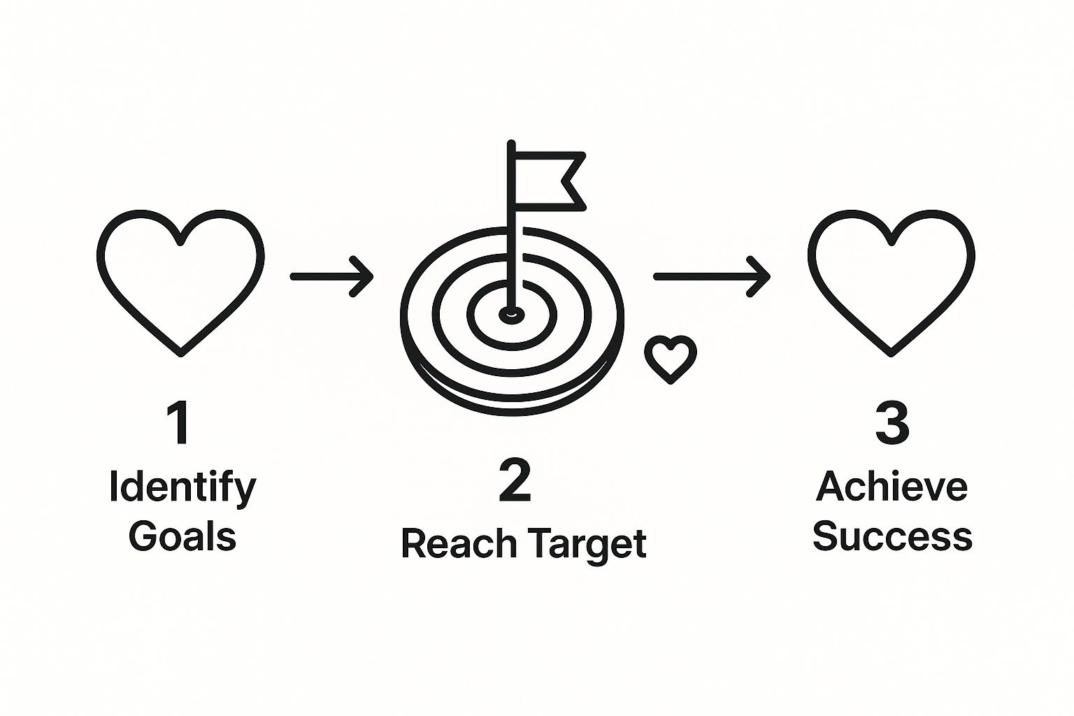
When you see it laid out like this, it’s clear: precise, consistent branding is what captures an audience’s affection and earns their loyalty.
Building Your Core Color Palette
Color is pure psychology in branding. The right palette can trigger specific feelings and forge an instant bond with your audience. Think about it—the power of a signature color is undeniable. Research has found that a distinct color can boost brand recognition by up to 80%, which is a massive edge in a noisy marketplace. In fact, if you dig into branding statistics, you’ll find that 90% of snap judgments about products are based on color alone.
Your guidelines absolutely must define your official brand colors so they’re used perfectly on everything from a tiny website button to a massive billboard.
I always recommend structuring your palette logically:
- Primary Colors: These are the one or two heavy hitters that will define your brand’s look.
- Secondary Colors: These colors complement your primary ones and are great for things like subheadings, accents, and callout boxes.
- Accent Colors: Think of these as your highlighters. Use one or two sparingly to draw the eye to the most important things, like a “Buy Now” button.
For every single color, provide the exact codes so there’s no room for error. This isn’t optional.
- HEX: For all things web (e.g., #FFFFFF)
- RGB: For anything on a digital screen (e.g., R: 255, G: 255, B: 255)
- CMYK: For anything that gets printed (e.g., C:0, M:0, Y:0, K:0)
Getting this granular eliminates all the guesswork for designers, printers, and partners. It’s the only way to guarantee your brand looks exactly how you envisioned it, no matter where it shows up.
Finding Your Brand’s Voice and Tone
If your visuals are the handshake, your brand’s voice is the conversation that follows. It’s how you actually build a relationship. The words you choose and the personality they project are just as vital as your logo for making a real connection with people.
Saying your brand is “friendly” is a start, but it’s not enough. It’s too broad to mean anything on its own. To really carve out a unique space, you need to go deeper and define a more nuanced personality. A fantastic way I’ve found to kickstart this process is by exploring brand archetypes. Are you The Hero, all about confidence and achievement? Or are you The Sage, focused on wisdom and guidance? Choosing an archetype gives you an immediate, powerful framework for a voice that feels authentic and stays consistent everywhere.
Making Your Personality Practical
Once you’ve locked in those core personality traits, it’s time to bring them to life. You need to translate that personality into a practical, everyday tone of voice. This is all about getting granular on how your brand sounds in the wild.
One of the most effective tools I’ve used for this is a simple “This, Not That” chart. It’s a straightforward but incredibly powerful way to give your team clear guardrails with real-world examples.
For example, let’s say your brand is “Confident but not Arrogant.” Here’s how you’d show the difference:
- This: “Our platform is designed to boost your team’s productivity by 30%.”
- Not That: “We’re obviously the best solution on the market, and no one else comes close.”
This simple distinction clears up any confusion. It empowers everyone, from the marketing team writing ad copy to a support agent handling a tough ticket, to get the voice right without needing constant oversight. The goal is a voice that is unmistakably yours.
A well-defined brand voice turns your communication from a monologue into a conversation. It makes your brand feel human and relatable, building trust and loyalty with every word. This is a critical component when learning how to create brand guidelines that genuinely resonate.
Adapting Your Tone for Every Channel
Now, consistency doesn’t mean sounding like a broken record. A truly smart brand voice is flexible. It knows how to adapt its tone for different situations while holding on to its core personality. Think of it this way: your voice is who you are, but your tone is your mood in a specific context.
You wouldn’t talk to your best friend the same way you’d talk to a potential investor, right? You’re still you, but you adjust your language. Your brand needs to do the same thing.
- Social Media: Here, your tone can be more casual, witty, and part of the conversation.
- Press Releases: In this context, the tone shifts to be more formal, authoritative, and direct.
- Customer Support Emails: For these interactions, the tone must be empathetic, helpful, and crystal clear.
It’s crucial to document these tonal shifts. A simple table outlining the channel, the right tone, and a quick example works wonders. For a much deeper dive into getting this right, our complete brand voice guide provides an exhaustive look at mastering these subtleties.
Finally, pull together a quick brand glossary. This is your go-to list for specific words to use (like “team members” instead of “employees”) and, just as important, words to avoid (like confusing industry jargon or overly technical terms). This finishing touch is what guarantees your brand sounds consistent, professional, and authentic, no matter who’s doing the writing.
Finding Your Brand’s Voice Through Typography and Imagery

If your logo and colors are the face of your brand, then your typography and imagery are its body language. They convey emotion, personality, and the subtle cues that words alone often miss. Getting these elements right is a non-negotiable step in creating brand guidelines that actually resonate with your audience.
The Power of Well-Chosen Fonts
Typography is one of those things most people don’t consciously notice, but everyone feels. It’s a surprisingly powerful tool. The right fonts make your content a pleasure to read while quietly reinforcing your brand’s personality.
A solid strategy is to select both a primary and a secondary typeface. Think of the primary font as your headline-grabber—it’s for your main headers and big, bold statements. The secondary font is the workhorse, used for body text, captions, and all the supporting details.
A classic pairing that works wonders is a distinctive serif or sans-serif for headlines contrasted with a super-legible sans-serif for body copy. This instantly creates visual order and makes your content easy to digest. For example, a modern tech company might pair a strong, geometric font like Montserrat for its headlines with a clean, friendly font like Open Sans for paragraphs. It just works.
Creating a Clear Typographic Hierarchy
Once you’ve picked your fonts, you need to set the rules of the road. This is your typographic hierarchy, and its purpose is to eliminate guesswork for anyone creating content for your brand. This means getting specific about the font, size, weight, and even color for every single text element, from the main headline down to the tiniest caption.
To make this crystal clear in your guidelines, a simple table is often the best tool.
Typography Hierarchy Example
Here’s a quick look at how you might structure these rules. This table clearly defines how to apply your chosen fonts, ensuring consistency across all materials.
| Element | Font Family | Font Weight | Font Size | Usage Notes |
|---|---|---|---|---|
| Headline 1 (H1) | Montserrat | Bold (700) | 48px | Reserved for main page titles only. |
| Headline 2 (H2) | Montserrat | Bold (700) | 36px | Used for major section headings. |
| Headline 3 (H3) | Montserrat | Semi-Bold (600) | 24px | Used for sub-section headings. |
| Body Text | Open Sans | Regular (400) | 16px | The standard for all paragraph text. |
| Caption | Open Sans | Italic | 14px | Used for image captions and credits. |
Laying out your typography with this level of detail ensures that a website, a social media post, and a sales presentation all feel like they belong to the same family.
Telling a Cohesive Story With Your Visuals
Your imagery guidelines are just as vital. The real goal here is to graduate from generic stock photos and start building a visual library that feels authentic to you. It all starts with defining the story you want your images to tell.
Begin by thinking about the subject matter. A B2B software company, for instance, might decide all its photos should feature genuine teams collaborating in bright, modern offices—and strictly avoid any stiff, overly corporate-looking shots.
Next, you’ll want to get into the artistic and technical details.
- Composition: Do you prefer your subjects centered, or do you lean on the rule of thirds? Are you going for tight, focused shots or wide, atmospheric scenes?
- Color Treatment: Should every photo get a specific color grade—maybe a warm, cool, or slightly desaturated filter? Define a color profile that harmonizes with your main brand palette.
- Lighting: Is your brand’s style bright and airy with tons of natural light? Or is it more dramatic, using high-contrast lighting and shadows?
A Quick Tip from Experience: I’ve seen brands completely change their feel by establishing one simple rule: no photos where people are looking directly at the camera. This small tweak instantly shifted their imagery from feeling staged and “stock-like” to something much more candid and documentary in style.
Whether you rely on photography, illustration, or a mix of both, these guidelines are what weave everything together. They ensure every single image reinforces the narrative you’re building, making your brand more distinct, recognizable, and memorable.
Getting Your Brand Guidelines Used and Followed
You’ve done the hard work and built a brilliant set of brand guidelines. That’s a huge accomplishment, but it’s only the first step. A great guide that just sits in a folder collecting digital dust is worthless. The real magic happens when your guidelines are easy to find, simple to understand, and used consistently by everyone.
First things first, think about the format. A slick PDF is the classic choice and can work perfectly well, especially for smaller teams. But for a more dynamic approach, consider building out a dedicated section on your company intranet or even a password-protected microsite. Digital versions are a breeze to update on the fly, they’re searchable, and you can easily grant access to freelancers, agencies, and other partners.
My Two Cents: Don’t just attach the final PDF to a company-wide email and call it a day. A formal launch, even a quick and simple one, makes a world of difference. Walk everyone through the new guidelines in an all-hands meeting, explain the strategy behind the rules, and give a shout-out to the team who put it all together. Make it feel like an event.
How to Drive Real Adoption and Keep Things Consistent
Getting your team to actually use the guidelines is all about being proactive. This isn’t about being the “brand police”; it’s about education and making everyone’s job easier. Just pointing people to a link isn’t enough—you have to weave these rules into their daily work.
It’s a surprisingly common struggle. By 2025, it’s projected that over 95% of businesses will have formal brand guidelines. That’s a massive leap from a few years ago when 15% had none at all. But here’s the catch: according to research from Blacksmith.agency on brand consistency, only about a quarter of companies strictly enforce them. That means all that strategic work goes to waste.
To make sure you’re in that top 25%, here’s what you can do:
- Offer Hands-On Training: Go beyond a boring presentation. Host workshops where your design and marketing leads show people how to apply the guidelines to real projects. Think social media posts, sales decks, or email signatures.
- Designate Brand Champions: You can’t be everywhere at once. Find a “brand ambassador” in key departments like marketing, sales, HR, and product. They can be the first point of contact for their team, answering questions and championing consistency from the inside out.
- Build It Into Your Tools: Make it easy for people to get it right. If your team lives in Canva or Figma, build templates that are pre-loaded with the right logos, fonts, and color palettes. When following the rules is the easiest option, people will do it.
Treat Your Guidelines as a Living, Breathing Document
Finally, remember that your brand guidelines aren’t meant to be carved in stone. Your business will grow, markets will change, and your brand needs to evolve right along with them. The best guidelines are living documents.
Set aside time for an annual review. Look at what’s working, what isn’t, and what’s starting to feel dated. Are people constantly asking for a new logo lockup you didn’t account for? Is that secondary color you picked now being used more than a primary one? These are clear signs that it’s time for a refresh.
Building a brand that’s both strong and flexible is a marathon, not a sprint. If you need a strategic partner to help you navigate the process, exploring professional brand identity services can give you the expert support needed to keep your brand powerful for years to come.
Common Questions About Brand Guidelines
As you start to define your brand, some practical questions always seem to pop up. I’ve been through this process countless times, and believe me, knowing the answers to these common hurdles makes everything run smoother. Let’s tackle the most frequent queries so you can move forward with confidence.
How Long Does It Take To Create Brand Guidelines?
Honestly, there’s no single answer here. The timeline for creating brand guidelines can range from a few weeks to several months, and it really hinges on your company’s size, complexity, and how many people need to sign off on it.
For a small startup or a solopreneur who already has a clear vision, you might knock it out in a few weeks of focused work. The decision-making circle is tight, which means you can go from strategy to a finished document pretty quickly.
On the other hand, if you’re in a large corporation with different product lines, international teams, and a formal leadership structure, expect the process to take a few months. The biggest time sink isn’t usually the design work—it’s getting everyone aligned. That cycle of discussion, feedback, and refinement just takes time.
A Word of Advice: Fight the urge to rush this. It’s so much better to invest the time upfront to build a solid, strategic foundation. A rushed guide almost always creates more cleanup work down the line because it’s either ignored or simply misses the mark.
What Is The Difference Between a Brand Guide and a Style Guide?
This is probably the most common point of confusion I hear, and it’s understandable since people often use the terms interchangeably. While they’re related, there’s a key distinction that helps clarify their purpose.
A style guide is tactical. Think of it as the “how-to” manual for using your brand assets. It’s focused squarely on the rules of application.
A style guide typically covers:
- Logo rules (clear space, minimum size)
- Color palette specs (HEX, RGB, CMYK codes)
- Typography hierarchy (fonts, sizes, weights)
- Basic tone of voice notes
A brand guide (or brand book) is the whole story. It’s more strategic and comprehensive, containing everything in a style guide but also anchoring it all in the high-level “why” of your brand.
A true brand guide will almost always start with your foundation:
- Mission and vision
- Core company values
- Brand personality and archetypes
- Target audience personas
So, in a nutshell: a style guide tells you how to use the brand elements. A brand guide tells you how and, more importantly, why those are the right elements in the first place.
How Often Should We Update Our Brand Guidelines?
Your brand guidelines should be a living document, not something you create once and file away forever. To stay relevant and useful, it needs to evolve right alongside your business.
As a good rule of thumb, plan on a formal review at least annually. This is your chance to make sure the guidelines still reflect your current business goals and marketing strategies. Maybe you’ve launched on a new social channel that needs its own rules, or perhaps some of the messaging feels a bit dated.
You should budget for a more significant refresh or overhaul every 3-5 years. These larger updates are usually triggered by a major business event, like:
- A merger or acquisition
- A major pivot in your business model
- Launching into a new market or a flagship product
- A cultural shift that makes your branding feel out of step
Of course, small tweaks—like adding a new logo lockup for a partner or refining a few messaging points—can and should happen whenever they’re needed. The goal is to keep the guide accurate and truly useful for your team today.
Who Should Be Involved in Creating The Brand Guidelines?
Building effective guidelines is a team sport. If you create them in a silo, don’t be surprised when nobody uses them. The best brand books come from collaboration, capturing different perspectives from across the company.
Your core team should always include the people who will own, use, and champion the guidelines day-to-day.
- Leadership/Executives: Their input is non-negotiable for setting the strategic foundation—the mission, vision, and values that guide everything else.
- Marketing & Brand Managers: These are your project leads. They’ll likely own the document, drive its creation, and oversee its use.
- Designers (Graphic/UI/UX): Your visual experts. They’ll be the ones developing and documenting the entire visual identity system.
- Copywriters & Content Strategists: They are critical for shaping the brand voice, tone, and messaging framework.
Don’t stop there. It’s incredibly valuable to bring in people from your customer-facing teams. Your sales and customer service reps are on the front lines, and they have an unfiltered view of how customers see your brand and what language connects. Their real-world insights can make your brand voice feel authentic and truly effective. For bigger companies, a dedicated brand committee or an external agency can help orchestrate the process.
Building robust brand guidelines is a strategic investment in your company’s future. By taking a collective and informed approach, you can build a powerful tool for consistency and growth. The team at ReachLabs.ai specializes in integrating data-driven insights with world-class creative talent to elevate brands. If you’re ready to build a brand that truly moves the needle, explore our full suite of services.


